
March by Zivan Rosic

March is a collaboration of architects and creative marketing professionals founded in 1998 in Santa Monica by two partners. The partnership offers experience and innovation in marketing, strategy, and design. The core mission of March is to build brand value through architecture.
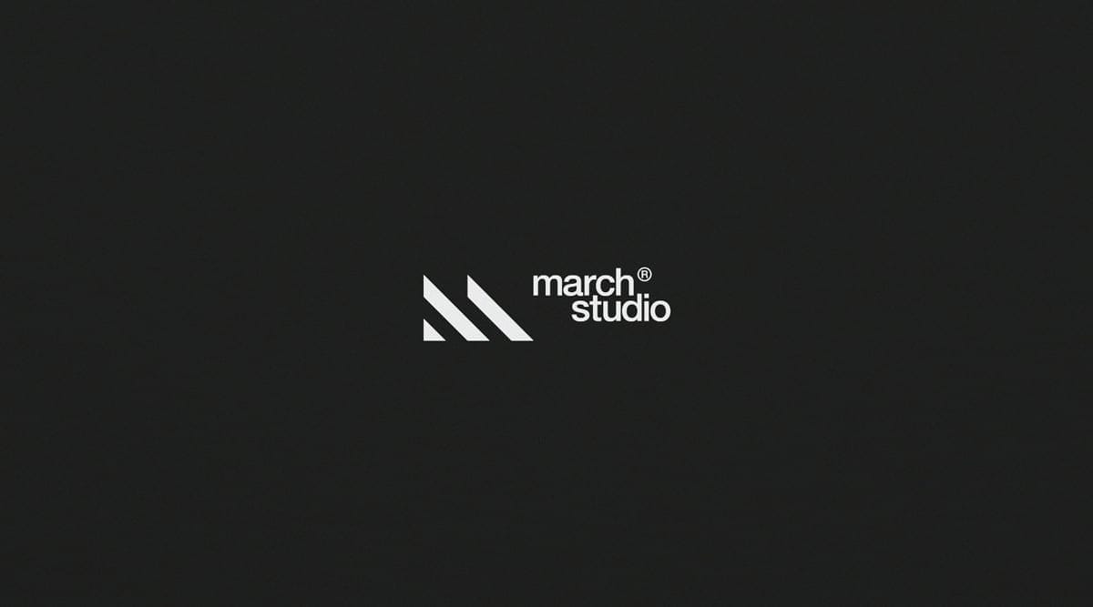
The studio was originally called M)Arch (pronounced m arch), a short hand name for Marketing Architecture. The new strategy was to remove this as it was confusing a lot of previous clients. The studio was regularly, and incorrectly referred to as "march", so a name change was the next practical step.
- Zivan Rosic
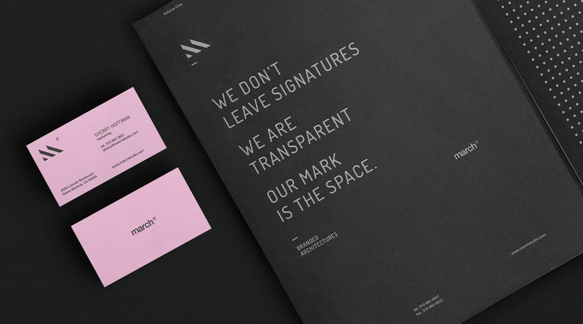
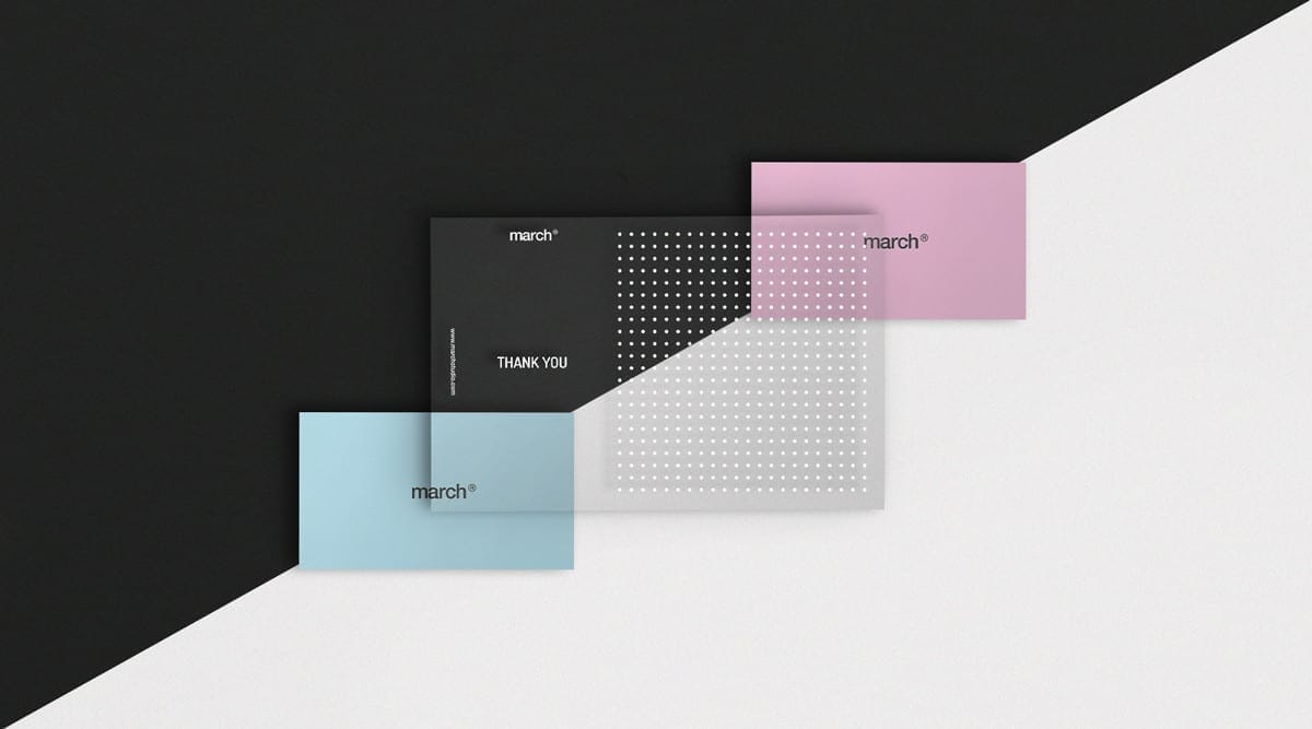
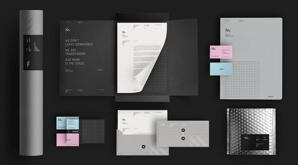
This was a freelance branding/identity project I was brought into to art direct and design. The agency that hired me was Flux branding. The word March evokes powerful emotions, both as a month in the calendar associated with spring / renewal and as a rhythmic and militarized way of walking: 'marching' in unison. The word itself proved to be foundational in creating visuals that would complement it. The studios' ethos, of placing client needs over architectural style allowed for the concept of 'transparency' (used in a thank you card) in the visual system.
- Zivan Rosic
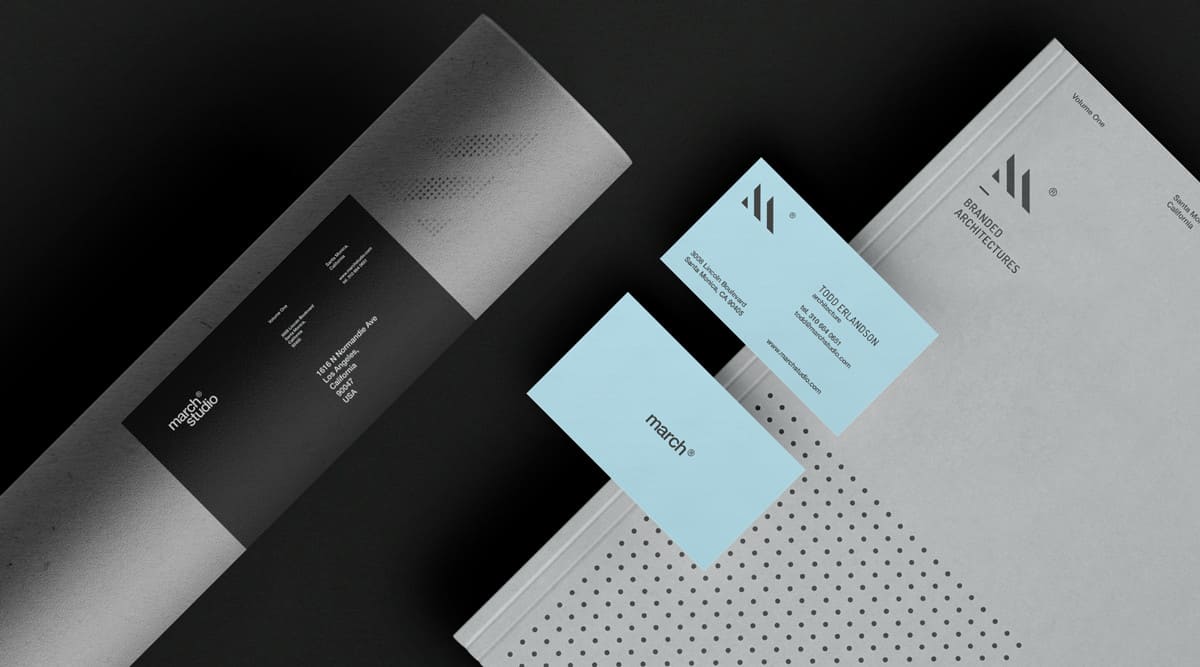
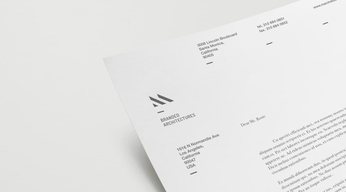
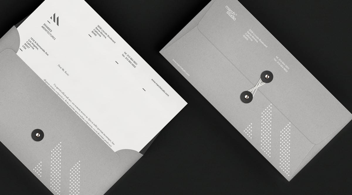
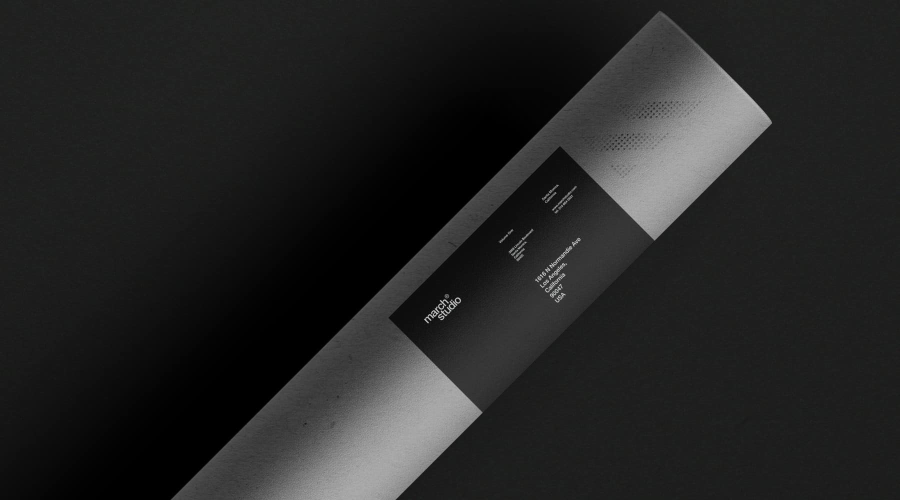
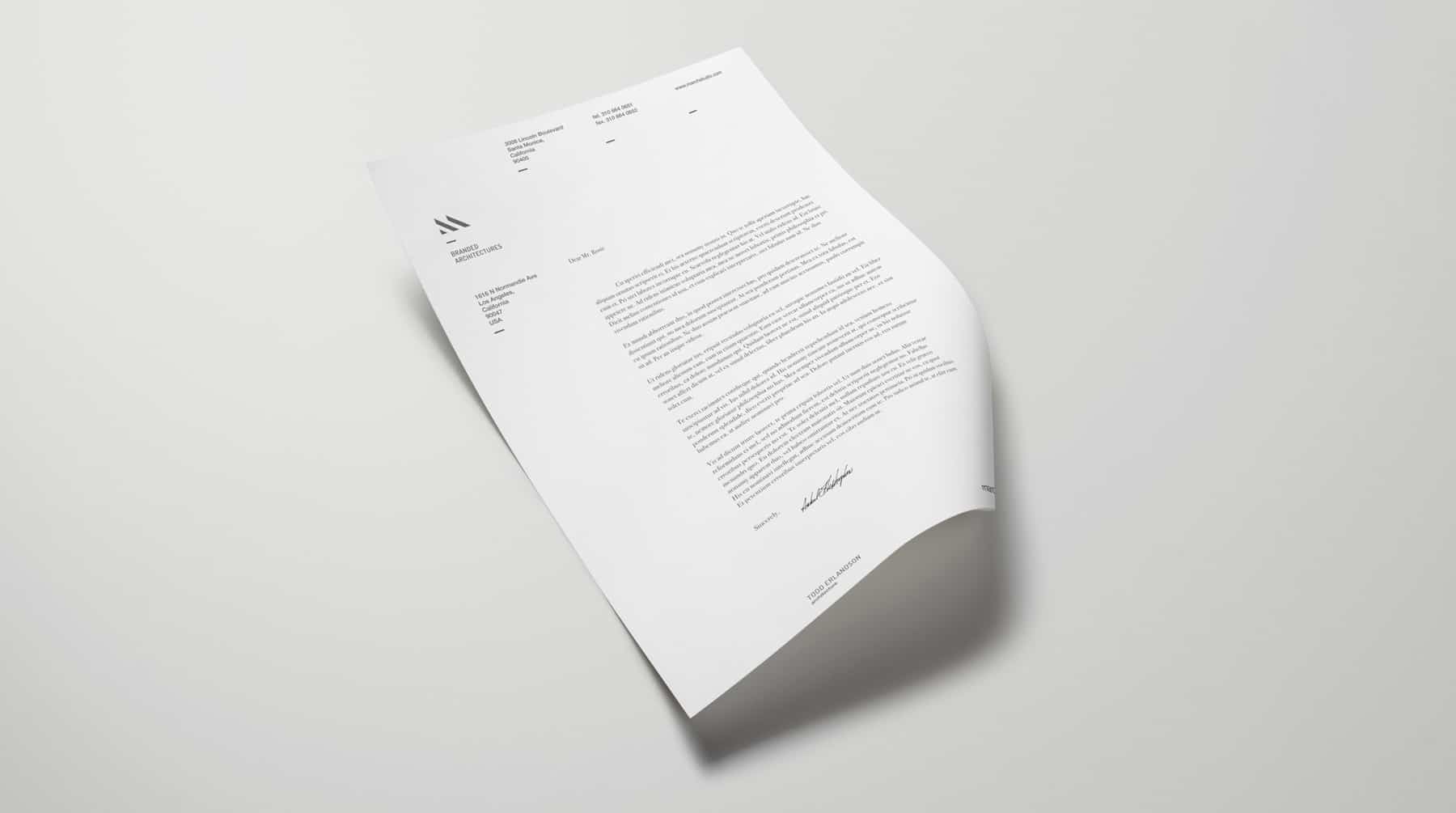
The logomark as an "M", minimal, and stylized to evoke architectural forms and hint at the act of 'marching' (placing one leg strait in front of the other). A sober gray and black color palette was chosen to mirror primary palettes of architectural forms, along with accented bright colors picked by the partners to add personality. Helvetica Neue was chosen as logotype for its neutral qualities and balance with the mark. Lastly, the dot grid was meant to evoke both an overhead view of a 'march', and architectural grids. Initially, there were 3 refined concepts presented. The final result was a second revision.
- Zivan Rosic
About Zivan Rosic
Zivan Rosic is a Serbian born designer and filmmaker currently residing in Los Angeles. His desired approach to logo works and visual identity is always to reduce forms to their most basic nature, while still maintaining strong visuals and clear communication. He has a fondness for geography and travel, both of which greatly influenced his youth. You can find more of his works on his Behance profile or website.