World of the Rings by Kamil Piatkowski

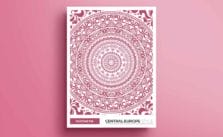
Circle is a simple element that exists regardless of boundaries. The symbol, which was the beginning of everything. In "World of the Rings" each circle is the same and yet completely different, the characteristics for each of the country are very distinct. Underlines the diversity of this place, showing its character and what makes it unique. Circle is a symbol of the culture and history of a place - reflects his aesthetic and make it relevant.
-Kamil Piatkowski
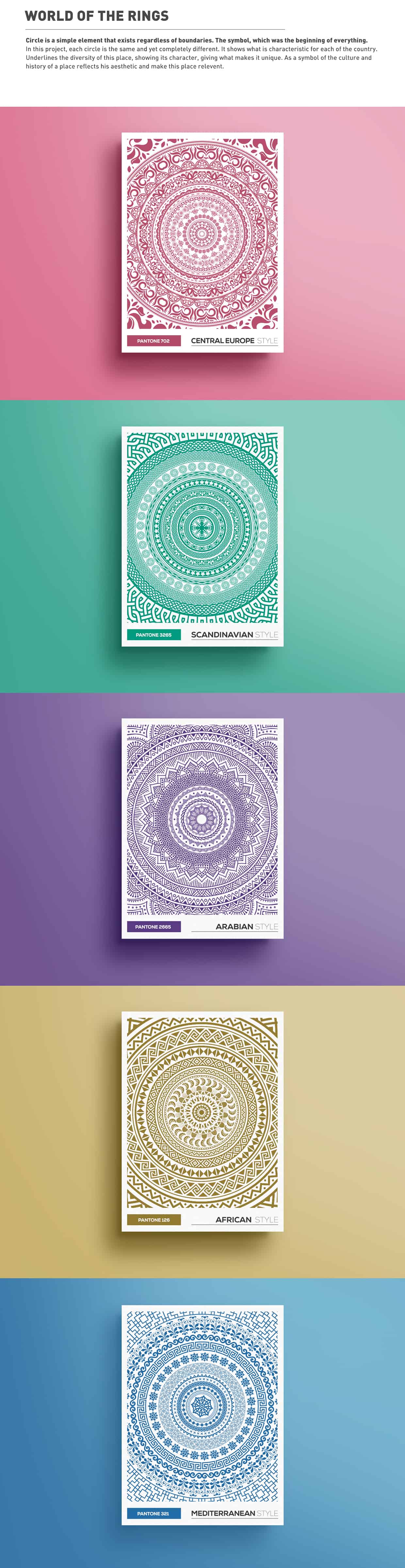
I like the patterns and their use in projects. I wanted to try to close them in a circle, which is a symbol of the past and the future. Playing with the connection patterns and the shape of the wheel. I was inspired by the famous lecture of trendwatcher Li Edelkoort about the future design, graphic recital wheel and its impact on our lives. Geometry, pattern design, symmetry - this aesthetics is close to my heart. Combo of elements from different worlds, inconsistent, which together create something new.
Finding inspiration from the surrounding world. Being open to different cultures, art, design. Trying to develop your personal style.
-Kamil Piatkowski
About Kamil Piatkowski
Kamil Piątkowski is a Polish designer, whose passion and work is graphic design. He lives and works in Poznań, Poland. Kamil specializes in: packaging design, branding, ID and industrial design. Fascinated by the geometric patterns, which are often used in his works. See more of his work on Behance.
Looks very detailed. Love the patterns and the colors.