
Yelp | Rebrand Concept by Alexandra Camacho

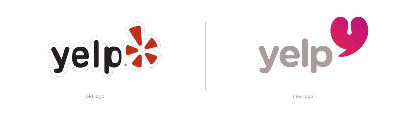
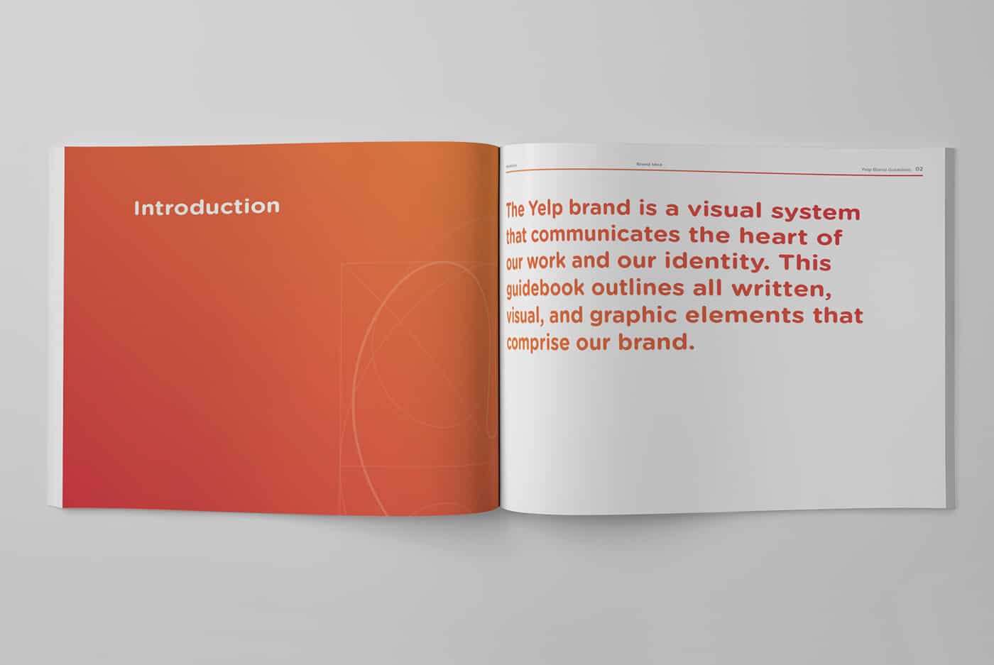
Alexandra Camacho was tasked to rebrand a social media company for a branding course and set about refreshing the identity for Yelp. The core ideas behind the rebrand are to be fresh, youth and modernity. She started by simplifying all the important aspects of Yelp. She saw it as a community where your voice can be heard and shared.
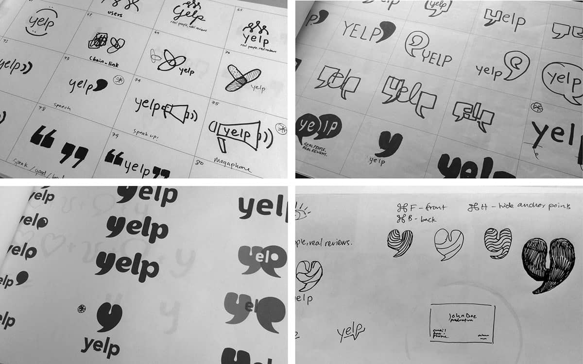
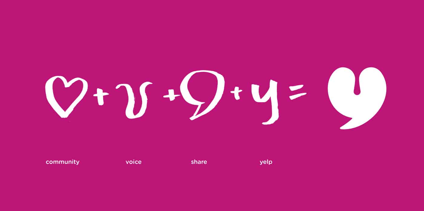
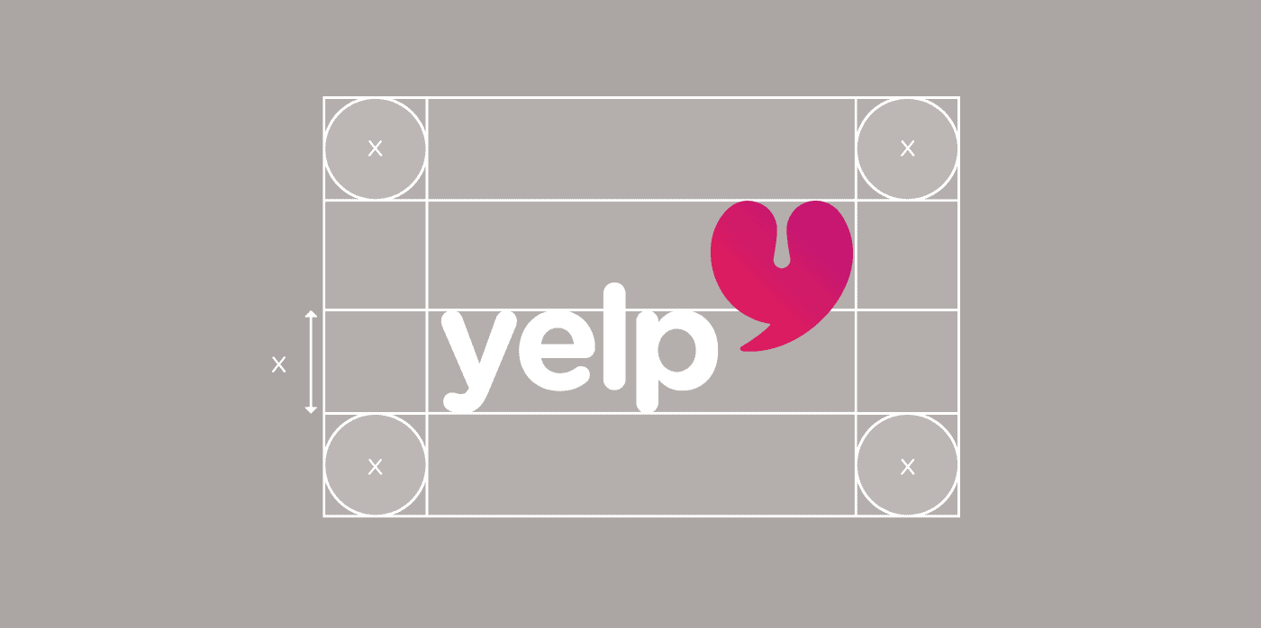
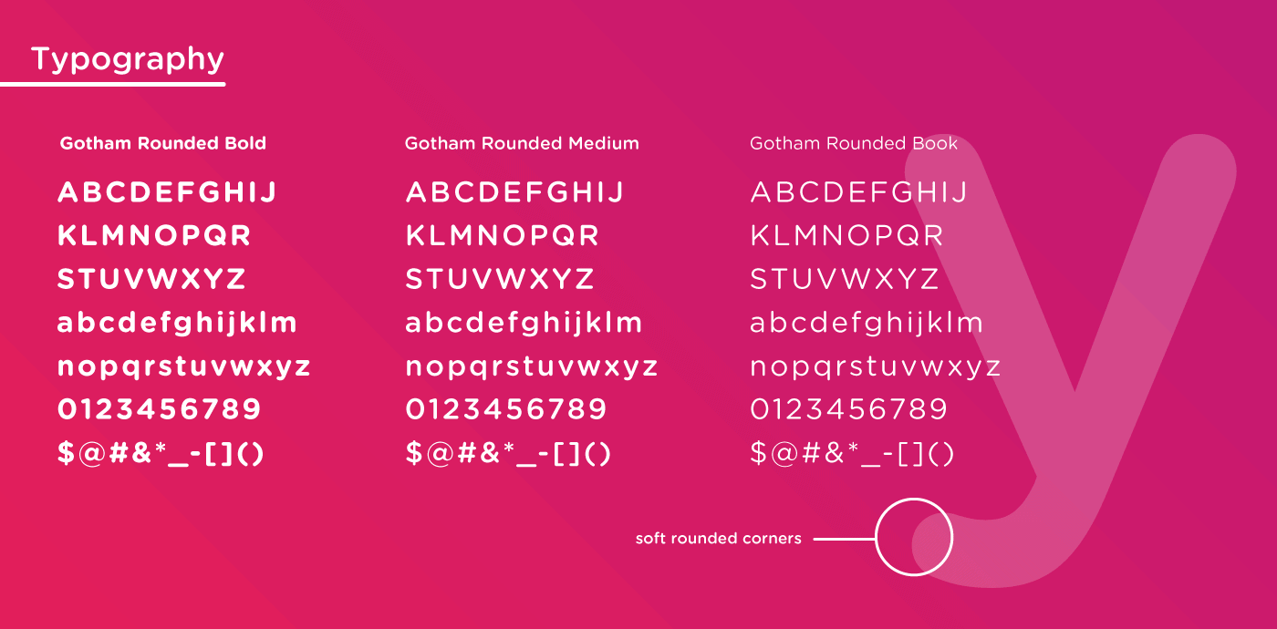
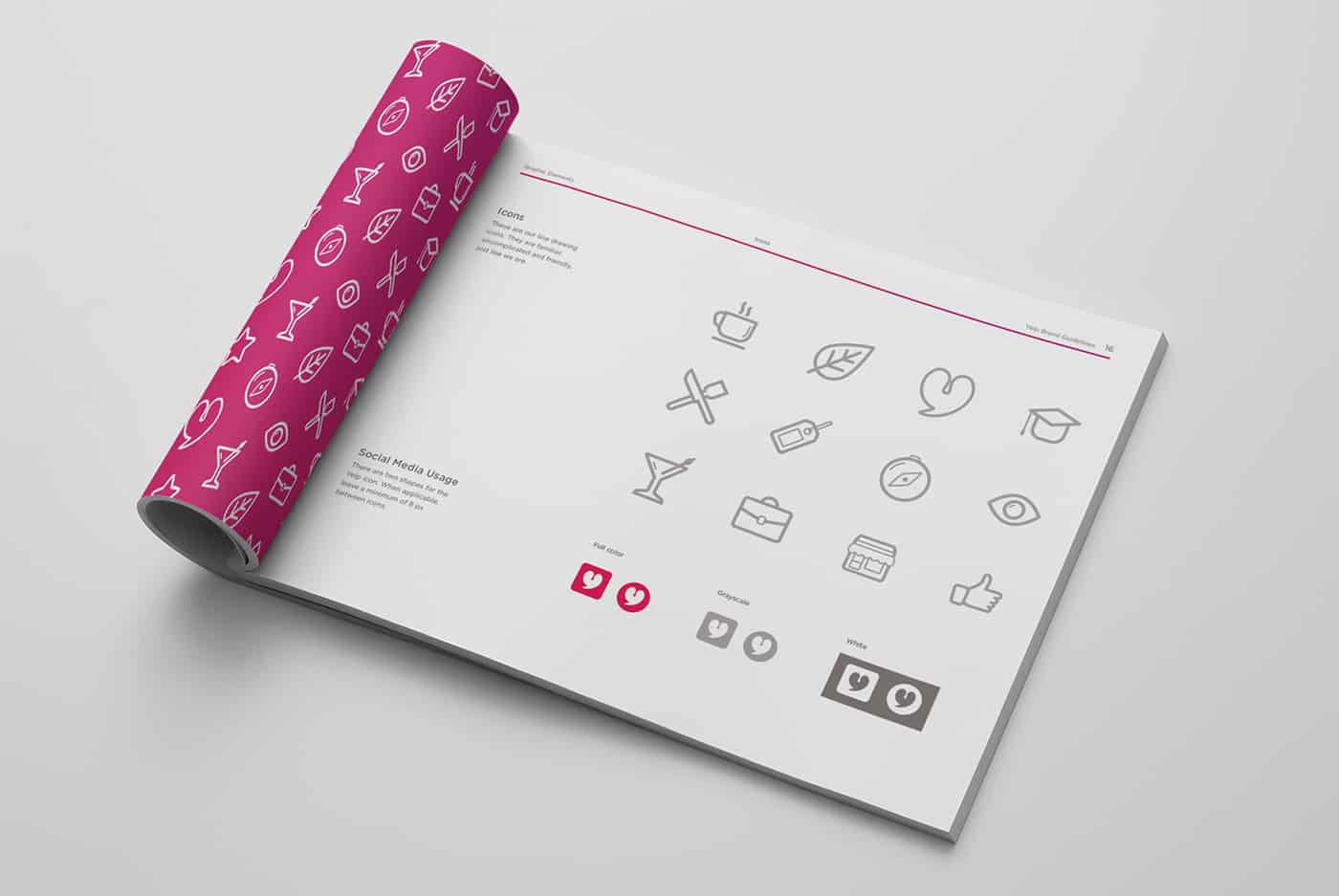
The brandmark had to represent these three attributes in reference to Yelp. My initial sketches looked more of a “y” in the shape of a speech bubble. However, throughout the process I exaggerated the shape so the negative space would look like tonsils, which is meant to represent your voice as a yelper. The soft edges of the icon encouraged me to explore round typefaces and I ultimately decided upon Gotham Rounded.
- Alexandra Camacho
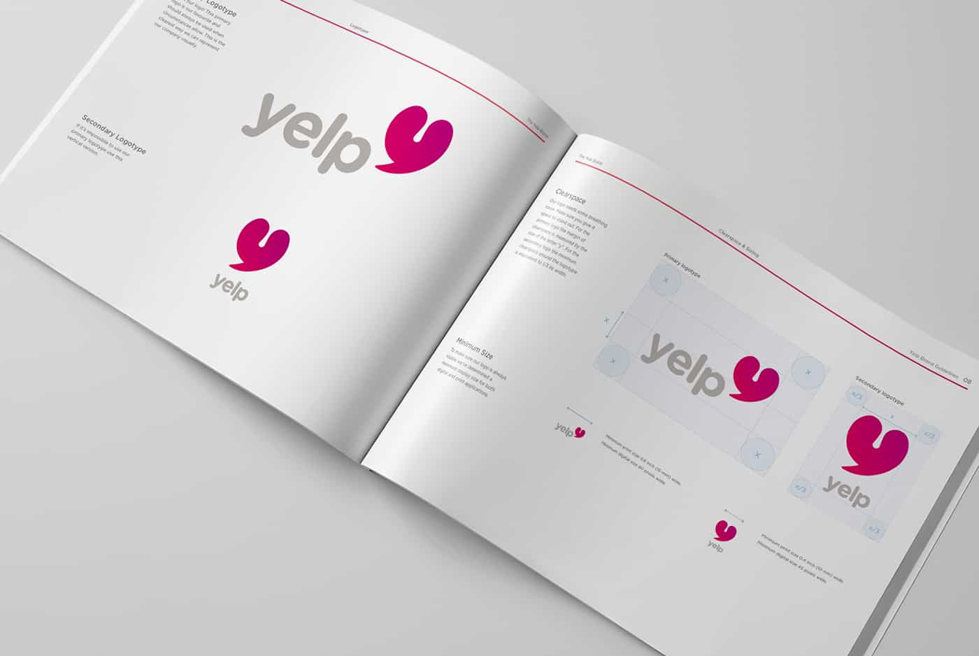


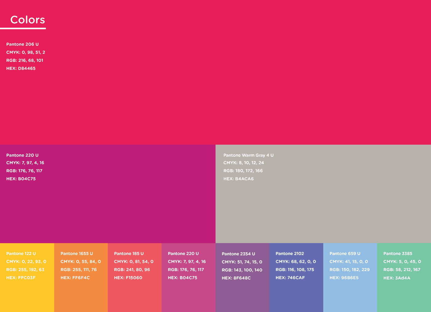

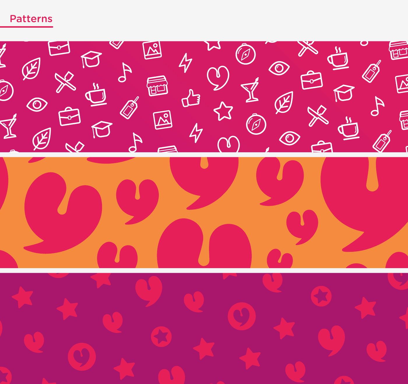
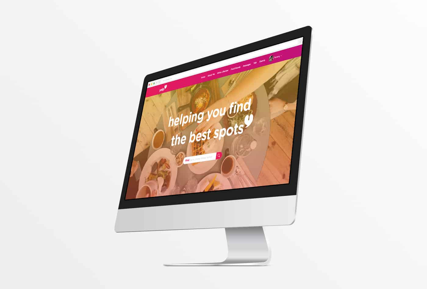
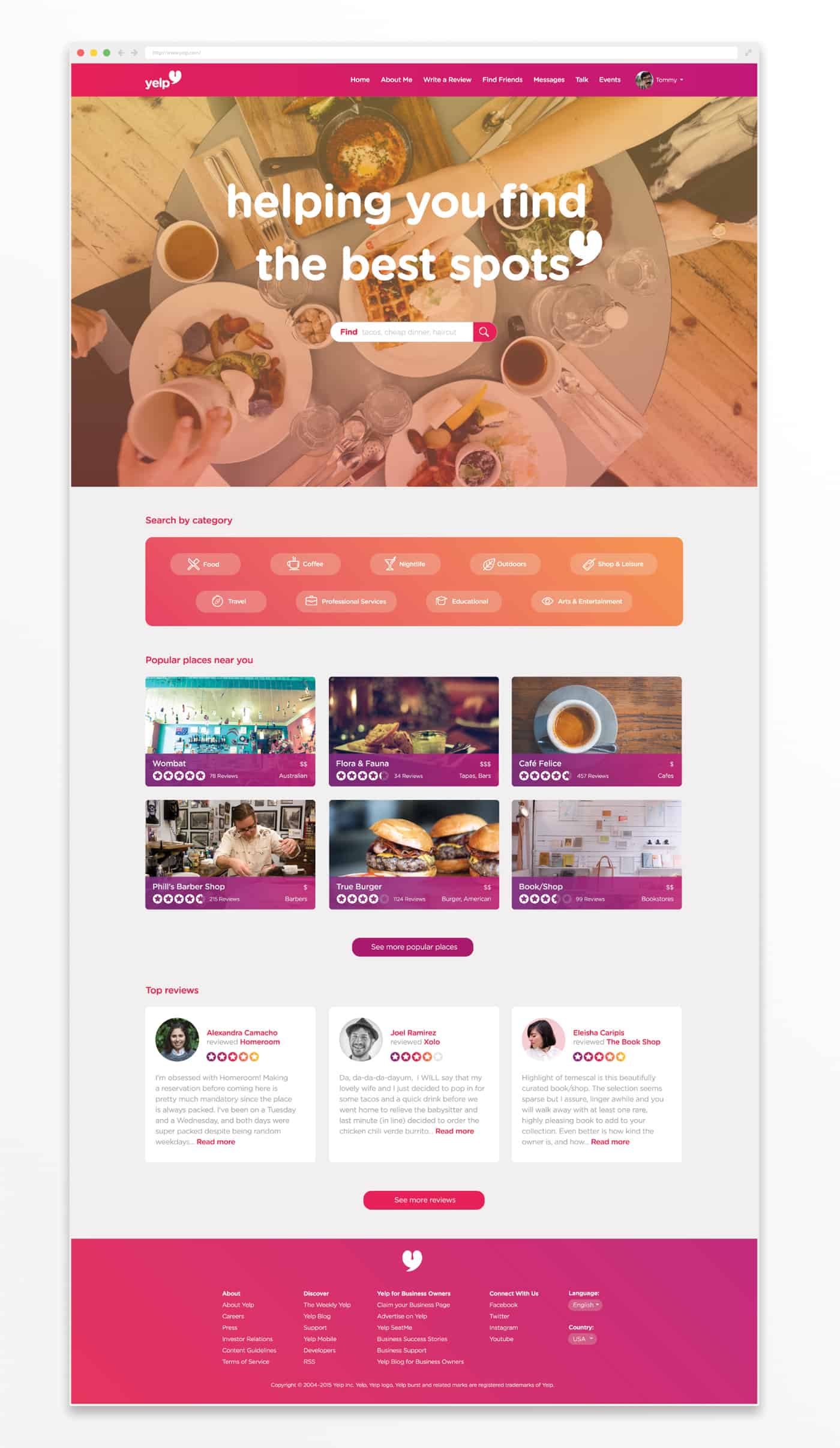
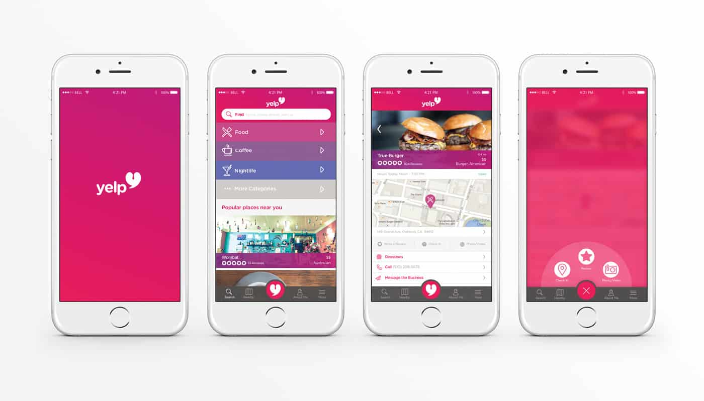
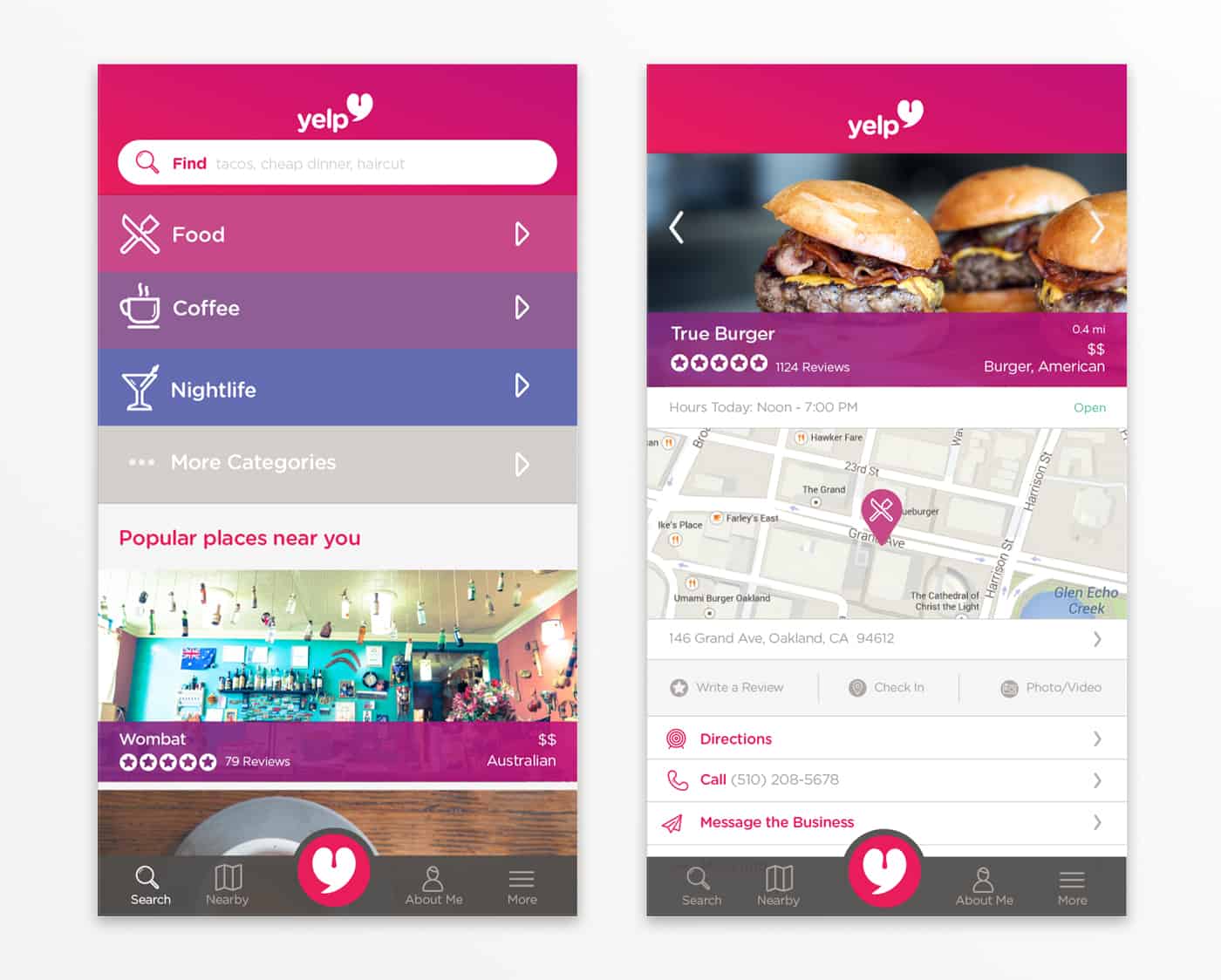

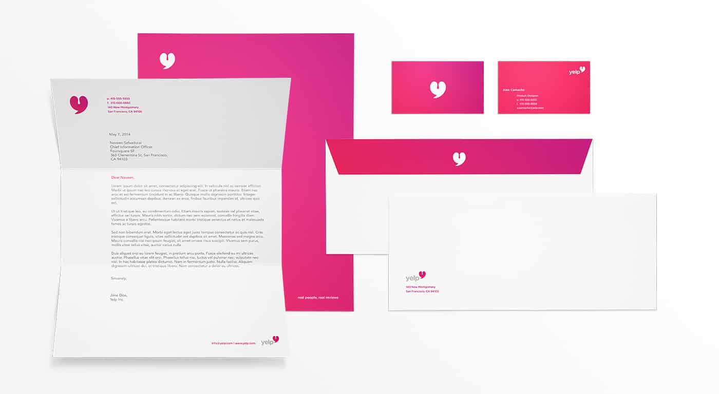
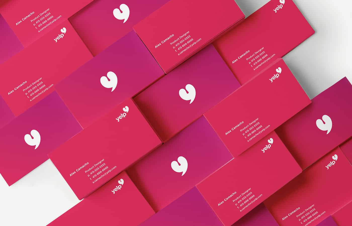


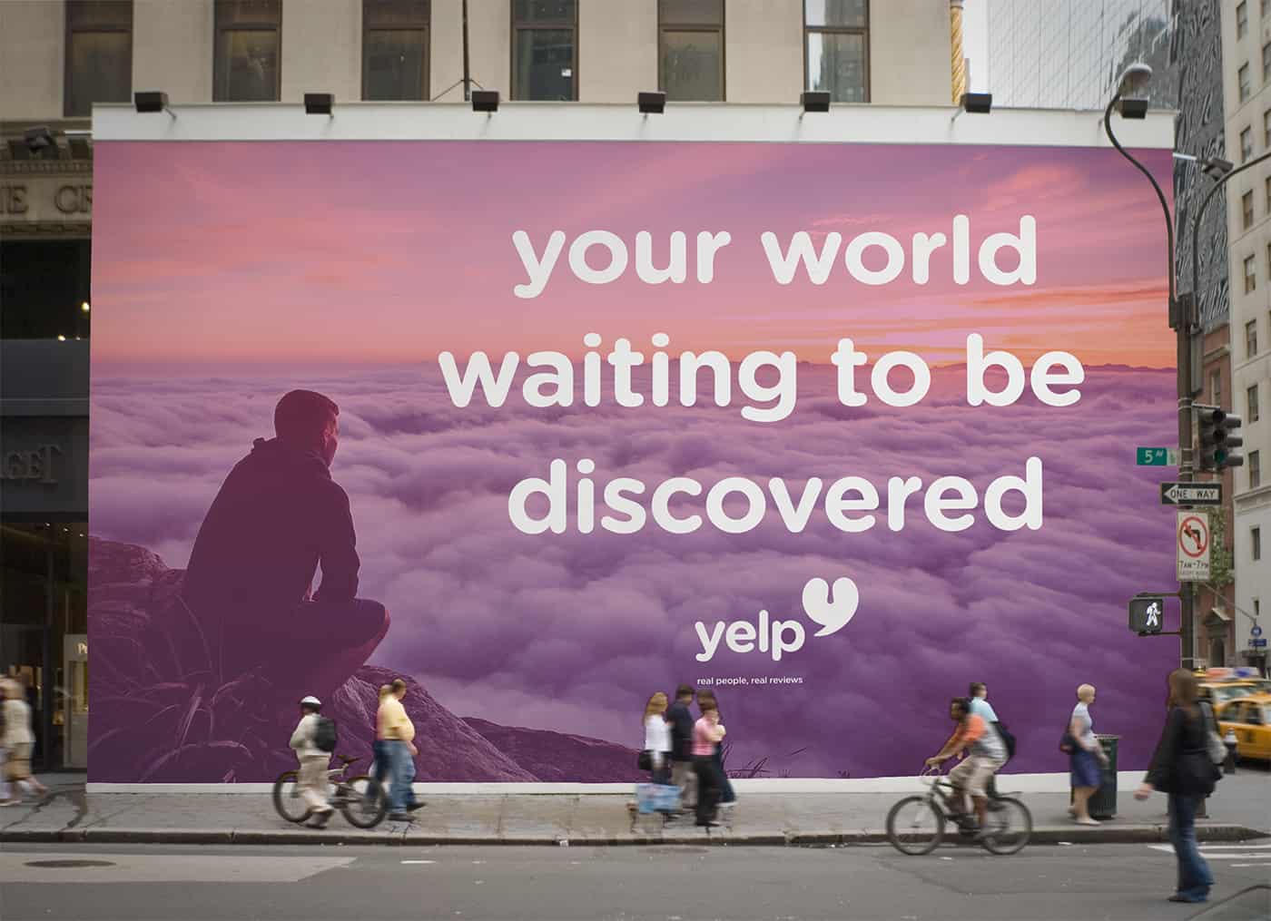
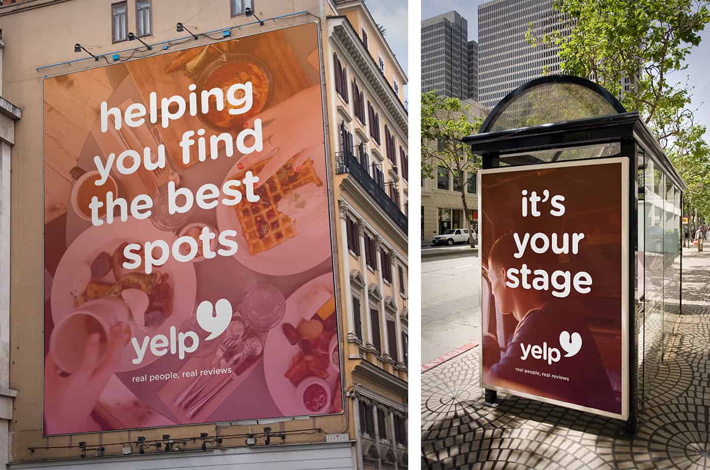
Yelp currently uses reds in their branding and I wanted to stick with that. I also wanted to introduce new colors that would bring excitement to the new image but still help identify each of the review categories. In the end I chose a palette centered around a cherry red, applied singularly and in gradients. In a way, this branding concept is idealistic. It’s based upon my own experiences as a Yelp user and the ways I thought I could enhance them.
-Alexandra Camacho
About Alexandra Camacho
Alexandra Camacho is an Advertising student at the Academy of Art University with a focus in Art Direction and Graphic Design. She's also a design intern at Young & Hungry in San Francisco. Born and raised in Puerto Vallarta, Mexico, she moved to the Bay Area to start her career as a designer. She loves riding her bike through the city and is an avid film photographer. You can check out some of her work by visiting her Behance or follow her documented life on Instagram.
I love those gradients. Great idea with the logo concept too!
Omg! The patterns and the type are so cute! I love the colors and the gradient too. Can't take my eyes off this - great brand, great work! Congrats!