1-N
Brand identity for 1 (to) N. 1-N is all about relationships and proportions. How we relate to ourselves and others, in an organization and in society. They examine these links from an organizational, social, ethical and entrepreneurial perspective. And en passant facilitate change. Through critical research into connections from an origin, they develop interesting perspectives that provoke change.
The Jakobus
1-N is situated in a former church, called the Jakobus. The original foundation (1890) in combination with the energy of the new, modern design creates an inspiring, business-like, but also homely atmosphere. This unique atmosphere of calm and inspiration gives the opportunity to reflect on the issues that concerns all of us.
The Plastic Number
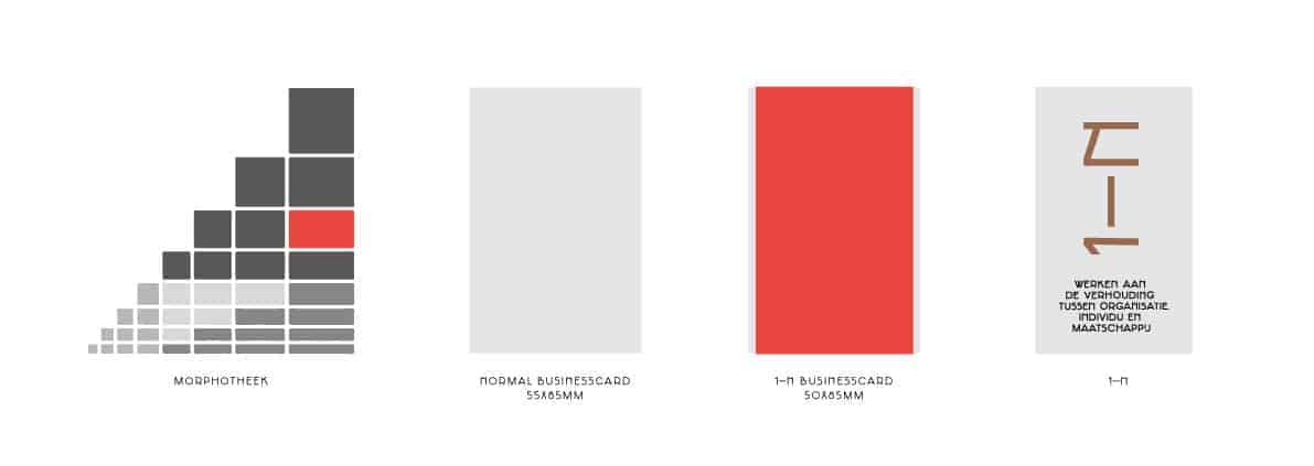
From this idea of origin and relationships, Autobahn designed a visual identity for 1-N. An important concept for the identity is the relationship theory of Benedictine monk Dom Hans van der Laan (1904 - 1991). This theory shows us how objects are related. He called this 'the Plastic Number'. A visualization of this theory is shown within the Morphotheek.
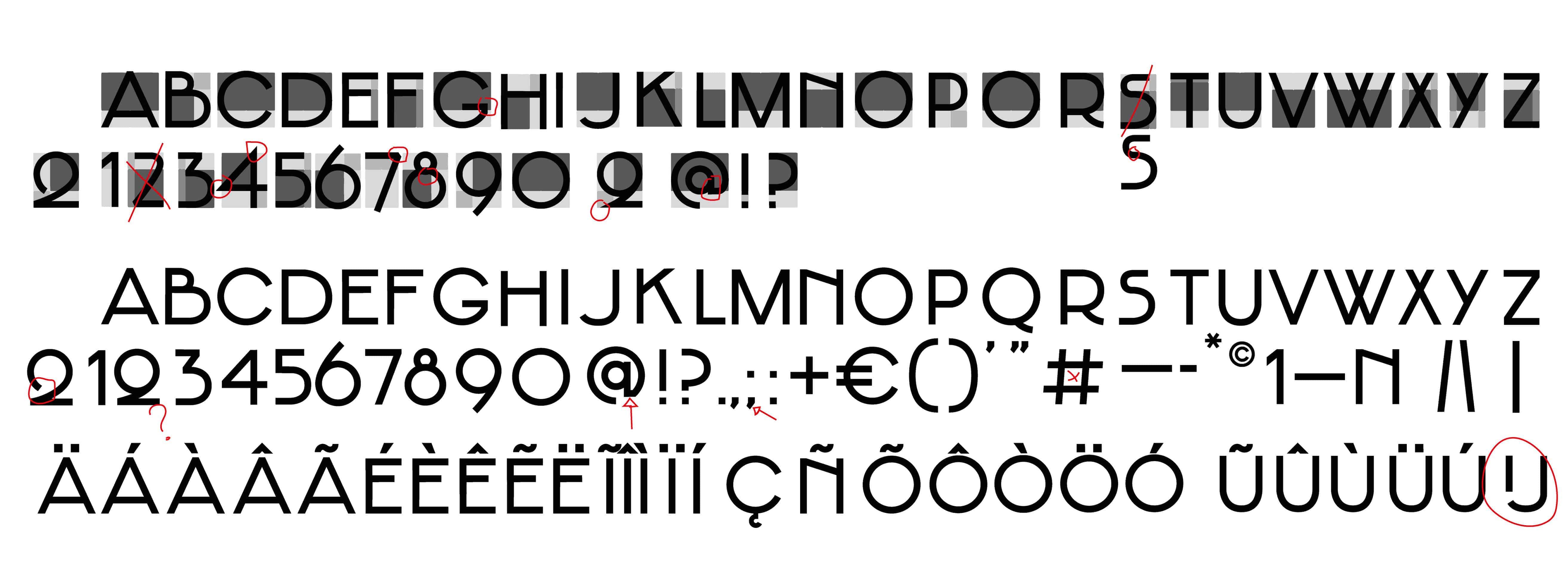
Typeface
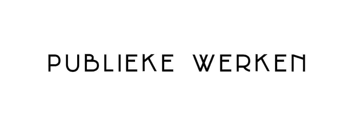
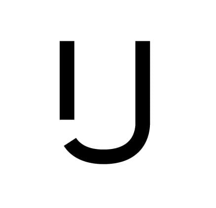
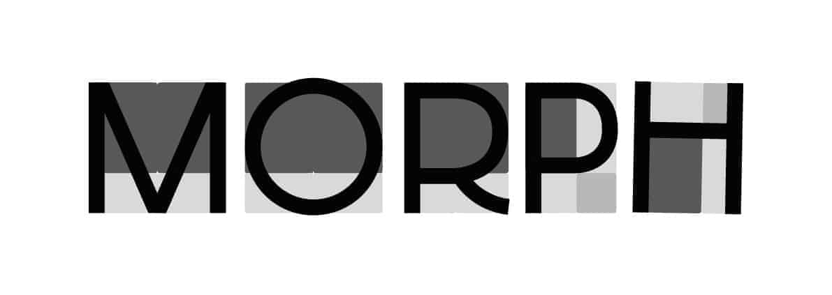
The typeface Jakobus is designed with cubes from the Morphotheek to create a scale relation within and between glyphs. The stroke of the glyphs is based on the smallest width in the Morphotheek. Within the typeface, a logo glyph is added and is accessible through Open Type features. By doing so, 1-N can share the font instead of .eps or .jpg files of the logo.
Business card
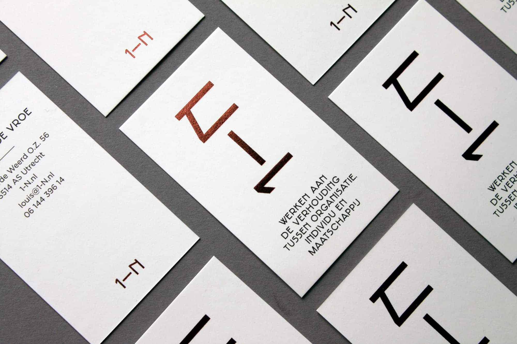
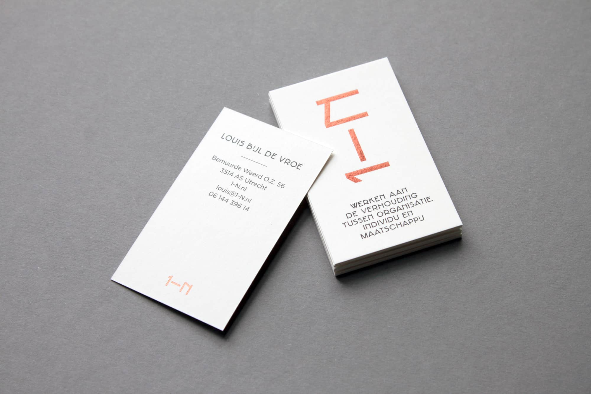
The measurements of 1-N (print)materials is also based on the Morphotheek. The conventional size for a business card is 55x85mm. The 1-N business card is 50x85mm, making it slightly different in look and feel. Printed in black on 350 grams Olin natural white with a copper foil stamp and typeset in Gotham and Jakobus.


The project got a lot of response. People like the combination of theory (the Plastic Number) and form in this design. It enables us to create multiple designs within a style and concept that are remarkable and recognizable 1-N. The Morphotheek is a useful tool to create relations between shapes and media.
Nice branding! Looks modern and chic