36 Days of Type

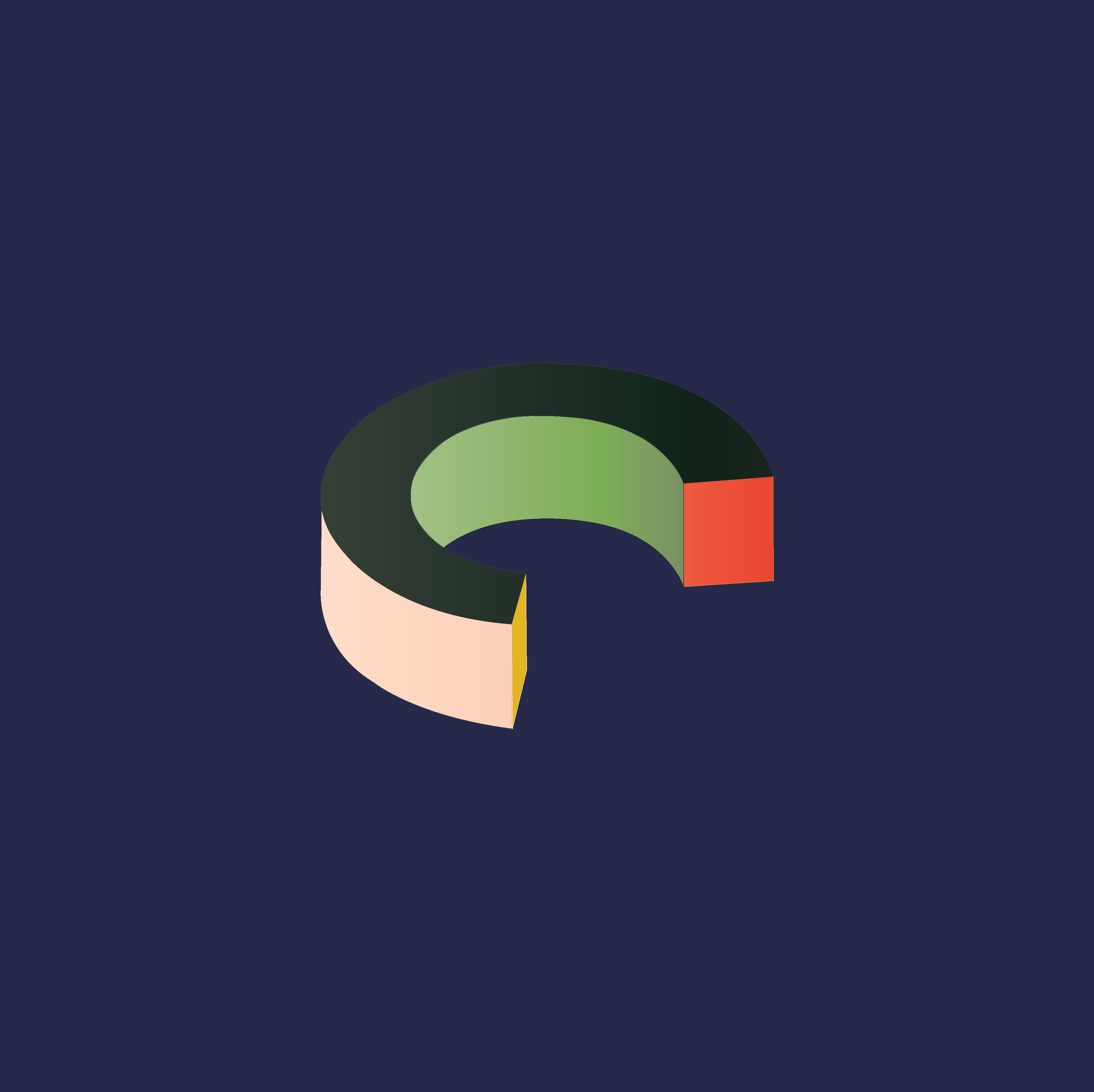
36 Days of Type invites designers, illustrators, and graphic artists to share their creative interpretation of letters and numbers. I crafted an alphabet and numbers in distinct color combinations but varied the styles of the type to create a one of kind typographic family.


Although the project has already been and gone its always good to flex those creative muscles. I currently hold a 9-5 design job in NYC and this was a great escape from that. This was a fun little project which culminated in some really interesting type forms. Like all designers when I look back at the work there are obvious tweaks and changes I would love to make its never perfect, however that as we know is not the point of the exercise. I wanted to have fun, let loose and enjoy the small break away from the everyday. I found a distinct style when crafting these and that has helped inform me of my own practice. I liked the idea of shape crafting language.


I solely used Illustrator as not to over complicate the feel of the typography. As mentioned the combination of shape to create language is something I loved to craft when creating these letters. I researched all type of typographic styles from gothic to modern, and new I wanted to create a dimensional aspect.

I was able to learn that I was able to create something visually engaging without spending a large amount of time into it. Sometimes as a designer I get caught up with spending far to much time crafting and this can cloud perspective. This exercise has opened my eyes to speed of design and then being more reflective towards what I was able to produce.
I love this type of project!