A Wall of Feeling Good by Antonio Rodrigues Jr

To think positive, to stay positive and to spread positivity are all in the same boat when it comes to finding peace within our own self. Today, we will be featuring designs by a self taught designer, Antonio Rodrigues Jr. He designed a wall with full of positive vibes such as a wall of feeling good. Lets read on and spread the positive energy. Enjoy!
Feeling Good Description
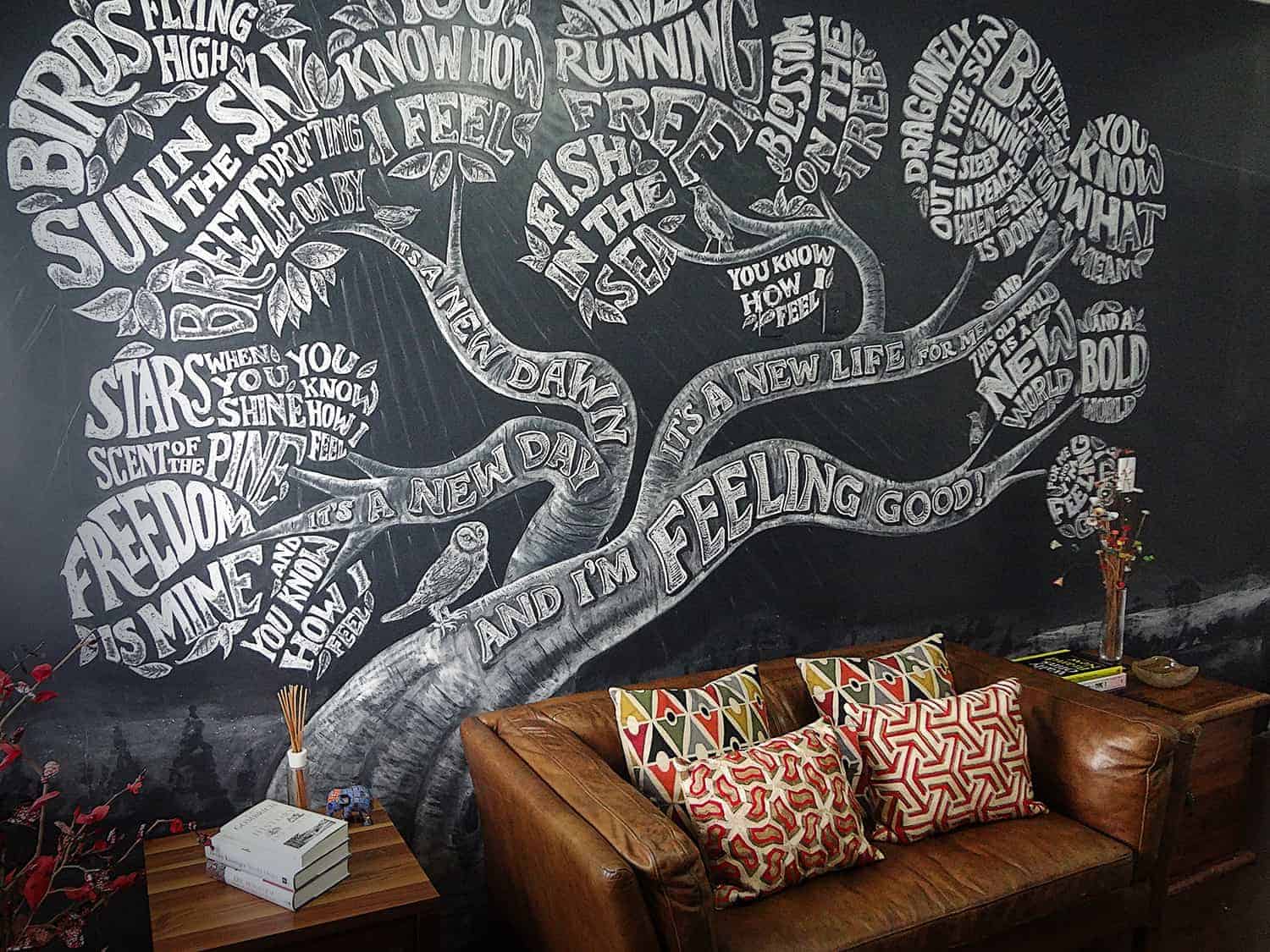
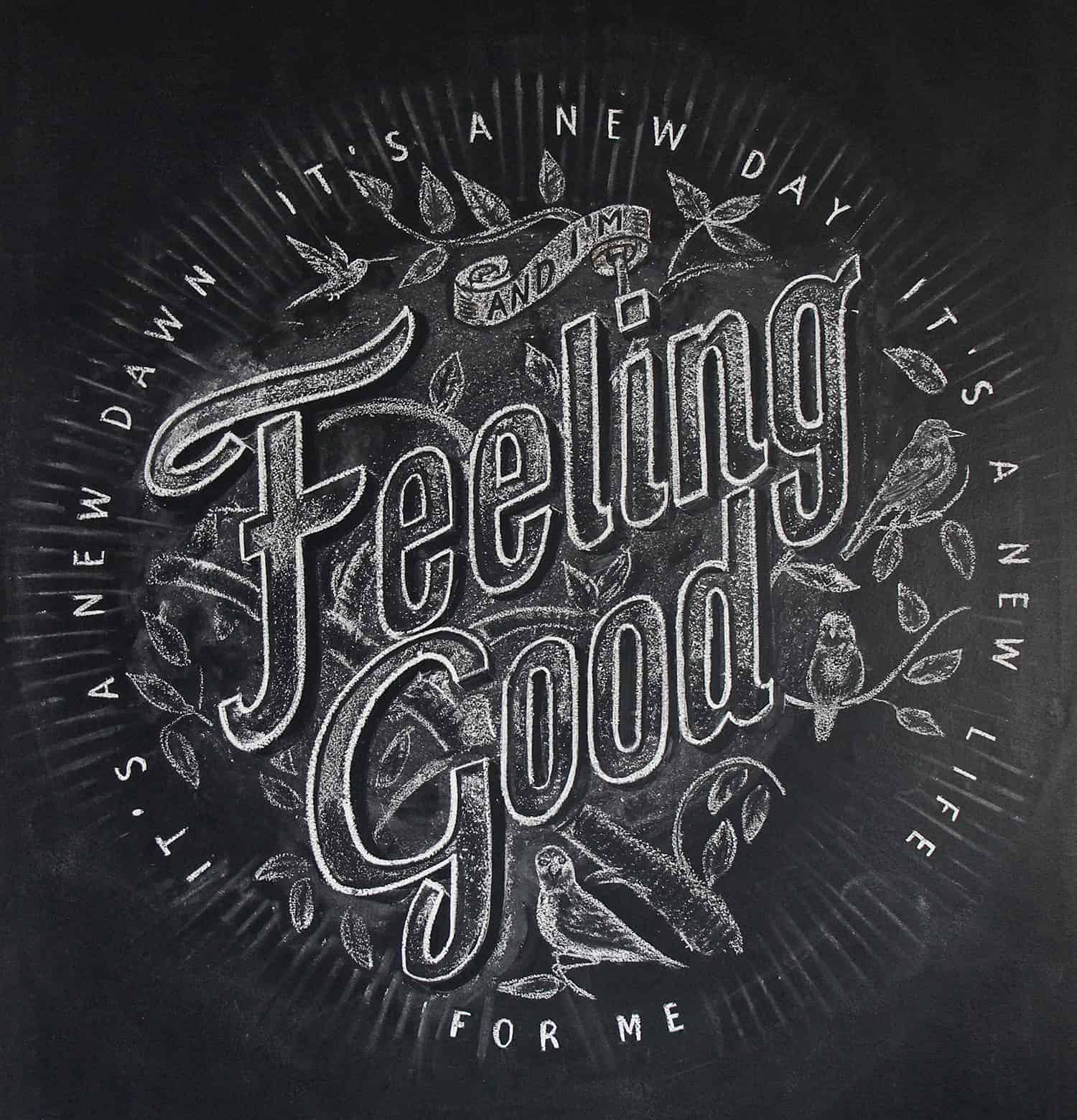
Personal work designed to renew my office’s chalk wall. Before this, the wall was covered with YES’es. You can check it here. After one year and something, I took some time to change it to this new project. I wanted however to keep the positive vibe of the previous work. Then I thought about Nina Simone's most iconic song.- Antonio Rodrigues Jr
Concept
The big majority of my clients are from abroad and we make massive use of Skype to talk about projects. I thought it would be nice to have some of my works on the BG some samples of my work, but they’d all look small. Then I thought about making the whole wall a piece of work. I also wanted it to be very positive, so clients would be talking to me with ‘YES’ in their heads.
- Antonio Rodrigues Jr
Process
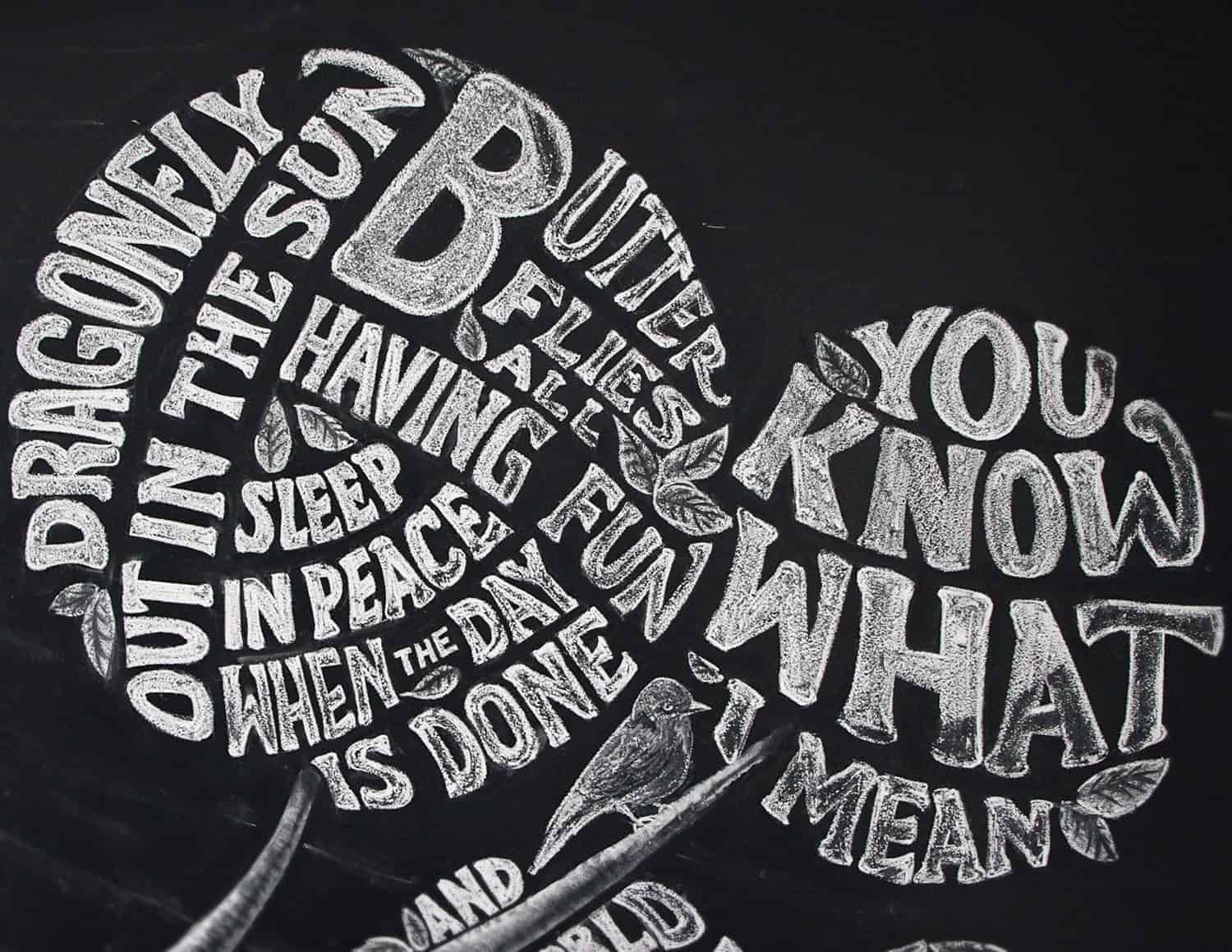
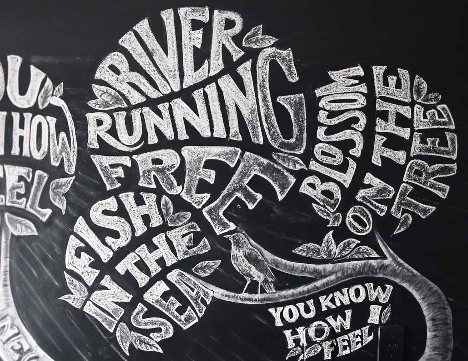
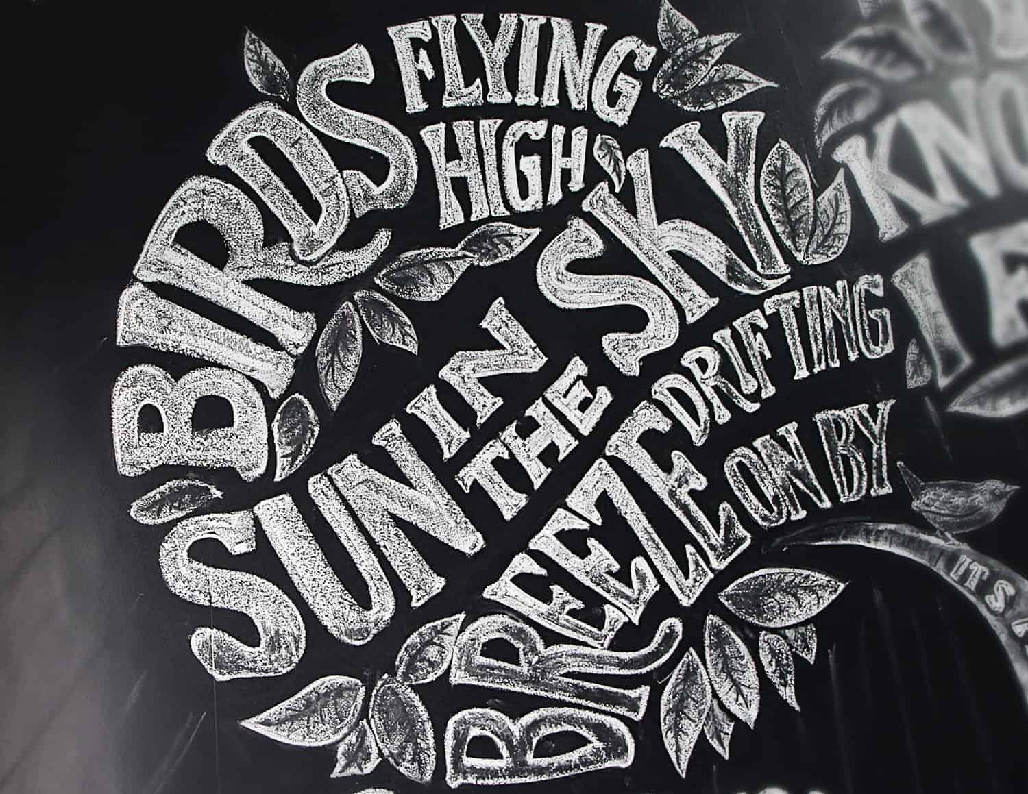
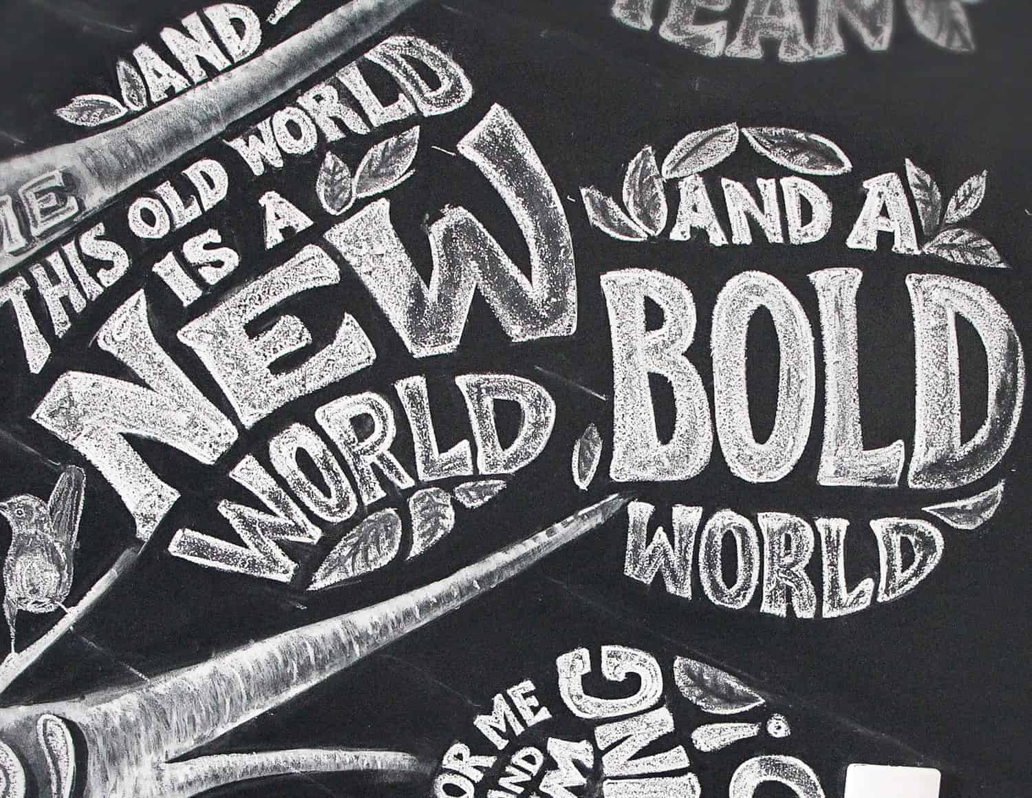
I drawn a few sketches until I got a grid that would fit the wall leaving room for the furniture, the light switch and the door. The verses are written in leaf balloons, with the repeated bits on a separate branch. I placed a few leaves, but only enough not to compromise legibility. The leaves fill in eventual gaps and reinforce the canopy idea.
- Antonio Rodrigues Jr
The same typographic style was used in the entire project (very similar to my very own Canberra typeface). On the verses, I only used a subtle shadow effect that helps seeing the individual balloons rather than a single block. It was done simply by removing chalk excess with a soft brush.
- Antonio Rodrigues Jr
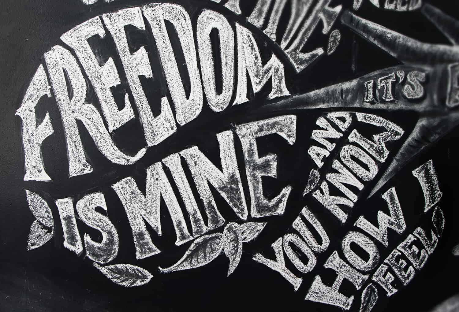
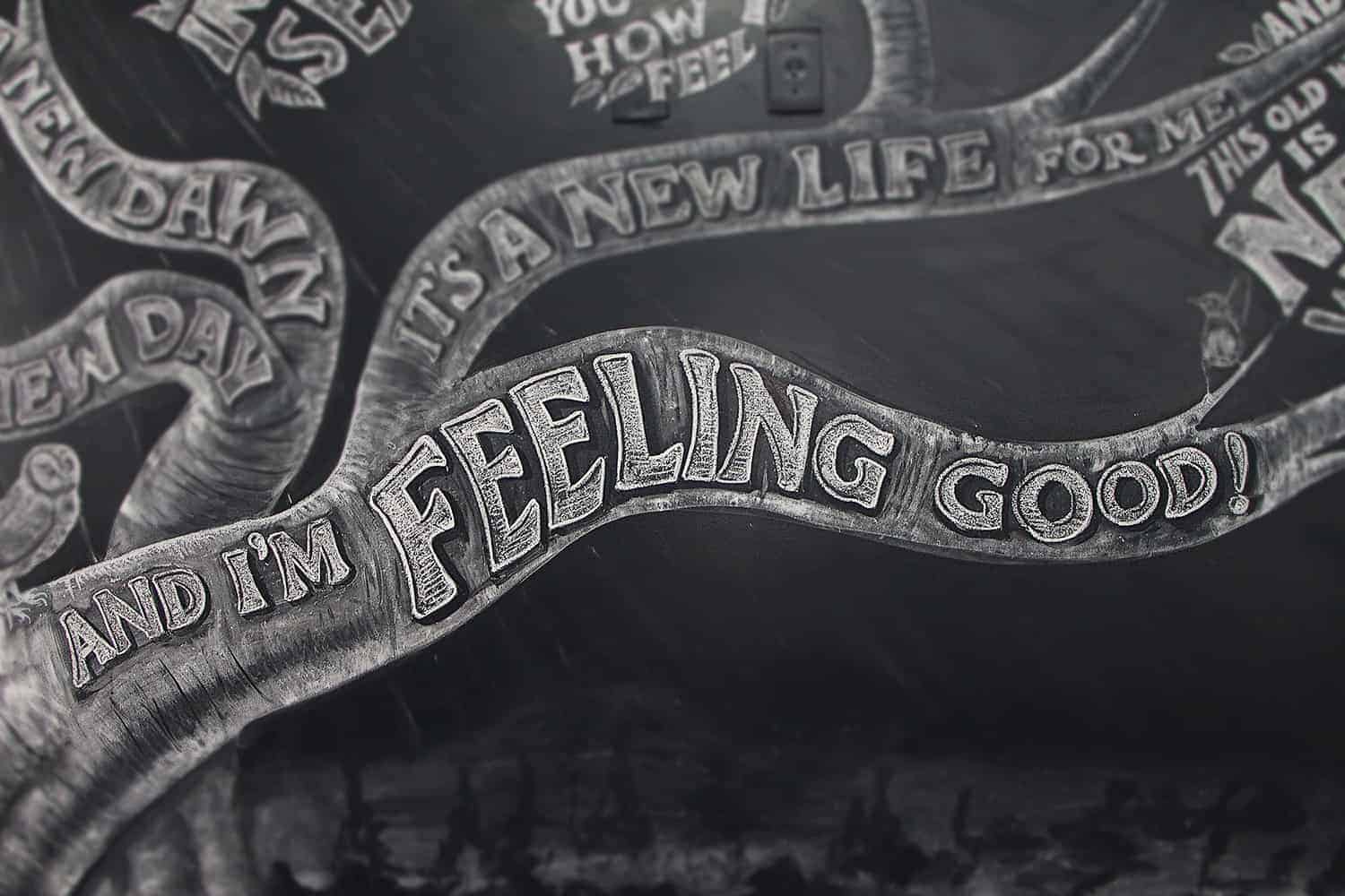
On the chorus I used a more complex effect. My intention was to make the words look as if they were sculpted on the tree trunk. Although the original idea was to feature all the subjects mentioned in the song, it would make an already busy composition look cluttered. So I stuck with only a few.
- Antonio Rodrigues Jr
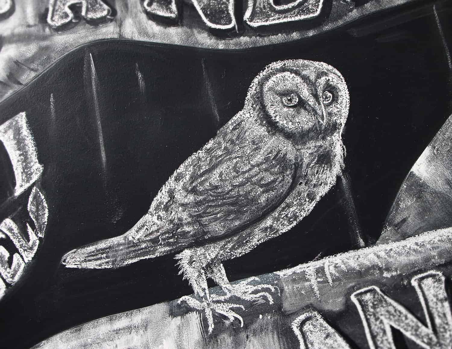
Next to each verse, I placed a little bird to ‘recite’ the lines. The swallow bird was originally drawn next to ‘Freedom is mine’ but it looked better when replaced to the upper left corner. The owl recites the chorus. I drawn the birds, as well as the BG, in a more realistic style to contrast with the whimsical tree.
- Antonio Rodrigues Jr
The technique is rather simple: I mark the entire bird area with the white chalk and then, using both soft and hard brushes I remove the whites. It’s very similar to painting, only that I use the brushes to remove rather than to add colour to the surface.
- Antonio Rodrigues Jr
The texture to the trunk was the hardest part of it. My original plan was to keep a mild blurred trunk that would allow the lettering to pop up. However, it didn’t quite work and I tried different techniques until I was happy with the result. I used watered chalk dust with a large hard flat brush. After it was dried, I smudged the area with my fingers and marked the borders with a moist cloth. The trunk lines are then increased by removing the excess with hard dry brushes, cloths and rubber. The crispy outlines are done with a moist cloth.
- Antonio Rodrigues Jr
Miscellaneous
From the sketches to finish the mess after the work was finished, it took me 36 hours, split in three days of work.
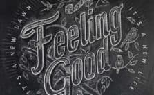
Clumsy is my middle name, and I fell off the stepladder in the first day of work, injuring my back and left hand. That forced me to put the project on hold for nearly 3 days. I designed a smaller board featuring only the chorus lines to be used as the thumbnail to the project.- Antonio Rodrigues Jr
About Antonio Rodrigues Jr.
Antonio Rodrigues Jr is a self taught graphic designer, illustrator and lettering lover with a Fine Arts background. He works with different styles and techniques, from handmade to computer generated graphics. You can find more of his works on his Behance profile or website.
"The technique is rather simple: I mark the entire bird area with the white chalk and then, using both soft and hard brushes I remove the whites. It’s very similar to painting, only that I use the brushes to remove rather than to add colour to the surface."
Wow so that's how they do it!