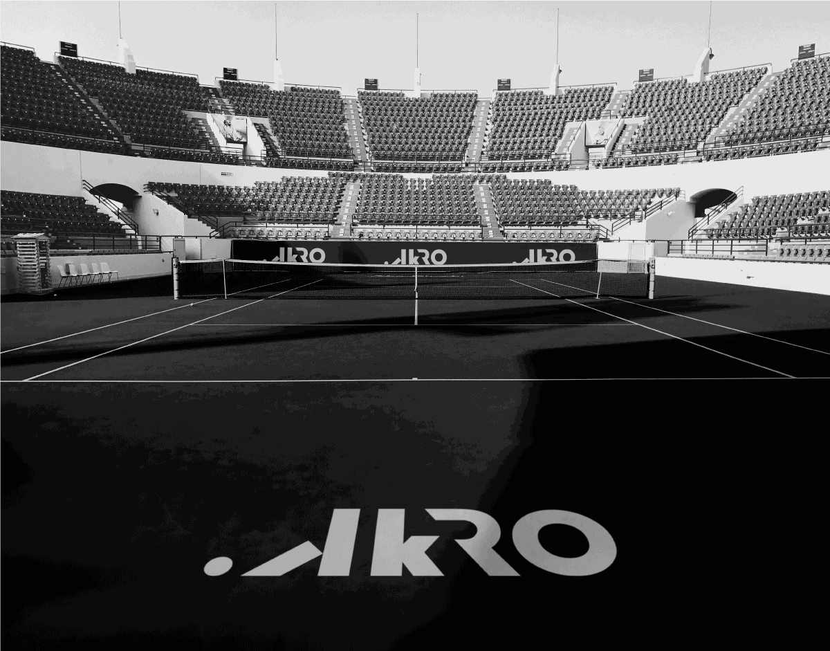
.AKRO

Sports accessory company, which represents a global sports culture, style and pursuit of greatness. Passionate about potential, believes that we are responsible for our choices. As such, they chose to inspire new ideas, methods, thoughts and lives through their products and speech. It tries to continually reinvent itself, both the limits of functionality, performance and innovation. Communicates with personality, with distinct and disruptive elements and languages, seeking authenticity. Thus, originality and personalization is one of the main concepts of brand innovation.
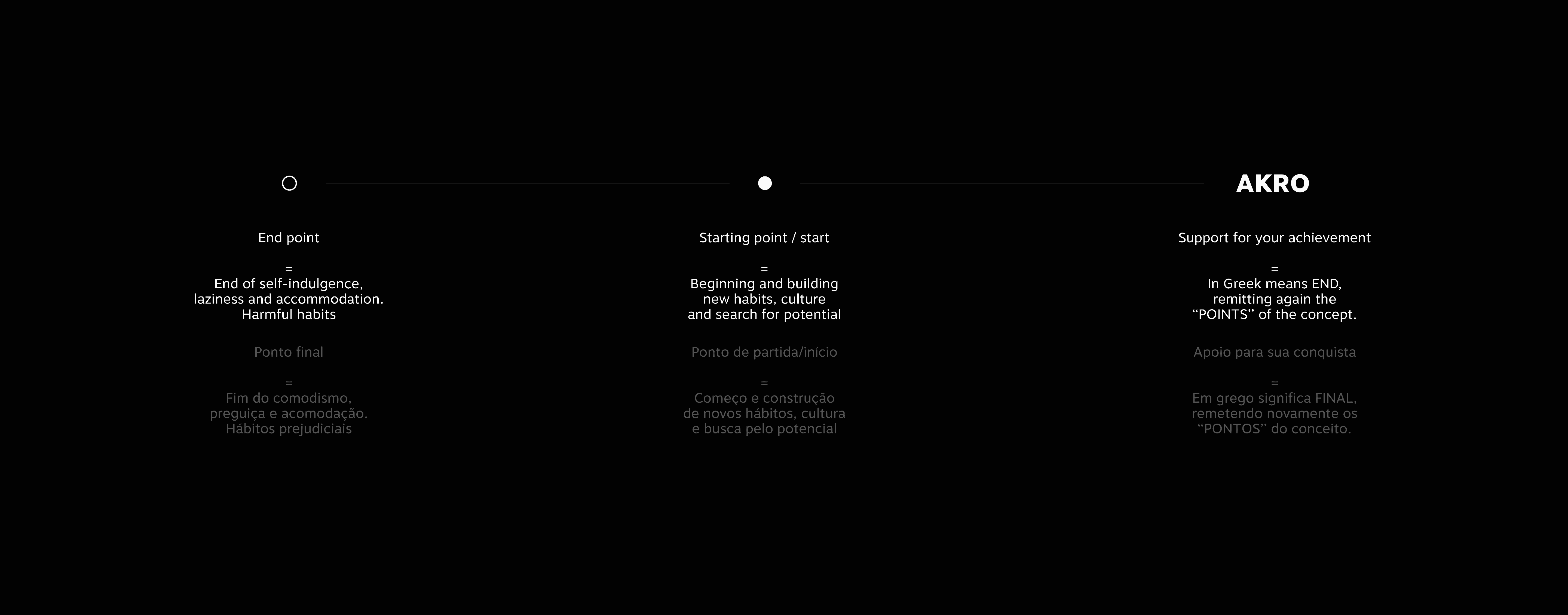
Made for everyday people, who seek exclusivity and a language with which they identify, live the lifestyle proposed by the brand - Where you are the hero and your lazy side is the villain = We are all heroes of our own history, and only fit for us to change our lives and awaken to reach our potential.
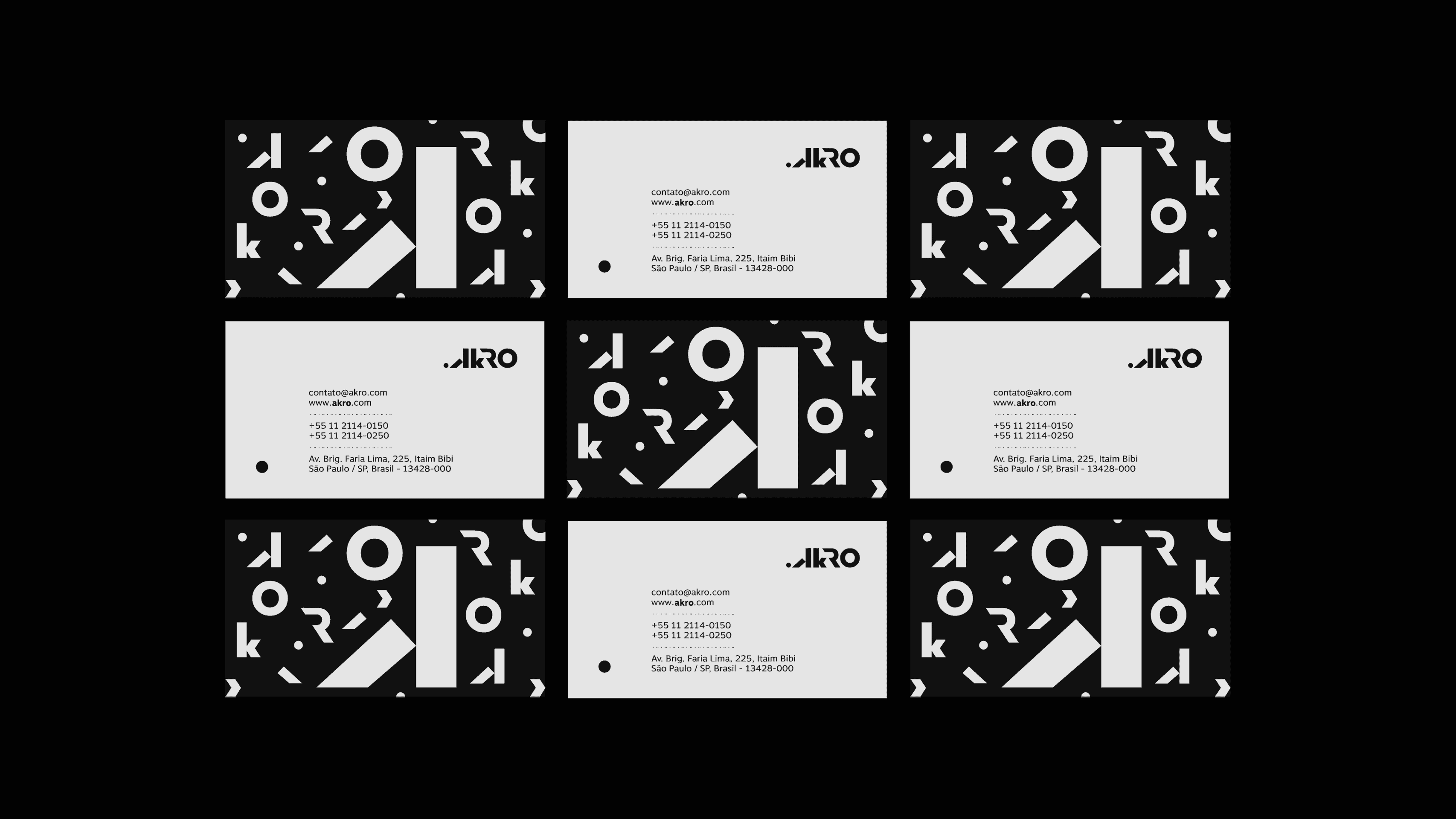
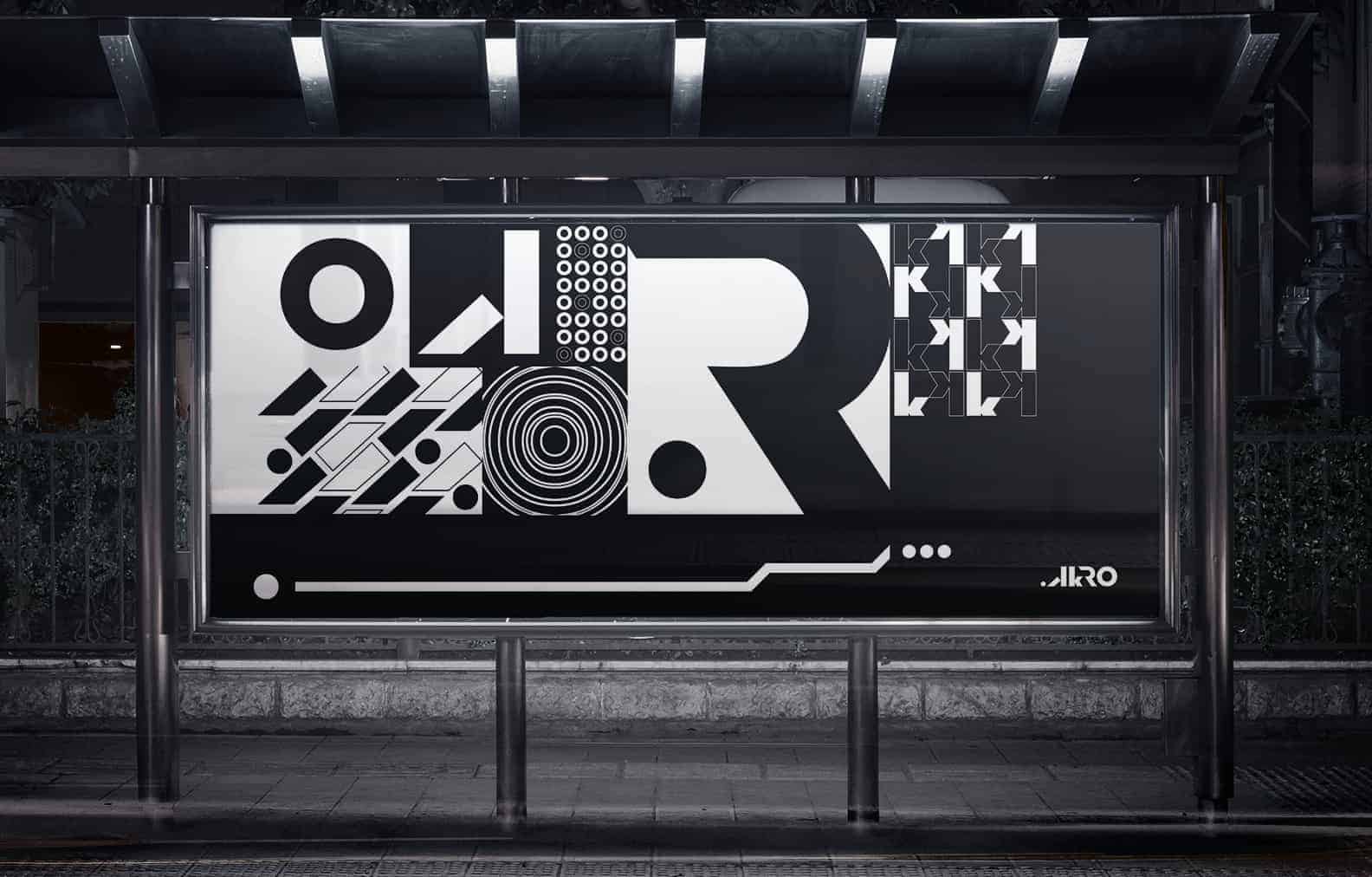
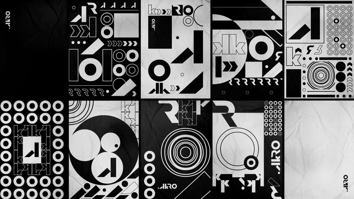
The idea arose from the need to do something original and out of the ordinary. Escaping the current standard of brands with generic symbols followed by their typography. We wanted something different, disruptive and that could be recognized not only by the logo, but also by its proposal, culture, visual identity and communication itself.
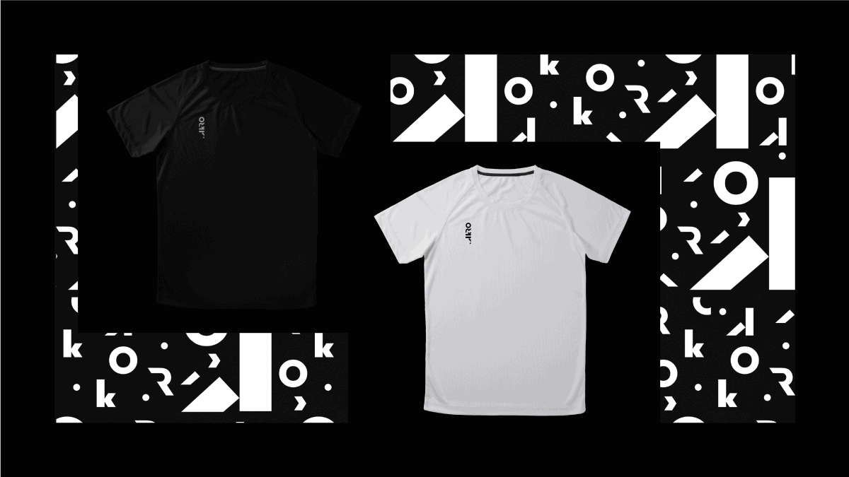
The colors of the logo, we chose something more balanced, positive / negative (following the concept of being our own villains) and pulling to the more introspective side, thus using white and black.
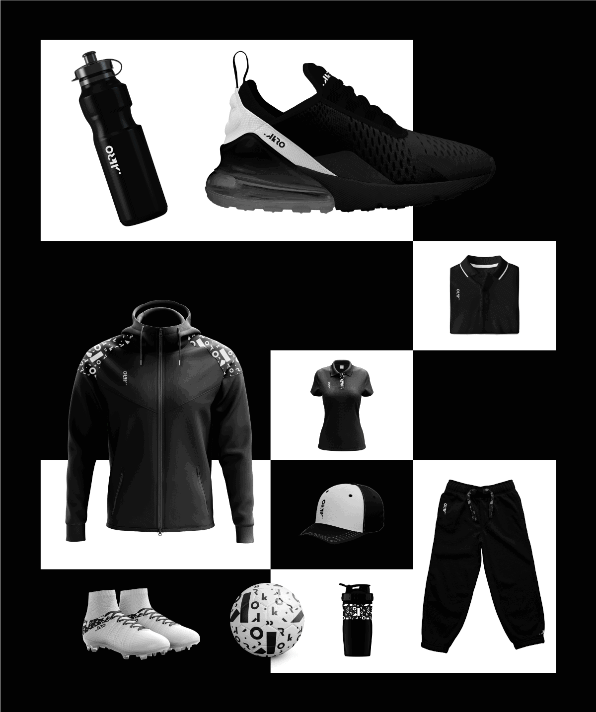
As for complementary colors, the idea was to bring personality and at the same time that they could talk to each other. More opaque and used only in advertising, so as not to "steal" the scene, taking the weight off the logo.
We always start with the briefing, identifying which problems are encountered; (for us and for them, difficulties in general). We seek to understand the proposal and then we continue with market research, competitors, audiences, positions and with that we are shaping our target audience and our personas. Having defined that, only then do we look for visual references, so as not to interfere with the previous process.
We mold some style-scapes to keep aligned in the direction and then we start the visual development processes, where we scribble the ideas on paper or software and we fit together to arrive at the results.
After a few choices, we prepared everything so that it has the necessary feeling and techniques, and then we focus on making it a presentable project.
As good as the project was, we didn’t expect such positive feedback and a return as great as the scale we had. It's incredible.
The style of the project is something we love to do: different, original and with personality. In addition to the company's prospect and culture, we love it too! But there is always that insecurity of not yet being 100% for ourselves and that there is always something to improve, but it is part, hahaha. We always have something to improve!
It was the studio's first repositioning project.
It was really cool to see the repercussion and the path of this new phase for us, the growth that this brought us both professionally and "emotionally" is very rewarding.
And we have an open agenda for 2020! :)
My God, this is very good!
UAL! Congratulations studio Blumer, a beautiful and incredible job.