Asropaten

Asropaten is a young company that creates sophisticated and customized web solutions. Since 2008 they constantly develop Web applications for medium and large enterprises.
With their unique methodology and innovative offer innovative custom web solutions, able to respond quickly and scalable for further development.
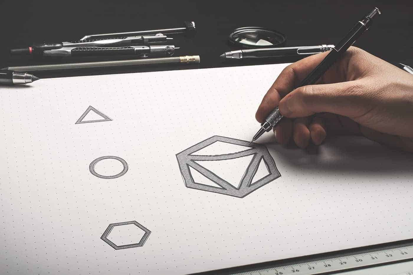
The logo was created by the union of several simple shapes like square, circle, triangle and hexagon.
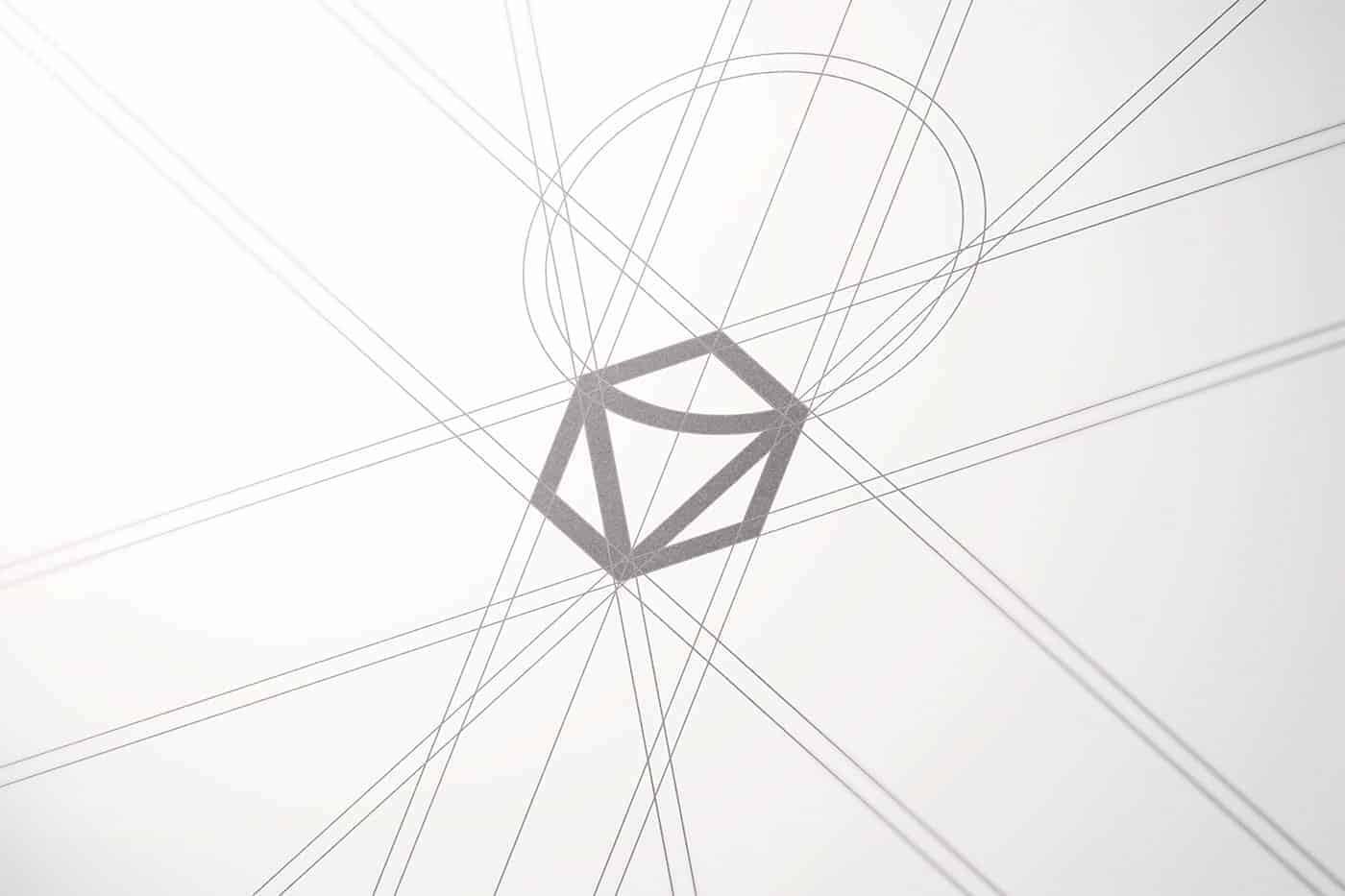
To get the final shape I was inspired by the gemstones, an important element, one of a kind which creates a deep connection with the company mission.
The Gem symbol expresses uniqueness and luxury and communicates the high quality of services offered to customers of the company.
I drew several sketches in pencil, I tried to get the different proposals and when I finally found the right one, I began to plan all the details.
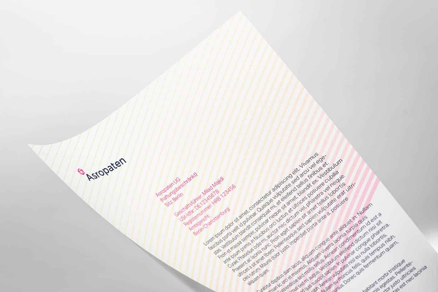
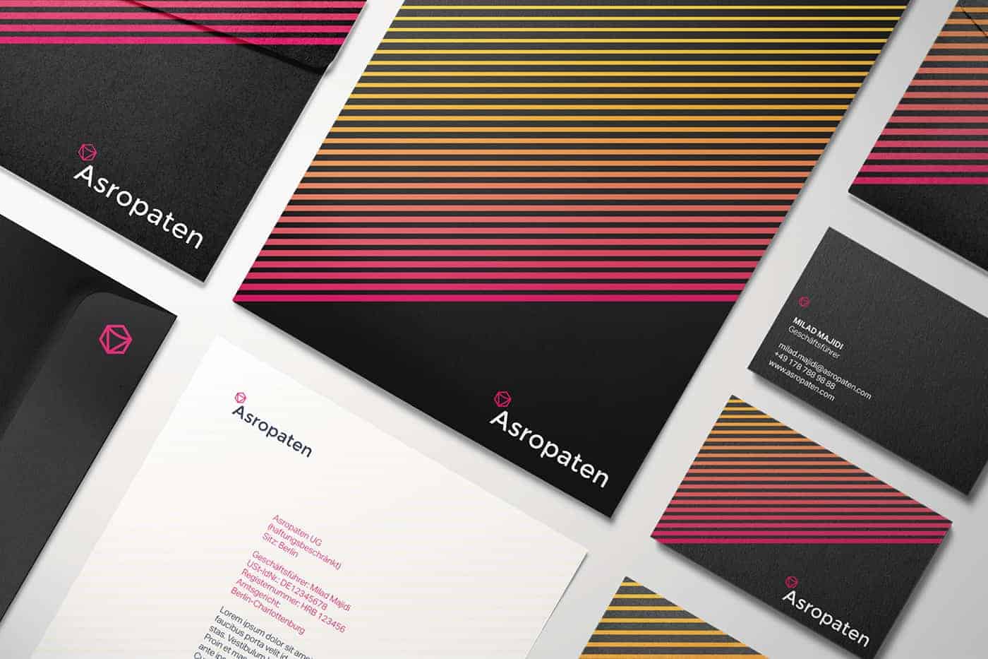
Using adobe illustrator I designed the grid, the logo, I decided which colors to use, and I designed the entire corporate identity.
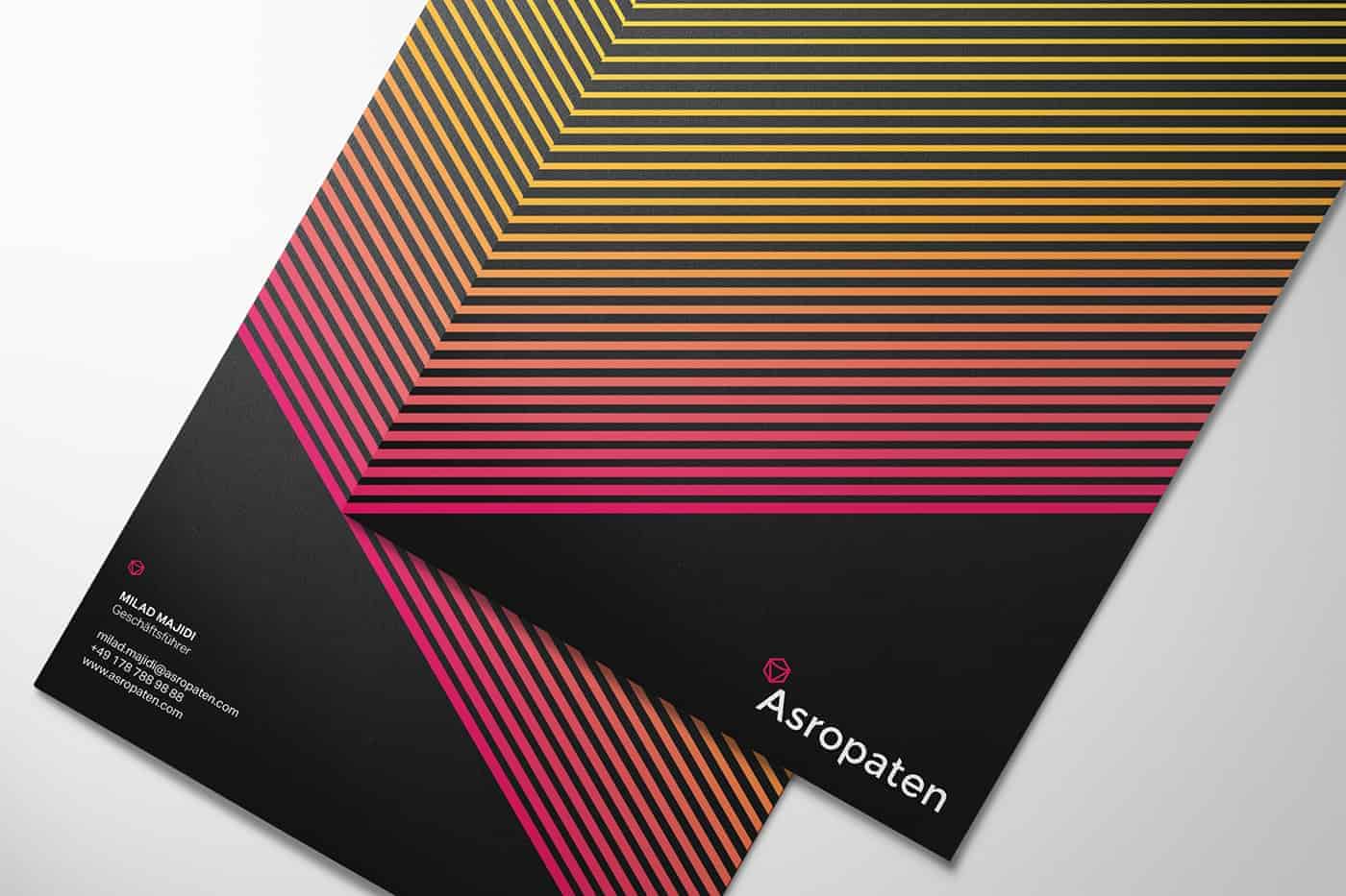

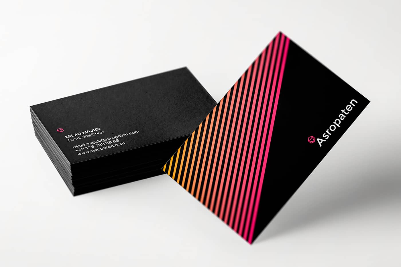
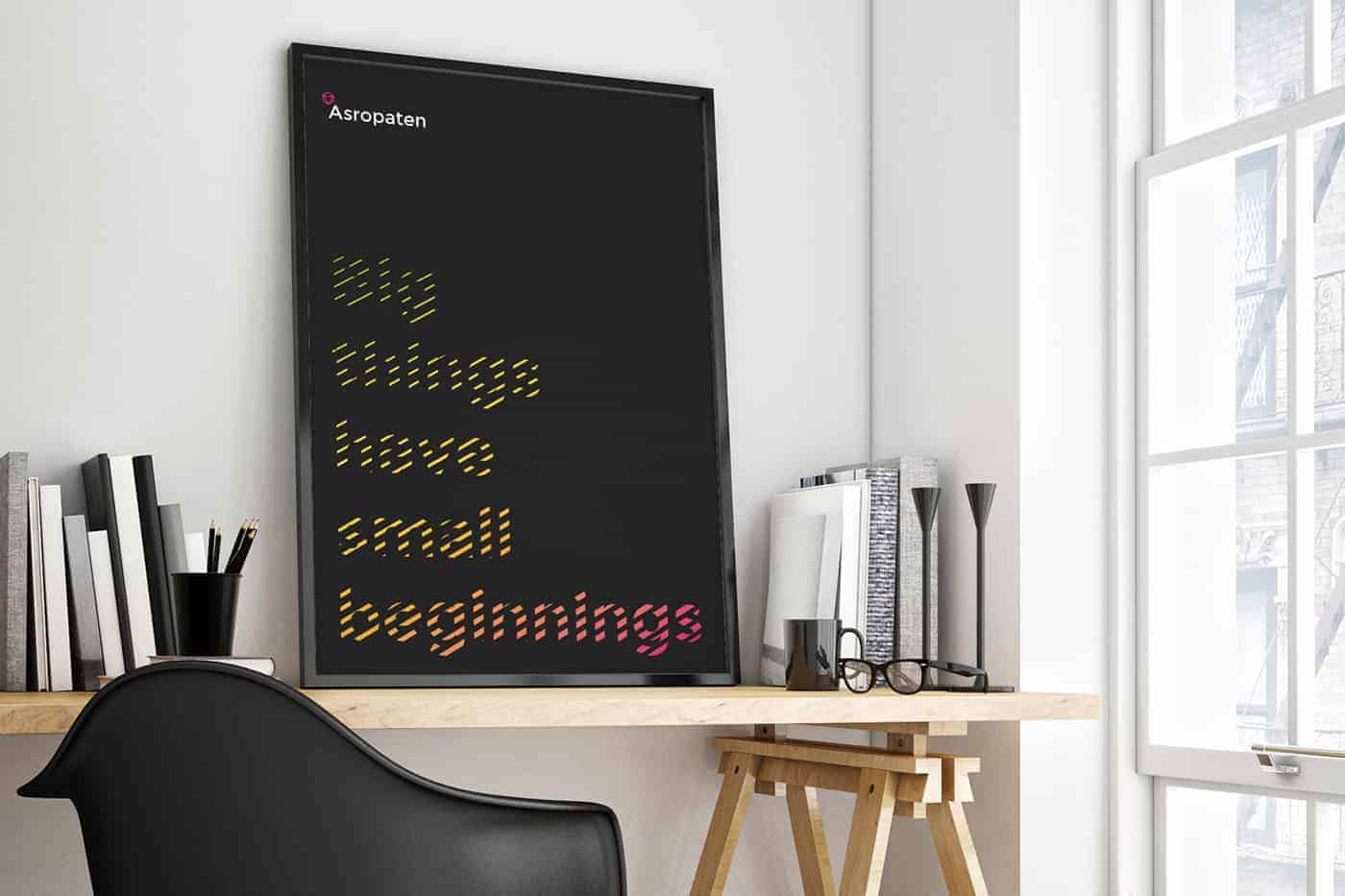
I showed three different proposals for color and pattern to a small group of people, and many preferred the proposal that became the definitive one, I asked these people what he liked of the logo and many have told me that he liked the combination of dark background and bright colors.