
Balance by Fraser Shiers

The Balance project by Fraser Shiers is called such name simply because the piece is about balancing work and life. He was commissioned by Banjo Advertising to illustrate the work life Balance concept that was conceived by art director Gemma McLellan and creative director Matt Busby Andrews. According to the creative director, "We're no longer interested in simply making more money. The main ambition people are searching for is to create more time for the things that are important to them". So, let us take a look at how Fraser Shiers illustrated this piece. Read on and enjoy!
Client: AMP
Agency: Banjo
Creative Director: Matt Busby Andrews
Art Director: Gemma McLellanI've produced a fair few illustrations for Banjo and their client AMP over the last 3 years and was very happy to be working with them again to produce 'Balance'. Conceptually the piece was clearly defined in the brief I received from Gemma and Matt and at Banjo. My role was to execute their ideas in a visually interesting way which worked within AMP's brand guidelines.
- Fraser Shiers
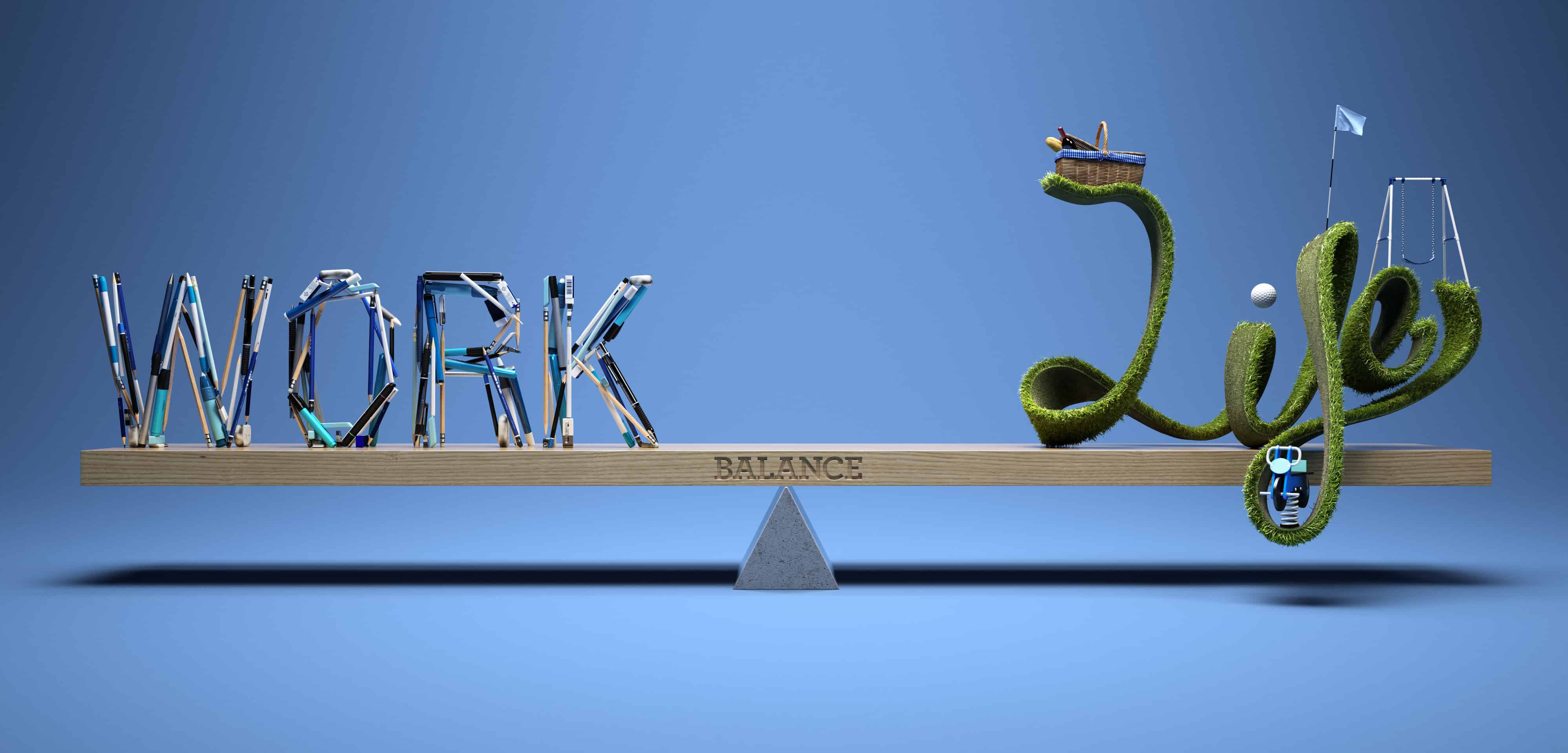
The deadline was very tight! I received the brief on a Thursday and delivered the final art the following Tuesday so some late nights and a weekend fell to the cause. We also had some client changes from AMP towards the end of the project. The items sitting on the word 'life' were initially all sports items but we ended up changing these late in the process to more general lifestyle items such as the picnic basket and swing.
- Fraser Shiers

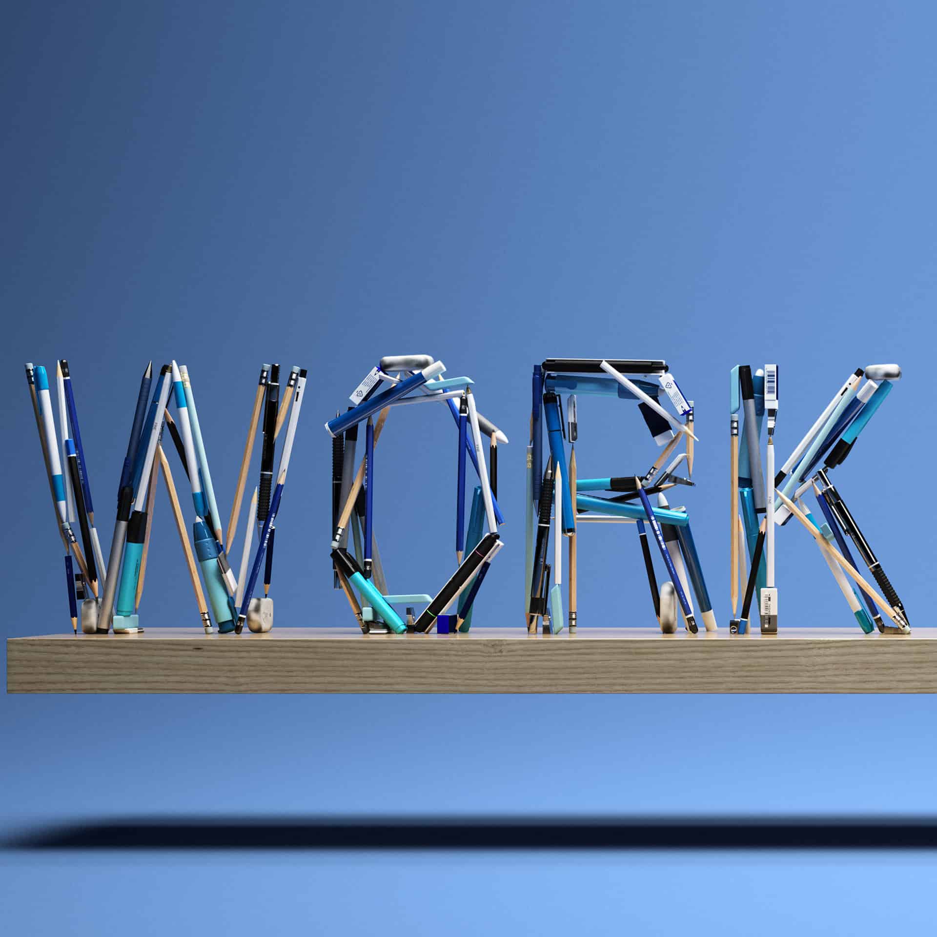
There were a couple of technical challenges from an illustration point of view. One was in creating sufficient weight and density in the word 'WORK'. Too many pens and pencils and the individual items became lost and were not immediately recognisable. Too fewer pens and pencils and the word lacked impact, legibility and an important sense of weight to balance 'LIFE'. The second real technical challenge was the keeping the turf looking neat and tidy whilst also feeling natural and at the same time ensuring immediate legibility of the word. It was easy for the grass to look overgrown which can feel uncared for and neglected. If the turf was too tightly clipped and manicured it felt a bit too tight and constrained to sell the free and relaxed contrast of 'LIFE' to compared to 'WORK'. We produced 4 draft versions before delivering the final art.
- Fraser Shiers
Fraser Shiers
Fraser Shiers is an illustrator and director of 3D illustration studio, Forge & Morrow. They are based in a beautiful beachside town just outside of Sydney in Australia. Most of their work is created for advertising and they've produced illustrations for many of the worlds leading brands such as Qantas, Jack Daniels, Shell, MasterCard and Harley Davidson. You can find more of his works on his Behance profile or website.
Perfectly done. Within seeing the image for a few seconds, I was nodding my head in agreement!