Balnealidade Brasil

Balneabilidade Brasil, is a non-governmental organization, based in Maranhão / Brazil.
Its work is focused on the Balneabilidade of the local beaches, that is, to maintain the quality of the waters destined to the recreation of primary contact, being understood as a direct and prolonged contact with water (swimming, diving, water skiing, etc.), where the possibility of ingesting appreciable amounts of water is high.

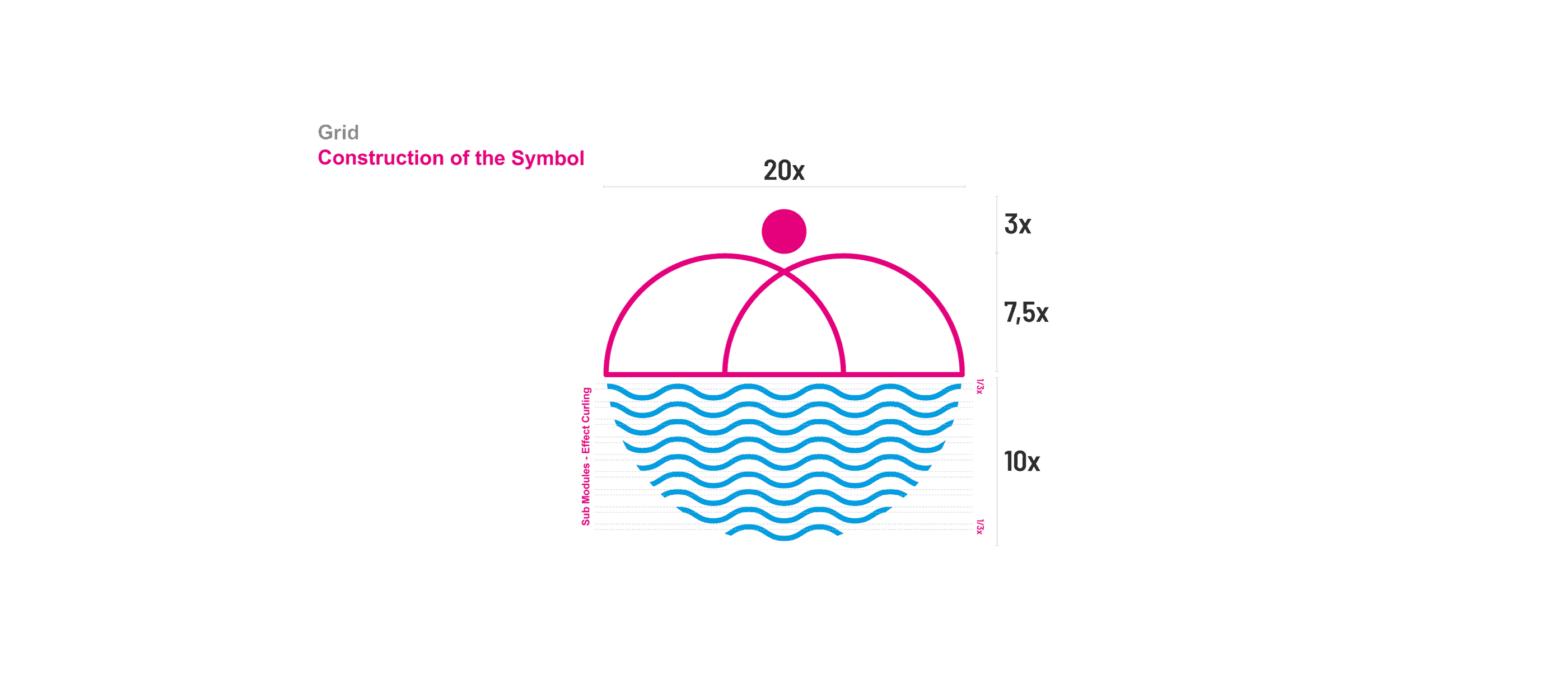
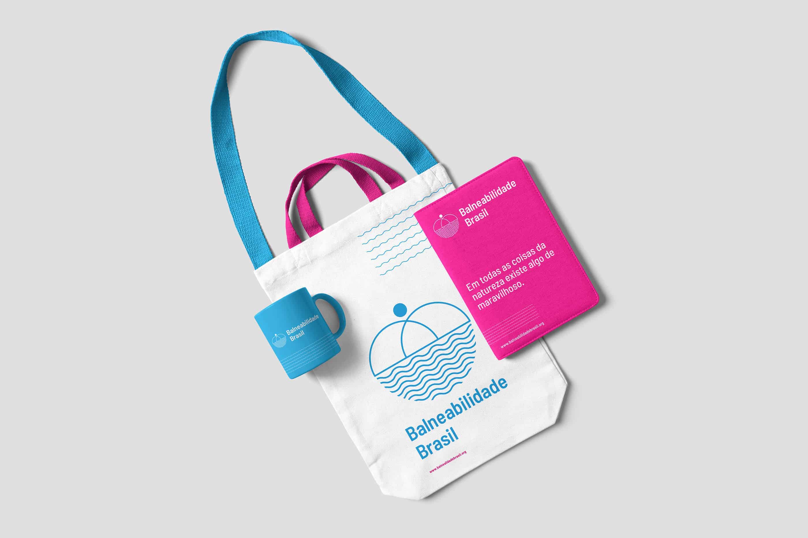
The development of the symbol was conceived within the following pillars: Union, Love, Water, Embrace and Affection.
The idea was to develop a symbol with fluid characteristics, but also conservative and clean.
The color palette was defined by the customer, especially considering economic issues. They chose the colors Blue and Magenta.
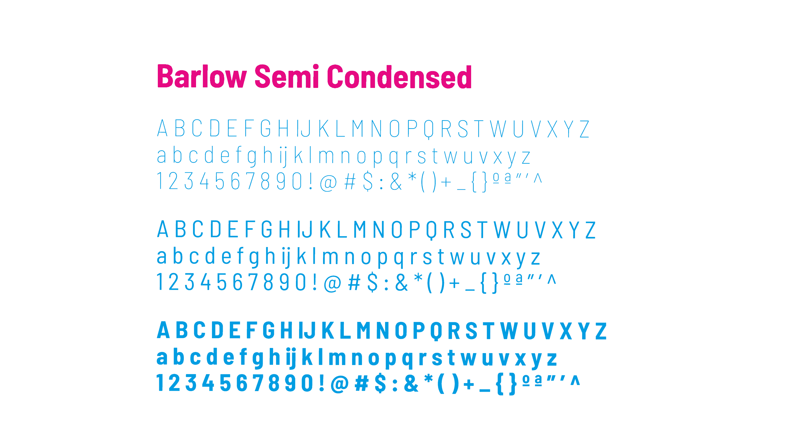
Typography should be a Sans, an important point defined by the client. We did a search on Google Fonts because you would need a free licensed font. We chose the Barlow Semi Condensed.
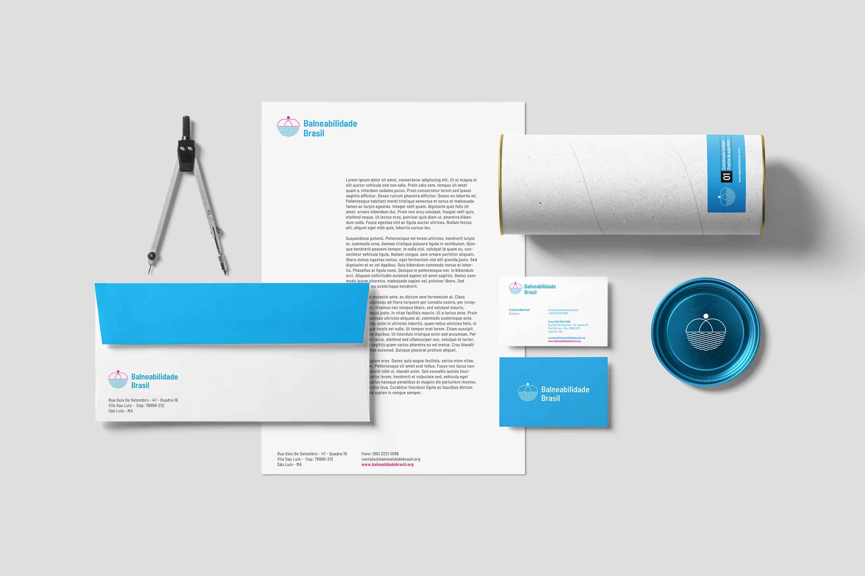
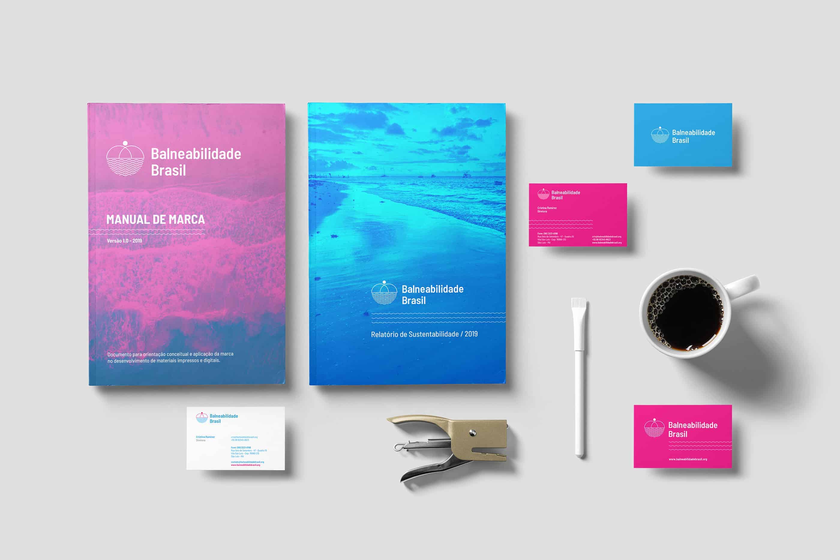
The initial stage of the project was a meeting with the client, where we defined some ways and needs that Visual Identity should follow.
I drew a series of drafts for the symbol, seeking to unite the concepts: Friendship, Love, Water and Embrace.
I developed a presentation explaining the whole concept and all the choices on the symbol of the brand.
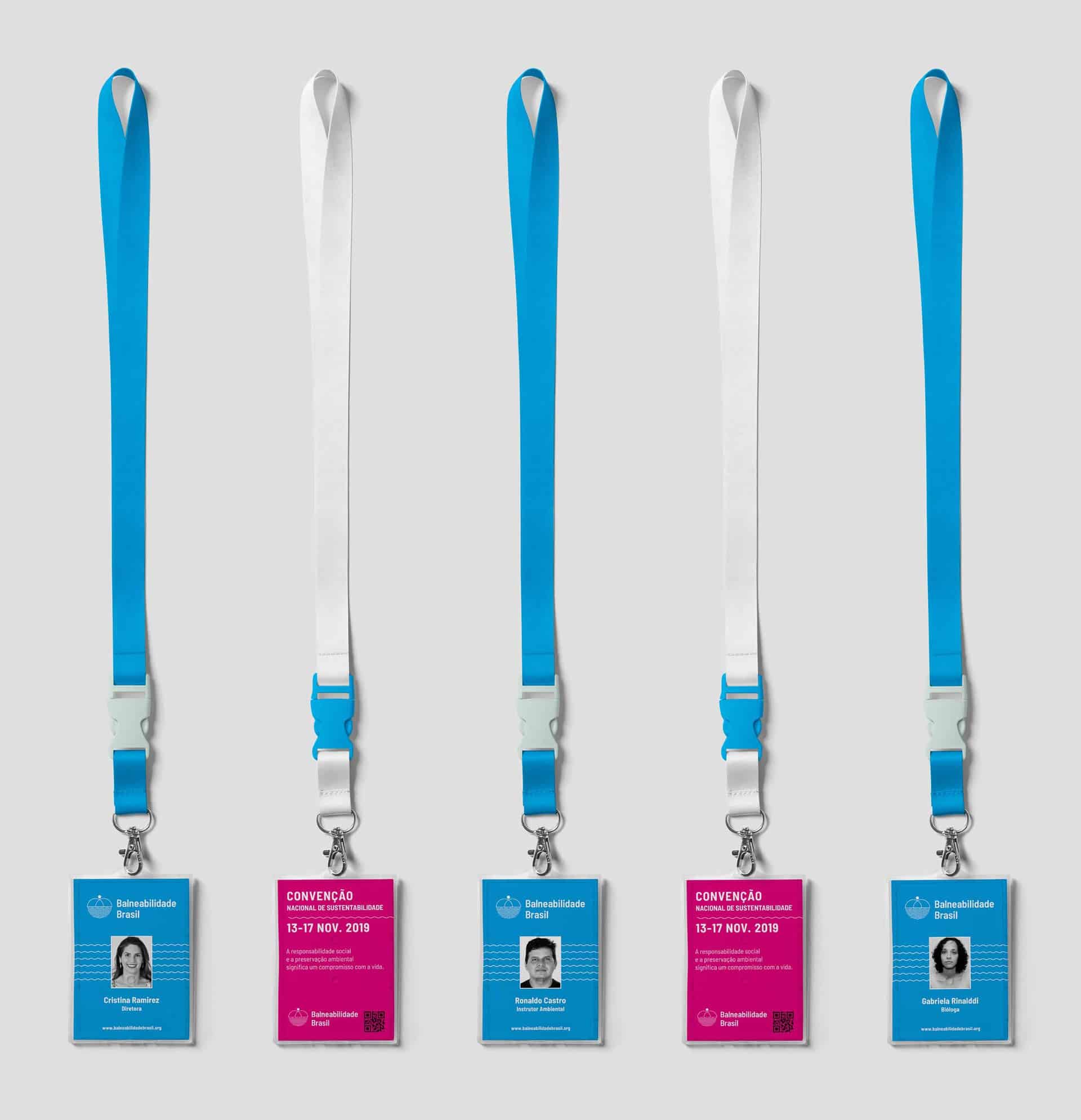
After the symbol was approved, I developed the vector versions of the brand in Illustrator. And all the pieces of brand communication were developed in InDesign and Photoshop.
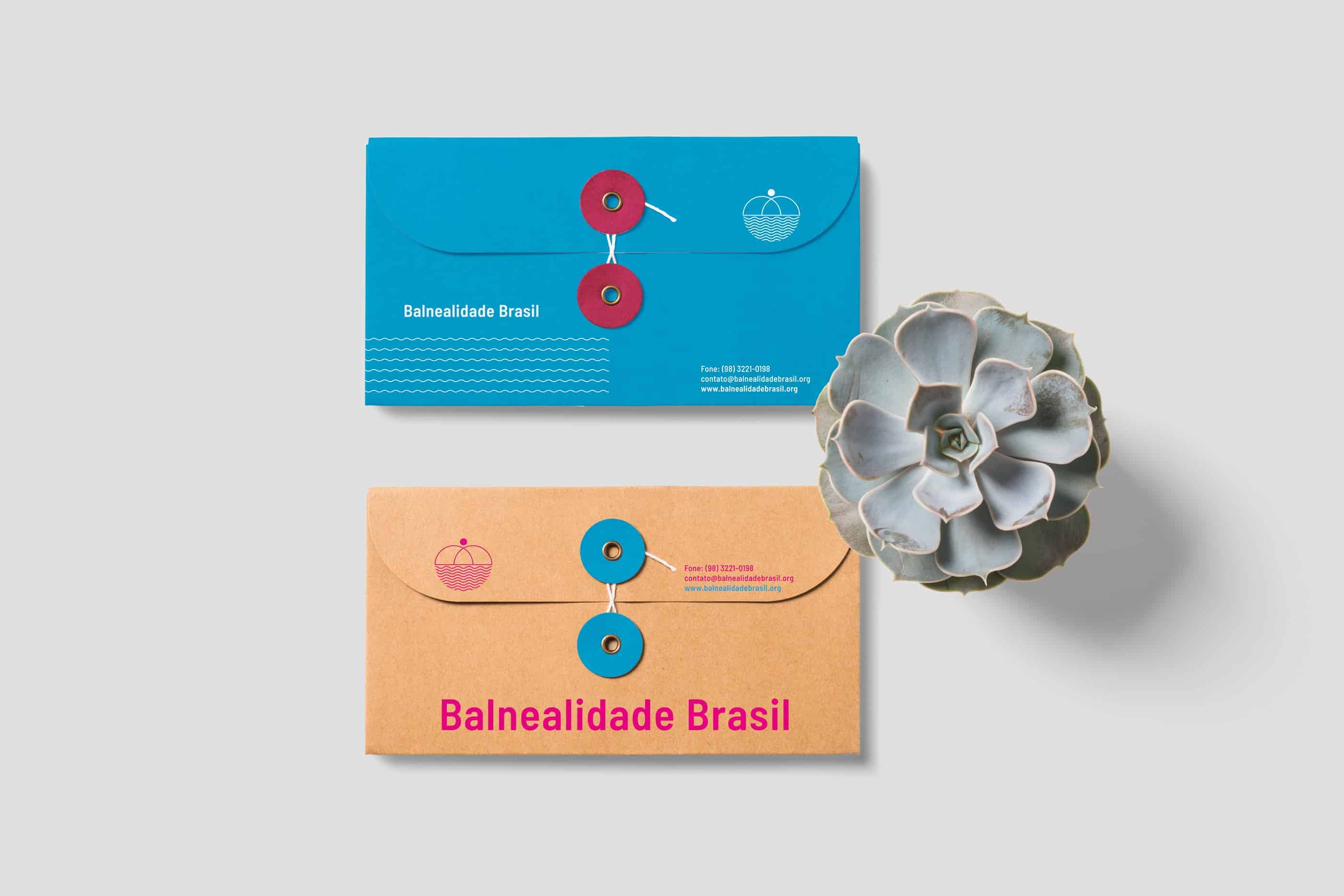
The project was very well accepted by any non-governmental organization. And also by the creative community where the project was released. I was very happy with the result achieved and with the return of the project.
Some designers commented on the kerning of the brand logo. Maybe this point would be rethought.
Link Project:
https://www.behance.net/gallery/73967781/Balnealidade-Brasil