BANCOR | Rebranding

This is a project made in university. I had to do a rebranding for Bancor, the bank of the province of Córdoba and one of the most important public banks of Argentina. I had to do a 'brand diagnosis' to detect what were the problems of the current brand and to improve it through a rebranding.

The first thing I did was research about the brands of the banking world in which I collected dozens of banking logos from Argentina, both from private and public entities. After that I started to think: What kind of branding did it need? Would a logotype be enough? Did it need to stand out from otros banks or not?
Once I decided what kind of brand was needed I started with other design choices, like what color palette and font should i use.
The font was to me one of the main problems of the brand, so I decided to ditch the all caps, geometric font and choose a heavy grotesk font that I thought would be more suitable.
As to the color palette I decided to keep the same color palette because I believed that it was part of Bancor identity and changing it would affect the brand recognition.
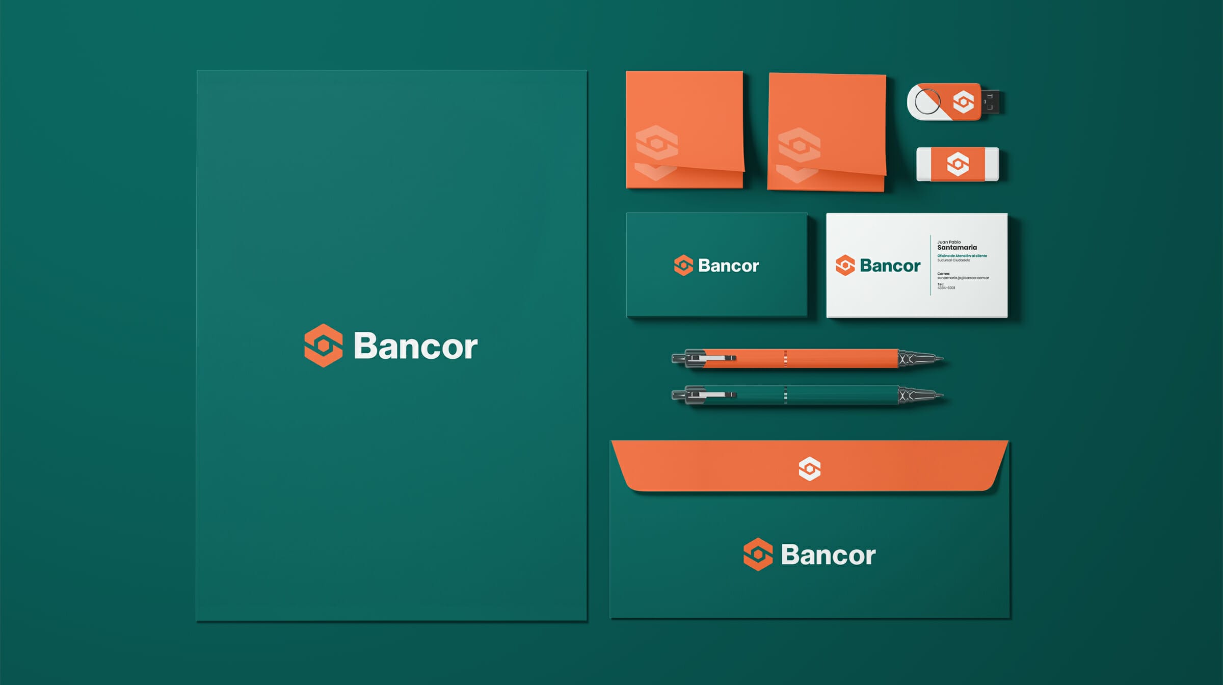

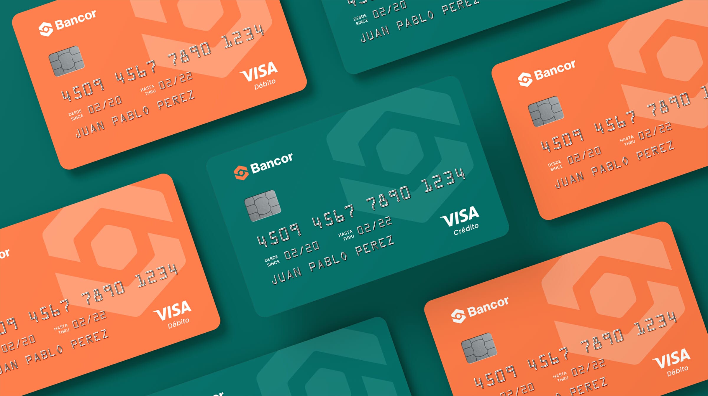
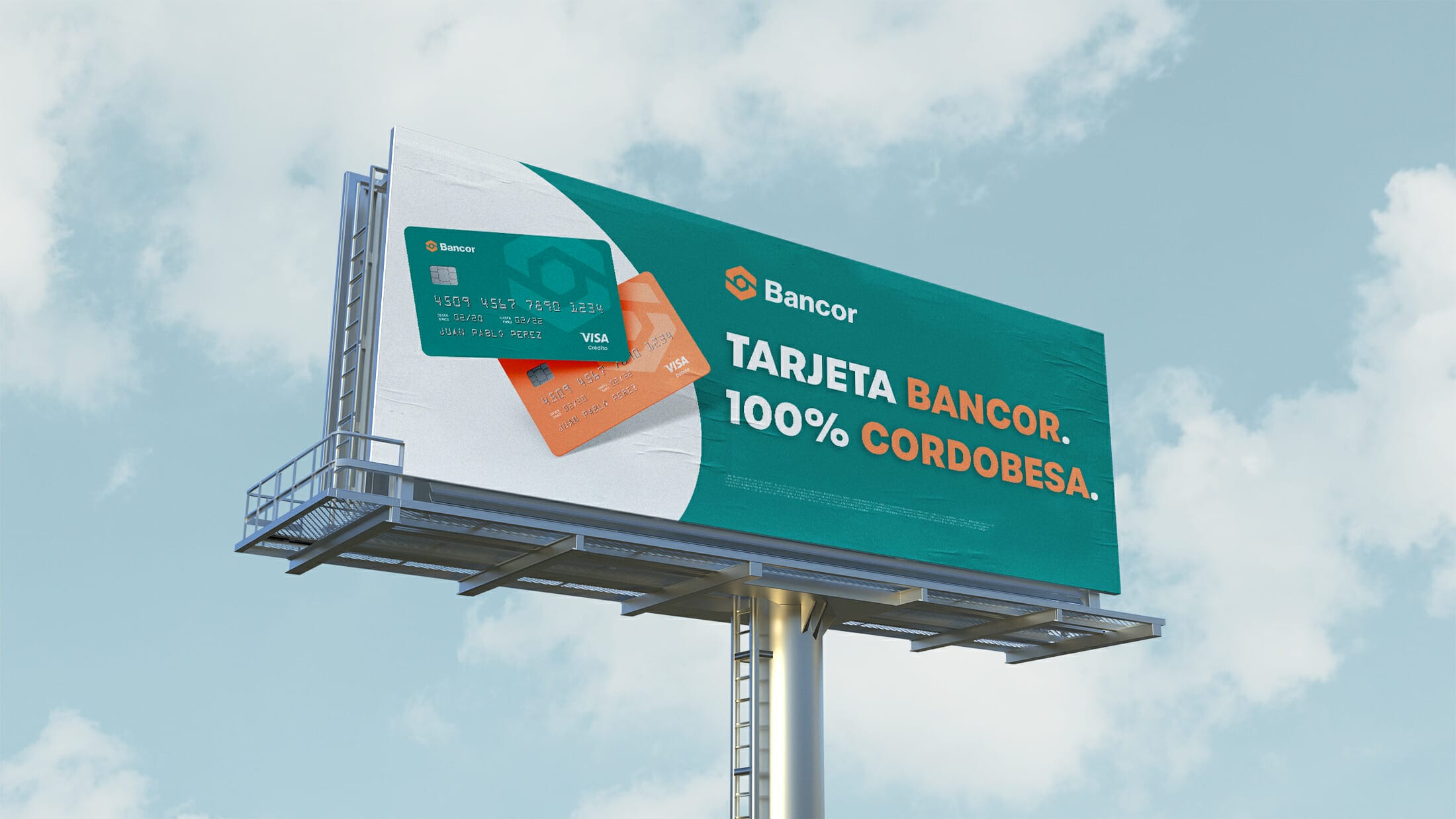
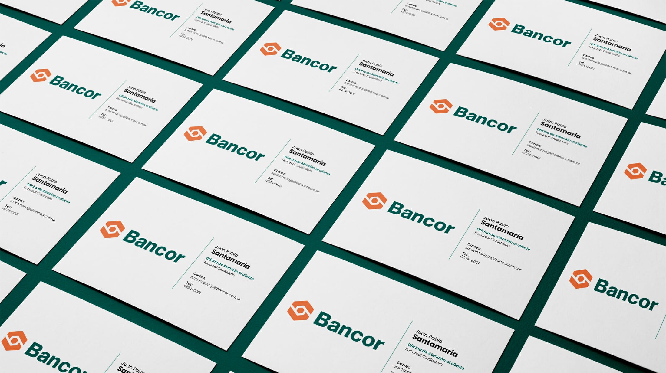
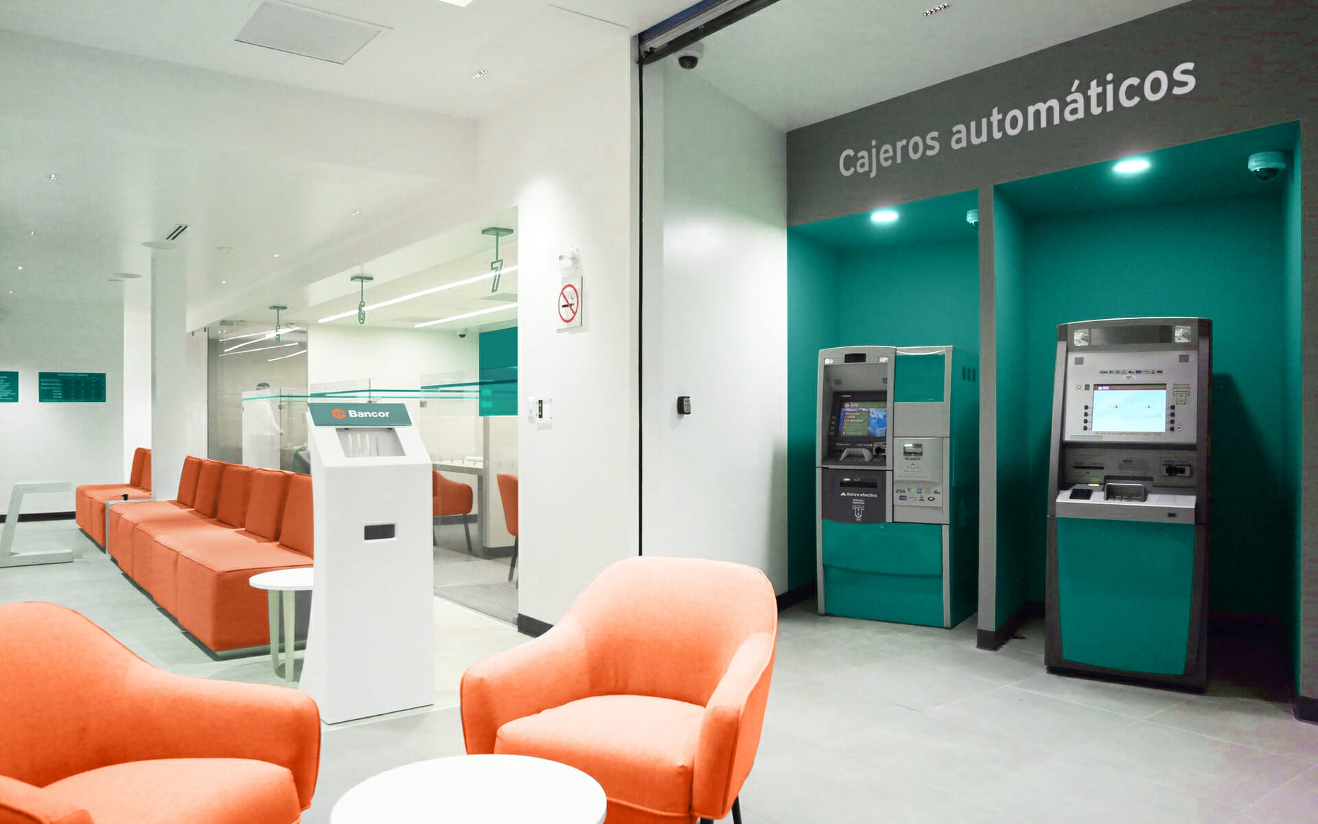
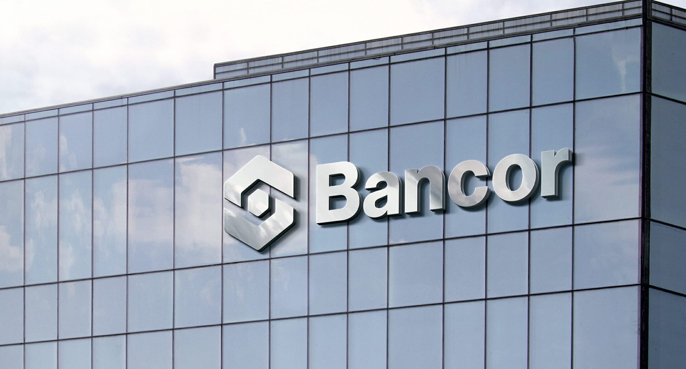
The first step of the project was the design of the brand in which I used Illustrator only. In the second step i started testing the brand in different applications to check if there was any kind of legibility problem. The final step was the design in which different branding pieces in which I was going to use the brand (billboards, landing page, credit cards, etc).
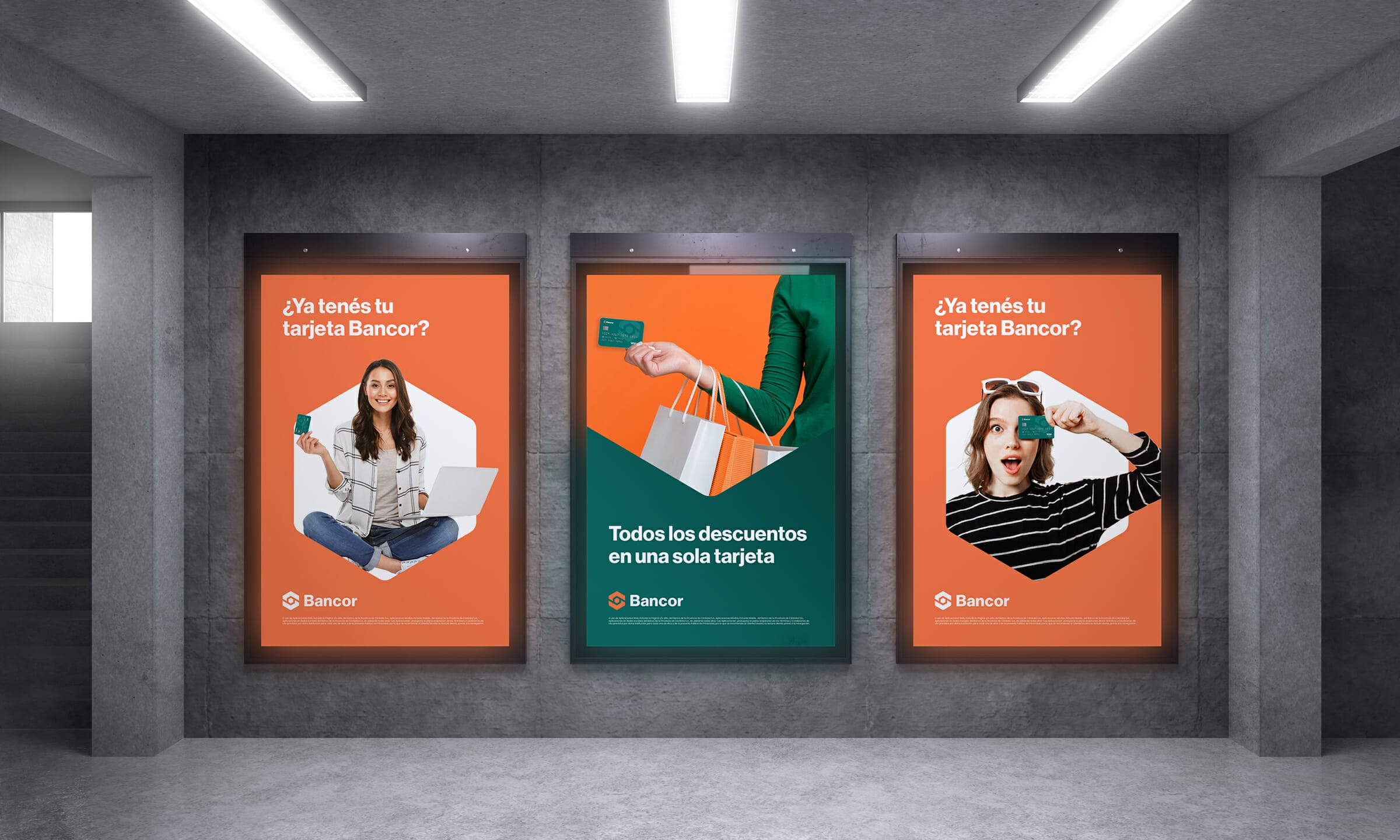
My project ended up with a high grade. To me it was a really interesting project. It was the first time I had to do the branding for a public entity. I learn a lot about the difference between the needs of public entities and public entities. So yes, it was very helpful to learn this other side of branding.