Barley & Hops by Jon Ander Pazos

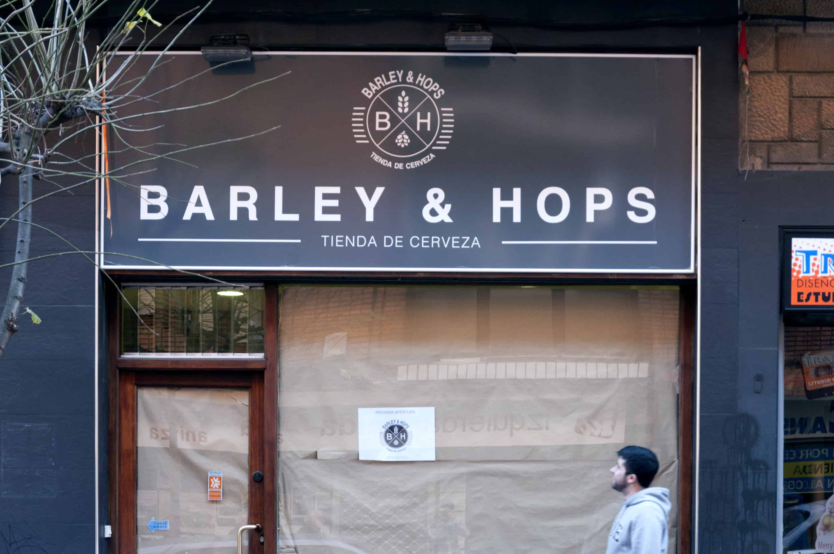
Barley & Hops is a small business located in Barakaldo, Spain, specializes in selling premium beer. The aim was to get a consistent visual identity that reflects the brand values. For this, Jon Ander Pazos, a talented architect and graphic designer from Barakaldo, has developed the company logo and a corporate texture which is used as a guiding thread of the different elements that were developed. Read on and enjoy!
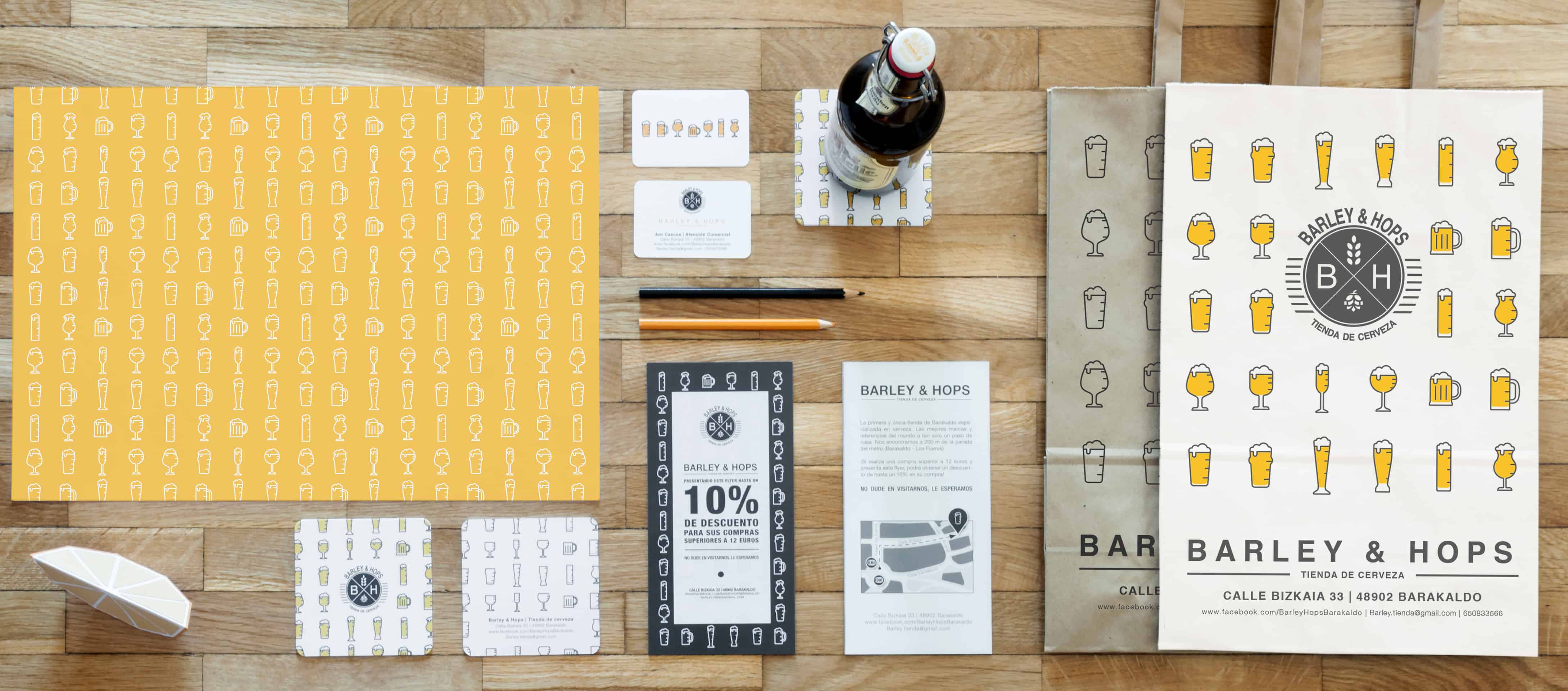
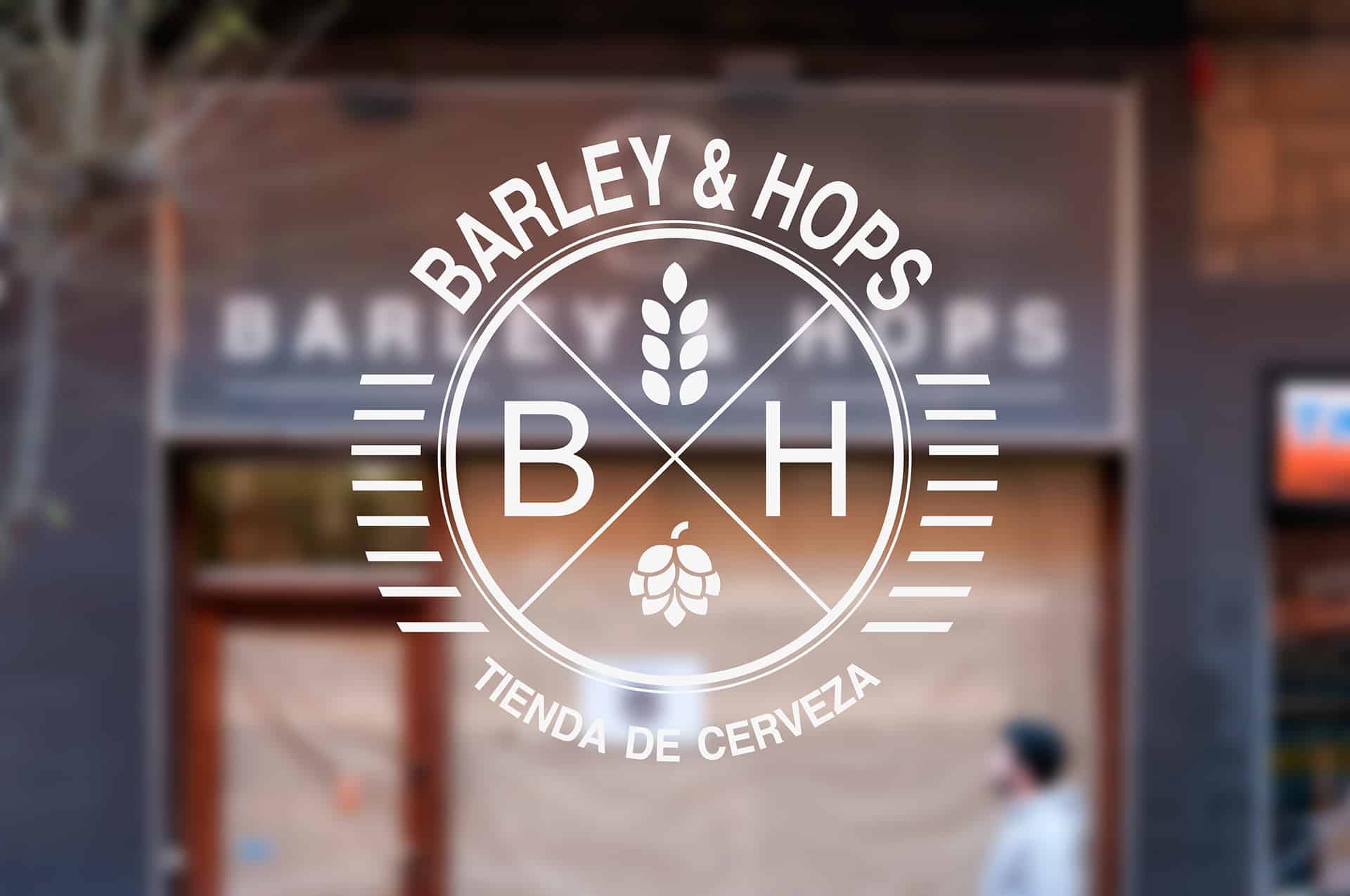
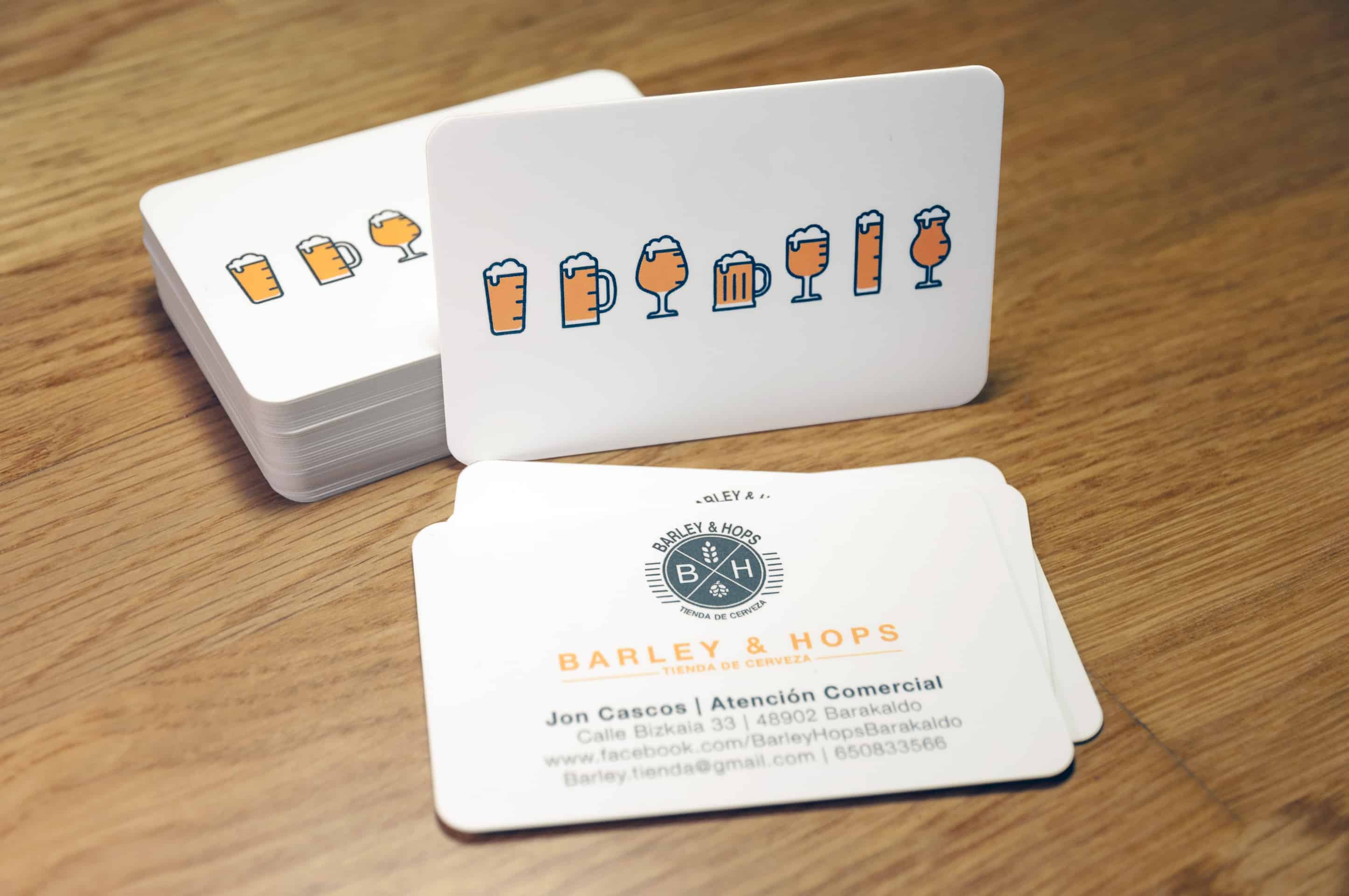
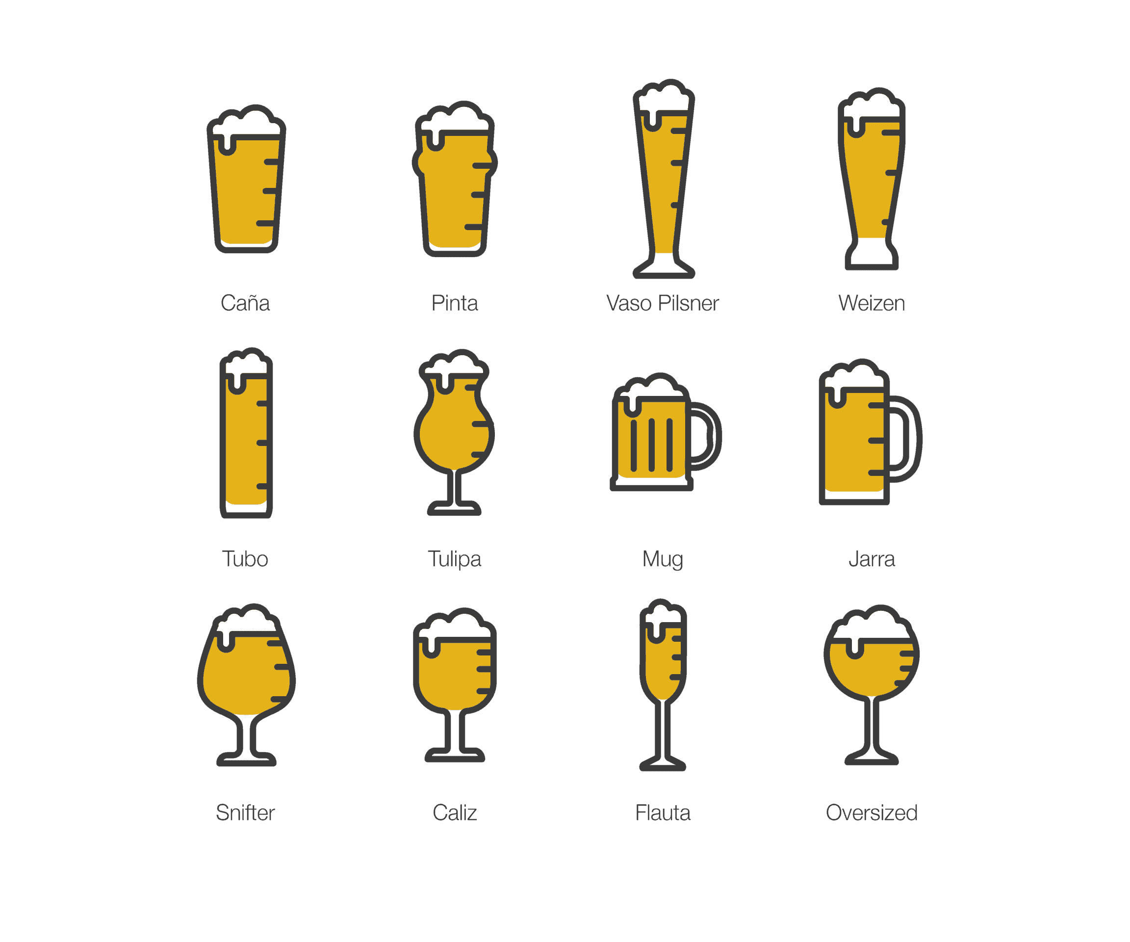
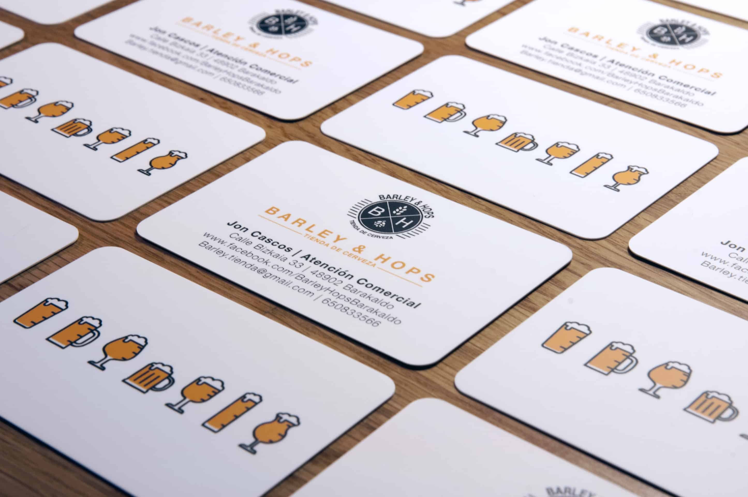
The logo focuses on the two elements of the business naming and these are kept in mind when creating the image of the brand. In addition, the shape of the circumference is taken as a morphological element of the logo, with the intention of representing a beer bottle crown cap in its simplest form. Corporate texture is a rapport of different types of beer glasses. This is intended to generate the dynamic and modern brand image required.
- Jon Ander Pazos

I have always felt inspired by the Swiss design and the Bauhaus School and their ease way to express so much with so little. When I was studying architecture I loved the philosophy of “less is more” from Mies Van der Rohe’s and the minimalism from his contemporaries. By the way, I also find inspiration in great designers and illustrators such as Saul Bass, Paul Rand and Milton Graser. I also find inspiration in many people more novel are doing great things that they are made known on the Internet.
- Jon Ander Pazos
![]()
After having the logo defined, I began to define the different applications and thought I could create a common element which unified the brand and homogenized it. Then, I decided to create a texture with different types of beer glasses. Mainly I used Adobe Illustrator and Indesign. Talking with Jon, the owner of the store, he told me he want to use a beer bottle crown cap with barley ears for the logo. But I thought that it seemed more appropriate to introduce the two elements of the symbol name, instead of just one. As I mention previously, I also tried to simplify the beer bottle crown cap to a shape of a circumference.
- Jon Ander Pazos
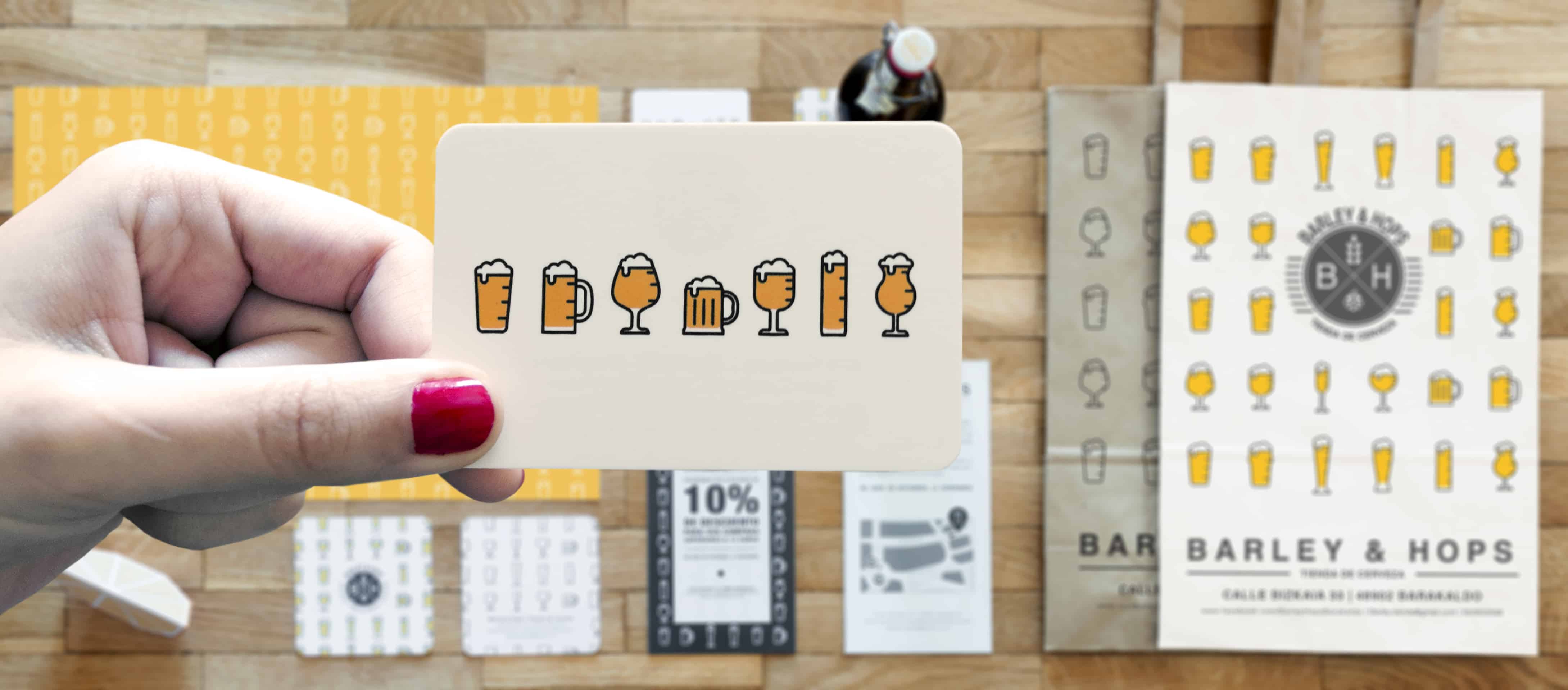
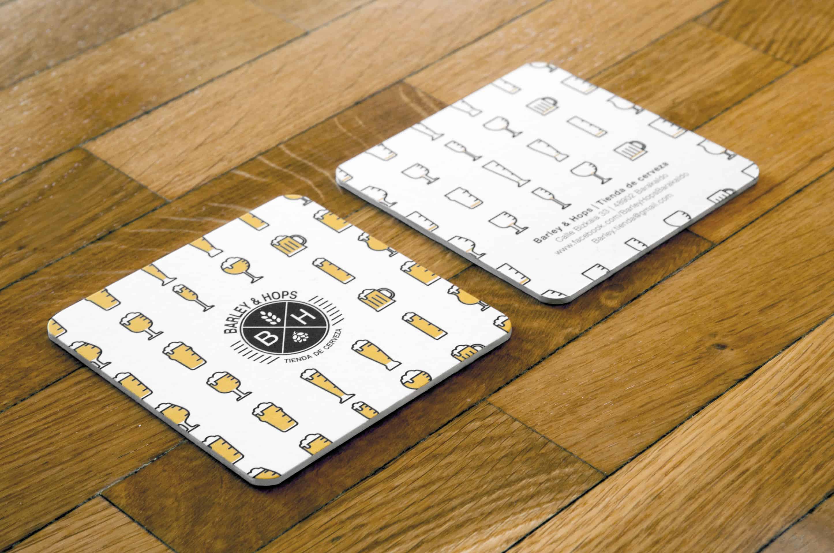
I made some revisions and changes to correct the colors and some details of the shape of the logo. I also had to make different versions of the cards and bags, changing materials and the designs.
- Jon Ander Pazos
About Jon Ander Pazos
Jon Ander Pazos is an architect and graphic designer from Barakaldo (Biscay) that he is currently based in Valencia. After fishing his studies in Architecture at the School of Architecture of San Sebastián, he moved to Valencia to complete his education with a Master of Multimedia Design. He’s passionate about graphic arts, with a special interest in branding, packaging, motion graphic and web design. He consider himself a curious person, loves traveling and learning new things everyday. You can find more of his works on his Behance profile.