Bauble

Created for the Adobe Hidden Treasures design challenge, Bauble is a concept for a cruelty free jewelry brand. Bauble invites their customers to shop guilt free while adding fun to their lives with trend-setting jewelry.
I created the concept, company name and logomark, in addition to all designs shown here. Bauhaus meets modern day with an unexpected font pairing, color palette and printing techniques.
Adobe recently released lost typefaces from the Bauhaus school of design. I was very inspired by the Adobe Hidden Treasures video. These typography sketches were lost to the Nazi regime and rediscovered after almost 100 years.
Seeing these completed and digitized typefaces was very special. As graphic designers it is an honor to have these typefaces available to us in 2018. I felt so positive at the outset of the project, so I wanted to create a really fun brand.
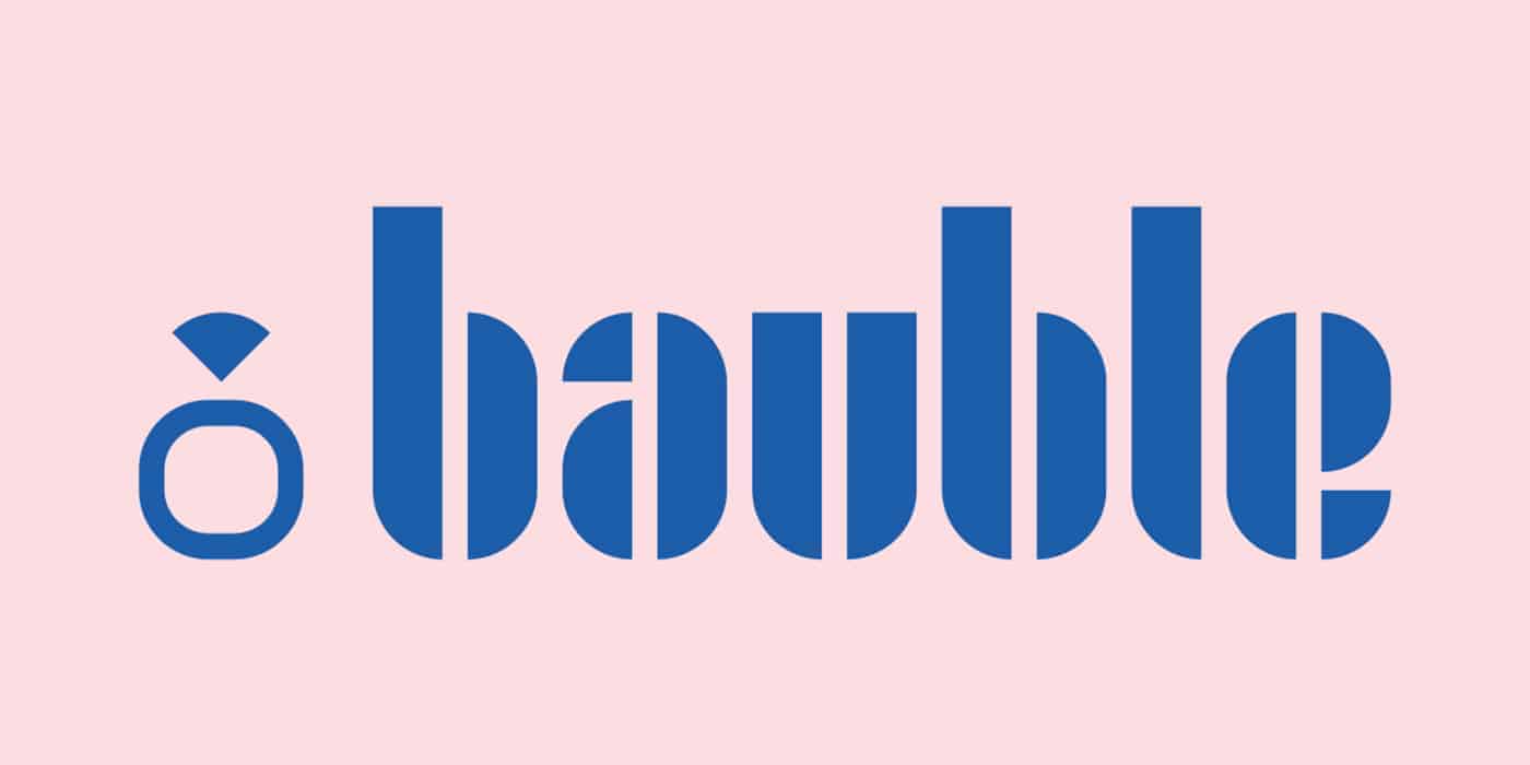
Adobe's project brief was to use one or more of the new Bauhaus Dessau fonts to create a digital logo in the Bauhaus style. I chose to create a concept for a modern jewelry brand using the Joschmi typeface, originally created by Joost Schmidt.
Joschmi is such a well-executed typeface with endless options. After examining the typeface I was most intrigued by a triangular shape used in many of the letterforms. I wanted to incorporate this shape into the logo because it reminded me of a gem.
I made lists of words synonymous with "jewelry". For the purposes of this project "bauble" was perfect because it had letters with the triangular shape. It is also a fun word to say that rolls off your tongue, and above all, the brand is supposed to be fun and trendy.
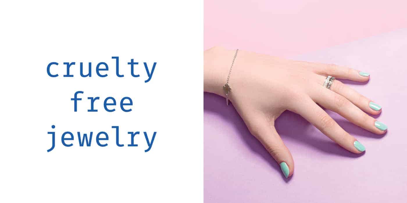
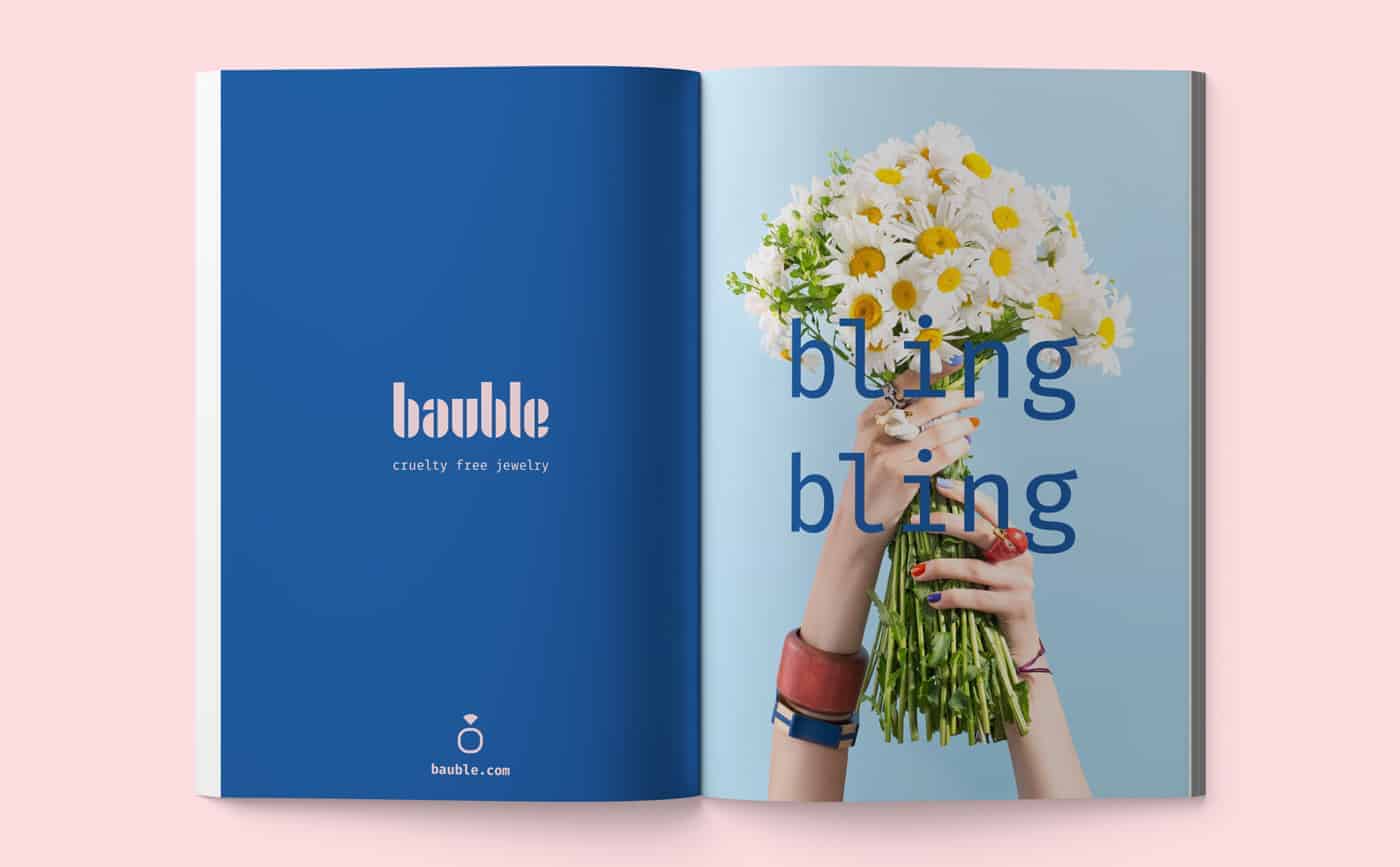
Due to the nature of how these typefaces were lost, I wanted Bauble to be a cruelty-free brand. What does that mean? To me, it means an ethical, sustainable and fair-trade brand. I added the tagline "cruelty-free jewelry" using Fira Mono, a monospaced font.
It was an unexpected font pairing since the brief said to use the Bauhaus style. I thought a lot about the Bauhaus school of design and how it closed in the 1930s. I wanted to show Bauhaus meets modern day. Plus I love a nice monospaced font.
The color palette was another conscious choice I made. Black, white and primary colors typified the Bauhaus style. I borrowed some of those colors, like blue and white, but I also added my own twist. After all, Bauhaus meets modern day would not be complete without millennial pink.
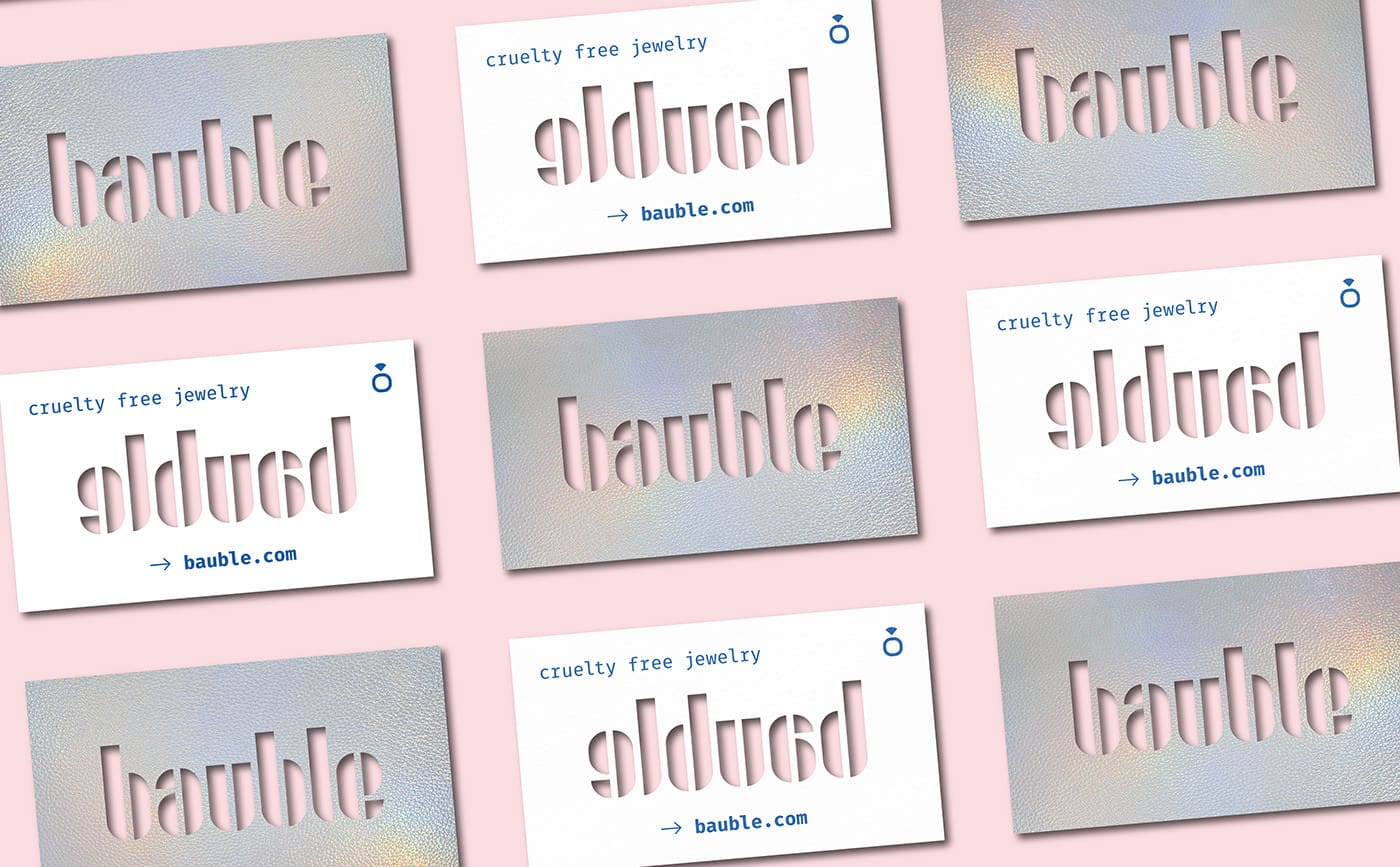
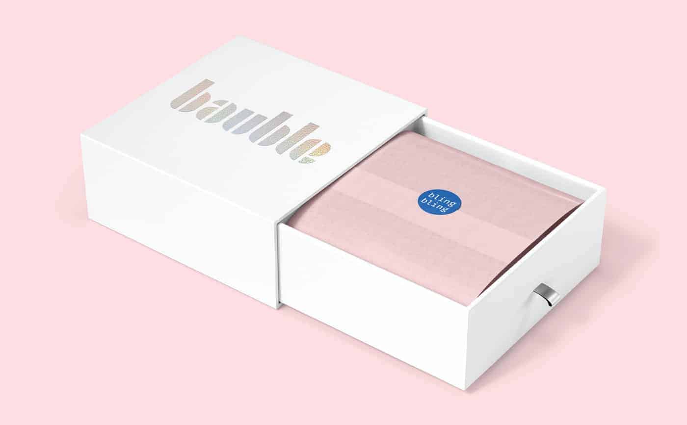
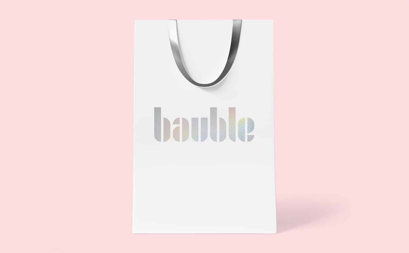
Next came the business card and packaging designs. Holographic silver paper certainly was not used in 1930s Germany. Nevertheless, it felt like the right choice for my Bauhaus meets modern day cruelty-free jewelry brand.
I used the pen tool in Adobe Illustrator to create the logomark. Originally the logo consisted of the company name set in Joschmi, in addition to the triangular shape. But I wondered if the shape would translate as a gem to everyday customers.
I decided that was not literal enough and added a ring. At first the ring was a perfect rounded circle. Then I decided to mimic the shape of the letters. After playing around with the scale of the ring I decided to make it the same size as the lowercase letters.
The tagline "cruelty free jewelry" worked well with each word on an individual line. With a little tweaking in Adobe Illustrator the words "cruelty" and "jewelry" are equal in length. As mentioned earlier, I used Fira Mono, a very minimal monospaced font.
Both Joschmi and Fira Mono are available through Adobe Typekit. I love using Typekit because thousands of quality fonts are included in your Creative Cloud membership. With one click of a button I was able to sync the fonts with Adobe Illustrator.
Next I chose the color palette. I save colors I like to a folder on my desktop frequently, so I pull from there at the outset of a project. The pink color hex code is #FCDDE0. The blue color hex code is #1F5DA8. I know it isn't technically a color, but most of my designs use a lot of white as well.
I used Adobe Illustrator to design the business cards. The holographic silver paper and die-cut logo are eye-catching. I was strategic in how I positioned the information on the back because I wanted the die-cut logo to look great on the front and back.
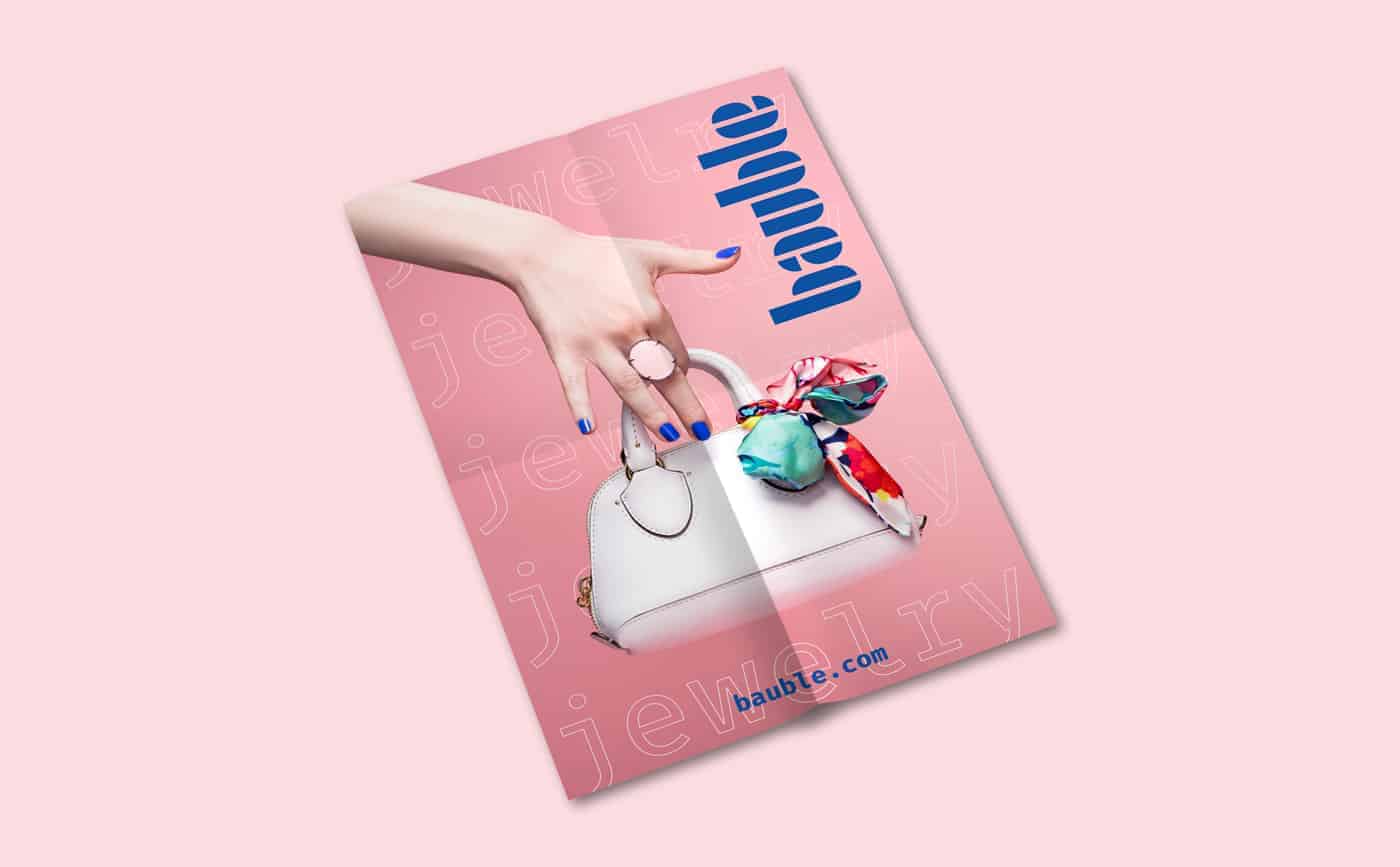
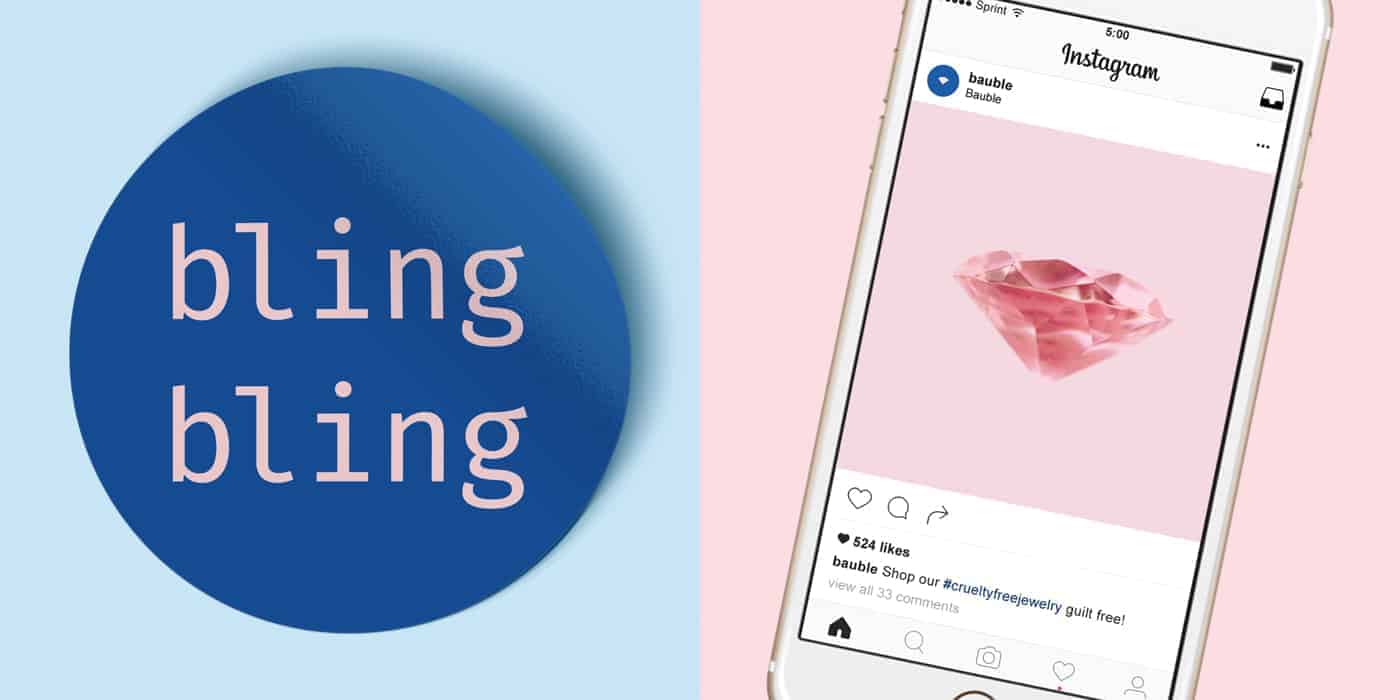
I also added fun elements like a blue sticker that says "bling bling" and holographic silver on the packaging. Photography also played an important role in the branding, and I used Adobe Photoshop to edit the photographs.
The project is very new so I am eager to hear feedback from people. With each project I grow as a graphic designer, and this was no exception! Project briefs are important to follow, but I also learned not to be afraid to experiment and try something new.
The Bauhaus school of design was extremely influential to graphic design. Nowadays people associate a very specific aesthetic with the Bauhaus style. Monospaced fonts, millennial pink and holographic silver certainly aren't hallmarks of the Bauhaus style!
But it was also an avant-garde movement that introduced new and experimental ideas. I wanted to add design elements that are not associated with the Bauhaus style, and by doing so, create something new. It is Bauhaus meets modern day!
I highly recommend Design Ideas readers check out the Adobe Hidden Treasures website (link to: https://adobehiddentreasures.com/). Joschmi, Xants and CarlMarx are the typefaces currently available for Creative Cloud members to download. More fonts are coming along with design briefs for future creative challenges.
If you are interested in seeing more of my work, check out laurenosoba.com or my Instagram (@laurenosoba).
I love the color combo!! Very feminine
Thank you, Megan!