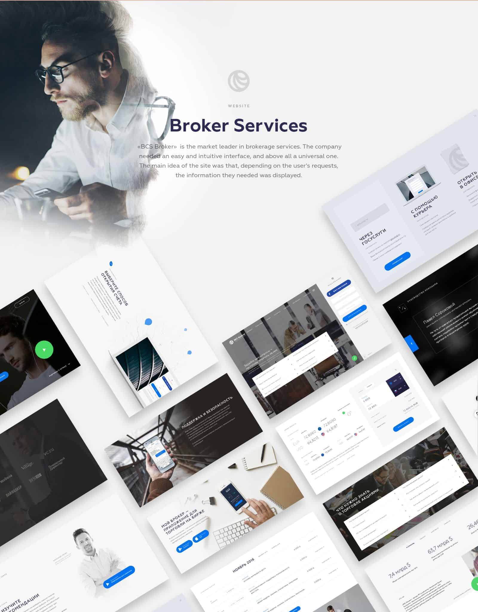
BCS Broker

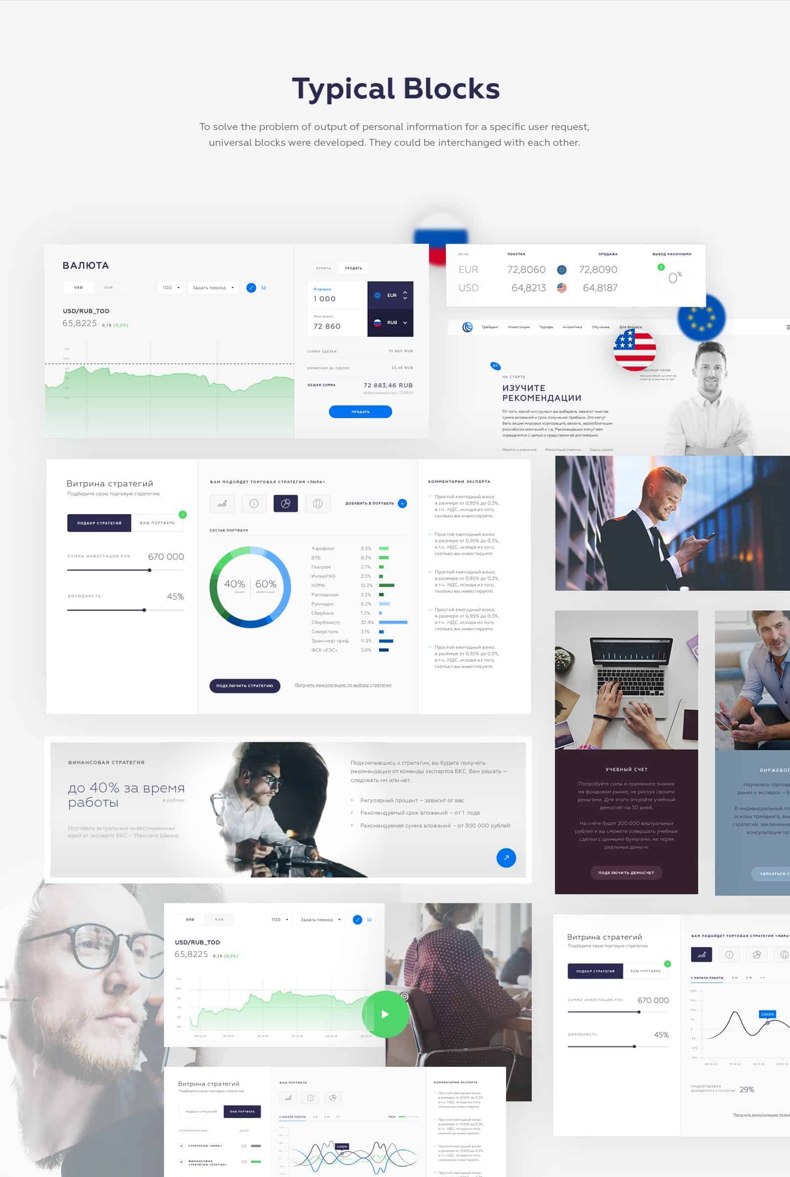
BCS Broker is the market leader in brokerage services. The company needed an easy and intuitive interface, and above all a universal one. The main idea of the site was that, depending on the user's requests, the information they needed was displayed. To solve the problem of output of personal information for a specific user request, universal blocks were developed. They could be interchanged with each other.

Most of the time, Brokers and other people, who trade in the markets are sitting behind dark monitors with charts. Until now most of the charts for traders are displayed on a dark background. So I wanted to make such site where the eyes of these people had a rest, but at the same time manage their attention through bright color accents.
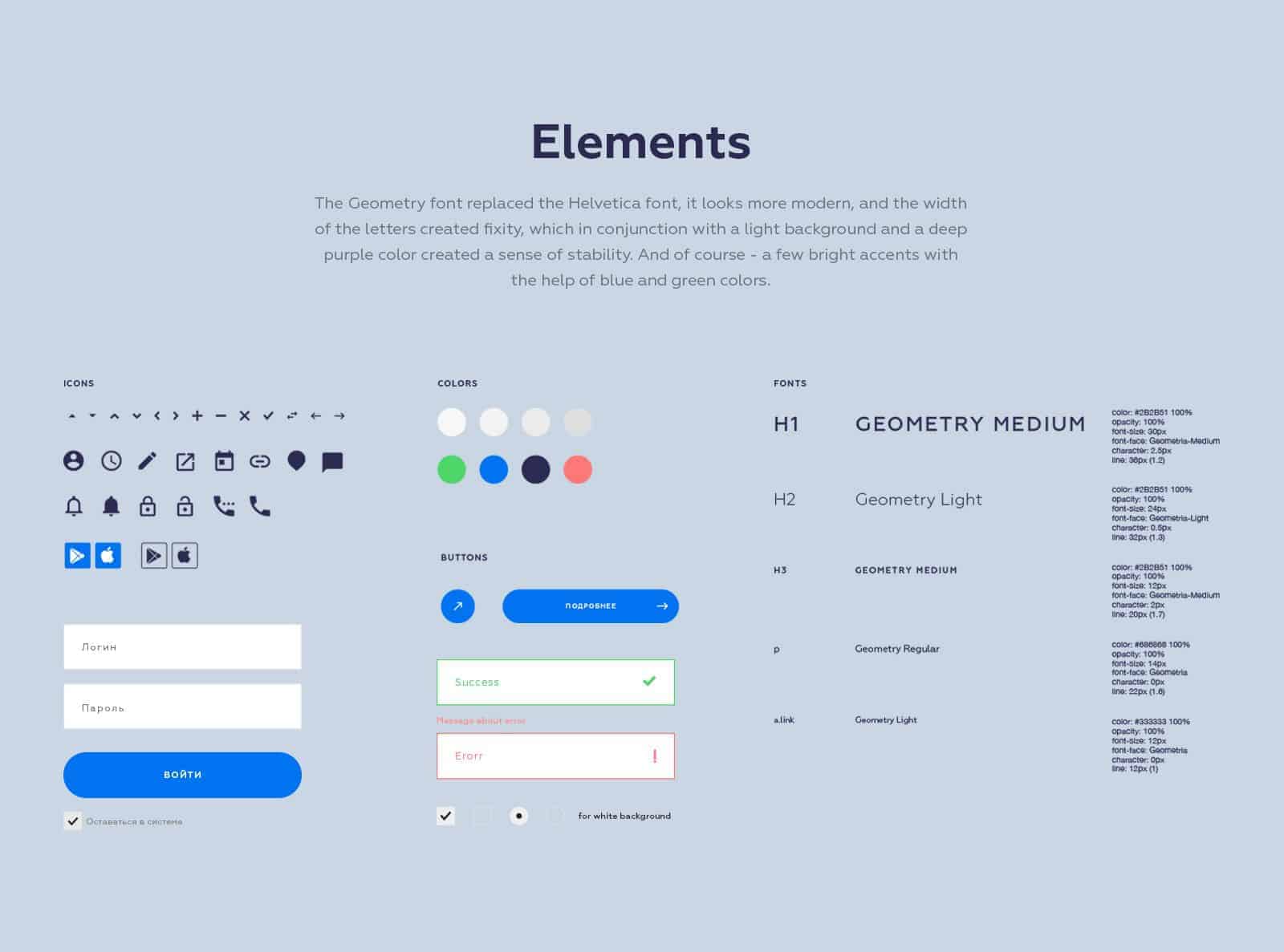
The Geometry font replaced the Helvetica font, it looks more modern, and the width of the letters created fixity, which in conjunction with a light background and a deep purple color created a sense of stability. And of course - a few bright accents with the help of blue and green colors.
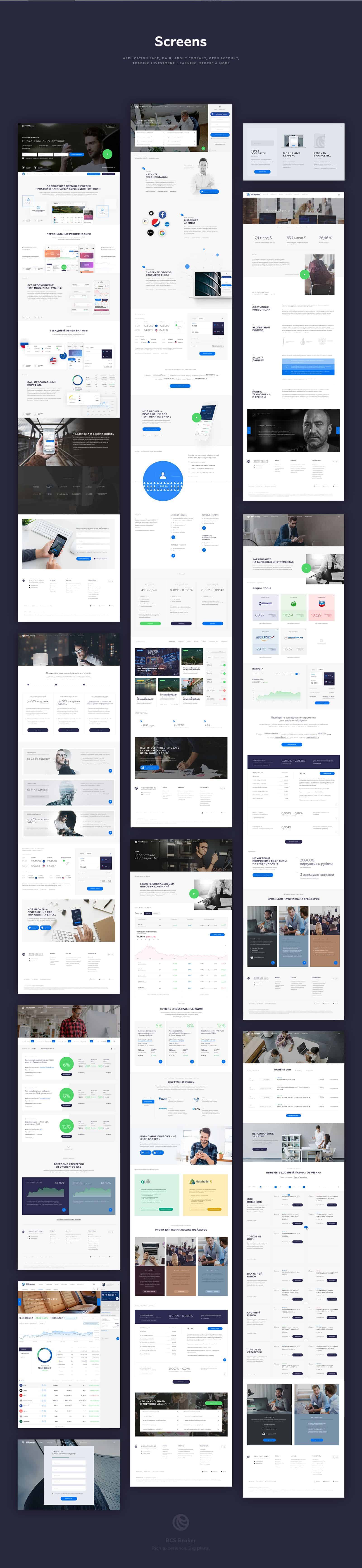
We worked with a large team of marketers, designers and developers. First, a universal block structure and a headline was developed, then we collected page by page. It was important for us to engage the user in the dialogue with the interface, so we came up with interactive elements that would involve him in this process, such as calculators, polls, block changes depending on the answers and user requests.


First, we launched a beta version of the updated site and decided to ask users whether they found the information they were looking for. Most of them had no problems, except the menu button, which was not found all. Now we have removed it and put all the menu items in the header.
Rich expirience. Big plans.
Press "L" on Behance
https://www.behance.net/gallery/52566173/BCS-Broker