Bente Tattoo Studio ®

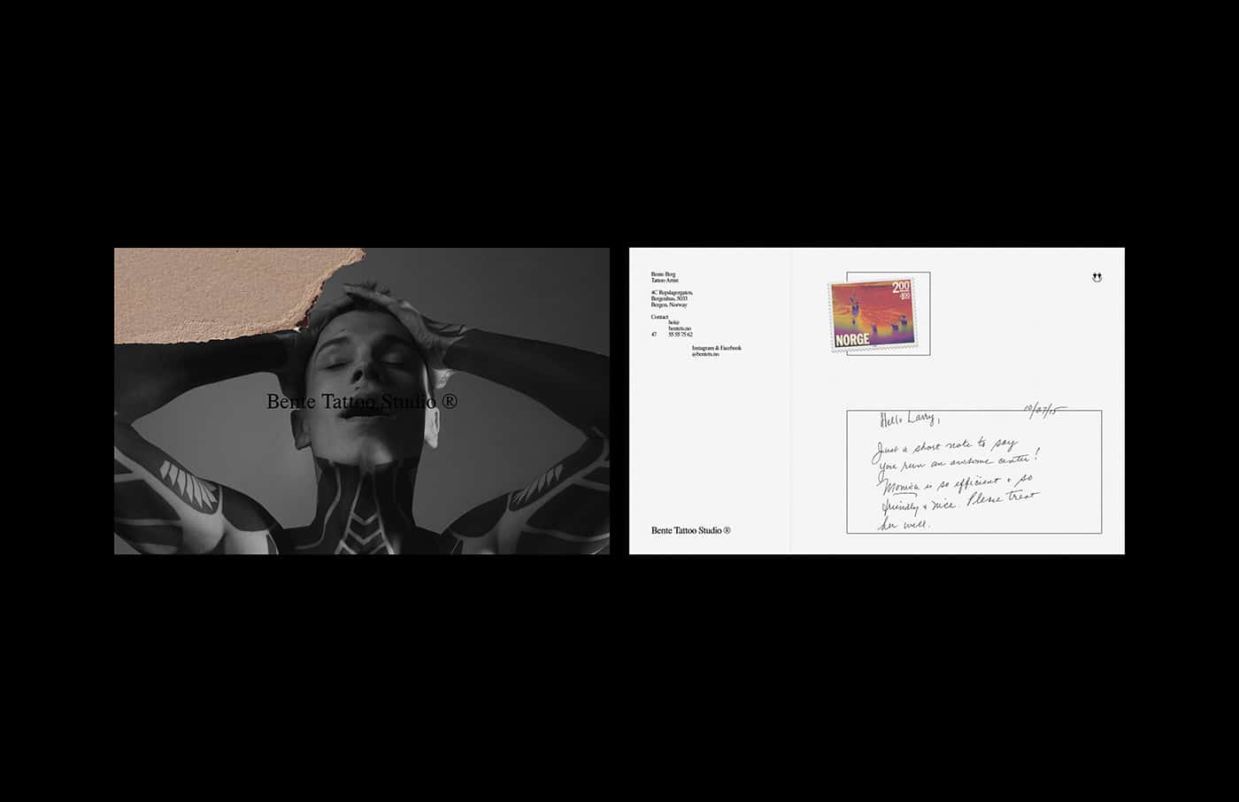
Bente Tattoo Studio ® was founded in July, 2018 by Bente Berg, a tattoo artist. The studio is based in Bergenhus, Bergen, Norway. As Bente herself puts it "his work is based on self-knowledge, imperfection, art, and ink is only an intermediary to express her clients inner selves."
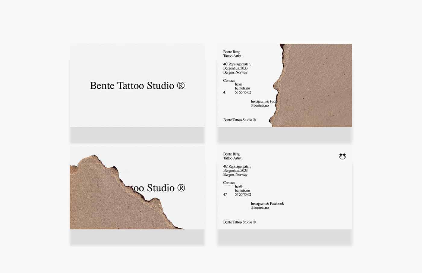
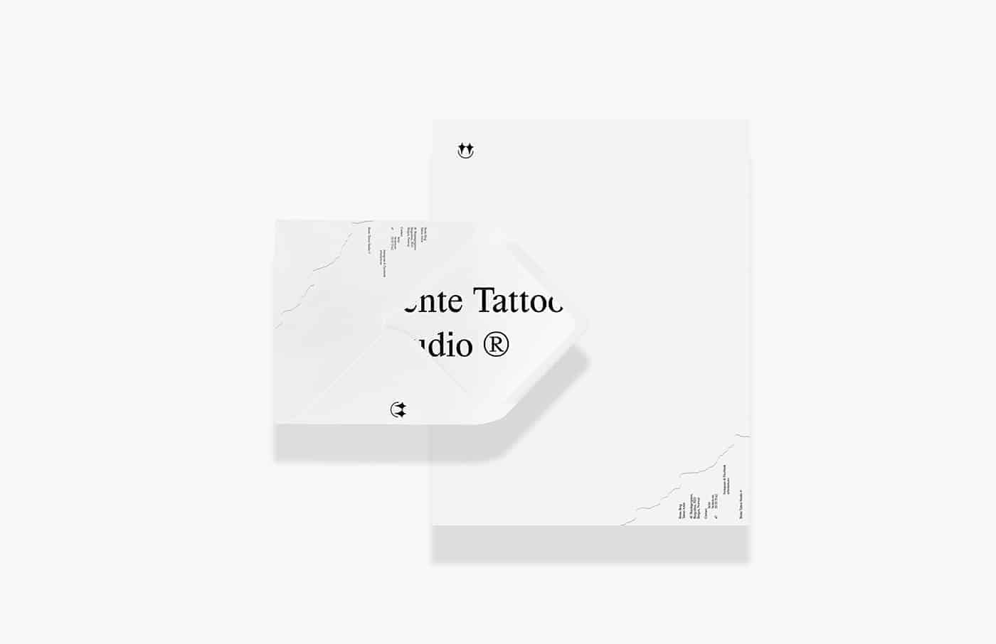
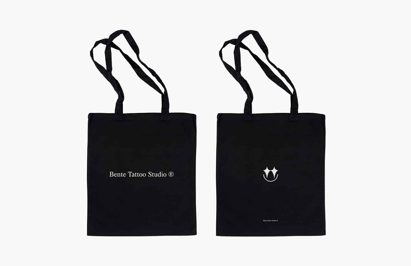
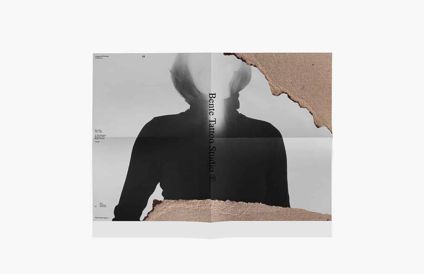
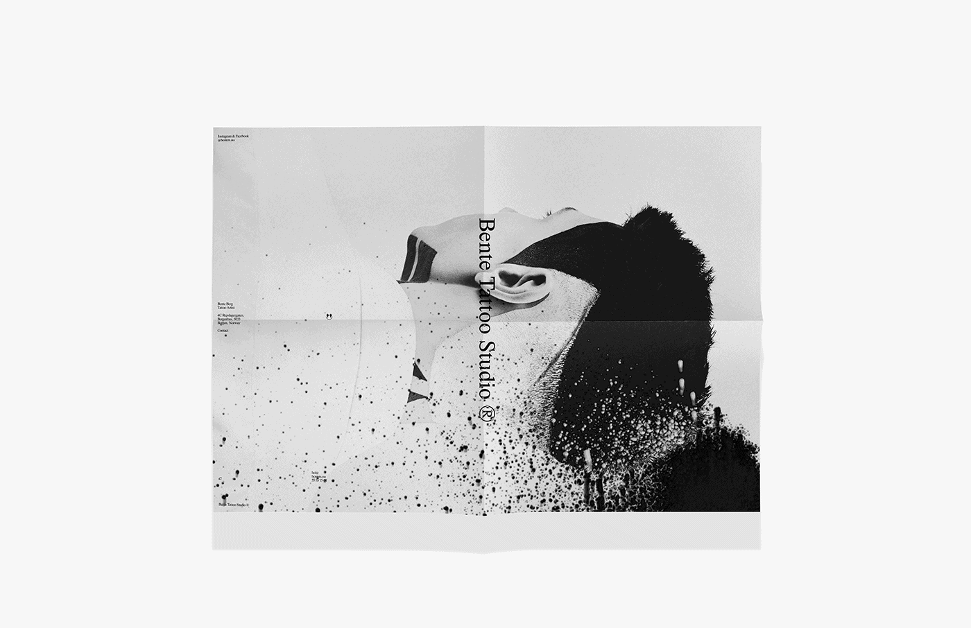
All visual elements combined with photography art direction create a result brought up in a classic visual communication. As for the materials used in stationery, (torn) cardboard is employed to represent the imperfection part, and put together with its texture, it is an abstract representation of Nordic hills. Moreover, for the visual identity, the typeface designed by Dreams Office was opted to bring to life to the whole identity system for its precise lines, classic aesthetics, and slightly imperfect curves. Everything folding and unfolding what, why, and who the studio is. The monochrome palette was the only pick by the client, but it worked out alright and it ended up bringing the right tone of seriousness and elegance in contrast to the texture and everything else.
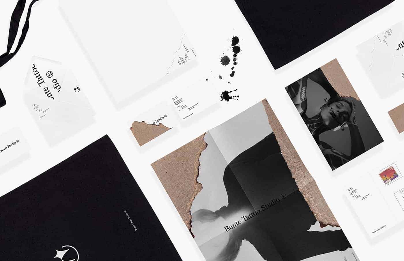
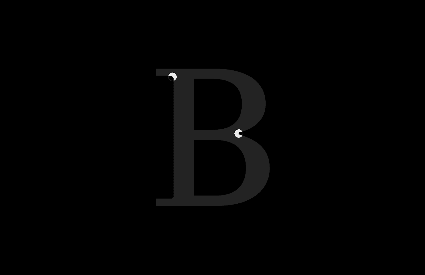
I used Illustrator to design the visual identity and grid of this project. Firstly, before anything was done, I designed the logo. Secondly, it came naturally, unfolding while I was sketching on my notebook on a daily commute in the subway. Before choosing to go classic and design a simple visual identity, I was thinking of going gothic and medieval, same old. Then, I decided to opt and showcase an option without the obvious blackletter for a tattoo studio and that could translate better the meaning behind the studio's cornerstone. In addition to that, I may also say that before even getting into the project I started binge-watching the show Vikings on Netflix and that the logo is an inspiration from the beautiful tattoos the Vikings had all over their bodies on the show, especially their faces, including one character in particular called Floki. From the show, I also got the inspiration of the cardboard (as everything always seems to be broken or torn as an outsider, they looked whole and beautiful for the people in the clan), the texture, to recreate the silhouette of a hill as to decorate the collaterals and unify the universe created for the studio. Another thing worth mentioning is that all the process started from the logo and everything came from that.

When you create with a strong concept, the approval is almost inevitable. But I didn't have it in mind when I was designing any of the projects I have been involved with so far. I don't want to get distracted by doing anything out of approval, instead, I really try to immerse myself in the materials I'm working on so that I may come up with the best solution. That sounds blah, but it really makes all the difference when trying to reach out an x-factor, something relevant and that can be eye-catching before the clients' and the beholders' eyes. In the process, I learned that you should stick to your instinct. I was terrified when I visualized cardboard in my mind before taking it and working on Photoshop and in interaction with the logo and visual identity. It simply suited as a glove and it was amazing to see something working when I wouldn't pick it in the first place. Moreover, this project was a confirmation of how human we are and that we're part of something bigger flowing as individuals. It made me more careful in terms of perspectives and that we are from different parts of the world, but we are equals. Ultimately, in terms of my design process, this project taught me that the differential of it could lay within the layout or textile you bring to it rather than a complex identity system.
Try out your ideas and have fun, they might work.
I love the simplicity of this!