BK2 Têxtil - Graphic Design

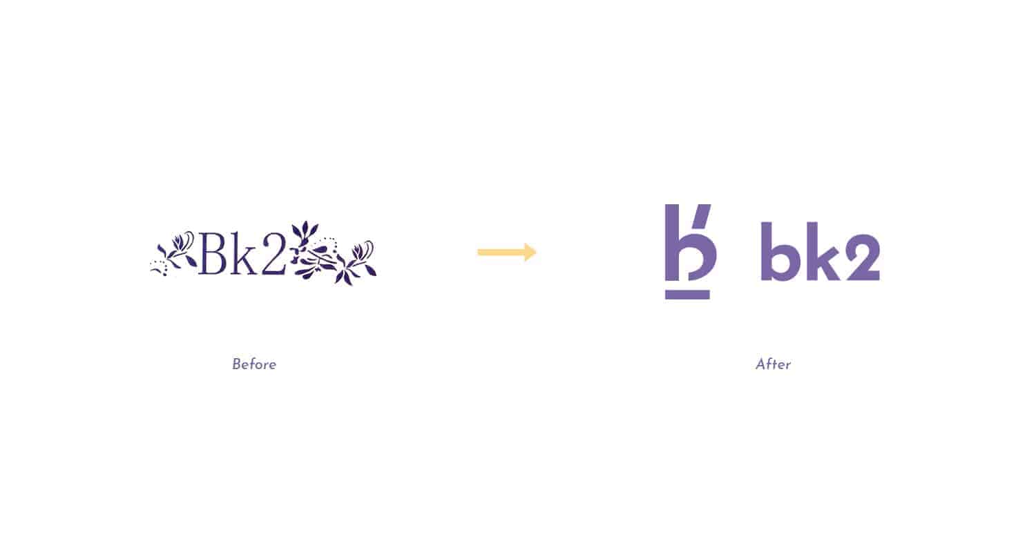
BK2 is a clothing company here in my city, specializing in serving the female audience. The main need that came up was to give a new face to the brand, which used to be only about the logo. His visual identity was virtually nonexistent.
Today BK2, besides a new brand, can count on a visual identity that really differentiates it in front of its competition, which is very high here in the region of performance.
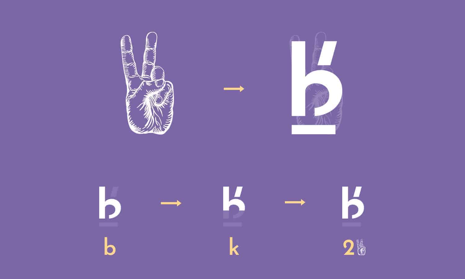
By first using the brainstorming process, I identified that the brand should visually pass a younger spirit, able to talk to its audience. Using "tools" such as semantic panels and keywords, for example, I came to the conclusion that the "peace and love" sign was the symbol found to represent this new face. He also makes an analogy to number 2, which is present in his name.
After that, I started to design the brand by subjectively incorporating the two elements mentioned above and also the letters "b" and "k". After several attempts, I came to this result that pleased me the most.
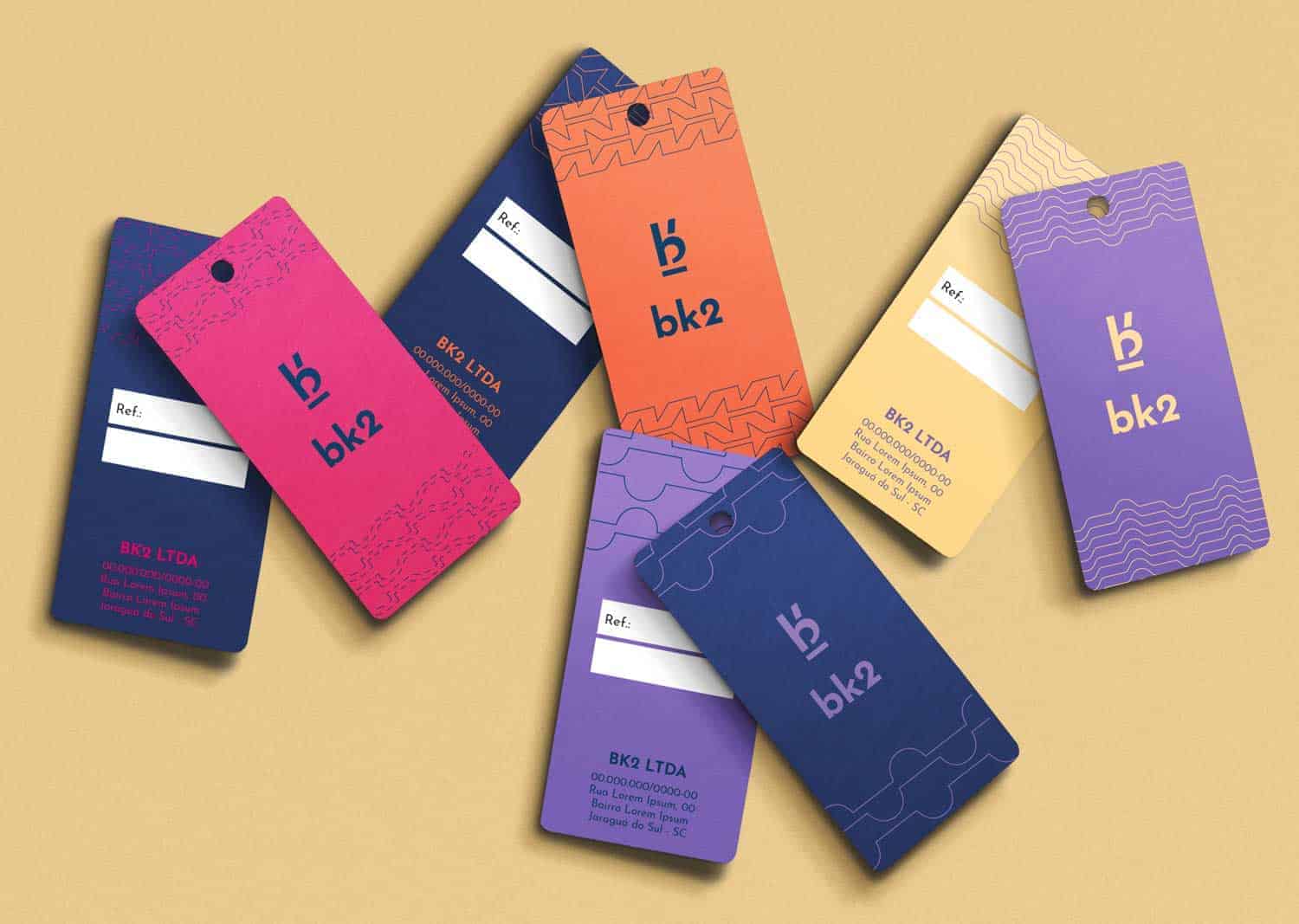
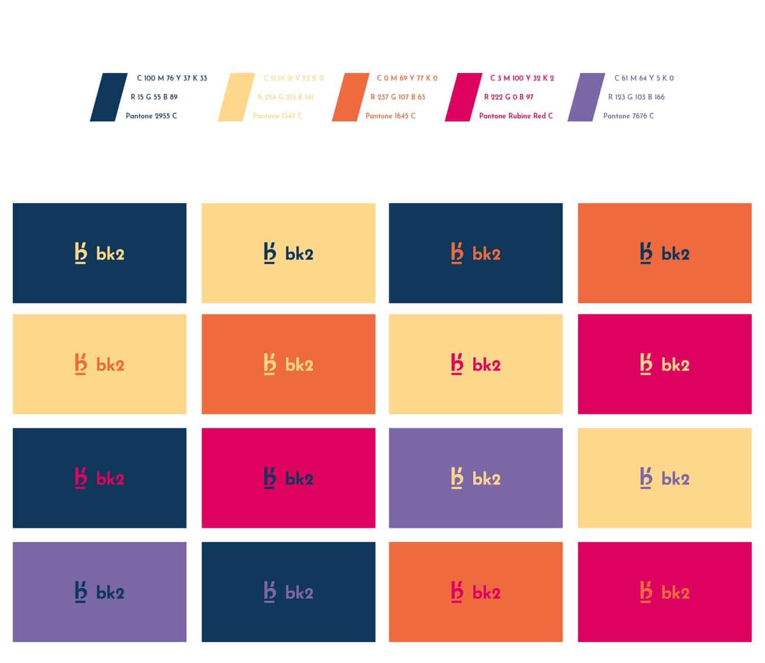
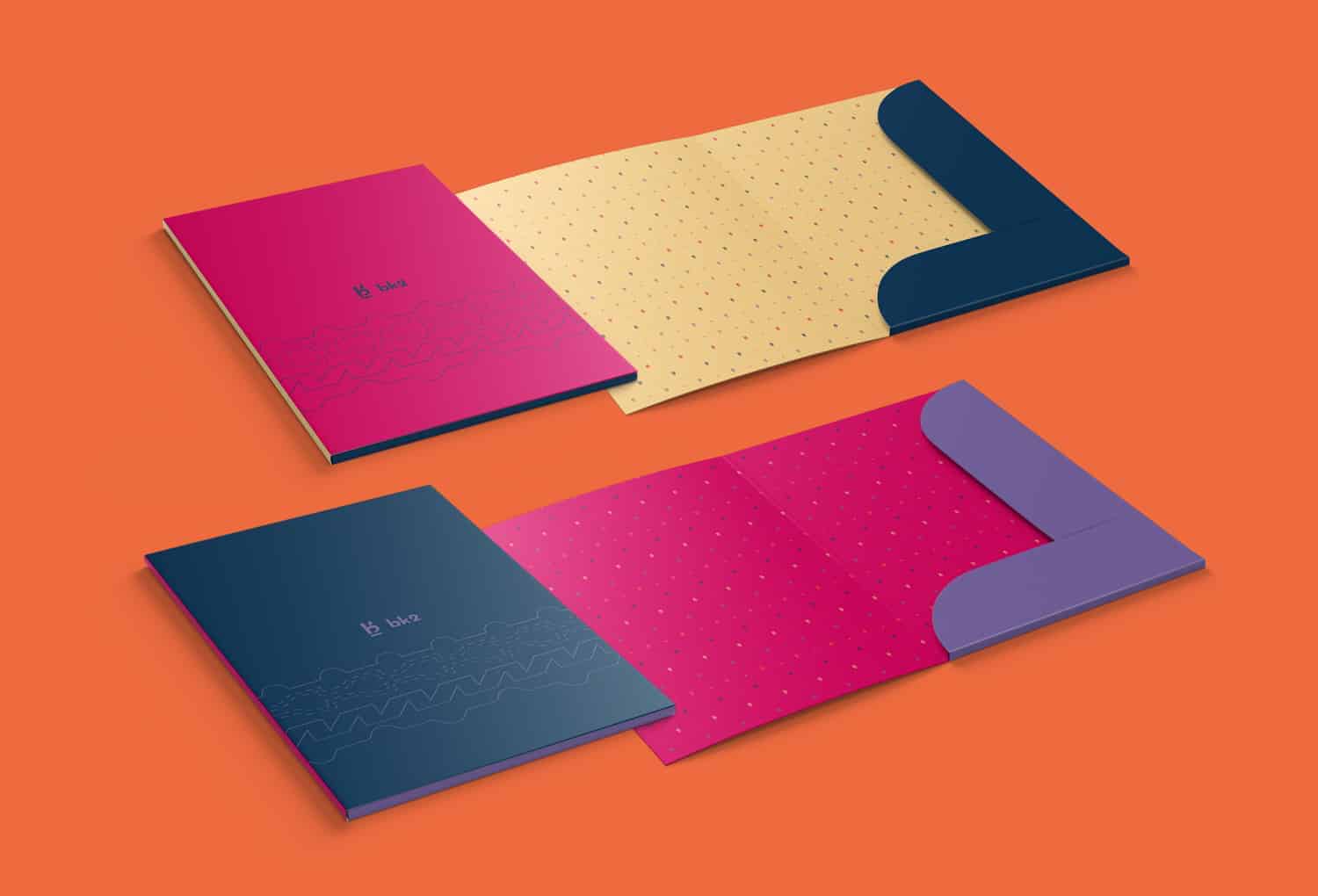
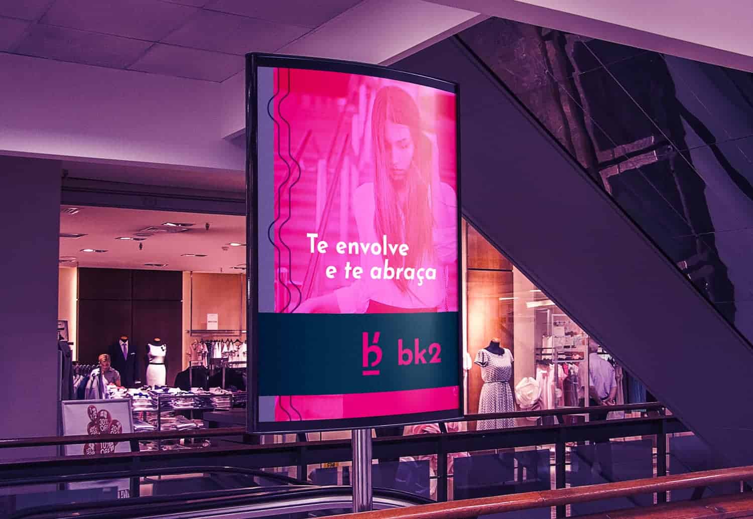
The color palette also plays an important part in the design. During Brainstorming, I also noticed the need to create a more dynamic palette to help make the brand even more unique. I tried to use colors as different as possible, but when applied together in the graphic material, make the visual language more harmonic and pleasant. The colors chosen help BK2 to be close to its audience in all seasons of the year.
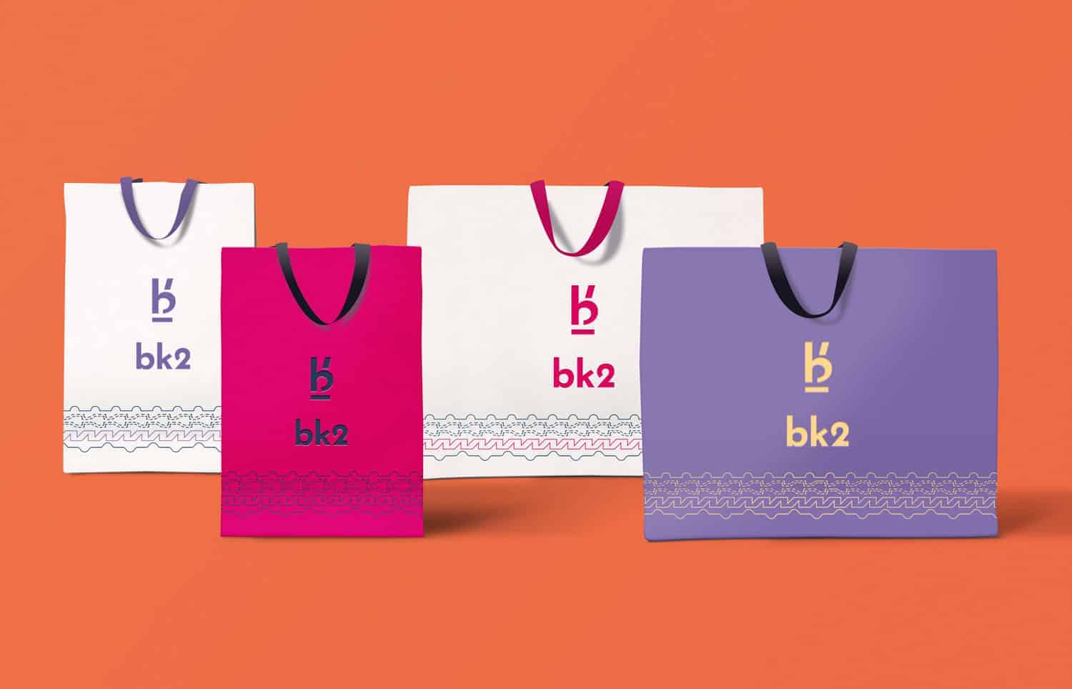
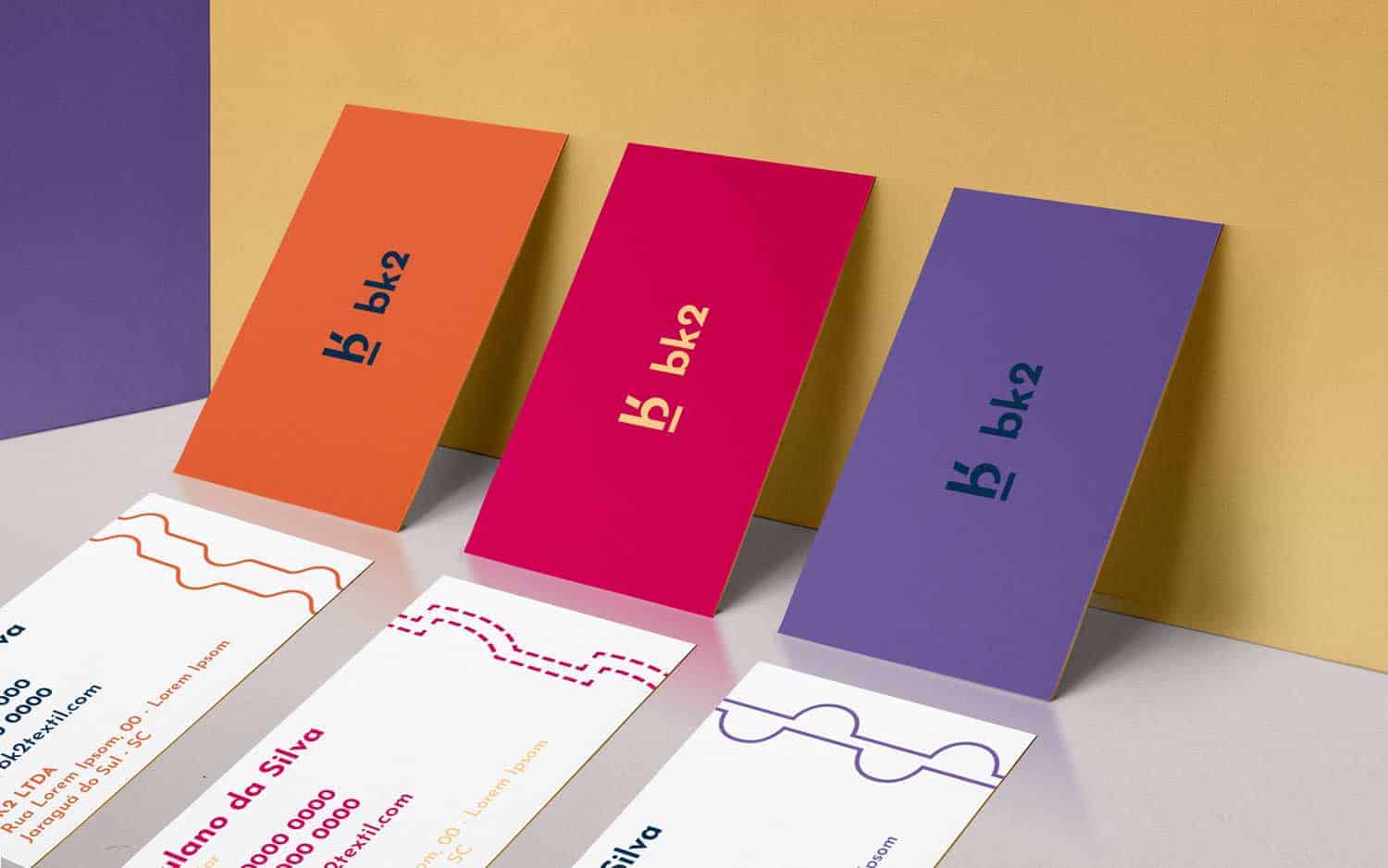
The visual elements developed to compose the visual identity were inspired by the designs of sewing molds.
The project was practically all developed in Illustrator, with the exception of the promotional banner proposal, where I made use of an image and made a small edition in it using Photoshop. For the development of the logo, also had some manual sketches, but in this specific project, I started soon for the software.
I received some encouraging feedback from the professionals I know and asked for some advice, especially if it comes to the color palette. One of the things I learned in this project was not getting stuck in the early alternatives of logo design for a long time. Initially, I liked some options, but I felt that something was missing. I then spent more time creating something different and came up with a better result.
The final result that you can see was what pleased me the most, but since everything is not a sea of roses, the client is currently using only part of the project, and will gradually implement the rest, mainly in the issue of Colors. He also requested an adjustment in the brand, kept the logo but wanted to leave the letters "B" and "K" in the box, unfortunately, to my frustration .. rsrs
The project with more details you can see here: www.behance.net/gallery/71356991/BK2-Textil-Identidade-visual
Genius!
Love the colors you chose!
Thank you Jenna, I'm glad you liked it.
A hug!
I agree great colors!