Bloom Records//Record Label

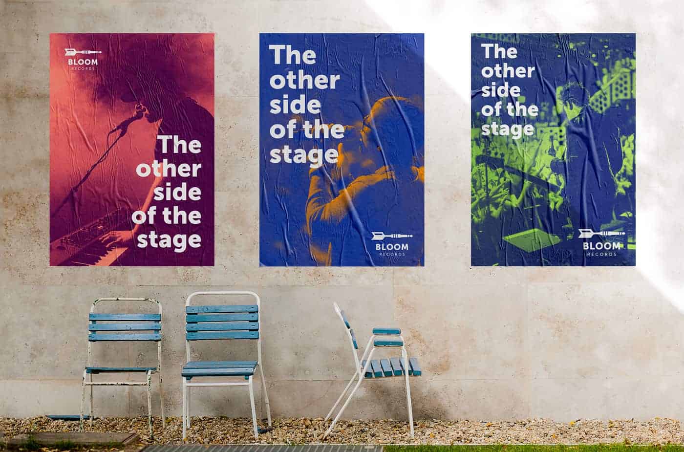
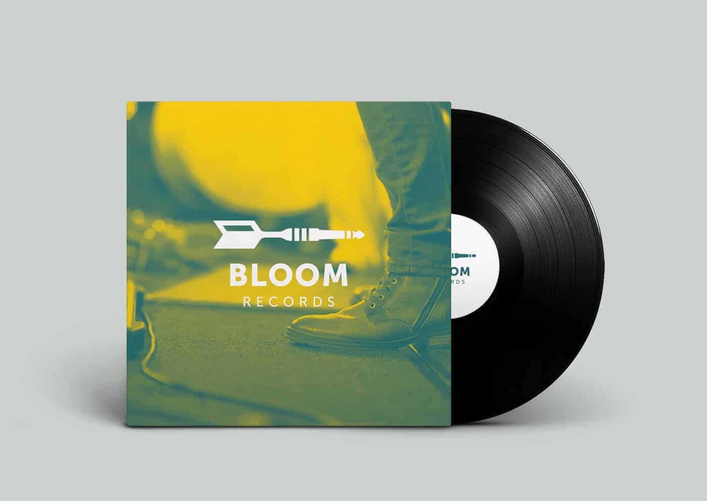
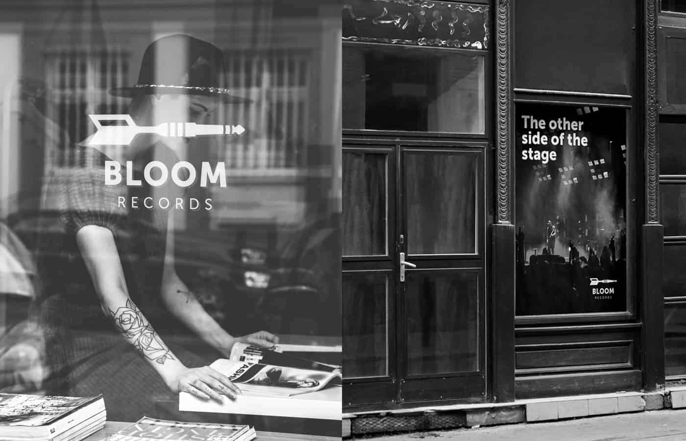
Bloom Records is a new rock record label which aims to promote new up-and-coming rock bands. The label will be characterized especially for the continuous investment in young talents and for the product promotion, with an eye towards on the live concerts. Bloom Records wants to realize the dream of young musicians talents: put them to the other side of the stage.
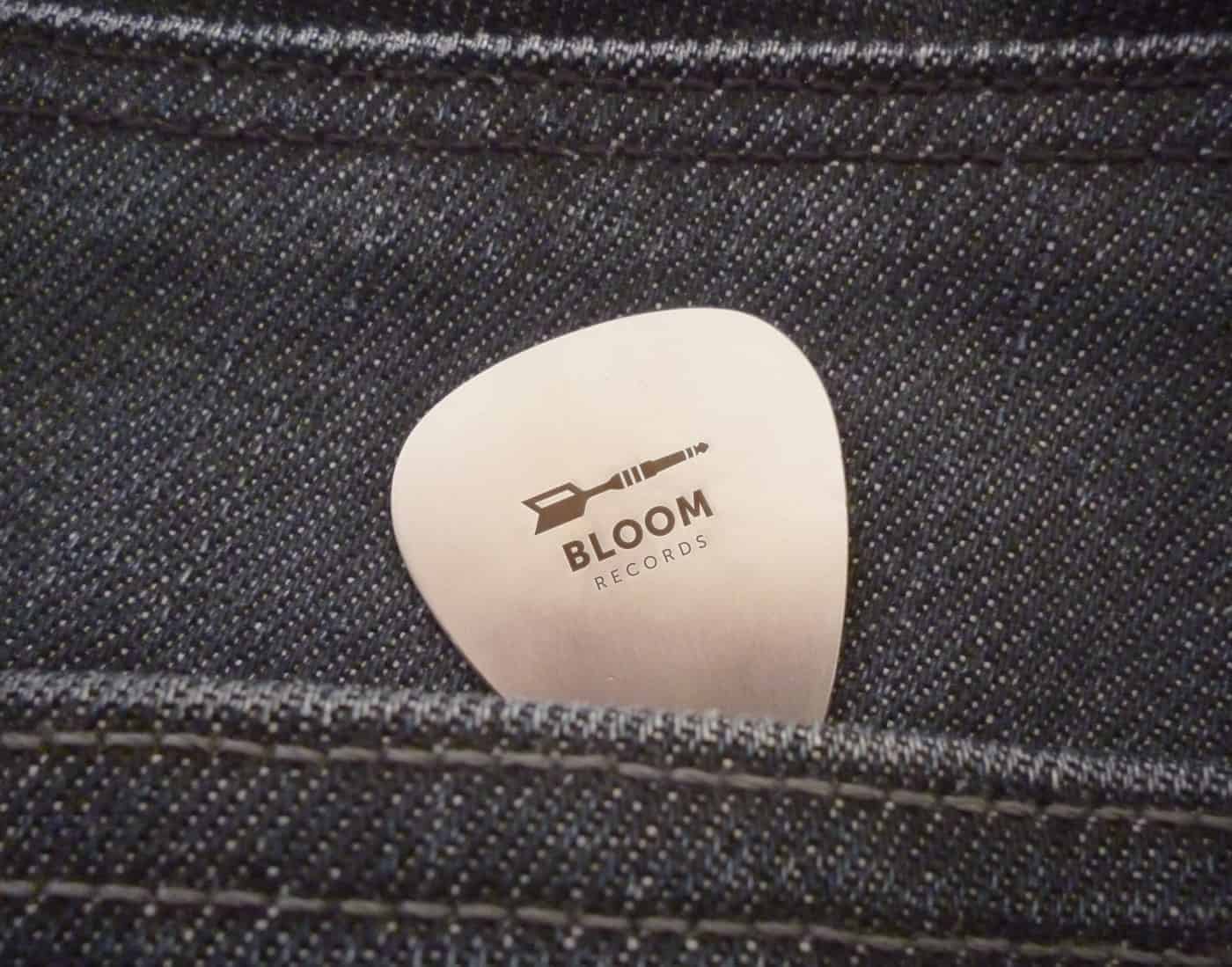
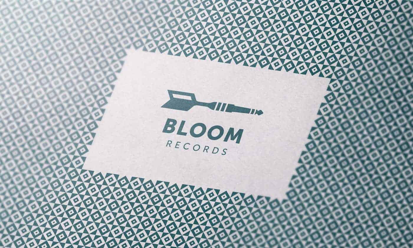
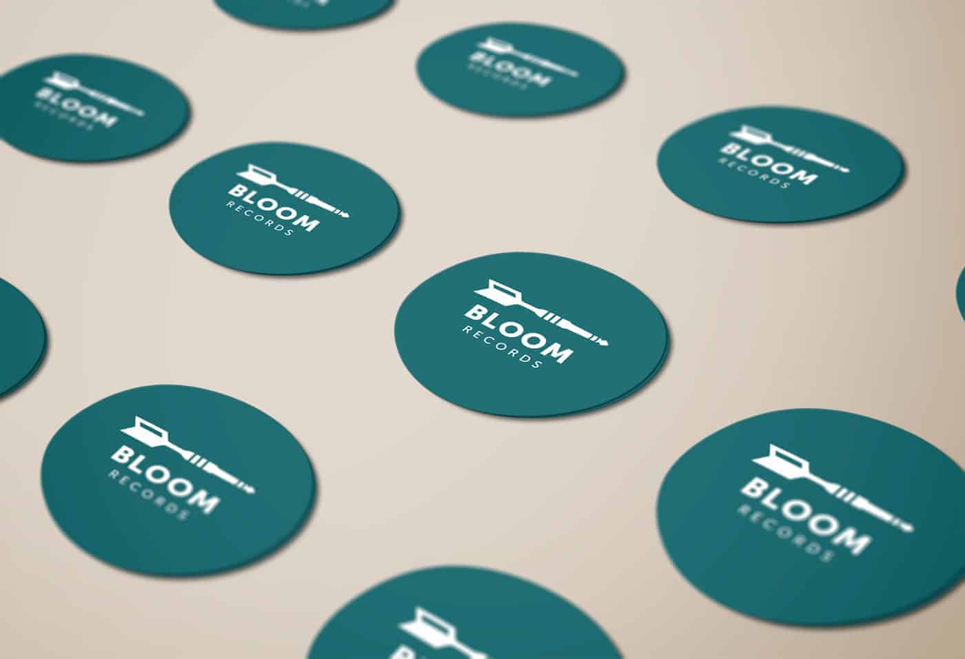
The inspiration is derived from the label mission: to realize the dreams of young musicians. So i thought the idea of achieving its goal and i designed a dart. Then i fused the dart with an audio jack to represent the power of the music.
I used simple shapes in the construction to create a logo that was very strong in accordance with the rock genre of the label.
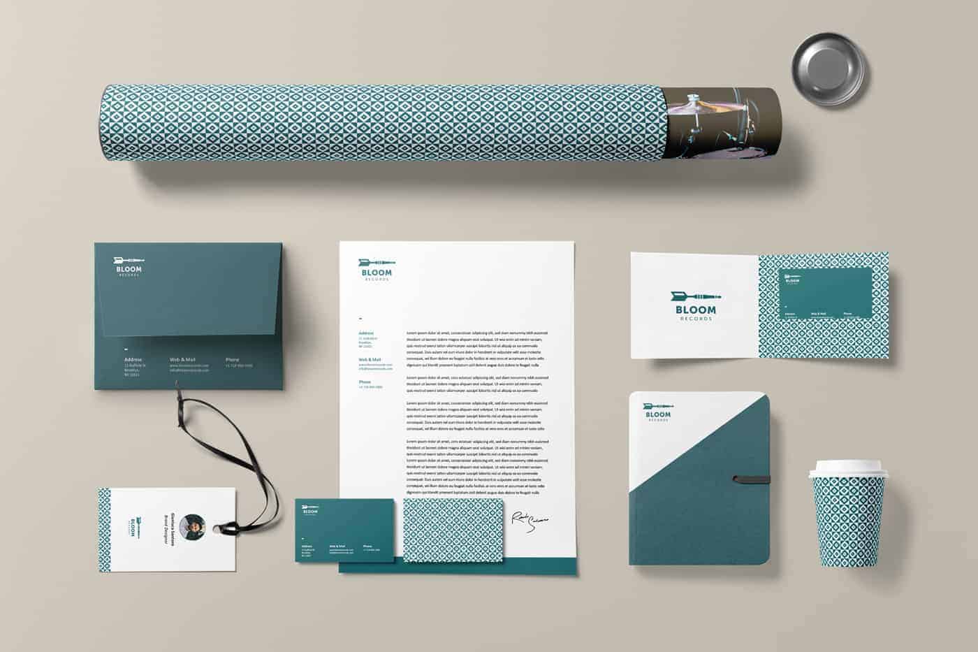
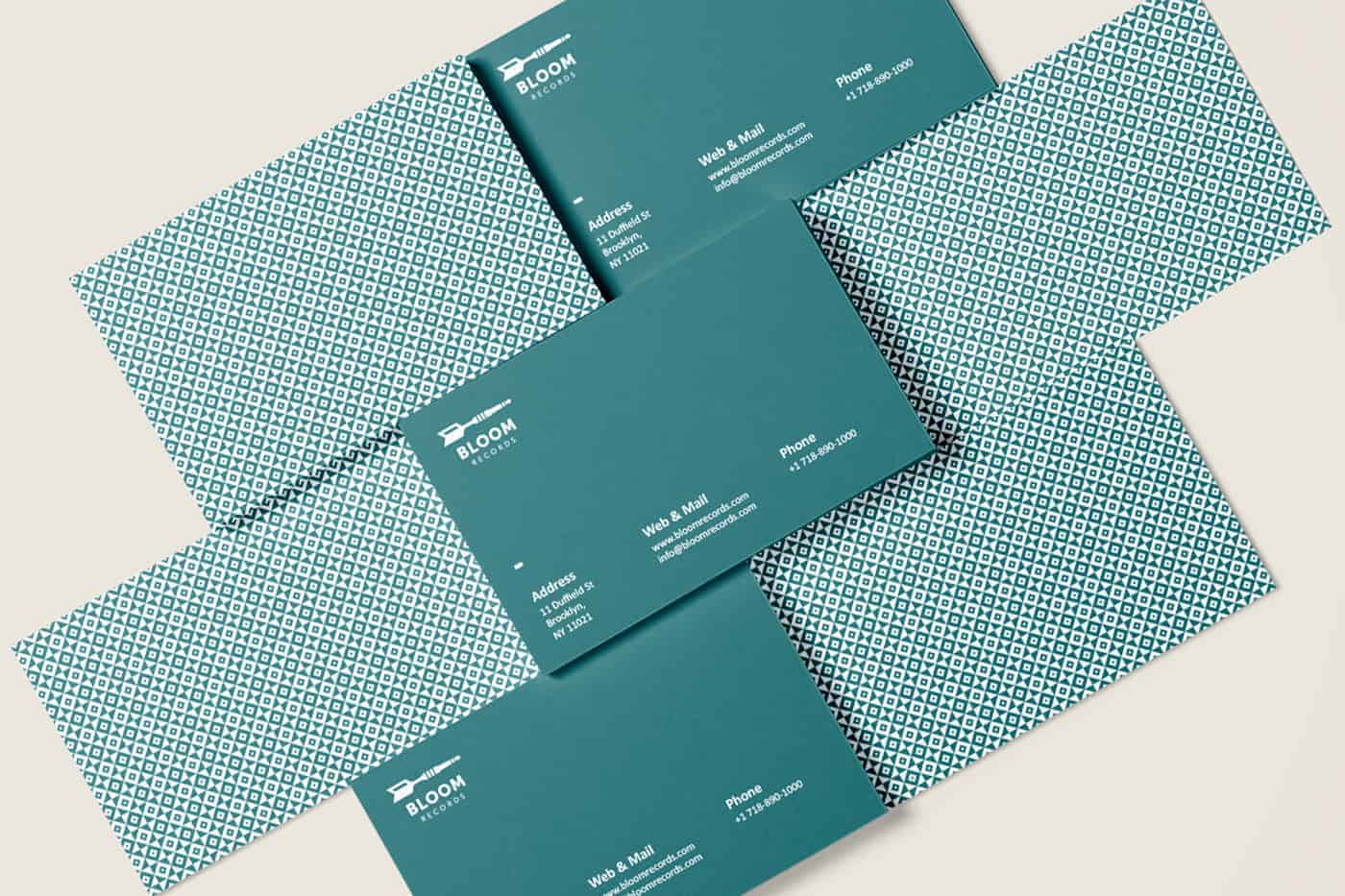
I designed a lot of sketches on my moleskine. Then I worked on Adobe Illustrator reproducing my sketches in the artboards in black and white. After that I chose my three preferred proposals, so I created the grid and chose the font: Museo Sans. Then I designed the pattern using squares to maintain a clean and modern brand image.
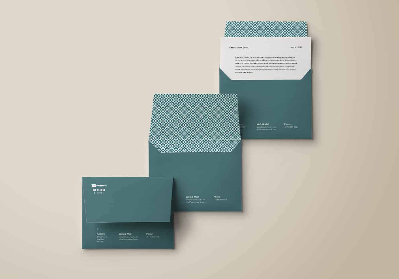
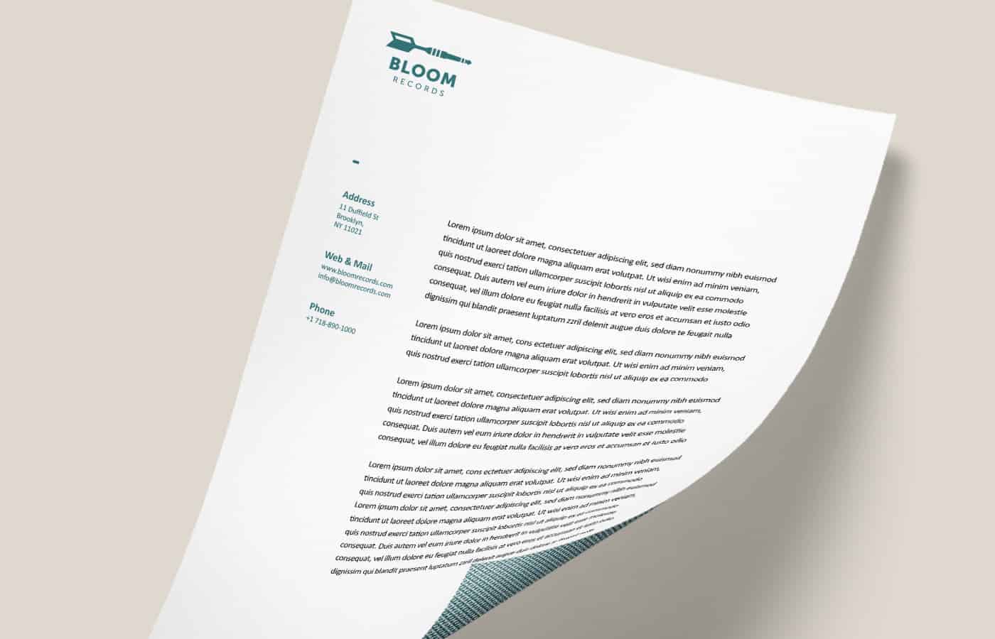
After that I chose the color palette and even in Illustrator I designed the stationery. At the end I also worked on three posters.
People are responding well to this project on Behance. I received a lot of question about Bloom Records and this is the most important thing for me. I'm a brand designer and sharing the experiences with other creatives people that work in other creative field is essential for me.
With this project I learned that simplicity is the key also for a strong rock record label. I study a lot the works of my favorite graphic designers like Bob Noorda, Massimo Vignelli and Paul Rand and their common point is the cleaning and the simplicity of their symbols.
That's some beautiful work and concept, Good job.
Thanks Charlotte :)
Love the logo concept and colour palette Gianluca. Well done!