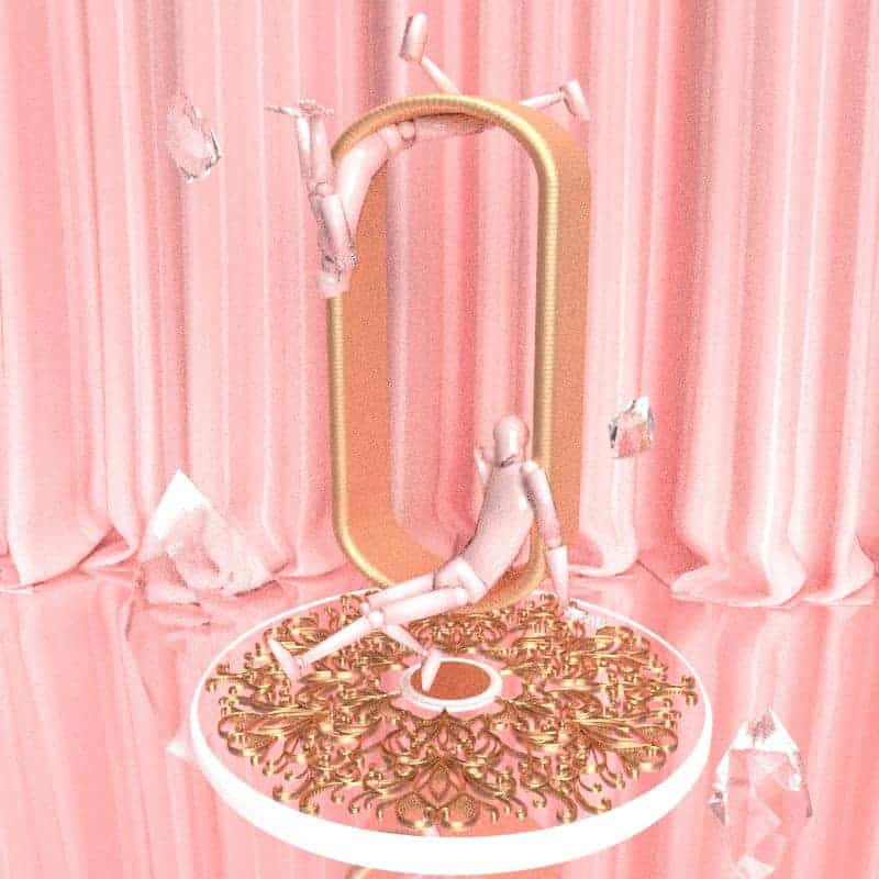
Body Language
This is a mini exploration of body languages and gestures when exaggerated in space. The movements were to represent different levels of comfort and flexibility from least to most. I have always like to play with the positioning of my models, and these renders were a fun experiment of scale, symmetry and hierarchy.
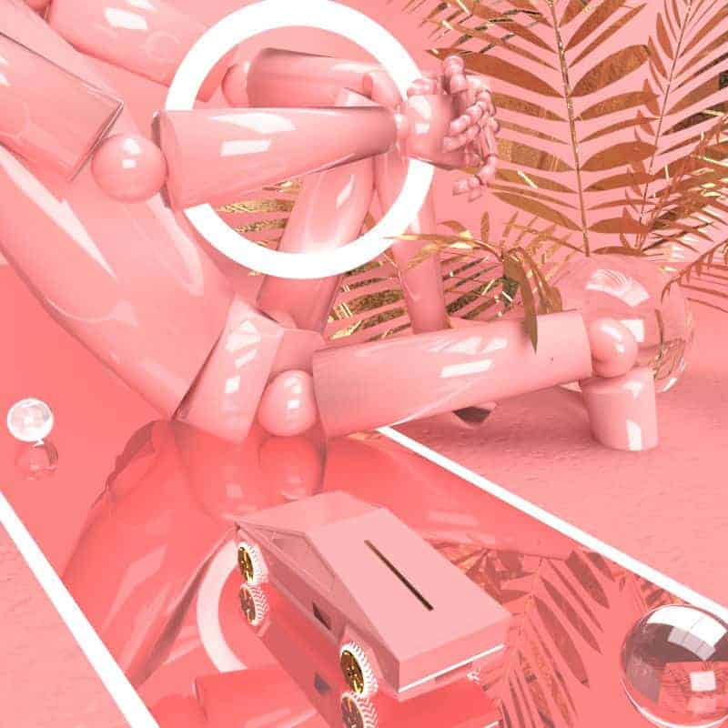
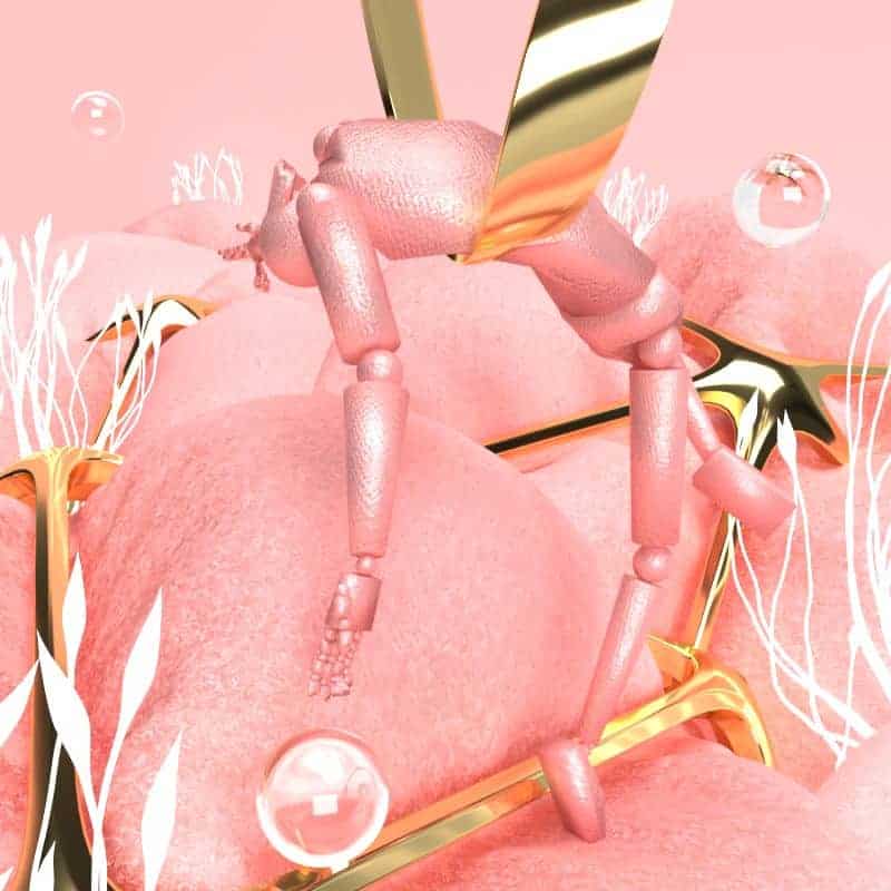
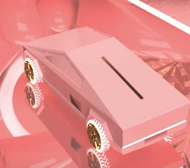
Some of the inspiration I had for these renders were the movie "Tron: Legacy", acrobatics and of course the fabulous Tesla Cybertruck memes. Also, as any creatives would have in the background as they work, music played a huge role in shaping the composition of these renders. Since the main concept is all about body language, I wanted to create something that showed a softer, feminine side in contrast to the sharp, artificial environment.
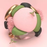
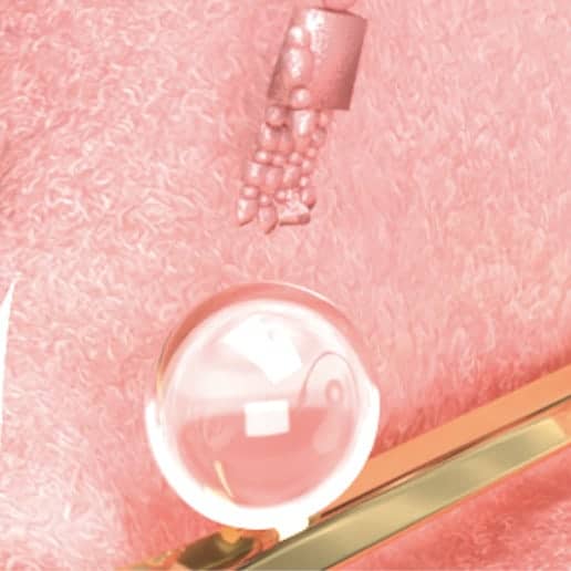
I can't seem to break away from the pink colors for some reason, so I've decided to embrace this aesthetic of mine now. It has been a constant pattern of going back to shades of pink and gold reflectives with a few hints of glass in all of my designs. They seem to deliver a whimsical, delicate and bright emotion for the artwork.
I used mostly Adobe Dimension for these renders, or any renders in general. It is much more intuitive and easy to use than other complex 3D programs. However, in terms of creating figures and specific models that Dimension doesn't offer (the program only has basic shapes and a few mockups for branding), that's where Cinema4D comes in handy.
The start of all my renders is definitely setting up the scene. Whether it is a straight, flat background or a slight top view tilt, the more I could visualize the final view of the render the better my workflow is. After the scene setup it's basically testing out different model placements, adding and swapping materials, adjust lighting and its rotation to really capture the shine of the materials in the previous step. For the body movement, I used Mixamo to animate and then freeze frame to capture a specific pose and import that model to my design.
After all of the technical stuff is done, it is just time to wait for the renders to run and make small adjustments to angle, sizing and export resolution.
A lot of people like the pink color scheme to my surprise, and I have been encourage to embrace that even more. Most of my renders tend to lack human elements because they are mostly all abstract objects in place, so the robots added another level of interaction to the viewers. I realized that my design always need to improve and incorporate more engaging content, so this render series was a good way to see how well the public perceived them and what could be done more.