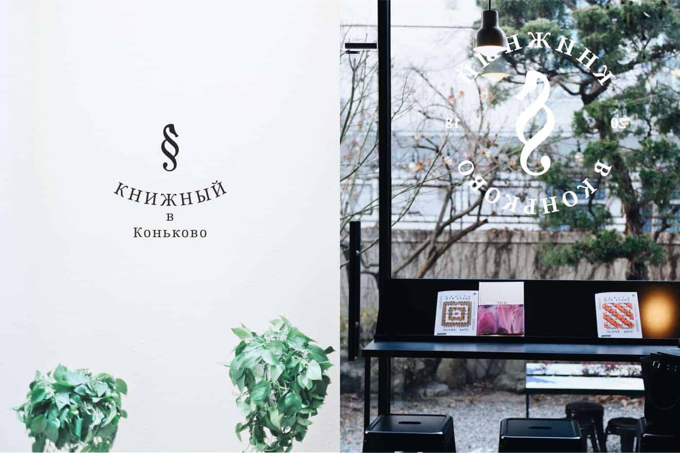
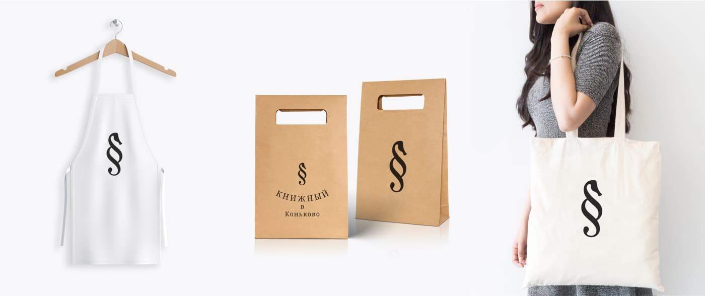
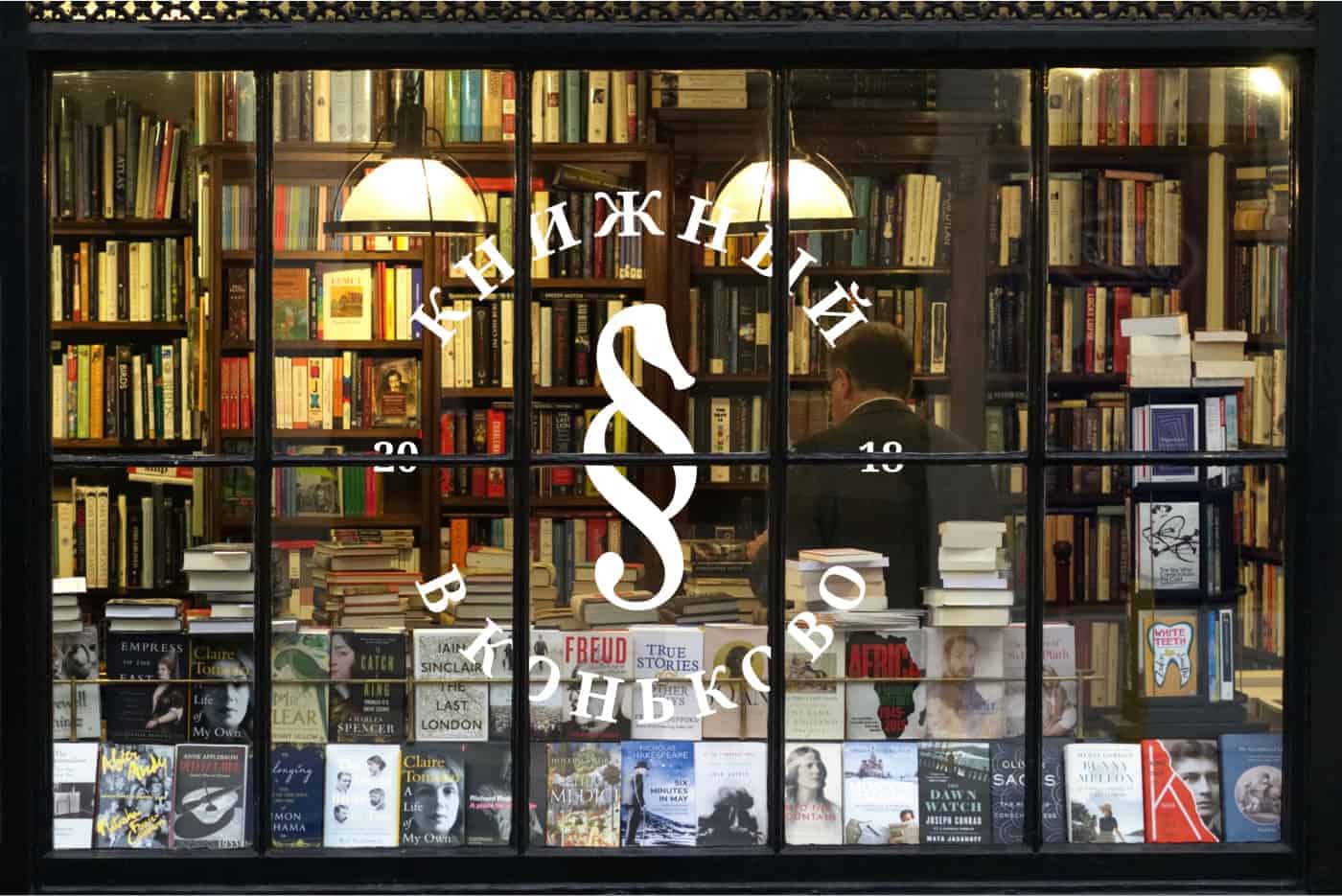
Bookstore brand

TASK:
To develop a logo concept for a bookstore, which is located in Moscow - district Konkovo. To exclude all typical and popular elements that are often used in the logo development in the similar sphere. To make the logo simple and convenient to use.

DECISION:
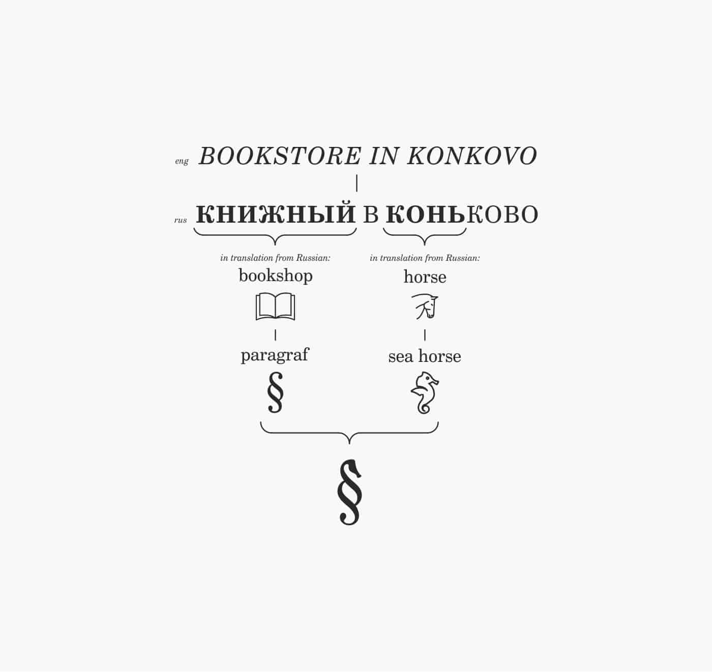
The logo image is made with merging one of the typographic marks - a paragraph and the image of a seahorse. Why did I use precisely seahorse? If you read “Konkovo” in Russian, you might notice that the name consists of the word “horse”. That’s why I took the word as a basis, changing it to a seahorse, because in its image and plastic it looks more like a paragraph.
I made a scheme by which you can understand the meaning of the logo, even if you do not know Russian:

Everything was designed in Adobe Illustrator. Photo retouching was done in Adobe Photoshop Lightroom and Adobe Photoshop.
It seems that adding one element to another is quite simple. But no. I spent about three days to make the seahorse look like it is now.


The logo was designed at the end of 2018. A kind of brilliant end of the year! ?
The logo caused an unexpected response! There were a lot of positive feedback and comments.
Many thanks for reading!
You can view the full project at https://www.behance.net/gallery/74310123/Bookstore-brand