Bor Noi Identity Design

Bor Noi as a brand is a step towards providing the consumer with the experience of healthy living through organic food. The 'Bor Noi' identity is handcrafted with utmost love and honesty and strives to portray 'Bor Noi' as a brand that believes in the well-being of nature, the people and the age-old traditions and practices.
![]()
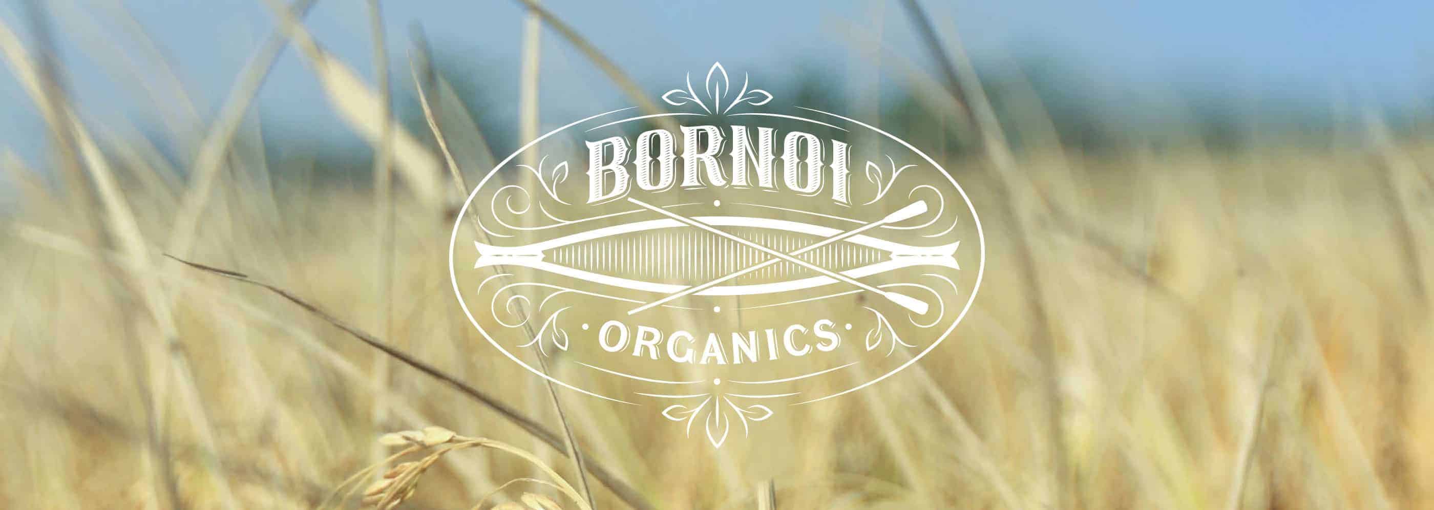
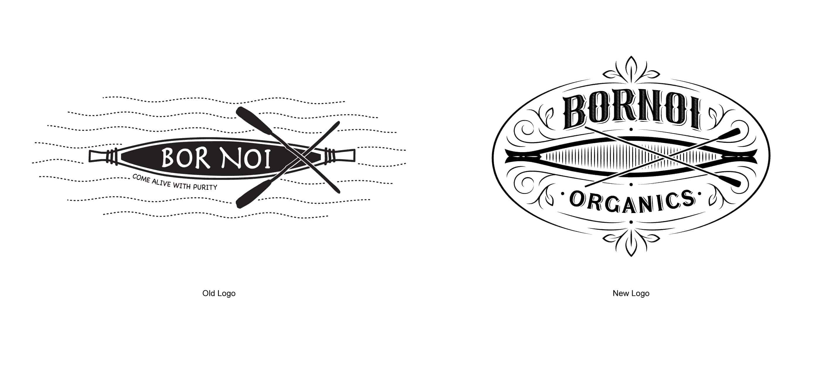
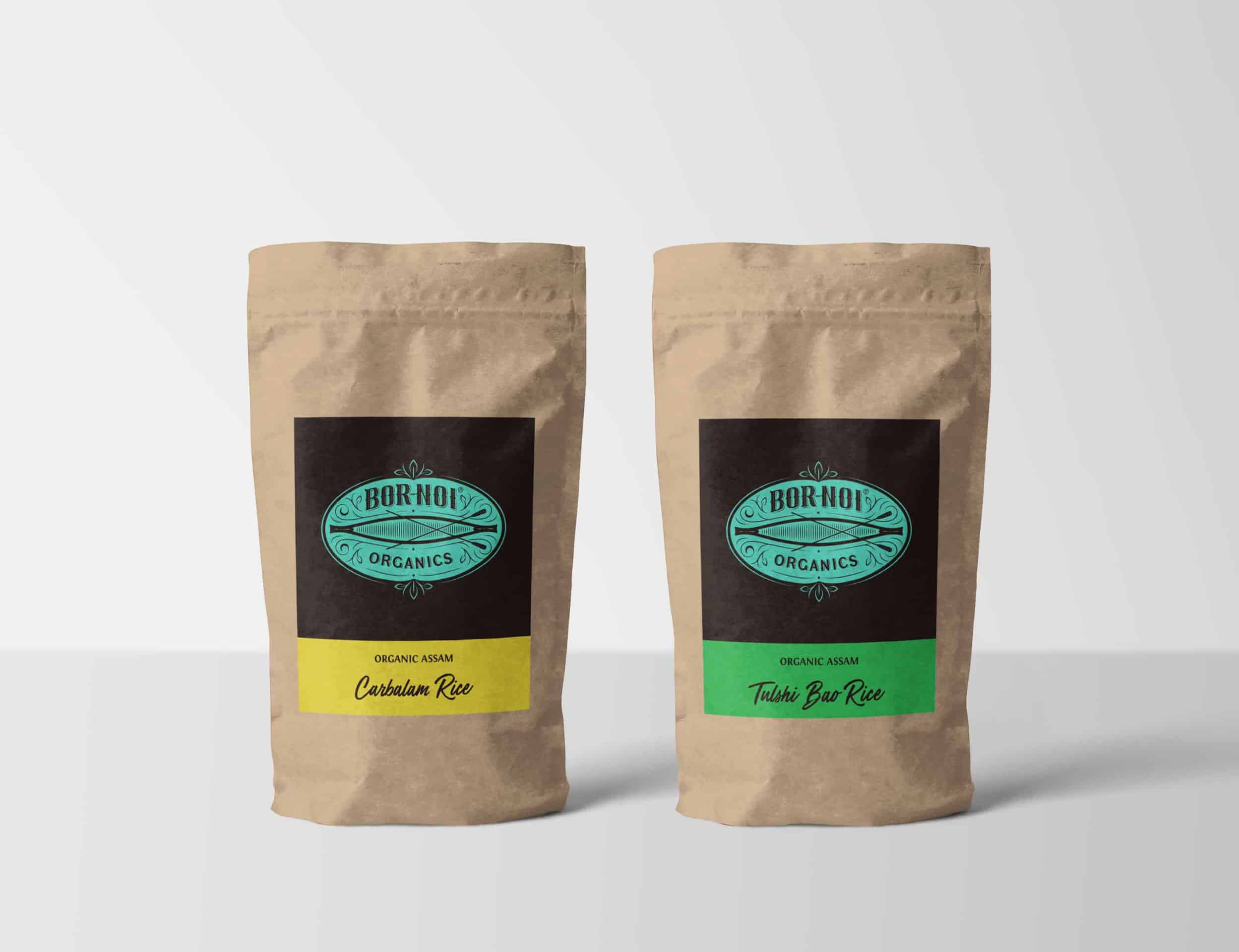
Bor Noi's existing identity uses the mighty river 'Brahmaputra' that flows through the region and a 'Riverboat' as a symbol of men and nature living in harmony. It also stands for Bor Noi's endeavour to infuse good thought and purity into the minds and lifestyle of the people and promote its belief in traditional farming practices and the well-being of organic homegrown food products. The identity refreshment seeks to uphold the ethos of the brand and stay true to its belief in purity and sincerity using the same core elements.
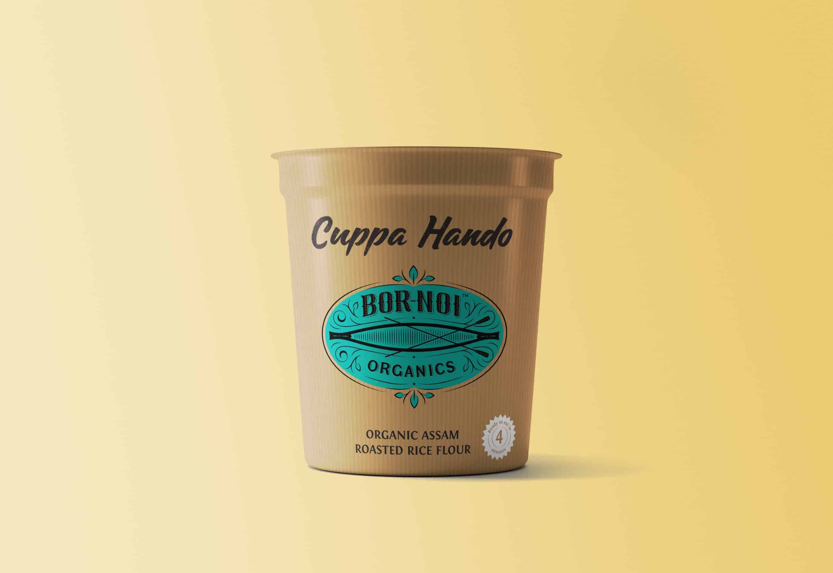
The identity is laboriously handcrafted with multiple iterations of refinements to achieve a balance between the brand's belief in purity and their commitment towards traditions, nature and the people. The logo uses black and teal as the primary colours and creates a stark contrast when it is placed in the brown kraft paper packaging. The colours are modern yet close to nature. The 'Bor Noi' emblem is a combination of custom hand-drawn typography and clean illustration with a varying stroke width to create a balance between age-old traditions and practices remaining sincere and committed to the modern and healthy lifestyle of the people. It uses subtle flourishes to reflect nature, leaves and ripples in the water. The riverboat is a symbol of a bond between men and nature and also signifies a new journey of health and happiness.
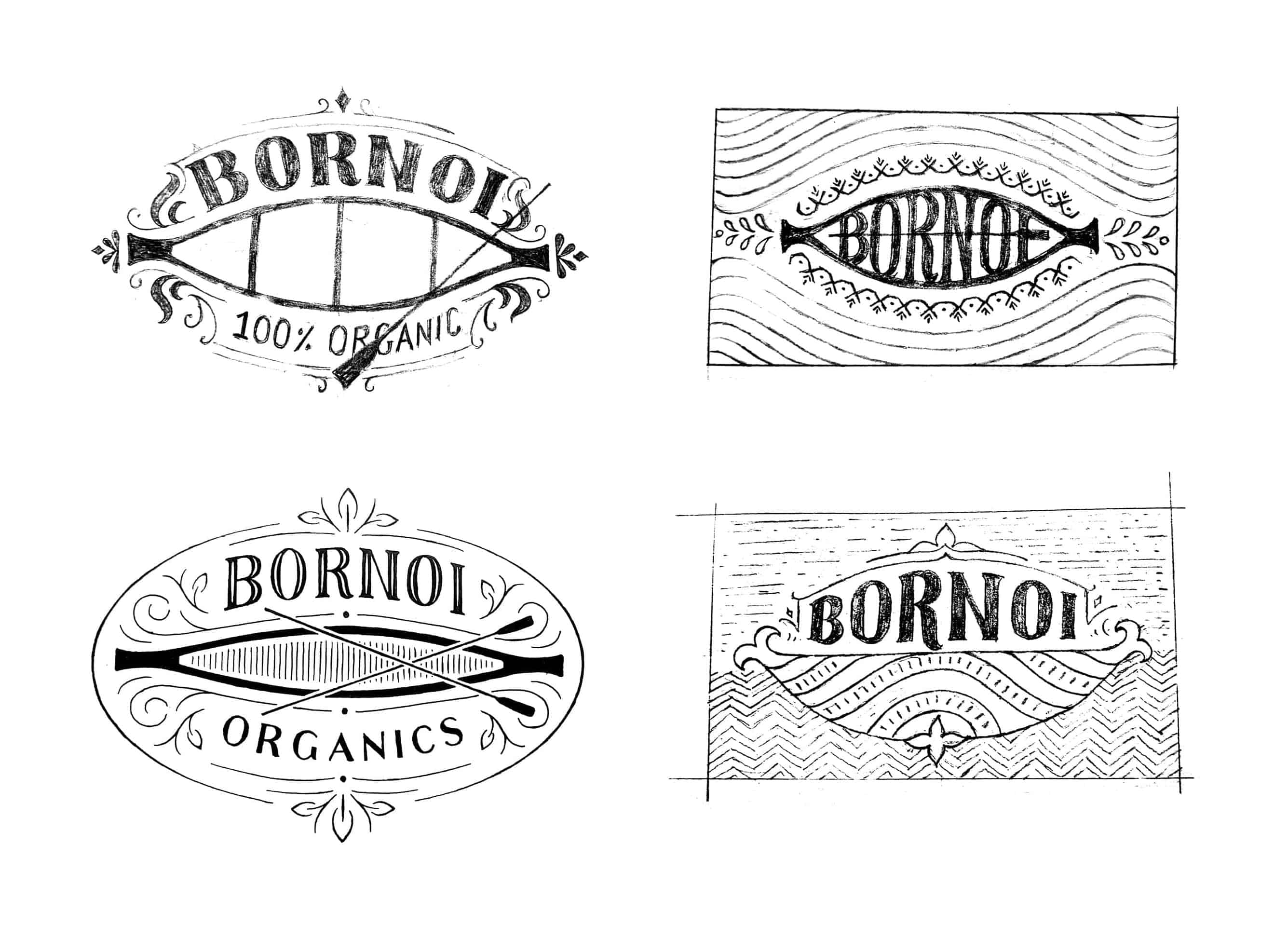
The identity refreshment process started with a careful understanding of the brand philosophy and what the old logo signified. It was key to identify the graphic elements and the meaning associated with each of them.
Concept sketching and detailing:
Once the elements for the brand emblem were identified I started drawing concept sketches in A4 paper with a pencil. The concepts were then shown to the client and we agreed to move forward with one of them. Next, I worked on refining the sketch adding details to the illustration and the typography. I used tracing paper to add new details and refinements. After multiple iterations, the final drawing of the emblem was approved.
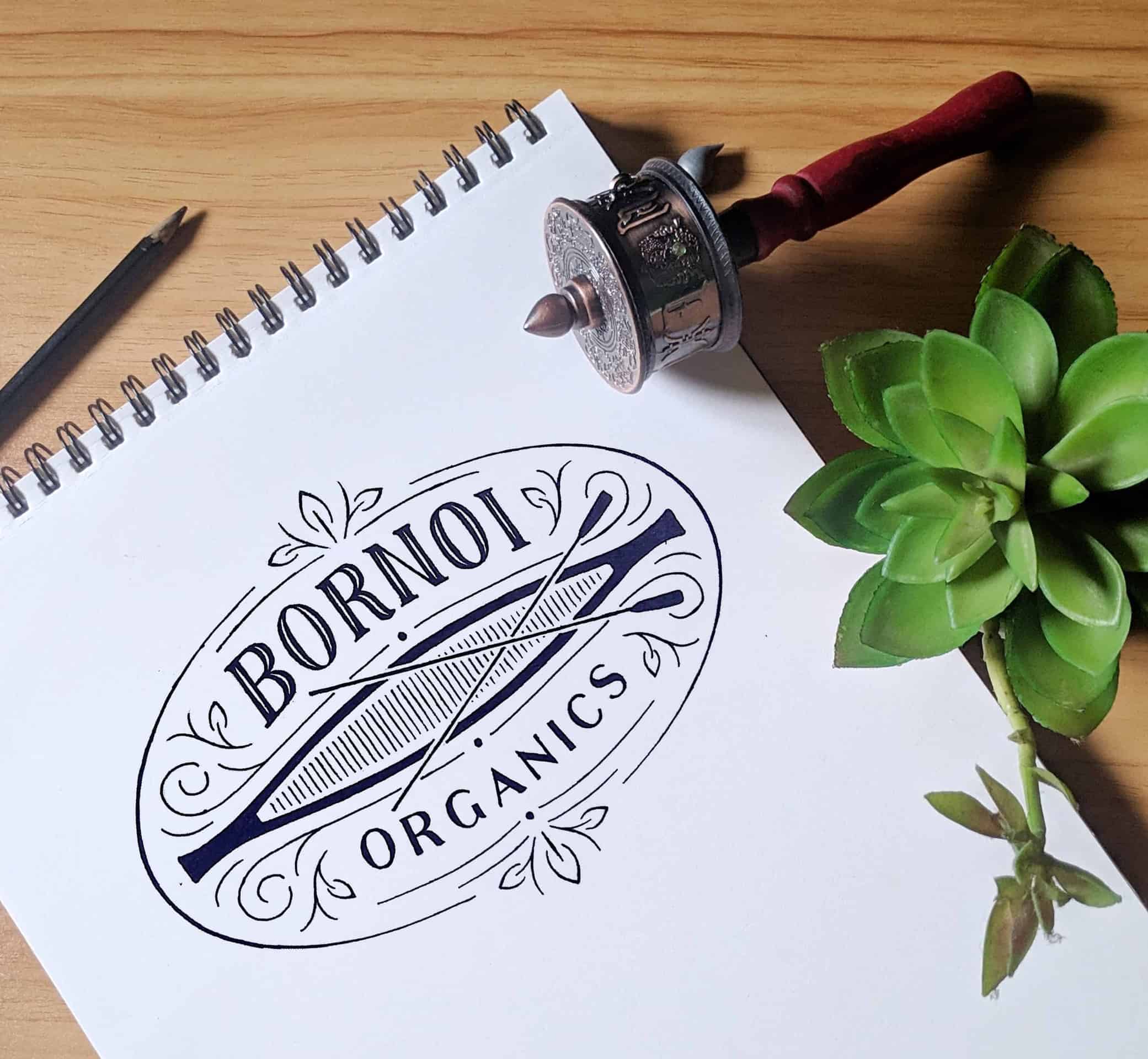
Scanning and digitizing:
The final drawing was then scanned and opened in Photoshop to clean it up, add contrast and make minor corrections. The cleaned-up image was then opened in Illustrator and convert to the vector form using the pen tool and minor refinements were added to get the finished brand emblem.
![]()
The new Bor Noi identity added a sincere and modern touch to the brand image. It also upholds the philosophy of the brand by keeping the core elements of the old logo yet adding a refreshing new identity to the brand. And the people seem to understand and appreciate the brand and its endeavour to bring natural goodness to their health and lifestyle.
It is very essential to understand the brand philosophy and its elements that can help identify the brand. I learnt from this project that each aspect of the design process is significant and should not be replaced or skipped trying to obtain the result in a shorter time. The minutest of the details makes an identity design memorable.