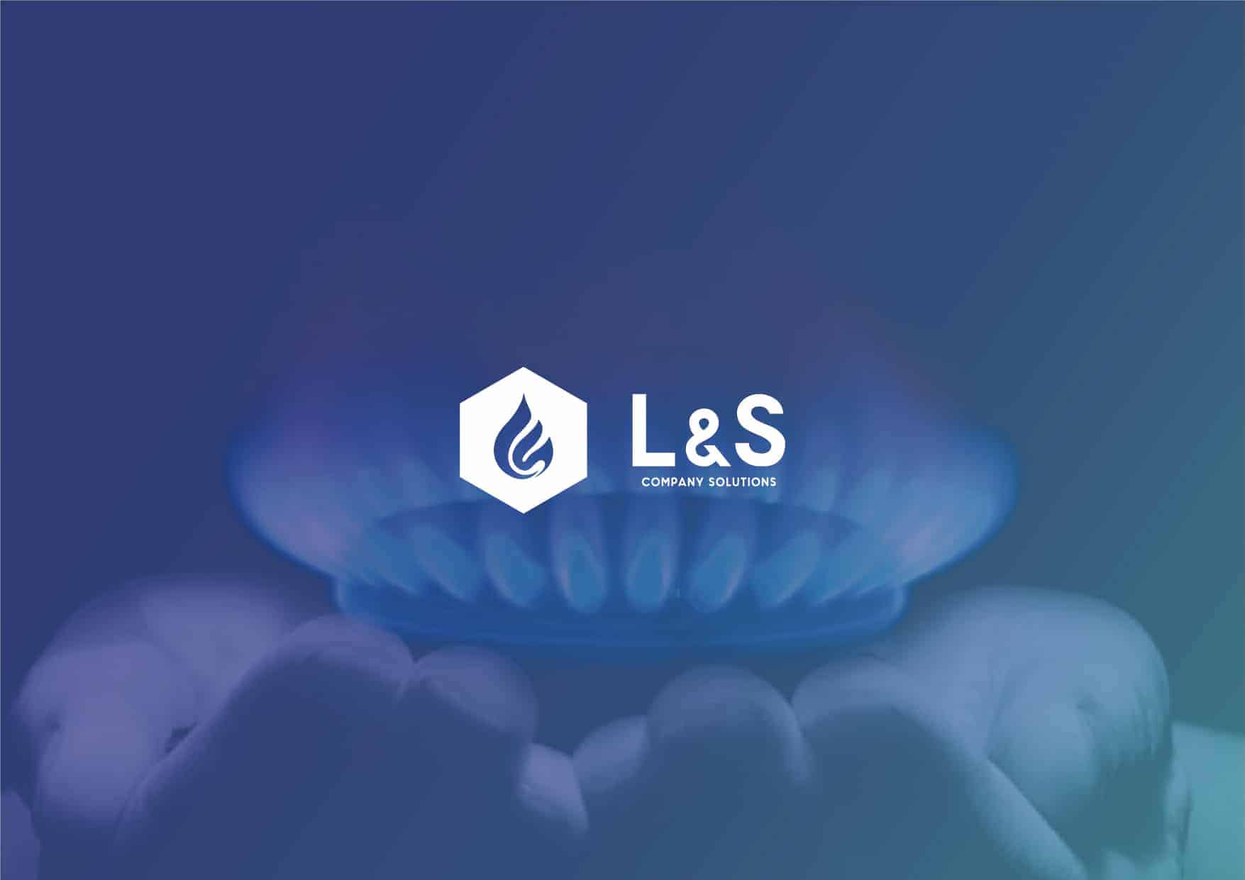
BRAND REDESIGN - L&S COMPANY SOLUTIONS

The Brand redesign of the company L&S COMPANY SOLUTIONS.
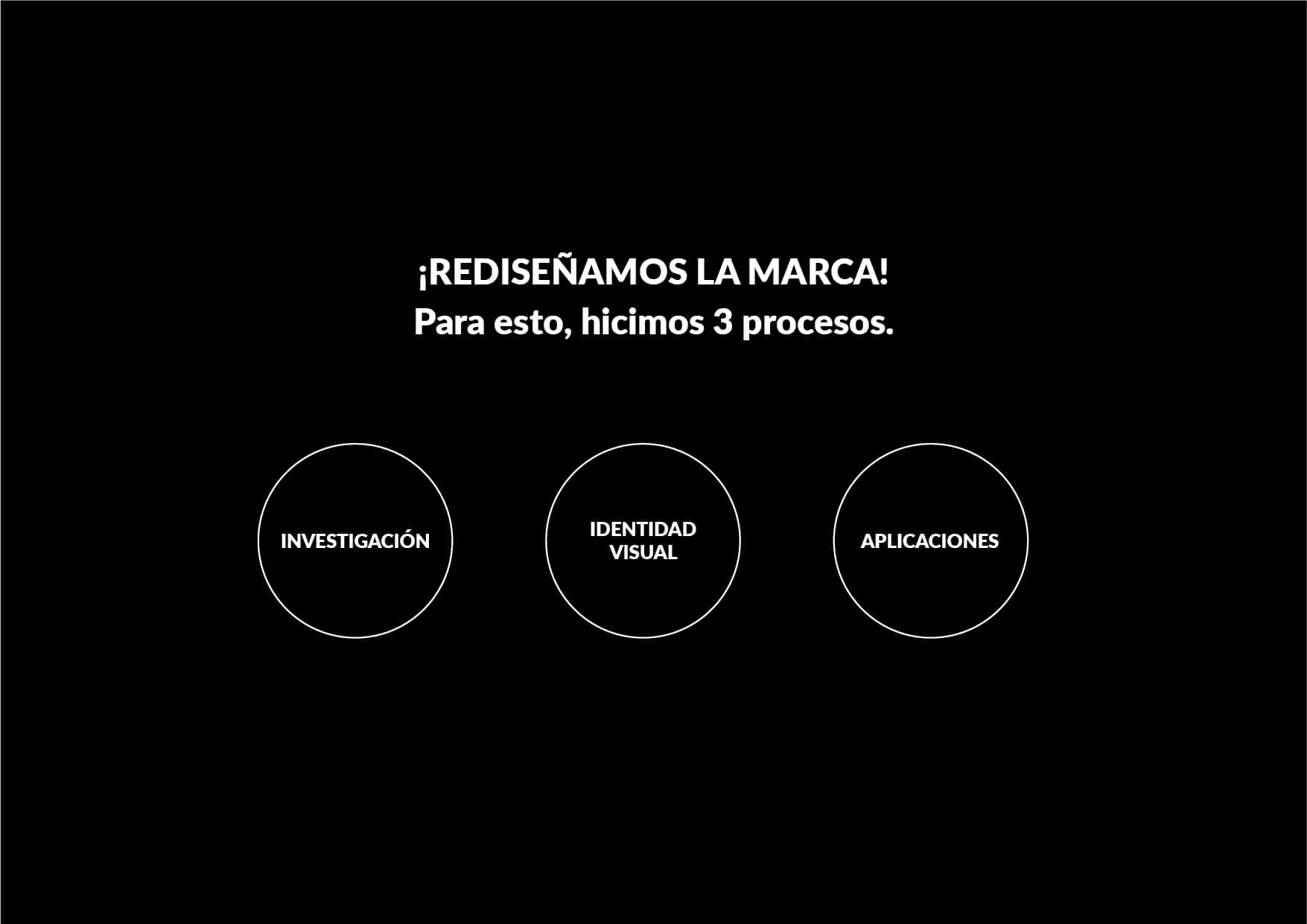
Consisted of the redesign of the visual identity of the current brand.
Company with extensive experience in the market of hydrocarbons, CNG, CNG and GNR.
The brand needed a visualization by its customers, as a serious and innovative brand in its sector.
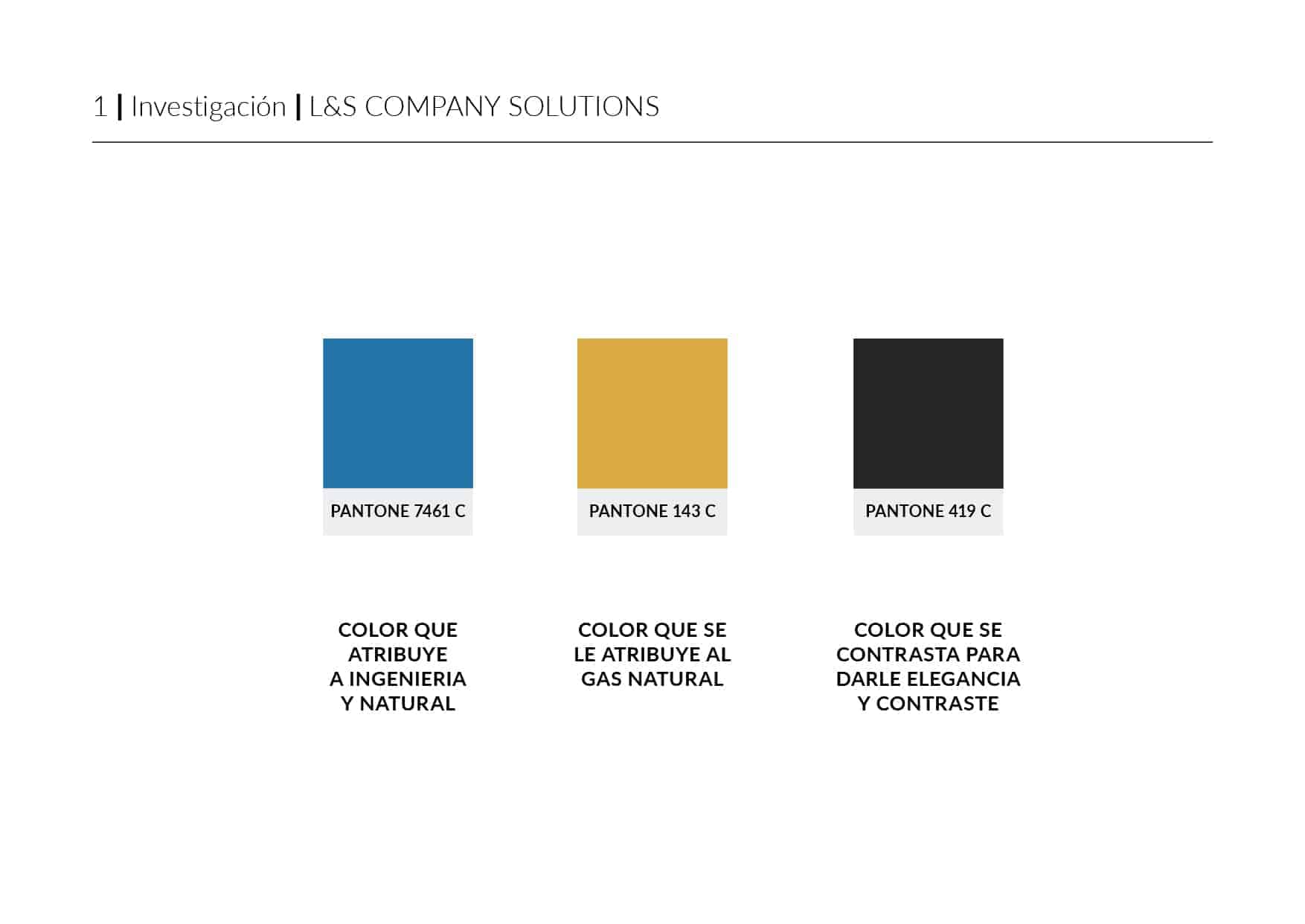
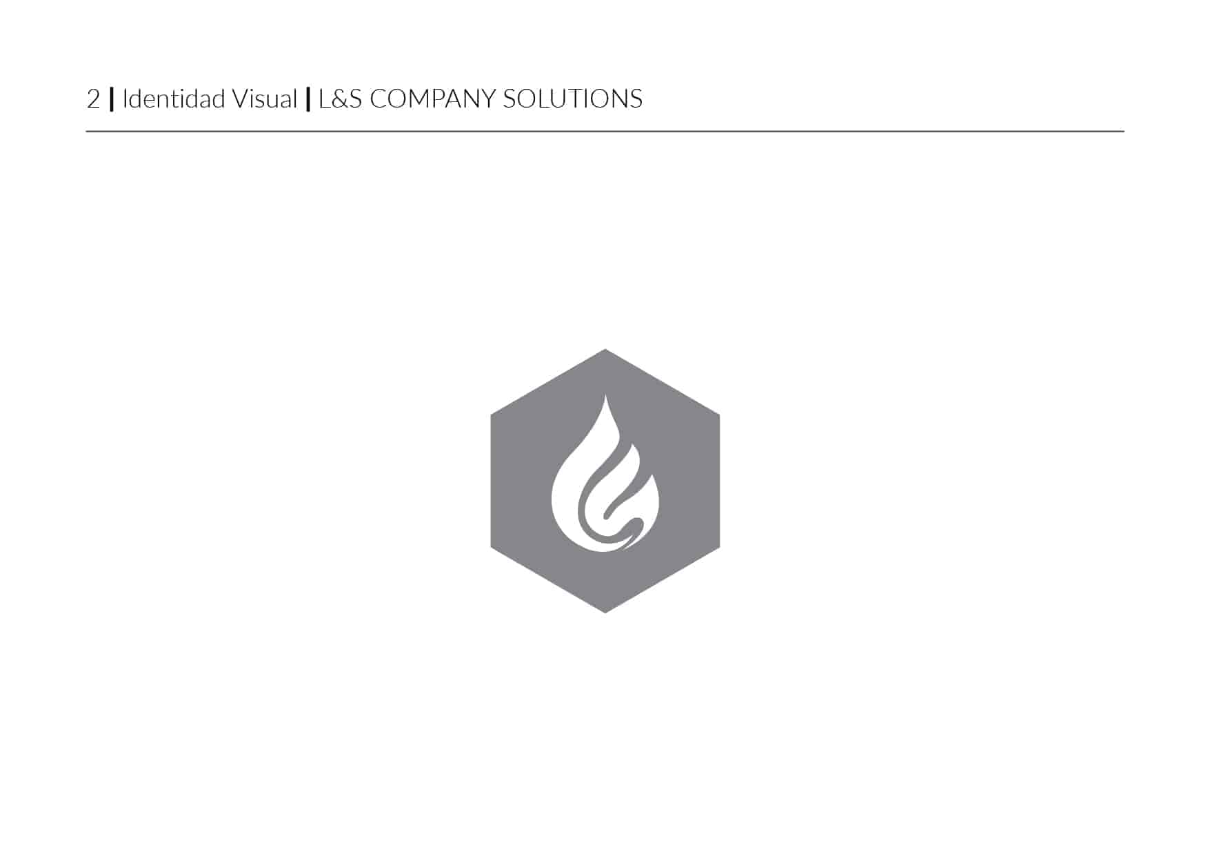
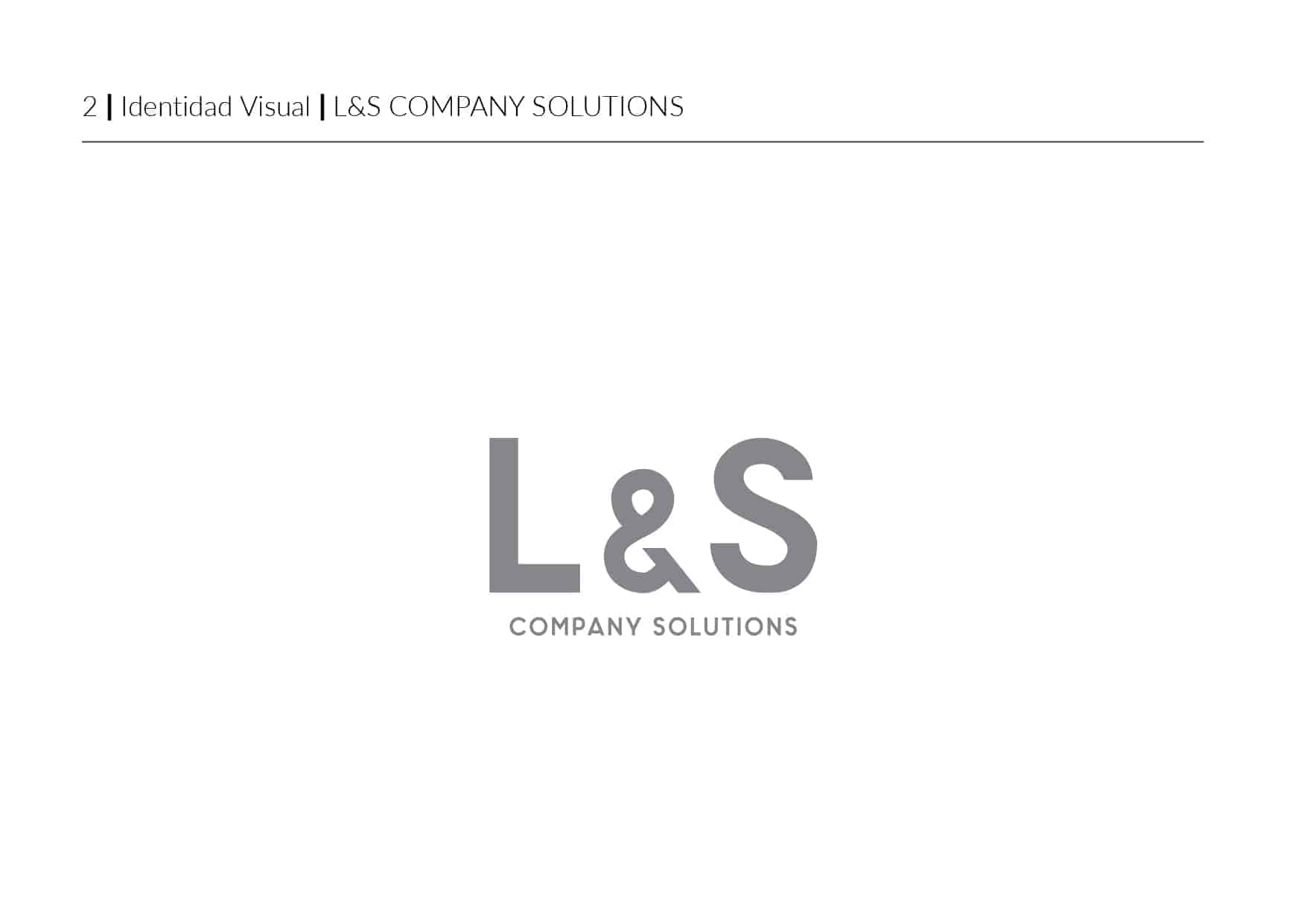
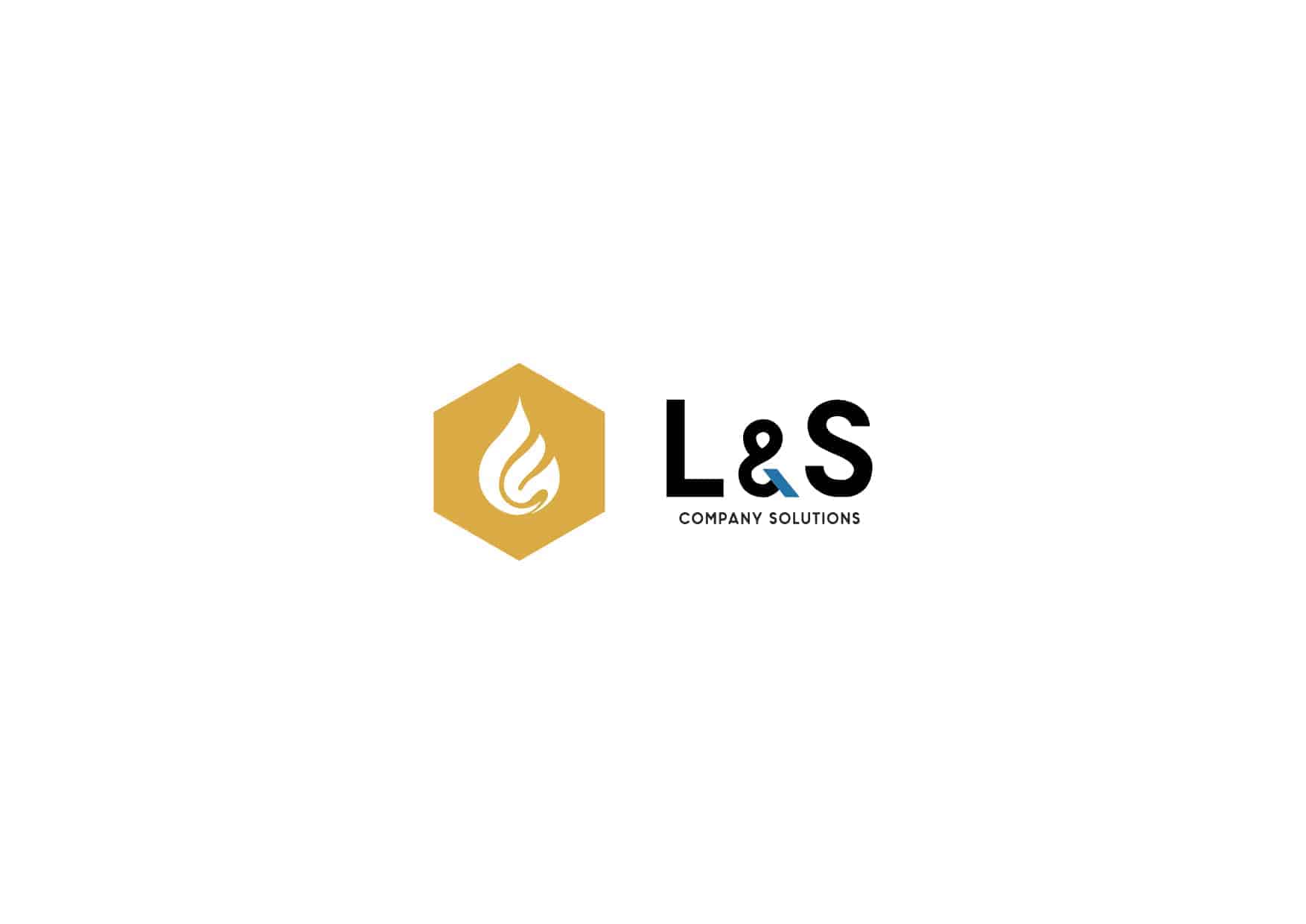
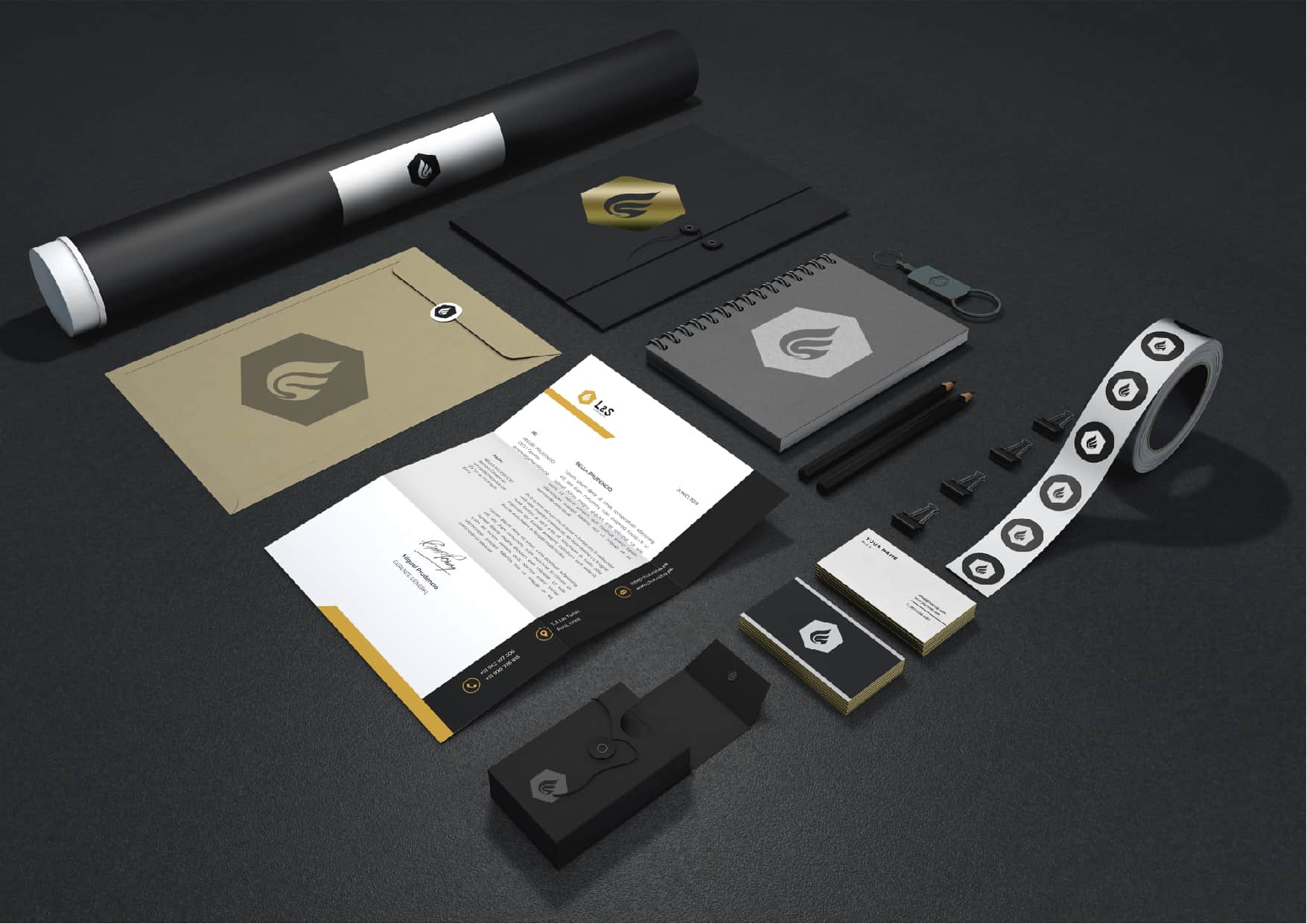
For the visual style of the brand, I opted for a minimalist and elegant style capable of being reproducible in different formats, the colors visually represent the concepts that are attributed to the brand, colors such as blue to imply nature and engineering, the yellow color representative of natural gas and the black color with a lower hue for contrast and elegance.
The programs to perform the redesign were specifically two, Adobe Photoshop and Adobe Illustrator.
Initially I collected visual information and made visual sketches in Illustrator, taking as a final result the final logo and isotype.
For realistic representations or mock ups I used Photoshop in the realization.
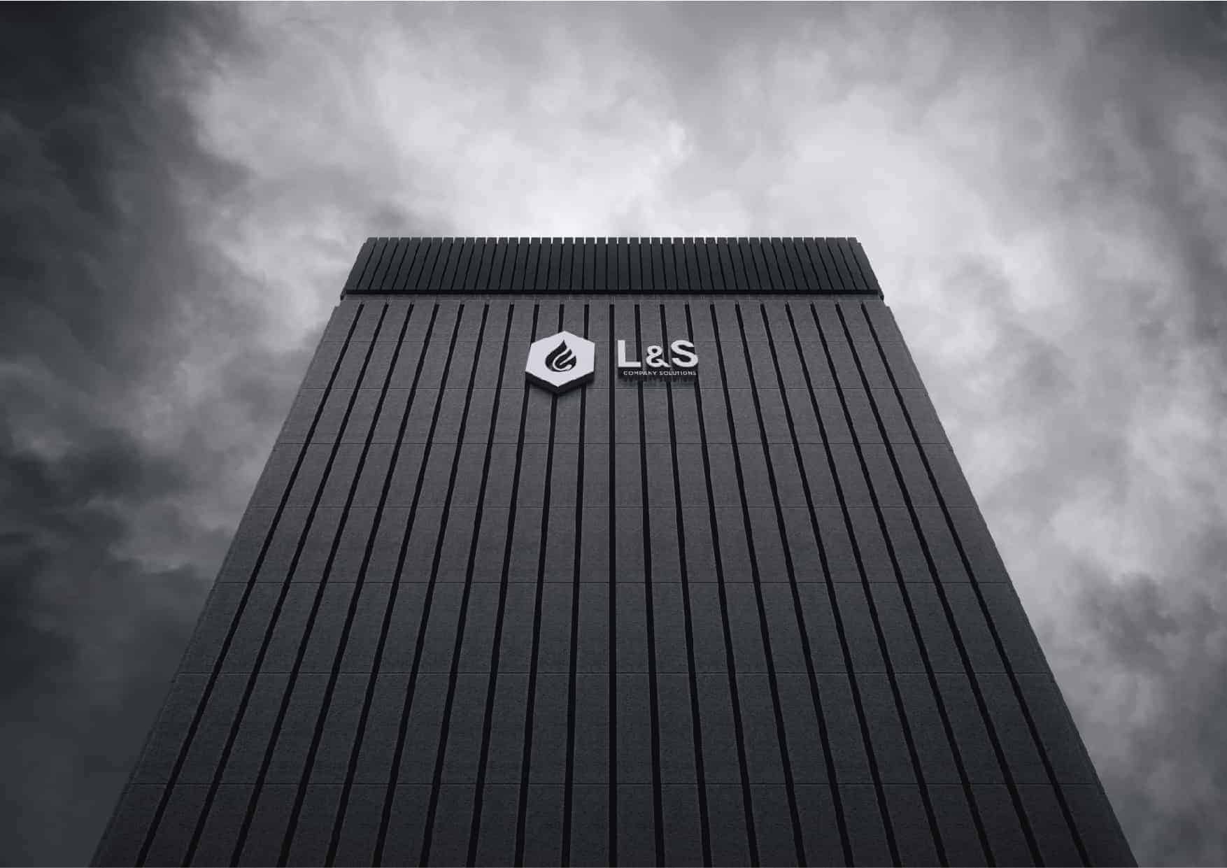
The result was positive for the client, adopting the redesign in the best way. As for the company's clients, they began to see it as a much more modern and serious company that differed from its competition, thus denoting the change in the way of communicating with them, giving the necessary confidence to take the services.
If you want to see the complete project visit:
https://www.behance.net/miguelangelpc
Great work!