Brand Studio - Identity

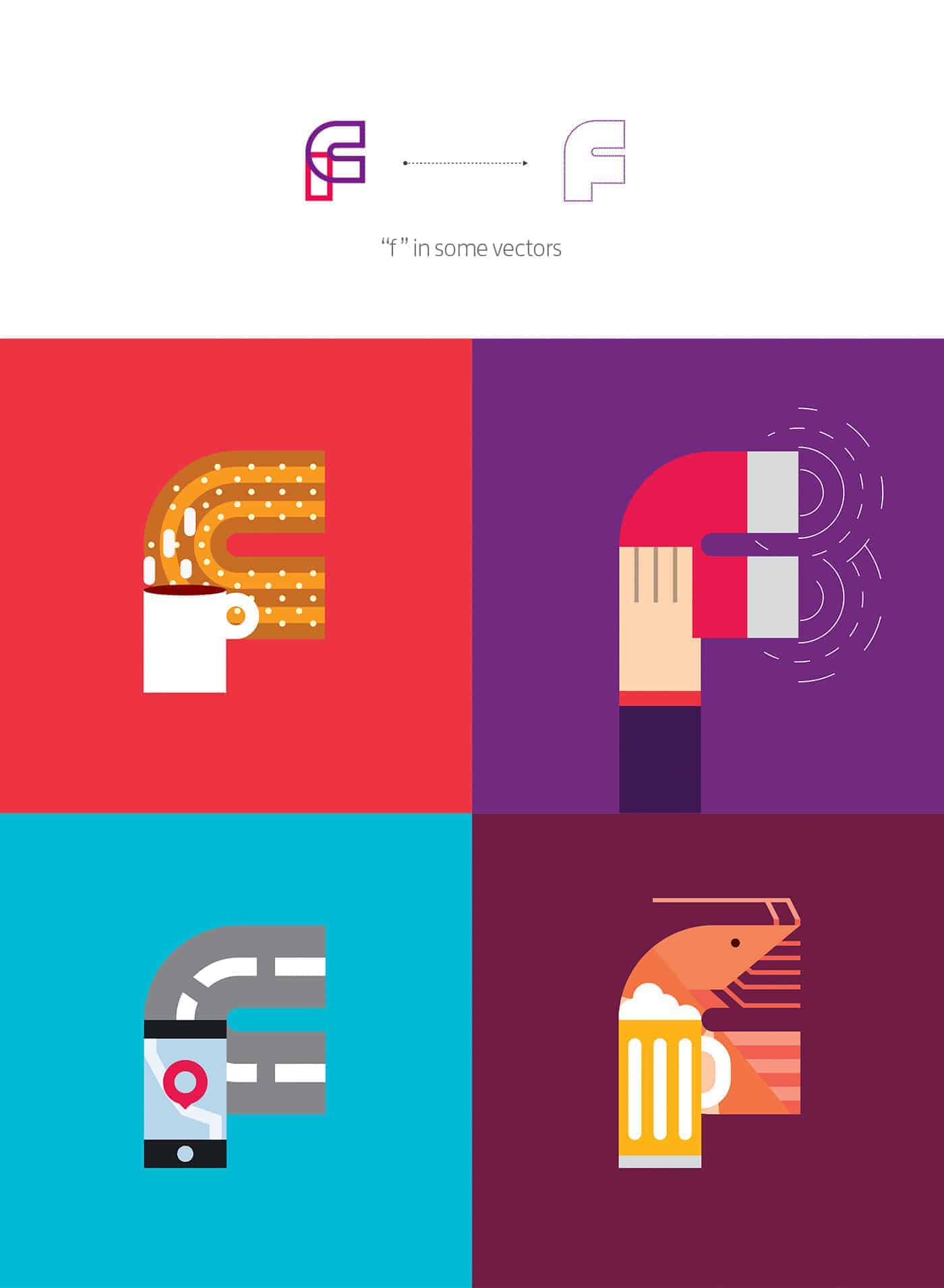
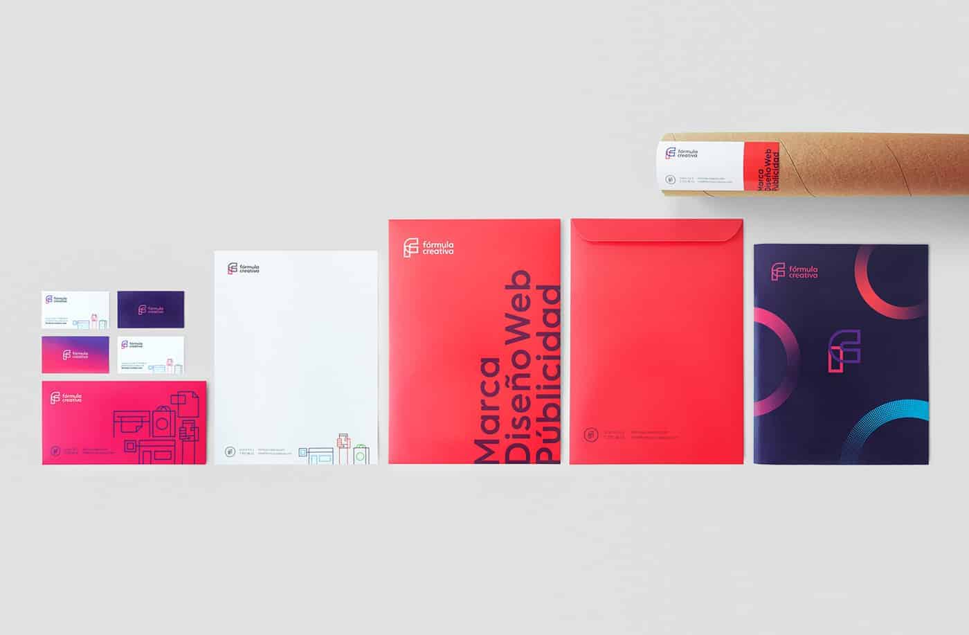
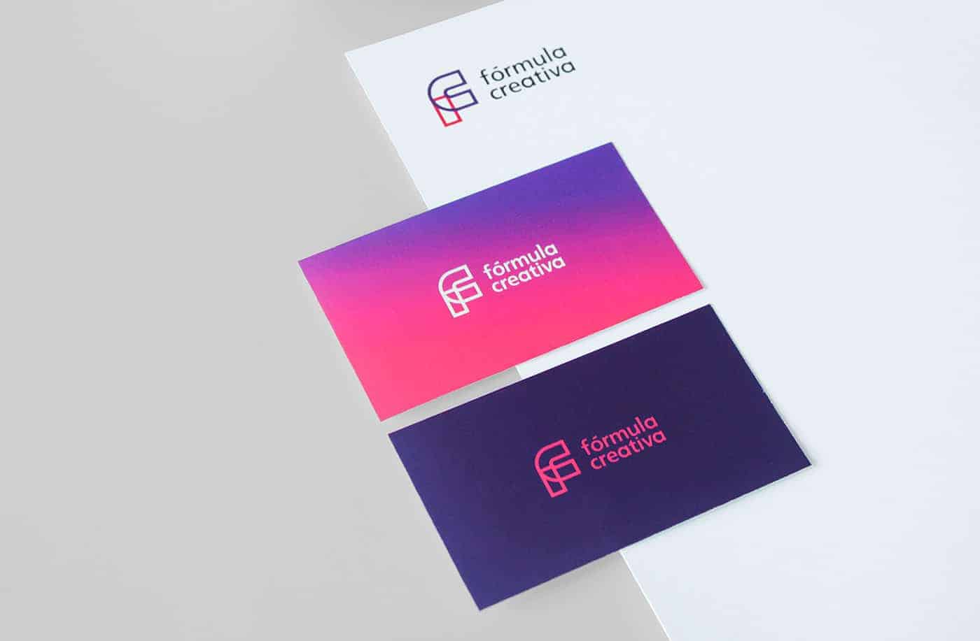
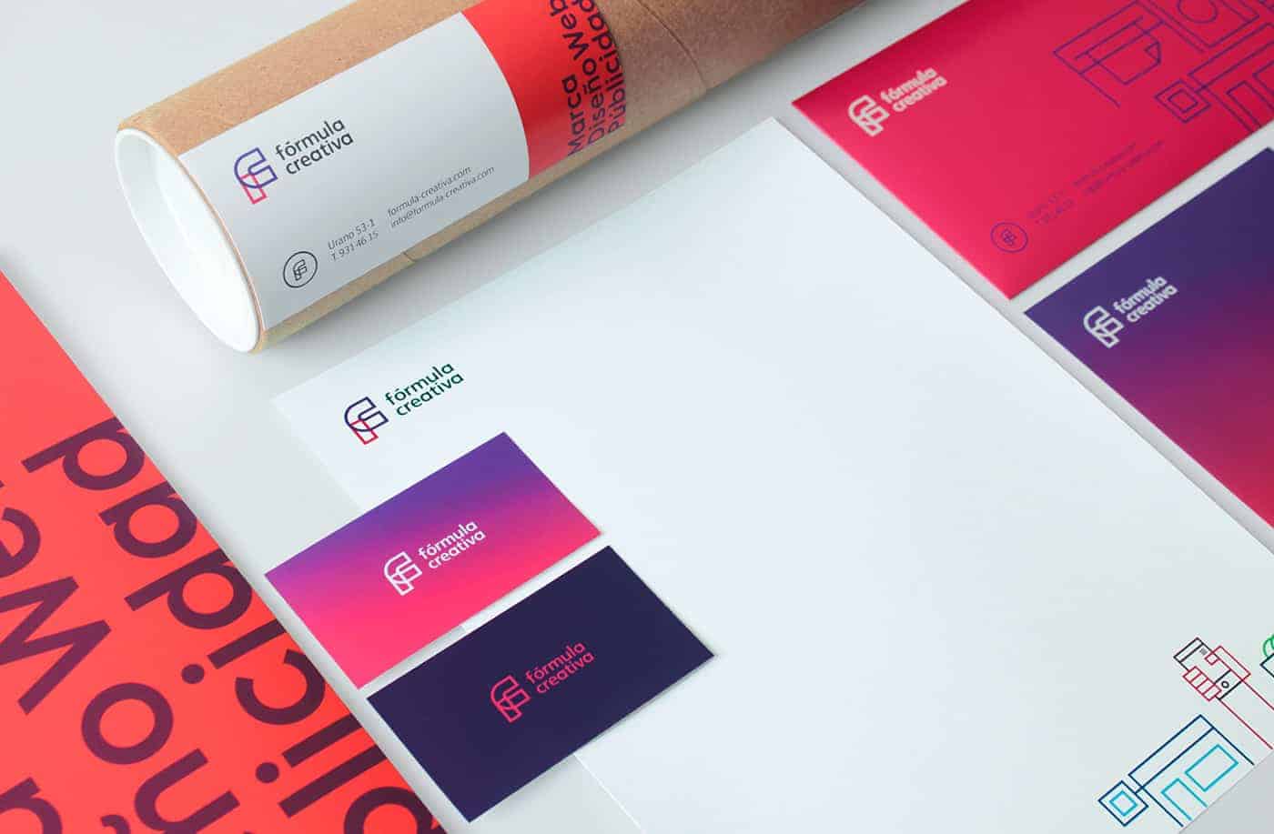
In 2012 we started our logo and design activities inspired by a beaker with "formula" full of color ; this design was very colorful, our current design rescues essence of our previous identities. The dictionary defines fórmula as an expression combination of symbols, we reference this and implemented it in a new identity that merges the letter F and the letter C that results in a monogram FC. We use icons representing each of the services we offer based on the lines crossing monogram.
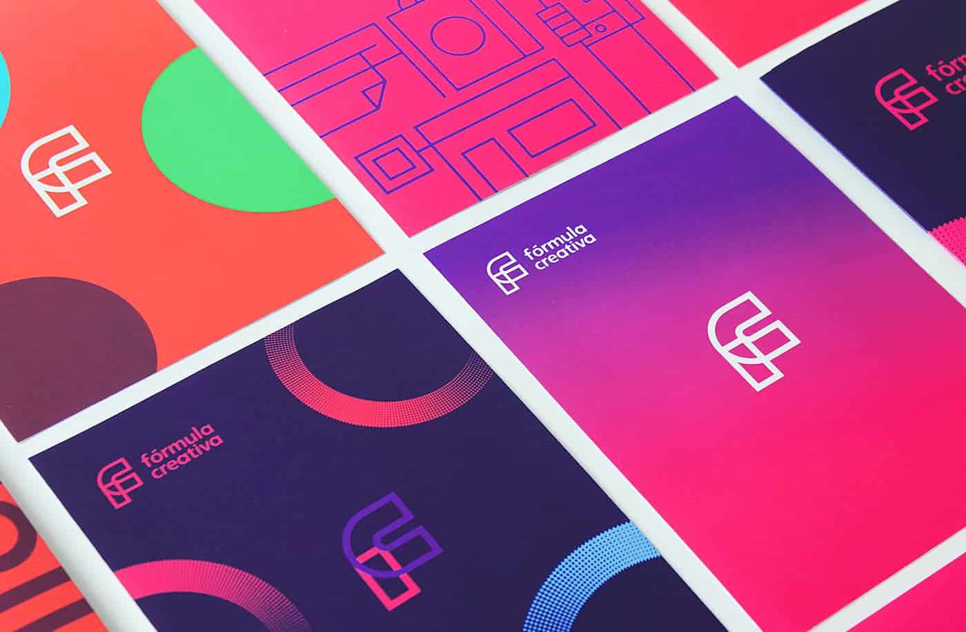
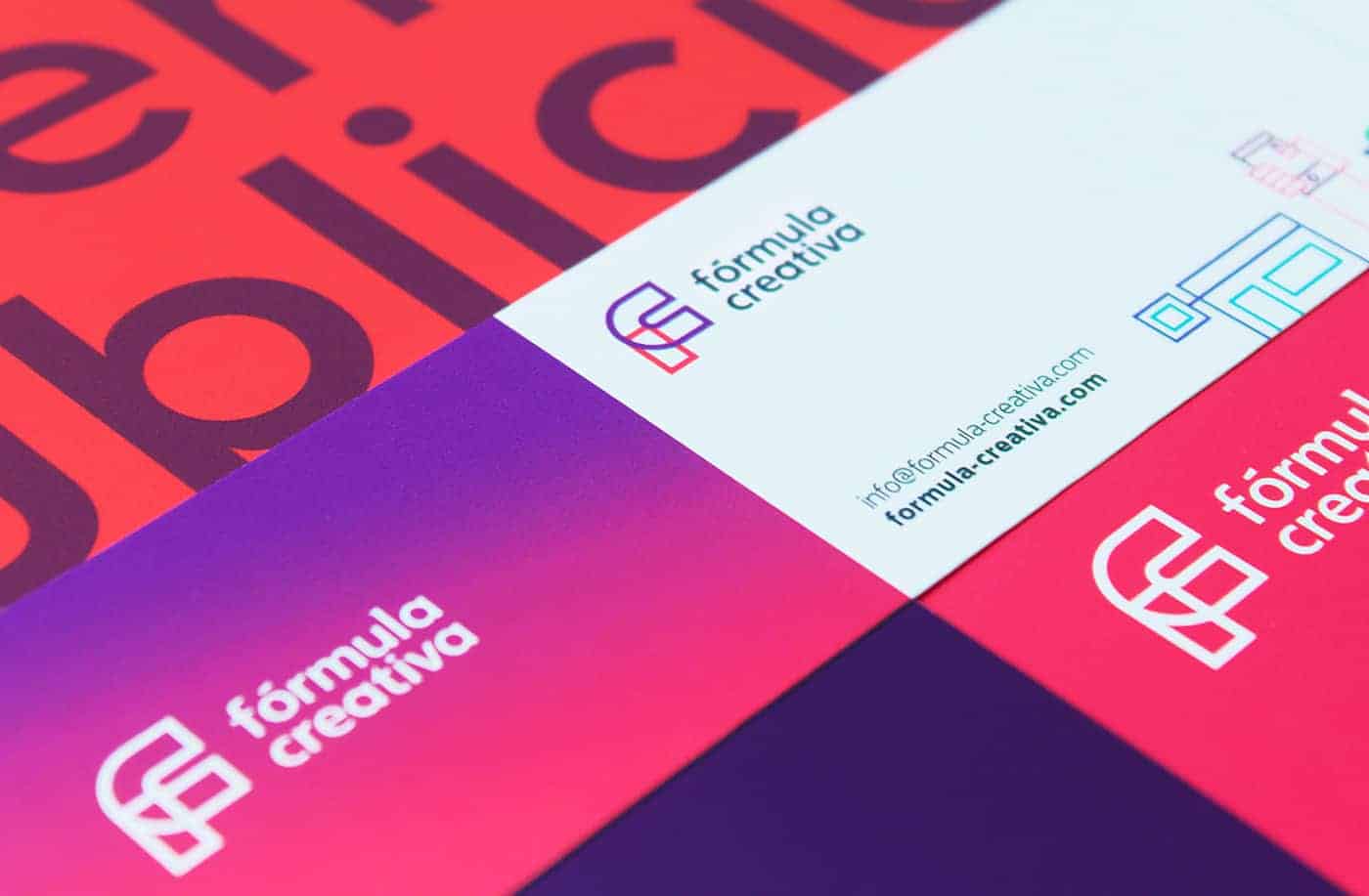
We wanted a colorful and simple identity that represented the feelings that generates a brand and everything it implies. We did the design that was easy to apply, very versatile. Many sketches were made, then we generate the graphics with illustrator and print stationery
![]()
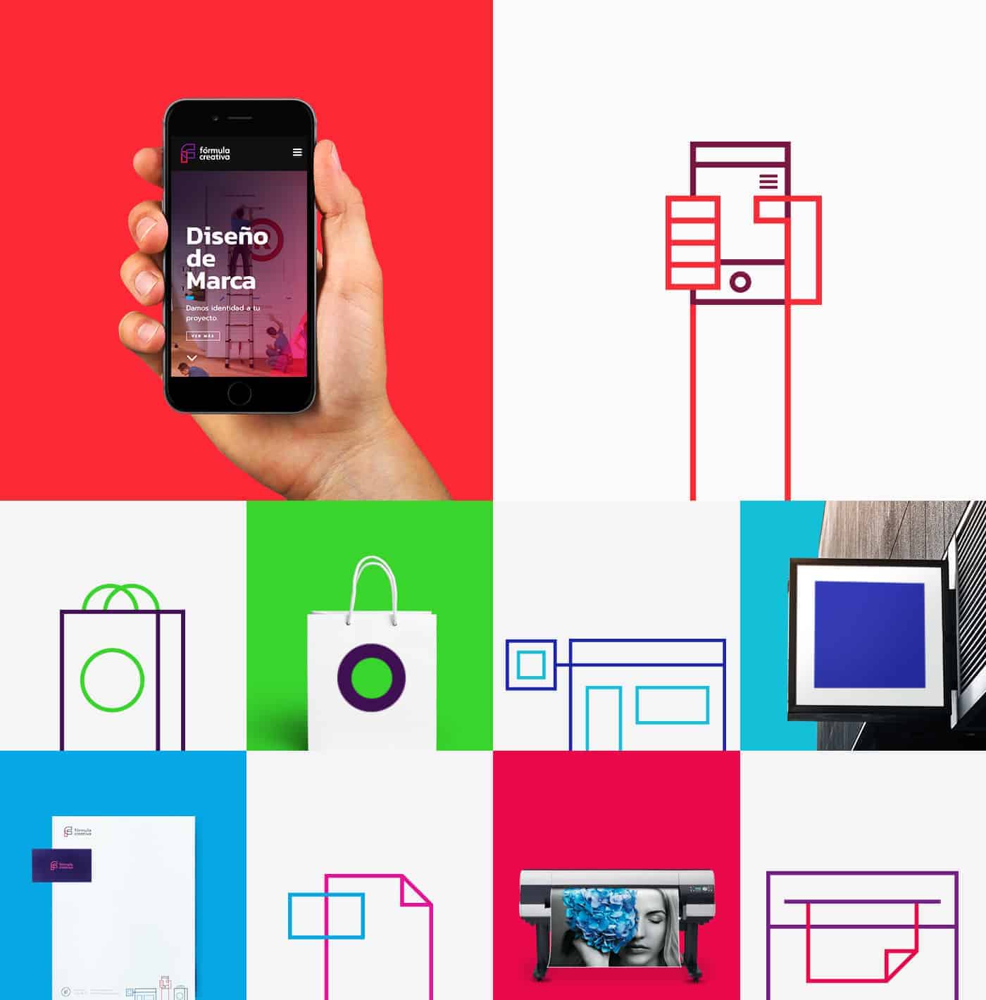
First several sketches proposal was made for the new branding, then proceeded to draw in illustrator once proposed taking digital version proceeded to print each to enhance details of color, style, again we proceeded to make the changes and choose the way forward, then the graphics for institutional stationery, lconos were made; each represents the services we offer ( identity, branding, responsive web design and packaging), shapes, typography.
After we finished printing, we proceeded to perform a photo shoot with a Canon Rebel T3i


The response of the people has been good, in our portfolio of behance highly appreciated the project, as have shared and have been invited to post our project sites specializing in design. We learned to take time to look into further details.
Thanks for taking your time to appreciate my work is very important. motivates us to continue designing