Branding Project For Engineering Consult Firm

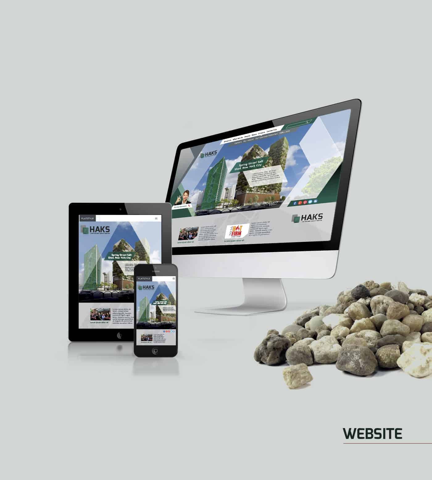
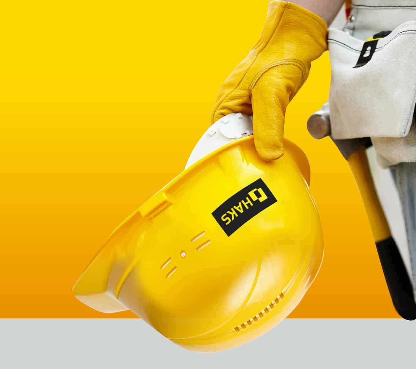
Haks - Is a engineering consulting firm grow into a mid-size, that provides full-service architectural and engineering. The company wanted a rebrand in its 25th anniversary. Research about the projects in which the company had participated and i found a firm who is supportive work culture with varied career paths, restore, mitigate, rehabilitate, convert and preserve critical infrastructure. What inspires me to take the graphic direction that the project required creating a new 21st century image for the redesign of the logo, stationery, brand applications and finally a new website
I started to build on the primary colors of the brand, green, gray and its variants, help create a theme of harmonious color, ensuring accessible text and distinguishes identifying elements and surfaces from each other.
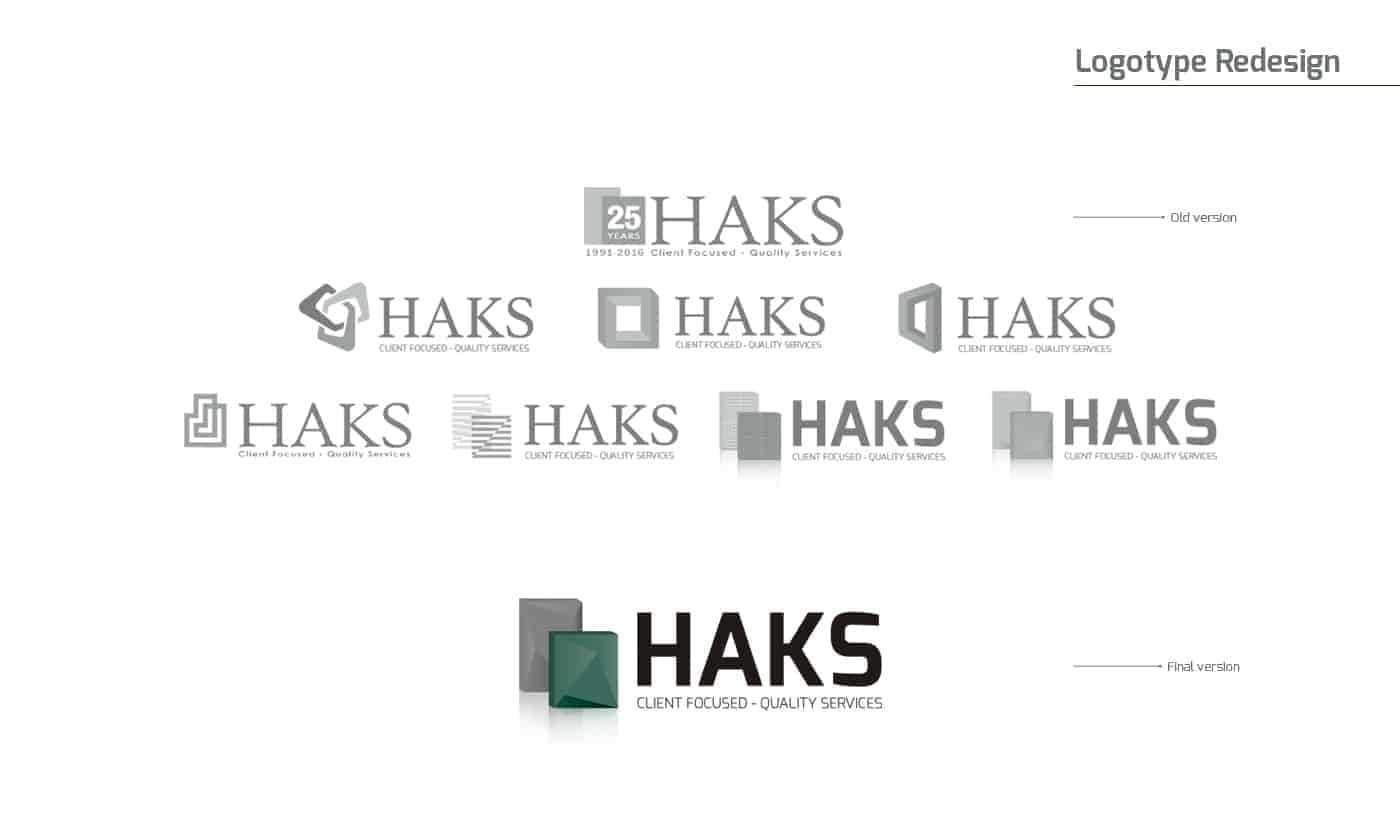
Then I tried to work on logo redesign, working as efficiently as possible with the shapes to achieve give the brand a new millennium look... some brand projects require collaboration, so I use the team environment to check the best variations of form to ensure i'm on the track.
I Focus on the quality materials they used to development of long-term projects and i use it like a platform to build the new image based on different kinds of texture and materials of constructions.
Believe it or not, I start with dollar store Scribble pads and regular Papermate pens to flesh out ideas.
- I want to make sure I have the image fully in my mind before I commit onto canvas
- I tend to favor Illustrator over others verctors programs. Illustrator — It packs a punch with a host of features that give you control over every aspect of your logo design.
The pixel grid makes it easy to cleanly align objects.
When color needs to be used sparingly, gradients can be very effective. Illustrator enables interactions with gradients directly on an object. Users can even apply gradients to individual strokes while still controlling placement and opacity.
When we talk about digital work with photos - of course Photoshop, but I have Adobe lightroom too - and a Wacom. The open source equivalent seems to be Krita - I haven’t played with it yet, I may - just to offer a fair assessment for people who can’t afford Photoshop. Krita’s UI looks like PS’s.
The main challenge with this rebranding is trying to maintain familiarity and consistency so that the customers will remember the firm. I use 3d shapes that resemble moldable materials in modern construction and a fresher type of font, which will provide a feeling of solidness. I usually starts the identity system after the logo is complete.
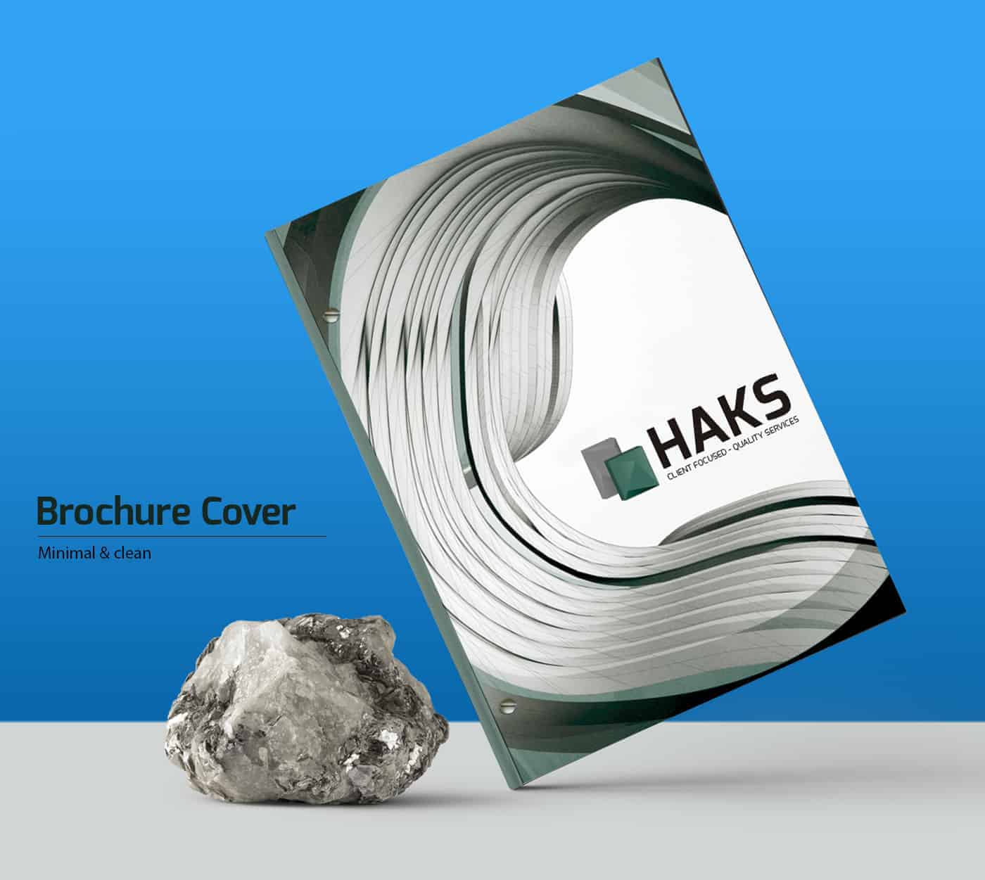
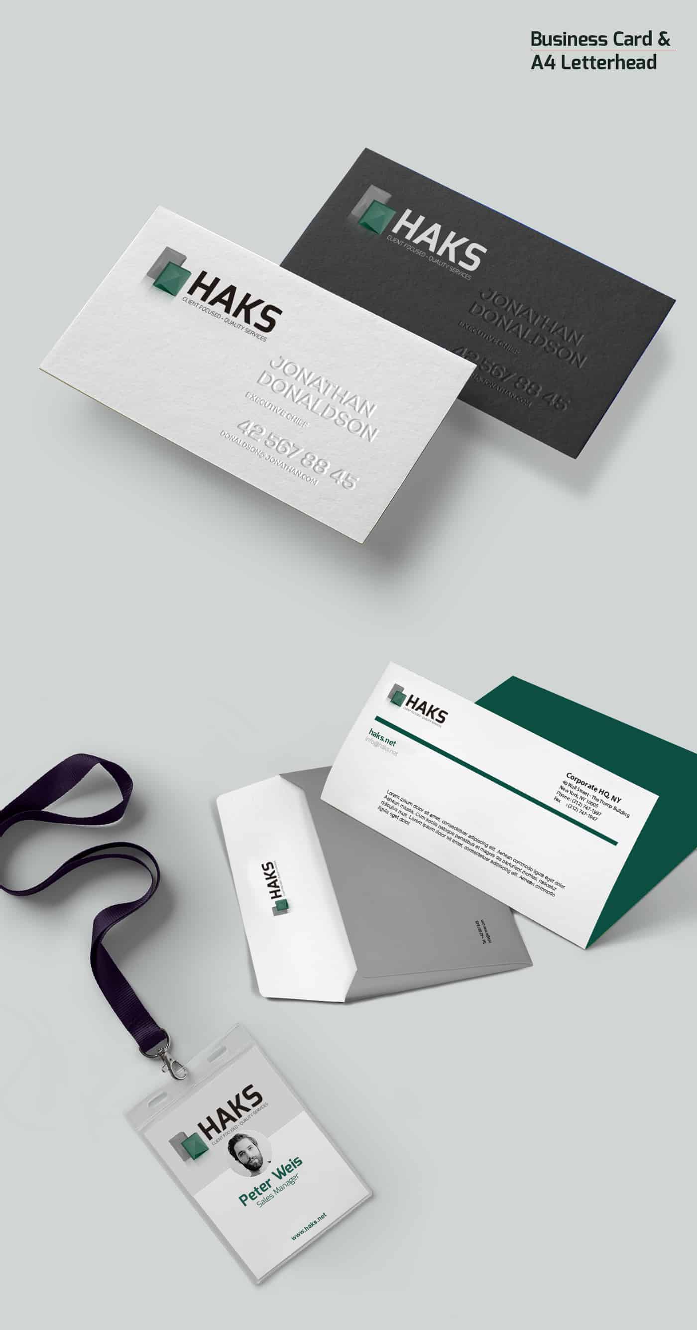
The purpose of the identity system is to form a systematic visual language around the logo — one that compliments the design thinking of the logo and offers a family of useful, flexible elements that help to design marketing and business collateral.
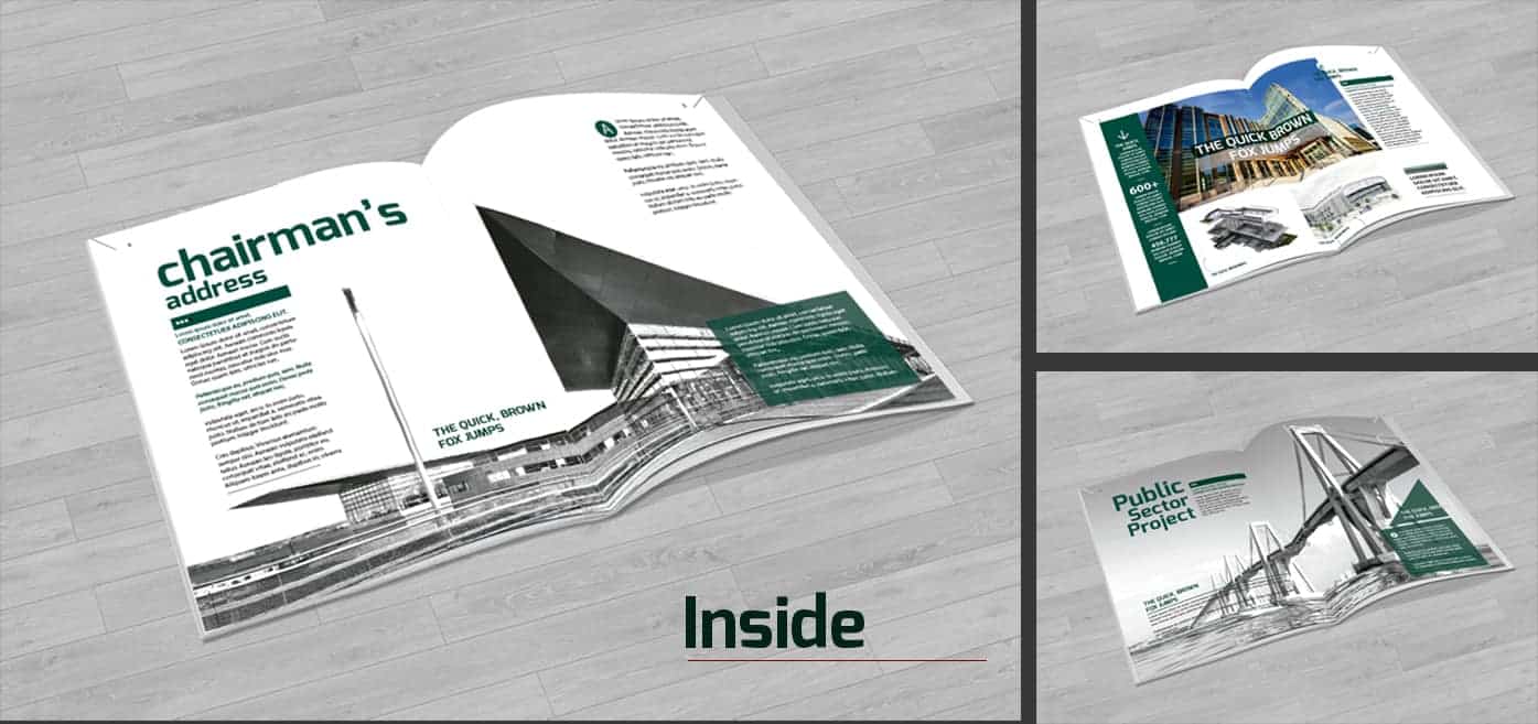
I’m proud of this print and digital project designed for this engineering firm. It was not my first experience working for this kind of companys but it was interesting to know more about the processes and ejecutions of masssive project of construction in citys like new york. I search a lot about this market and gathered critical data to overhaul the design.