British Film Institute

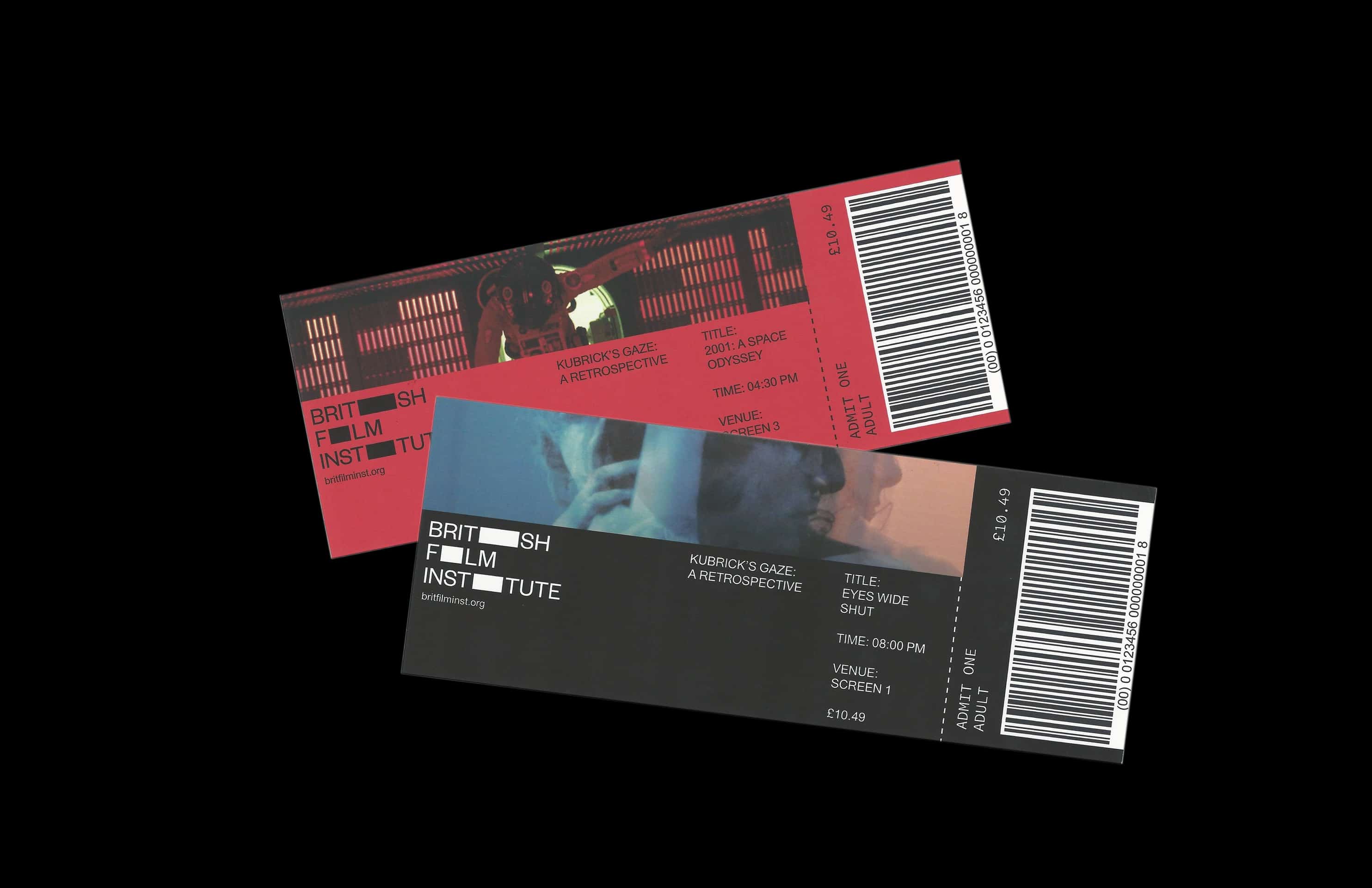
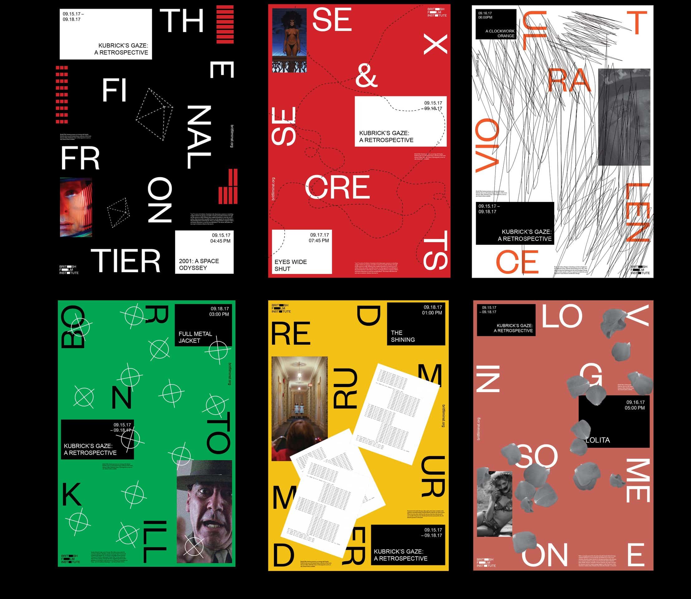
For my class project, the brief was to create a brand new identity for the British Film Institute in South Bank, London. The new British Film Institute rebrand is a modernized archive for today's British audiences and audiences around the world. Focusing on simplicity, the new identity is based off of the various cinematic screen ratios, with each variation of ratios being used as the 'i' in the mark. The mark can also work as just typography, typography and ratio forms or the three ratio forms. The new identity evolves itself throughout the institution through various mediums in print - a monthly journal based off the institute's notion of being a modern 'archiv'- motion, and containers for information in posters and signage.
![]()
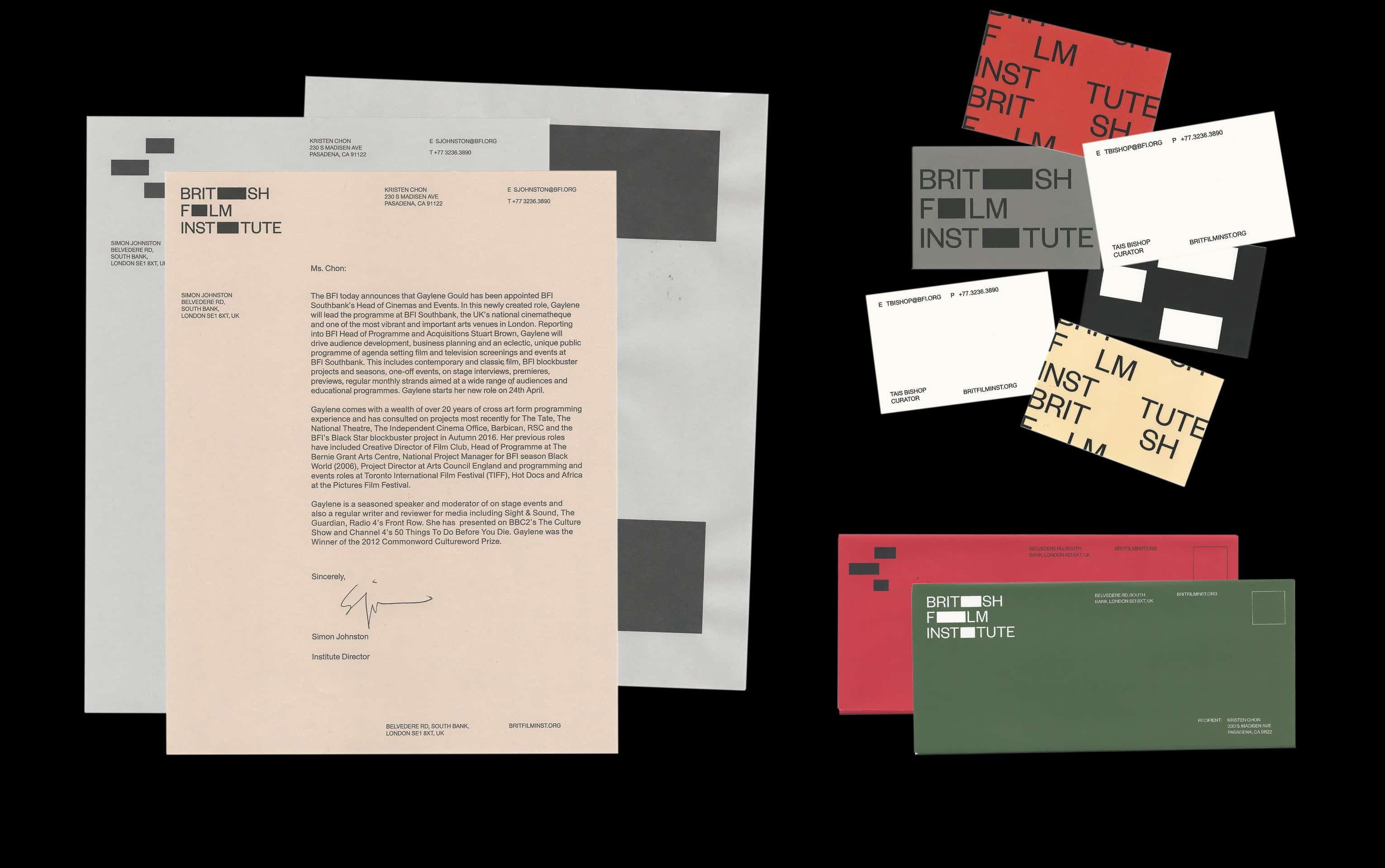
After doing some research on the technical aspects of film and cinematography, I was really inspired on bringing that technicality to the rebrand, specifically as inspiration for the logo. In terms of choosing the color palette, I was inspired by the palettes of the films that I watched during my research phase of the project, specifically films by Stanley Kubrick for the 'micro identity' - the posters. For the 'institute' identity, the colors were inspired by the various regions of Britain, the city, the countryside, and the 'royal red' of the monarchy.

Most of the tools I used in the making of this project were Adobe programs. However, there was a lot of sketching ideas and logos involved during the beginning of the project. I used various key word exercises and visual research to finally get to the decision that I would design the identity with the technicality of cinematography.


The response to the final outcome was overwhelmingly positive. It has been featured in the student gallery at my college, as well as being featured on the Graphic Design and Indesign curatorial page on Behance. This is probably one of my favorite projects that I have worked on and the outcome of this project definitely came out better than I expected after doing a lot of design research which is key to any identity system rebrand.