Camang:gam Brand Identity
The name of Camanggam is derived from 'Mukgam', which means black persimmon in Korean. We would like to continue the tradition of the ink stick with the seeds of the black persimmon tree growing in the garden of the black persimmon Stay.
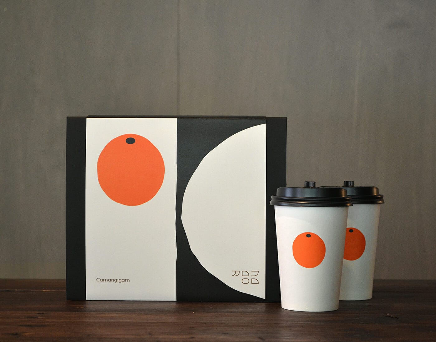
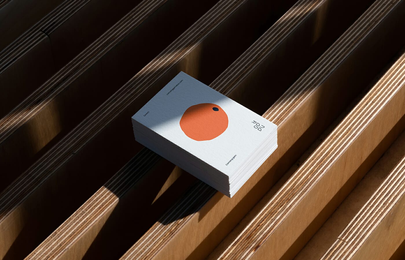
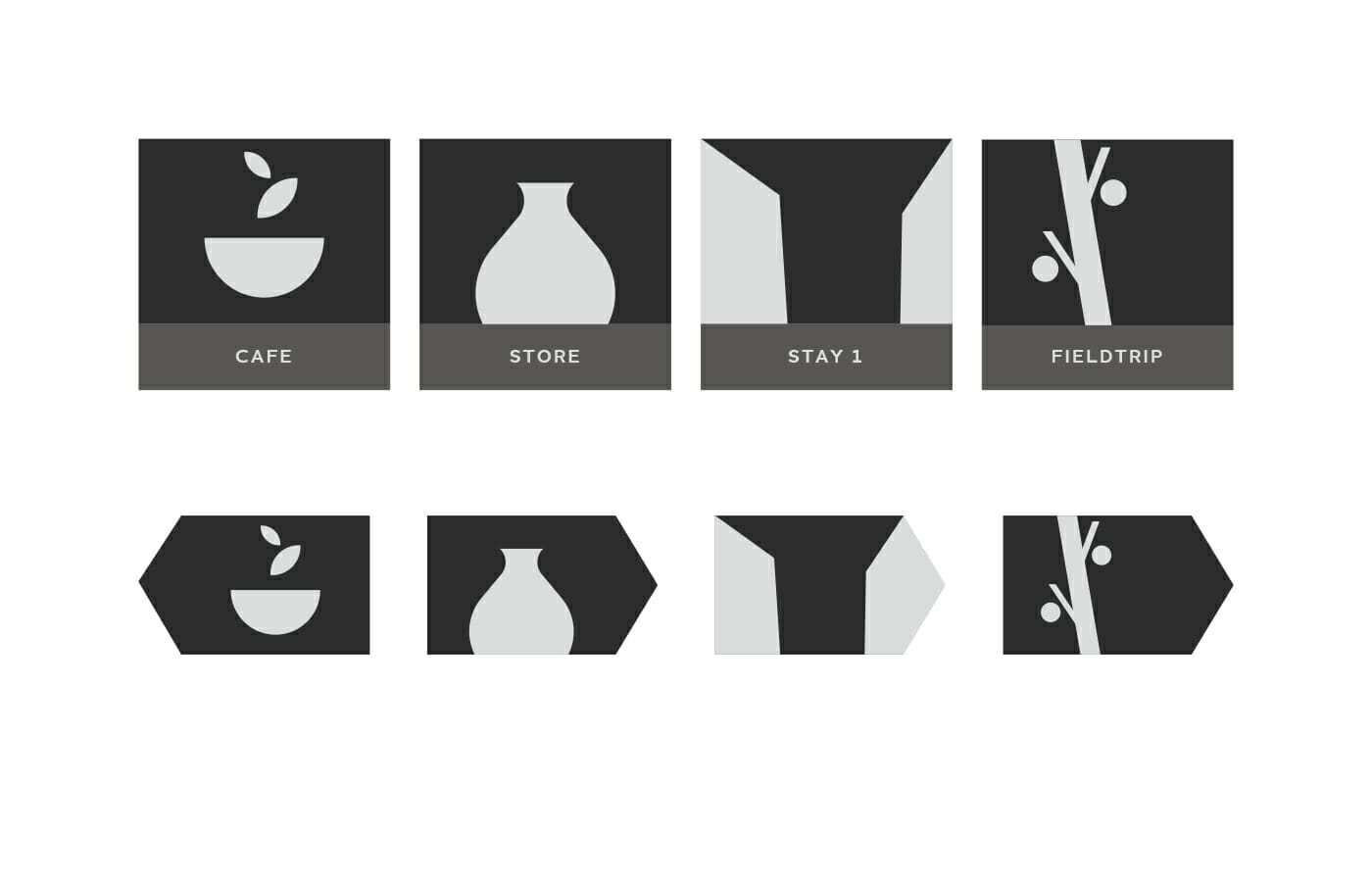
Inspired by the form of Camanggam's main area, we created the house shape which is used as our key graphic element throughout the applications.
For the wordmark, we focused on the geometric shape of Korean alphabet, Hangul. We eliminated the vowels and simplified the consonants of 까망감(Camanggam) to emphasize geometric features such as lines, curves, circular and rectangular shapes the letters have.

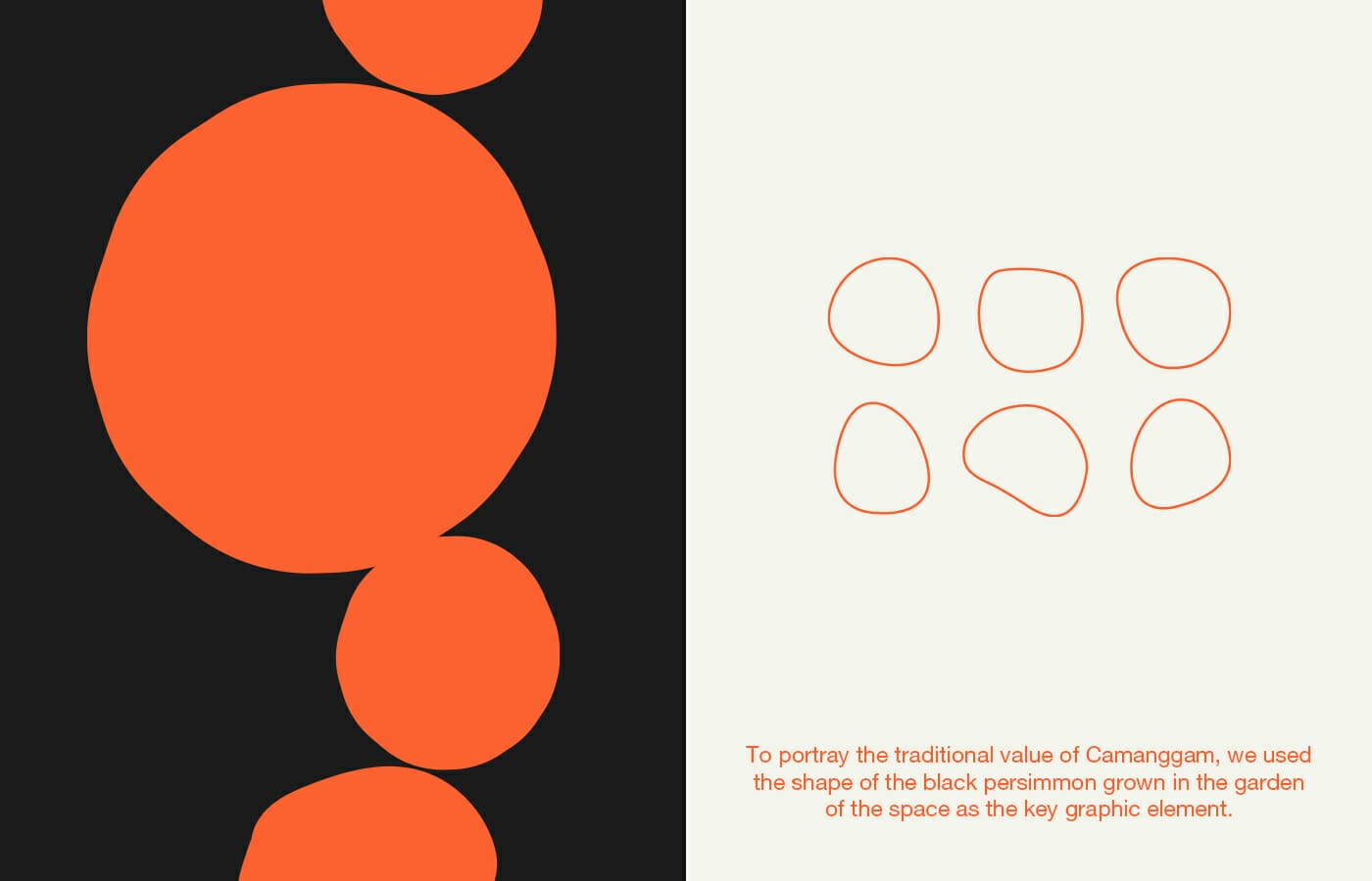
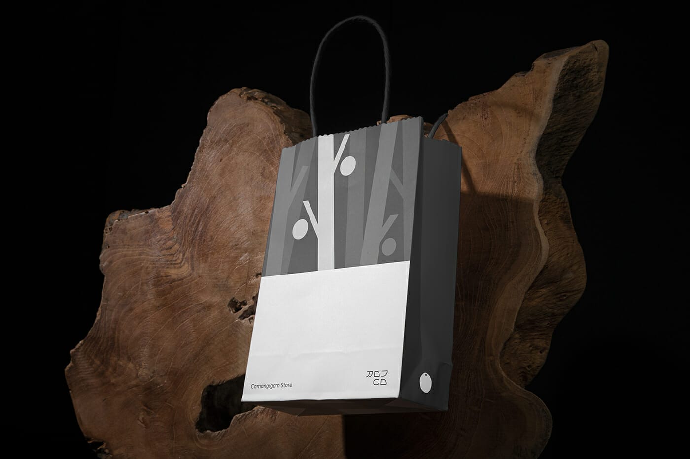
To portray the traditional value of Camanggam, we used the shape of the black persimmon grown in the garden of the space as the key graphic element.
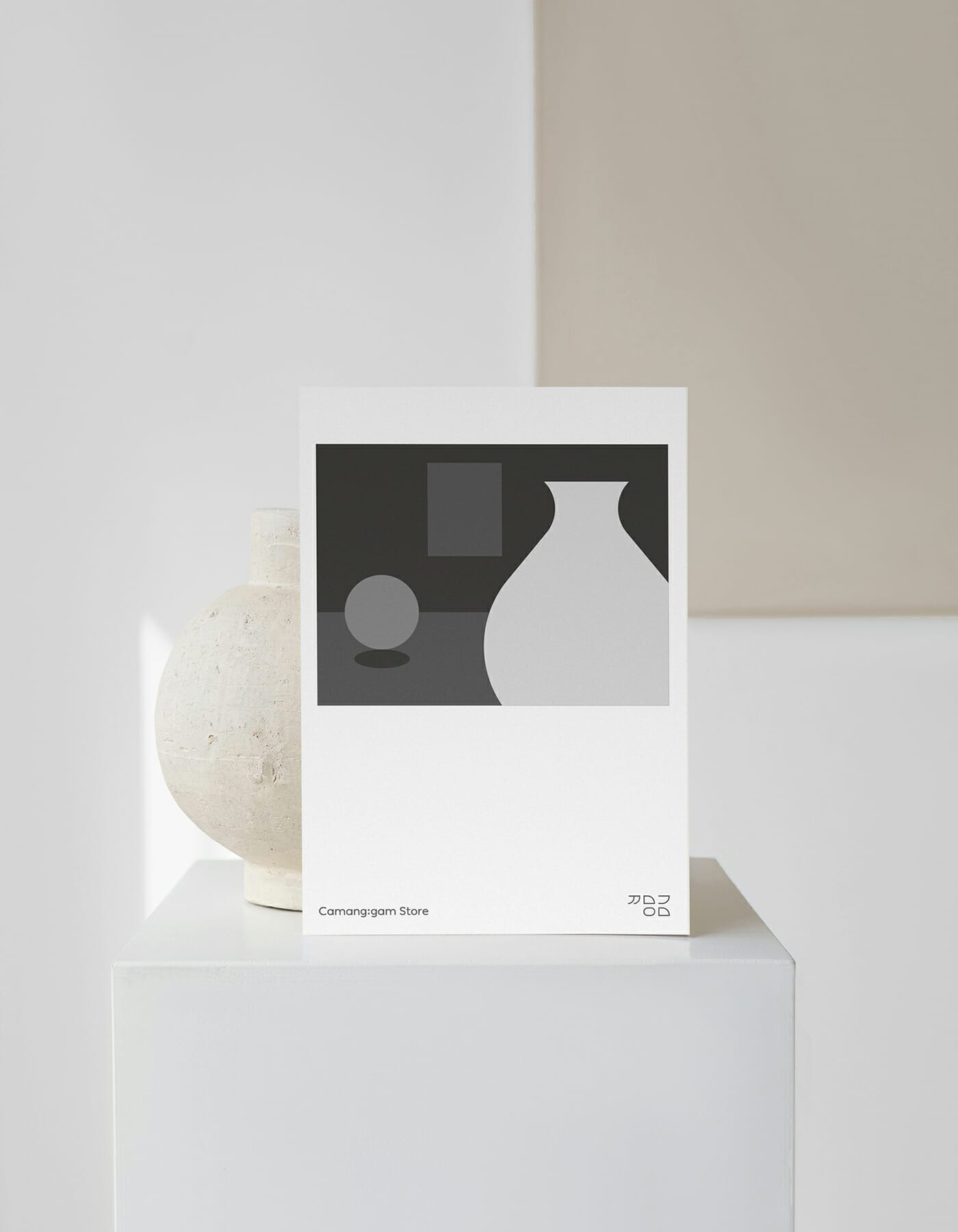
Most graphic work used Adobe Illustrator.
![]()
People who saw the project responded that it was a cute graphic.
It was fun to study the form of persimmons before designing a symbol of a specialty that can only be found in Camang:gam Stay, located in Damyang, Korea, and the process of capturing identity was meaningful.
Chuewolsan Mountain and Damyangho Lake surrounding Camang:gam Stay provide comfort. Spen time emptying your worries and worries here, with big gardens, wide mountains, and lakes.