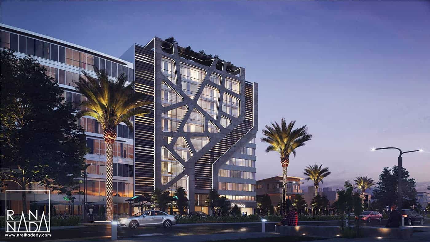
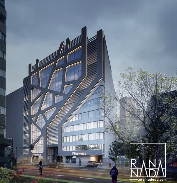
Care One Medical tower

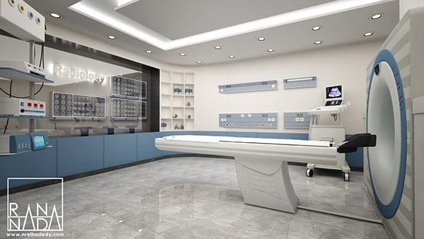
Care one Medical tower is enormous Medical Hub (Focal Point) in Egypt . The building area 825 sq comprises a 13-store , the ground floor consist of pharmacy , and the first two floors contain the ( radiology and laboratory ) , the higher levels contains the clinics .
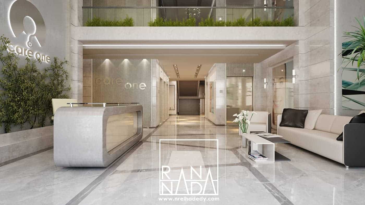
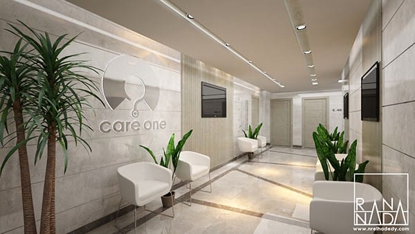
We integrate the external theme with the interior design in a new context , using the main elements we used in the exterior design but give it a welcoming atmosphere .
for each element of the interior design we tried to manifest our vision by different interpretation in each floor, using the same elements but in new contexts each time,
which will make the whole theme homogeneously merged, but interesting and varied when navigation from one space to another .
Our Approach is to create a an eye catching statement that represent
the building’s medical identity ,Through the following:
• The facade is distinguished from the near buildings ,by using
dark metal louver in both side , concentrating on the main focal
points which include the entrance and the organic mesh .
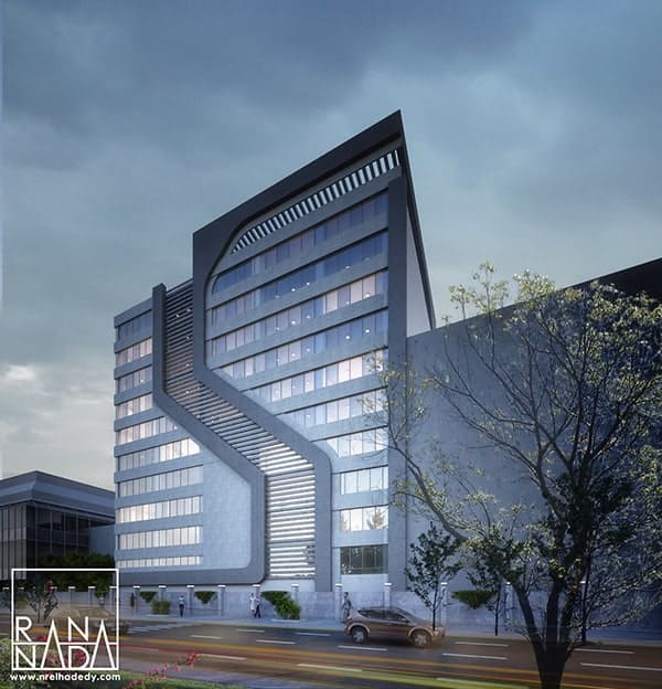
• Emphasis on the entrance form by a the vertical elements thats
starts from the entrance and goes all the way up to the roof creating
a groove in between which will be used for ads .
• Organize the sign boards , One of the main factors that could
enhance or disrupt the facade style is the random and unorganized
ads ,so we made sure to provide a space for ads that
won’t interfere with the facade design .
• Medical identity , Since it’s essential to give the building an
appearance that reflects its fundamental function , we used the
organic mesh that gives a strong statement from the outside of
the usage within .
• Elegant appearance , By using dark colors with indirect lights
and adding tiled textures gives a very elegant general feeling
of the building ,we particularly used the dark gray cladding to
give the building a stand out appearance in day light , and a
very modern and elegant appearance in night especially when
adding the leed light .
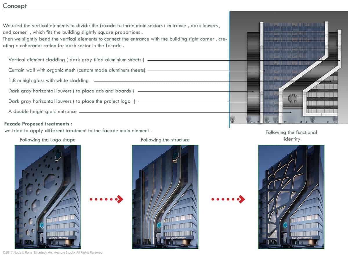
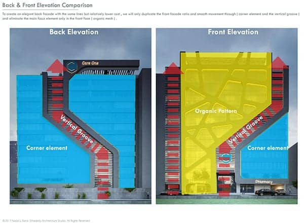
We used the vertical elements to divide the facade to three main sectors ( entrance , dark louvers ,
and corner , which fits the building slightly square proportions .
Then we slightly bend the vertical elements to connect the entrance with the building right corner . creating
a coherent ration for each sector in the facade .