CarmenBlue Art Cafe
The idea was to design a brand for a coffee shop that focused on a younger generation. A place to feel like home, share with friends and have a good time after school. We wanted something different, without rules. The design, although vintage inspired and also very modern in every piece.
![]()
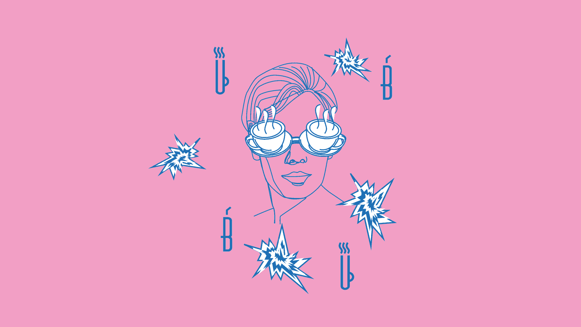
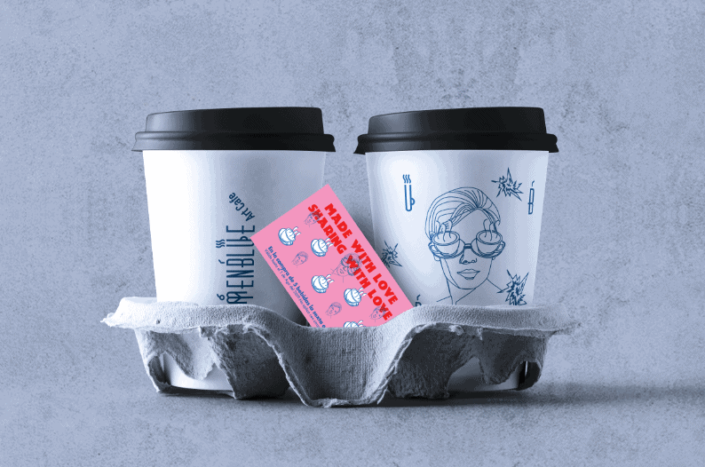
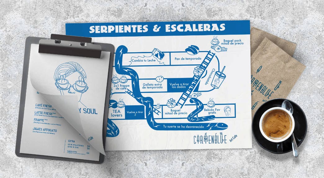
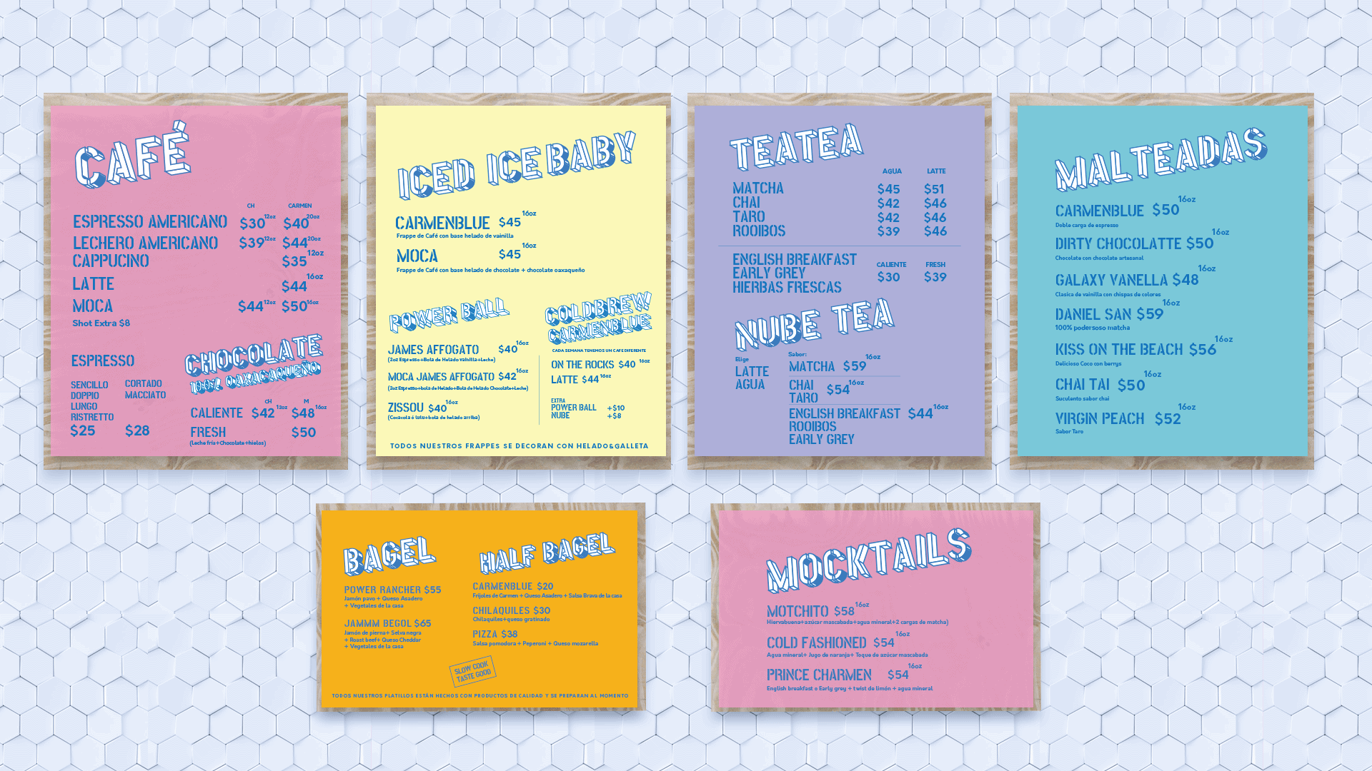
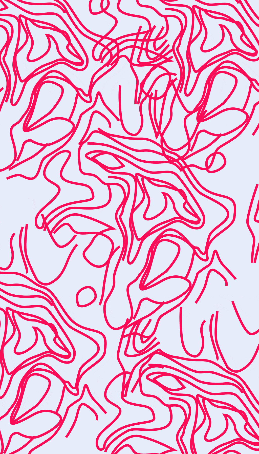
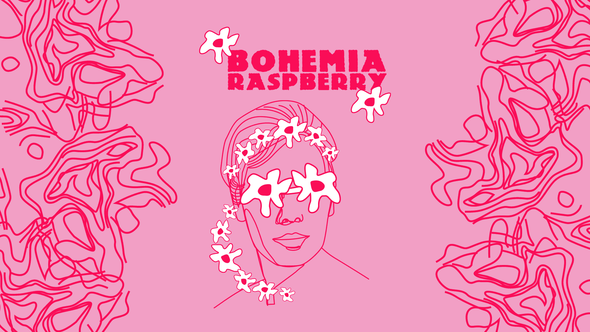
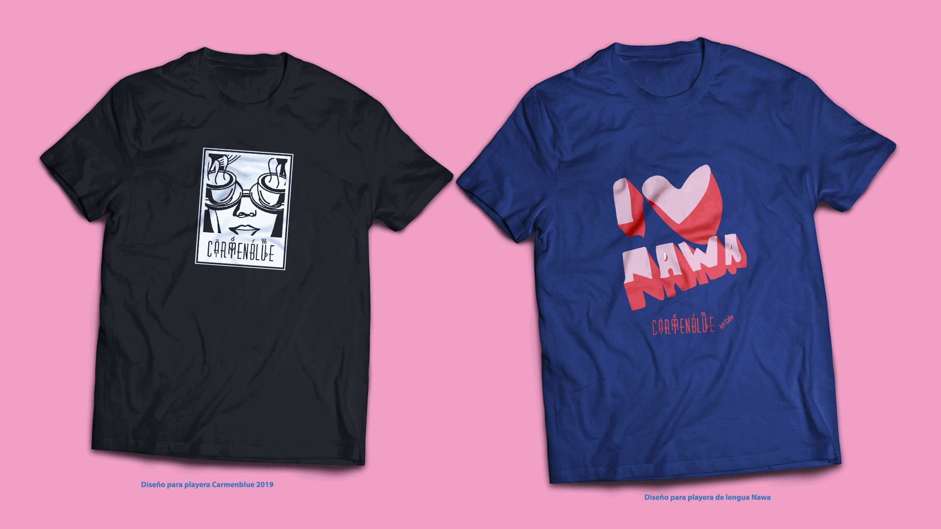
The idea to design CarmenBlue was based on my grandmother, Carmen. I wanted the character itself to be accomodating, fun, attentive, revered & a modern woman, even at her age. I was inspired by ads in the 50's that used housewives to represent the companies to sell their products. The design, although vintage inspired, is also very modern; using fun, funky objects such as the coffee glasses, the hearts and daggers for Valentine's Day. We also did a different take on her glasses using groovy flowers, for an event called "Bohemian Raspberry." CarmenBlue created a very unique take on things for its consumers. The logo design was inspired by 50's type fonts and simple elements to represent the types of products to be sold in CarmenBlue. For example the smoke and cup to represent the hot drinks such as coffee & teas, the straw for the frappes & milkshakes, a pretzel for food and a popsicle for desserts. We used pink and blue together as our way of breaking gender stereotypes to represent the unity and fresh take on things. Feeling at home is being able to be yourself and we aspire to create that atmosphere. We have always supported the LGBT community and uphold equality at CarmenBlue.
For the design I used Adobe Illustrator and Photoshop.
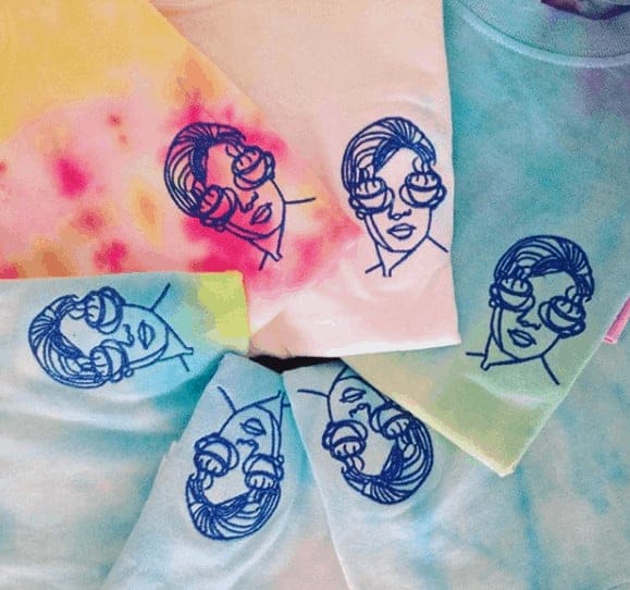
It was a project in which I felt very free to propose the illustration according to the image that was given to me of Carmen, when she turned 30 years old. We wanted something different, without rules. I started first with the logo in which I integrated the design elements, the fonts were inspired by the 50's era, with very elongated and close together letters. Certainly, for the real Carmen, the 50s were her Golden Age. We managed to make the image represent Carmen's strength, inspiring with certain touches of the past, as well as hints of disruptiveness. The tone was modern, fun and funky where we can use some humor as well, for example in the restroom there is a mural with part of Alanis Morrisette's song lyrics (And you've washed your hands clean of this) so people would remember to wash their hands. The events we held combined a lot of live music or other things happening in the shop such as: painting t-shirts, receiving non-alcoholic cocktails, or specialty drinks from Carmenblue, etc., all geared towards our young consumers.

The people love the character of CarmenBlue, this revered woman, that looks funky that holds her style well. They felt like home, in a place without labels or judgment.
With this project I learned, that, to accept your style, create your own language without fear and raise your inner voice is truly what makes one unique.
Special thanks to Doña Carmen, my mom, Maria Aceves and Cecilia Ulloa Delgado.