DASHI EGG SAND by WTNB coffee & studio in the HOUSE

Announcing the WTNB coffee & studio in the HOUSE "DASHI EGG SAND" package design by Yuta Takahashi.
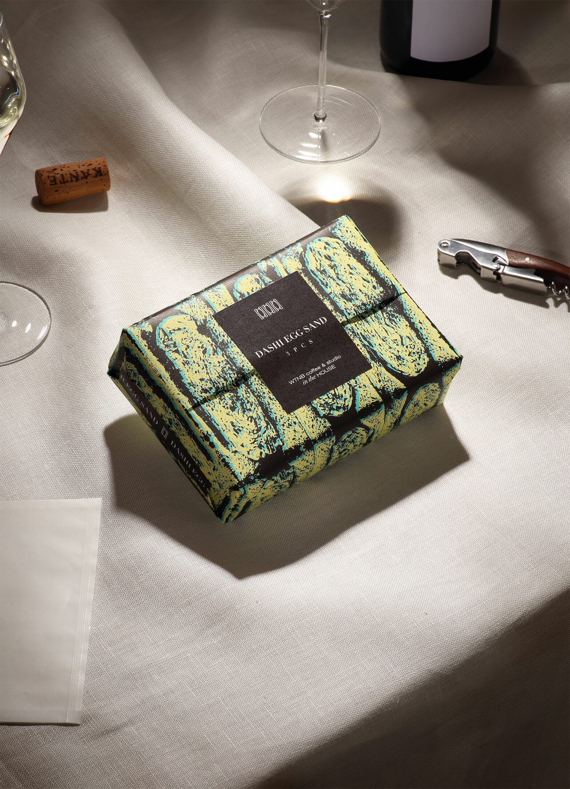
A packaging design used for Japanese Omelette Sandwich meant for takeout. The necessary elements for an aesthetic culinary experience can also be thought of in takeout food. As COVID-19 has increased takeout consumption, we felt the need for a package that would ensure meals weren't simply consumed.
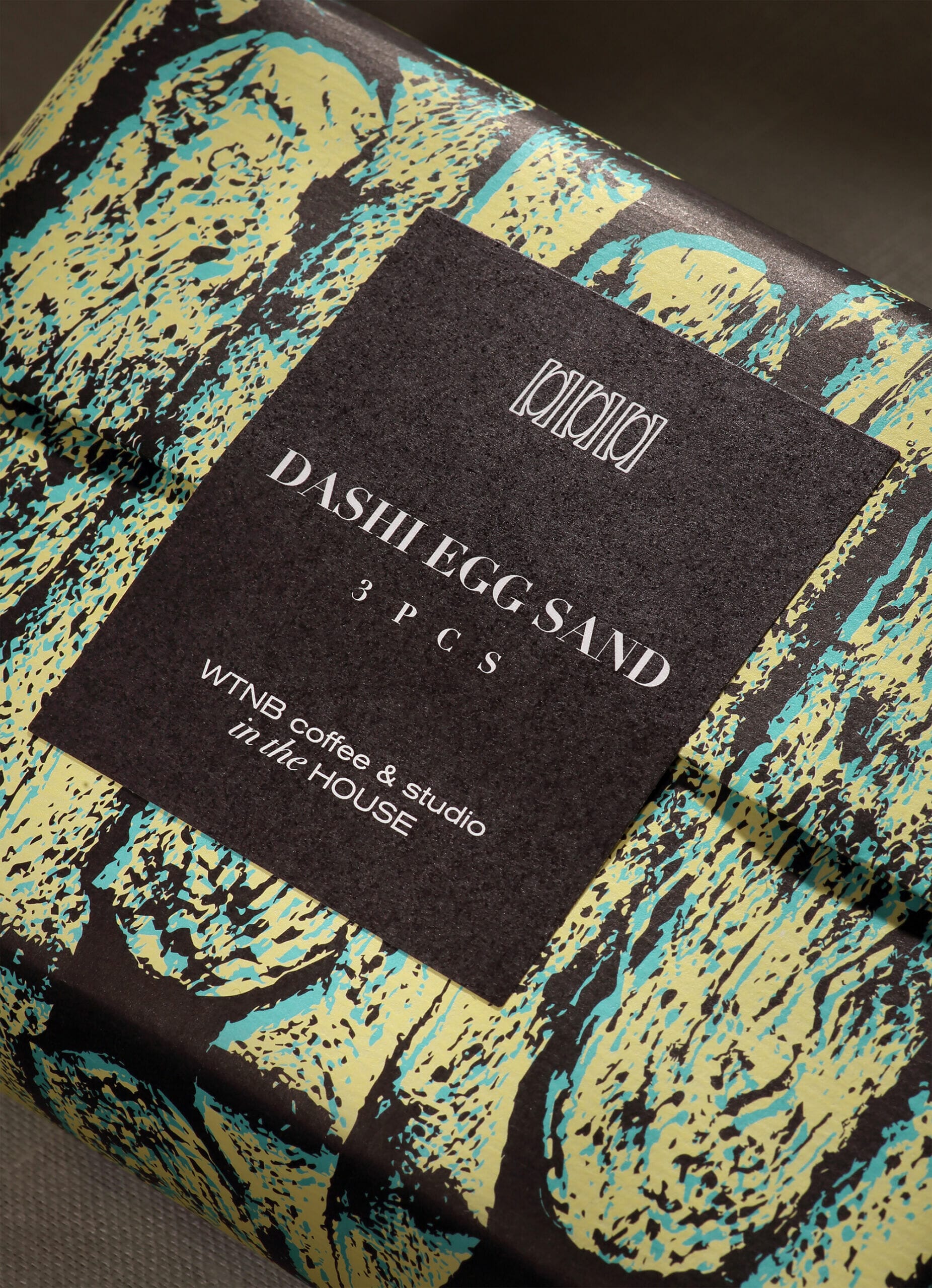
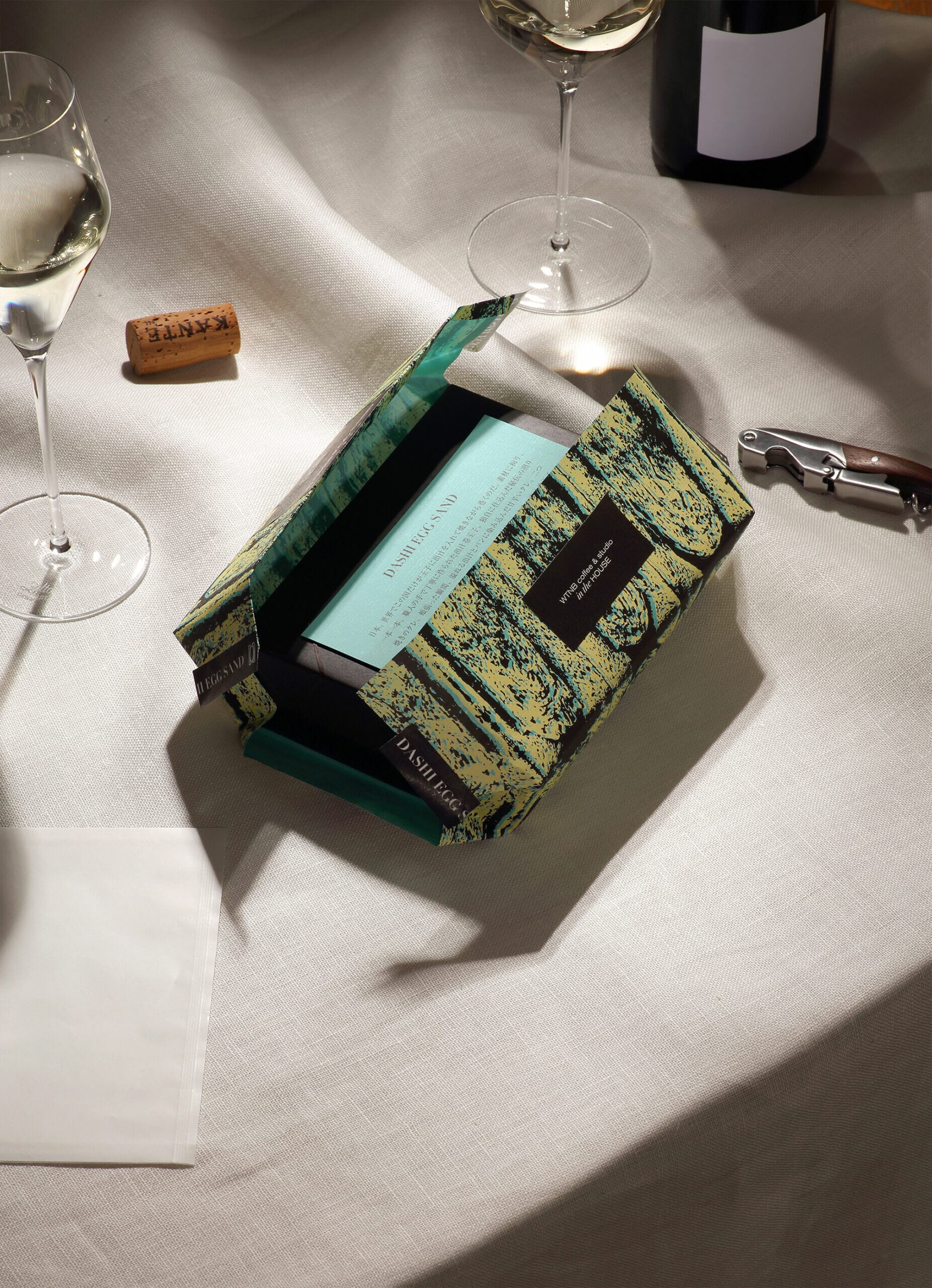
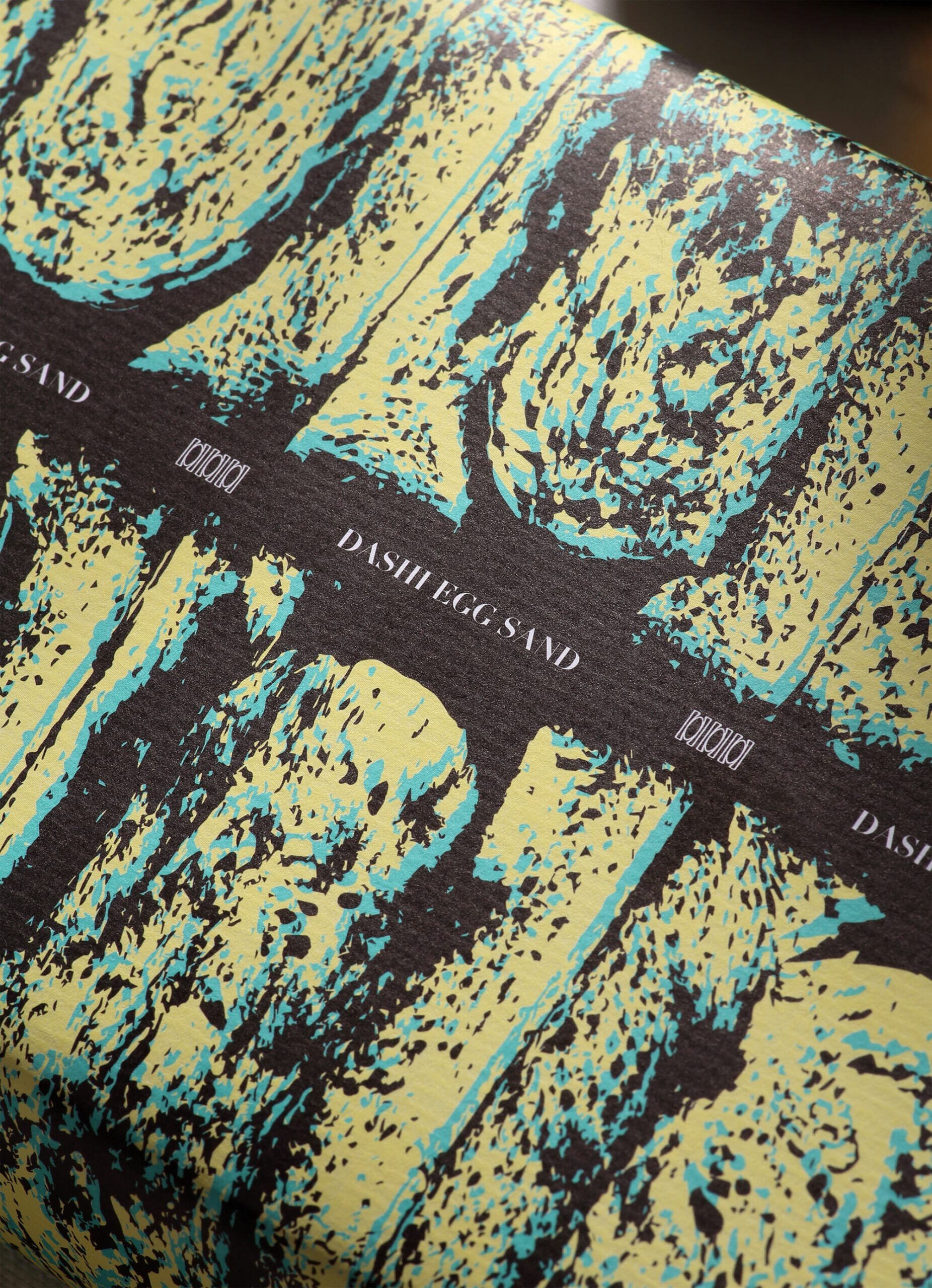
This design was born from the idea of how to express the goodness of the contents in the package. The soft wrapping paper and the illustrations on it are reminiscent of the gentletaste and texture of food. The wrapping paper has the illustration of a Sandwich's cross-section.
The ink is an original mix, expressing the color of eggs, secret sauce, and blue, the color for the client's store. The box is made of unbleached kraft paper with water and oil resistant processing that doesn't use plastic or film materials, aiming to reduce its environmental impact.

First, a cross section of an actual DASHI EGG SAND was photographed. The photo was imported into Photoshop, and the color photo was converted to two shades of black and white. The photo was then converted to vector data in Illustrator, and three layers were added and adjusted to balance the yellow, blue, and brown colors, respectively.
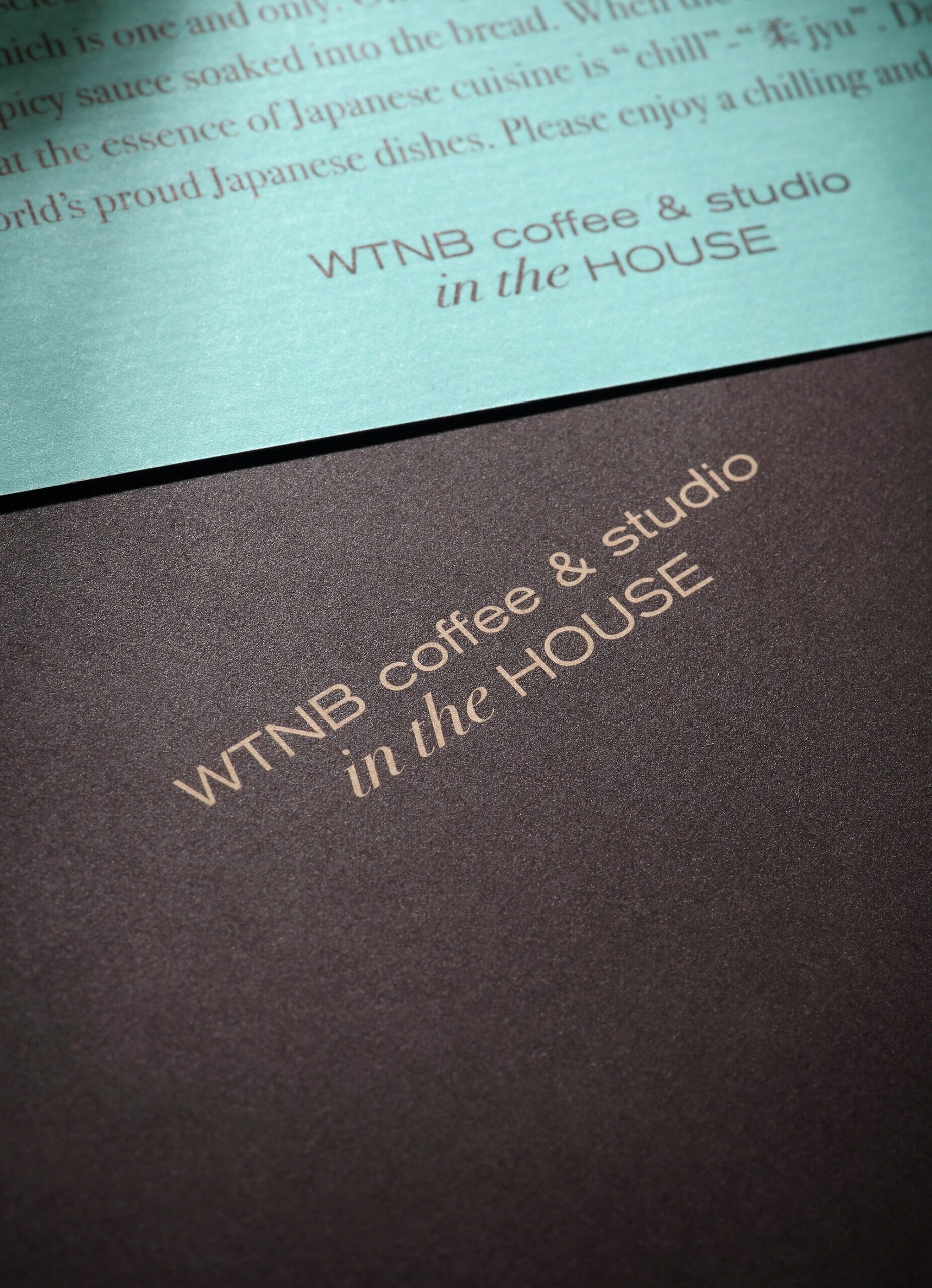
The logo design and other graphic designs were created in Illustrator. We created mock-ups many times and actually printed them many times to check the texture and other aspects of the design.
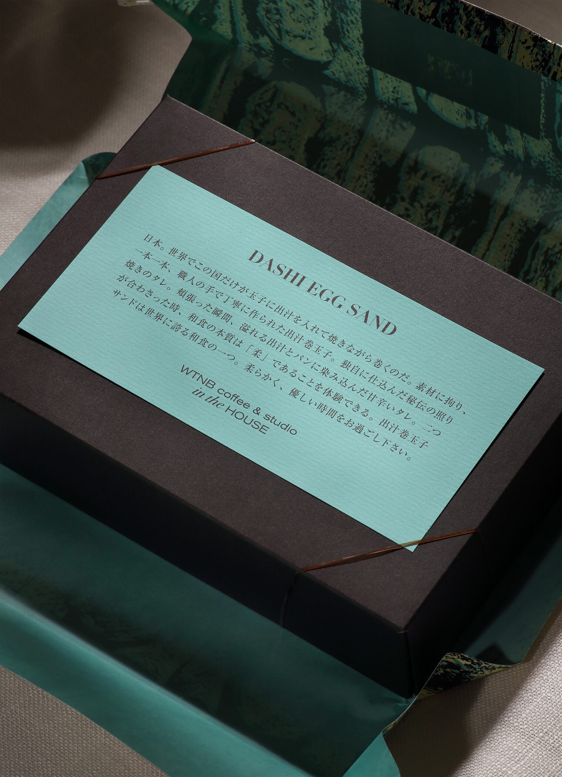
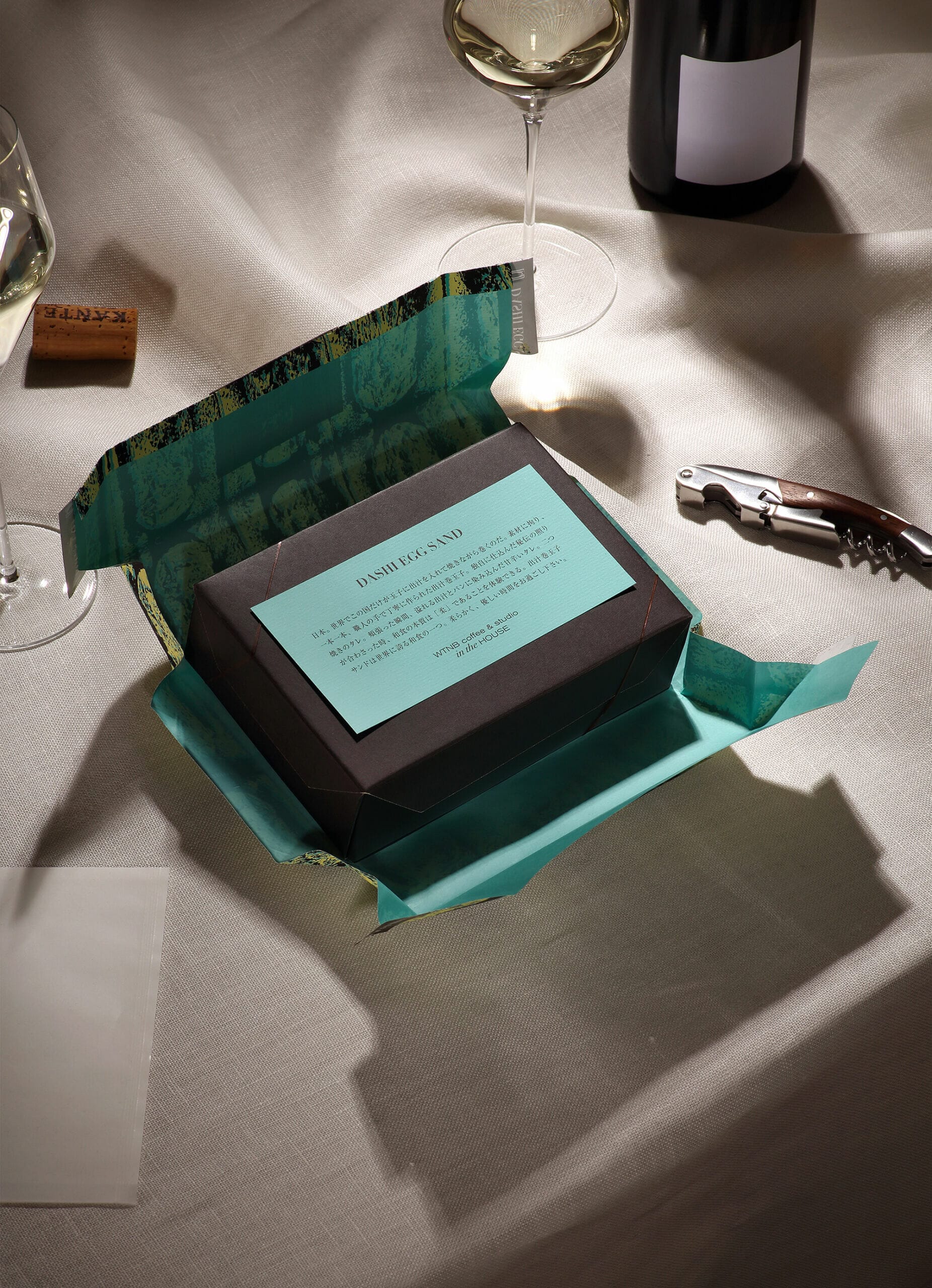
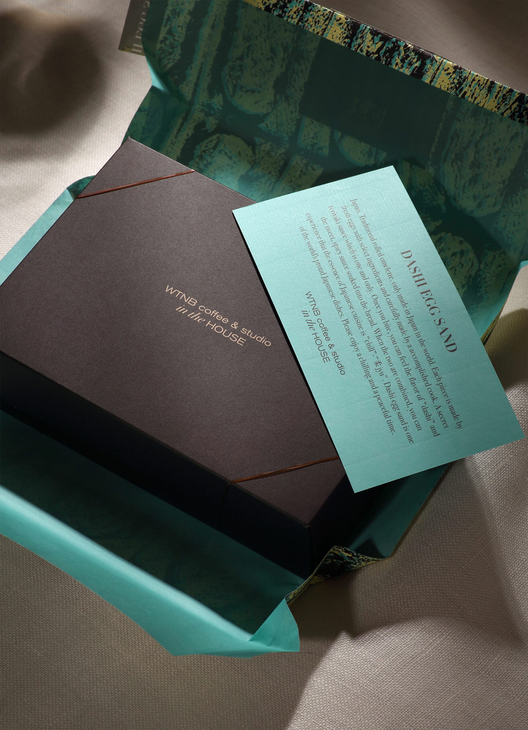
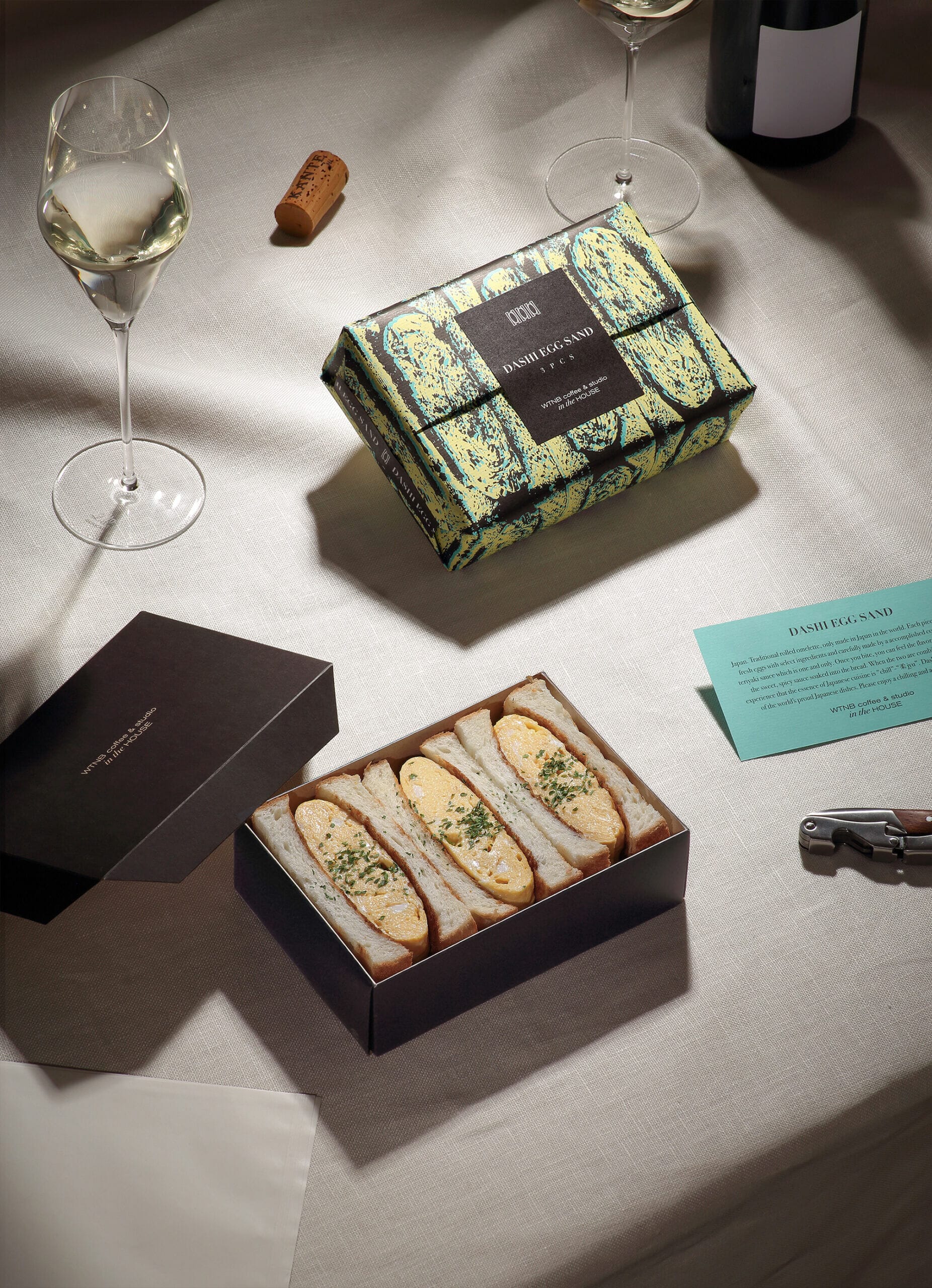
When the wrapping paper, which gives the impression of softly enveloping the dish, is opened, a first look reveals the contrast between the bright blue printed on the back and the brown of the box. Its form brings parties and picnics to mind. It has been thought up with improving the act in mind of having a special and enjoyable meal, rather than reluctantly filling the hunger.