Chrupek Co.
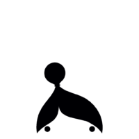
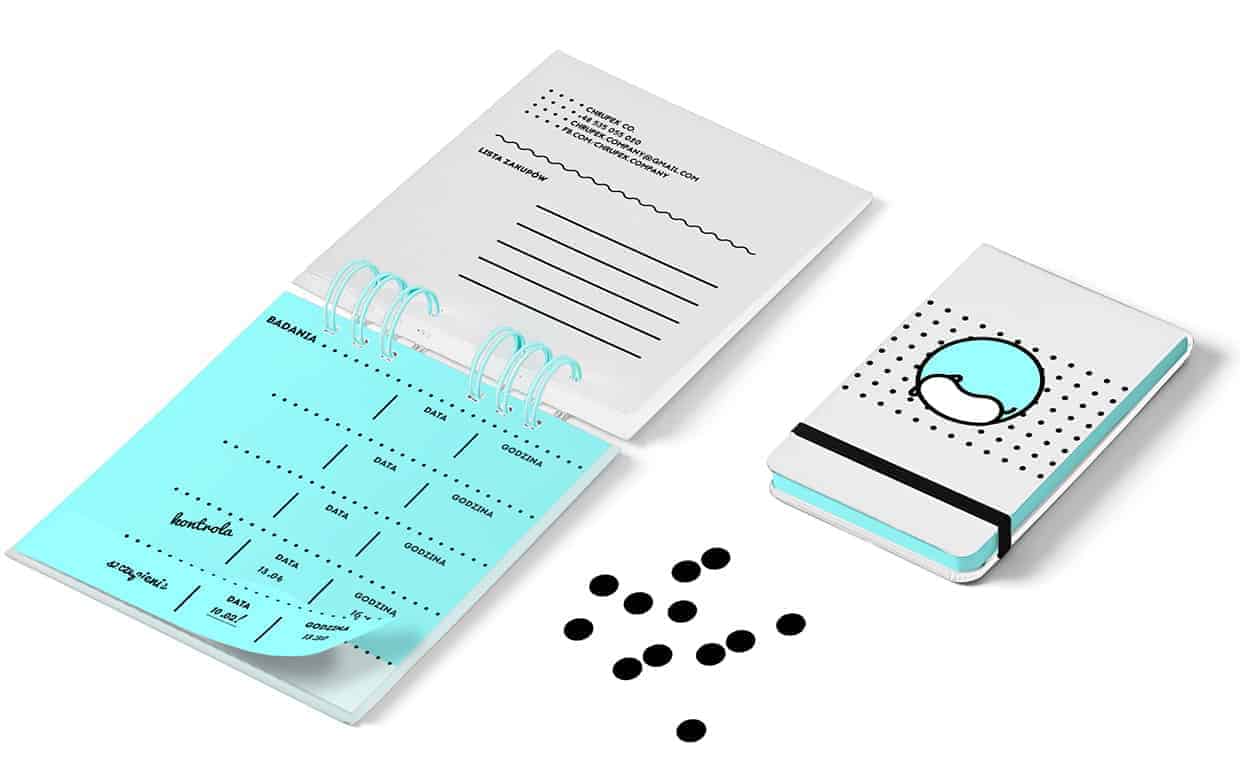
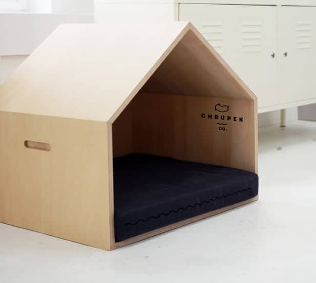
Visual identity for the company selling accessories for pets. Simple, geometric logo consistent with typography. Each element of the logo is based on the shape of a circle. Minimal use of color, simple accessories create a minimalist brand for people who value simplicity and materials of good quality.
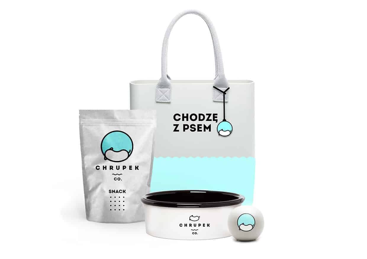

The company sells accessories for pets such as bedding, so I chose to show a sleeping dog. I decided to use simplest shape. Everyone knows how does a sleepy, sweet dog look like. To keep the mood, I picked joyful baby blue color.

It all starts with a drawing on paper. I tried to simplify the mark as much as possible keeping basic shapes resembling a sleeping dog. The mark has been transferred to digital world using Adobe Illustrator. Presentation was created in Adobe Photoshop. I used both free of charge mock-ups and created my own.
People love Chrupek :) I received plenty of positive responses. The logo gained wide interest and the mark has been selected to participate in the National Exhibition of Graphic Signs. I'm proud of that :) This project taught me that initial ideas can also be brilliant, adequate and successful.