Common Net

Common Net is a network of companies which provides community-driven solutions for the Internet access and the digitalization of the territory. The briefing showed the need to create a cool logo and young, aiming to express the fundamental concepts of sharing and network. Their slogan is "Internet as a common".
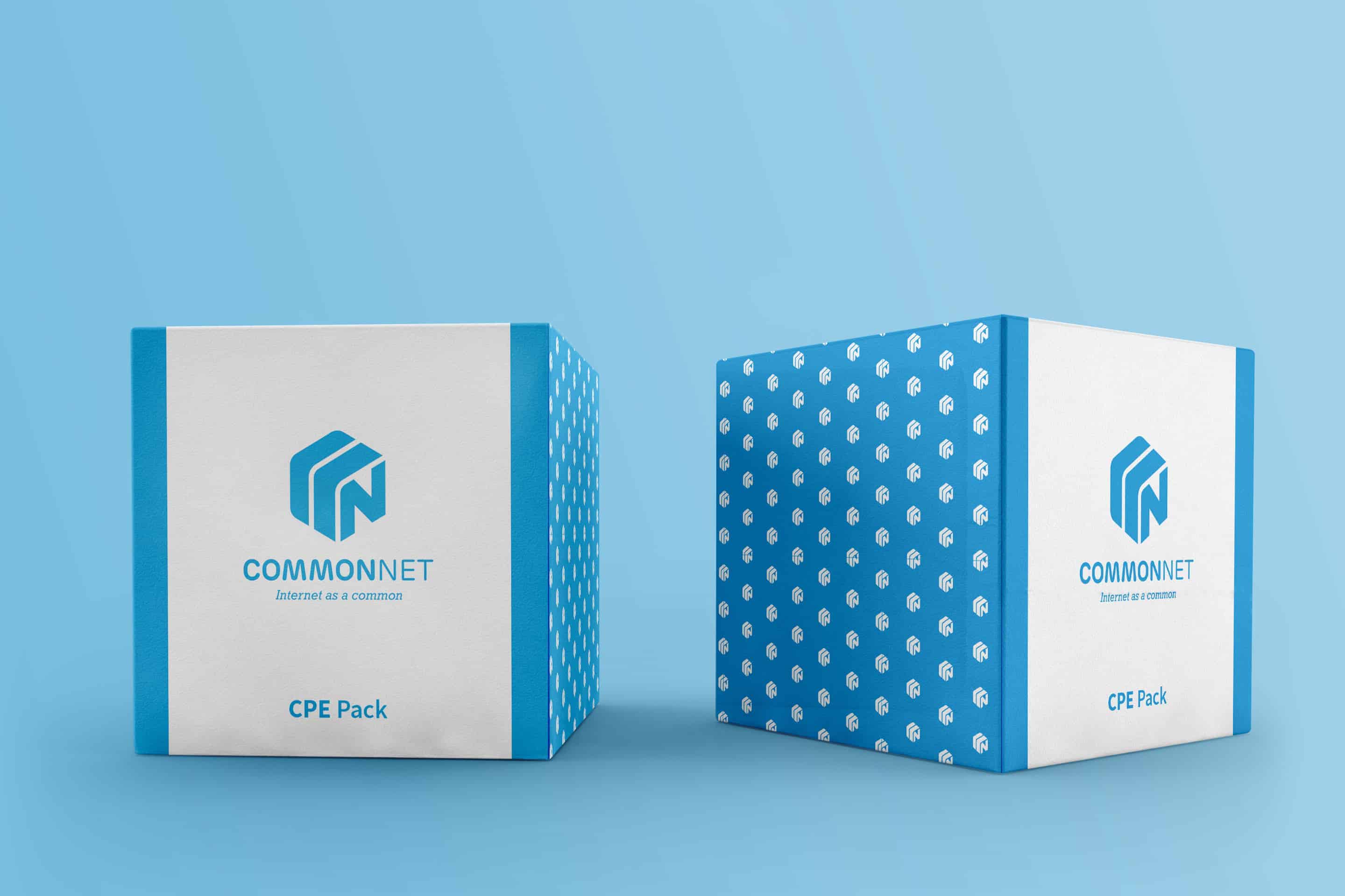
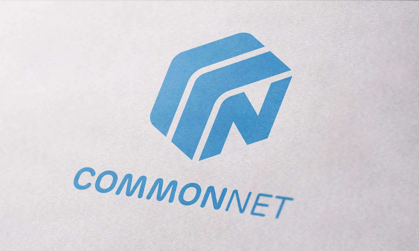
I was focused on two shapes: the circle and hexagon. Therefore I decided to join them by rounding the hex to lead to the concept of sharing immediately. Moreover, during the first meeting with Common Net, they showed me the modem prototype, which had a cube-shaped. So I decided to give tridimensionality to the logo, replacing the letter "N" on a face of the cube.
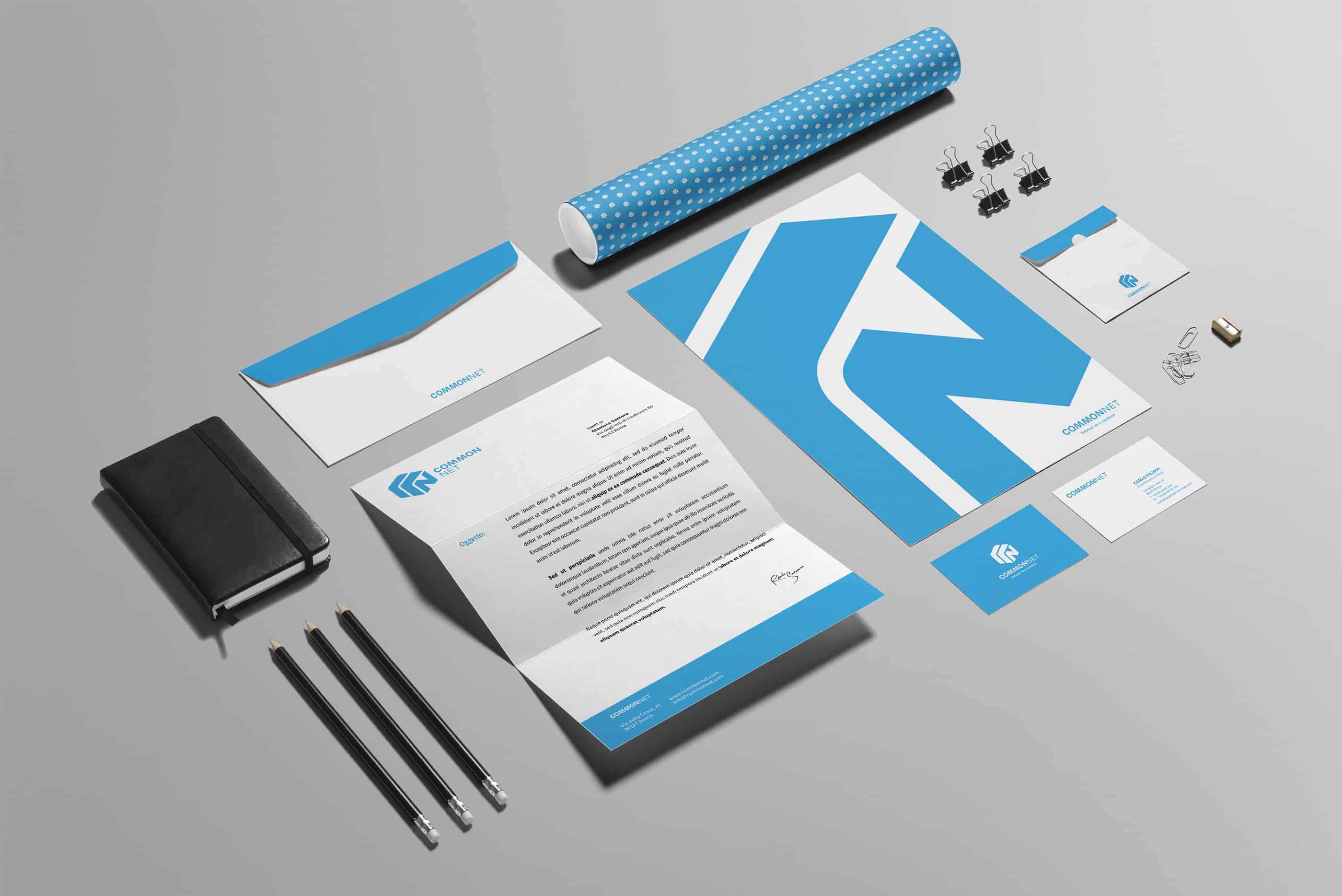
As usual I started with a brainstorming session. So I focused on 4-5 words and I drew on my Moleskine a lot of sketches, only to find a form or a theme coherent with brainstorming. I selected five of this and I started to project with Adobe Illustrator adding typography and colors. Then I presented to client after one month of working. Later I projected the stationery and the other branding items.
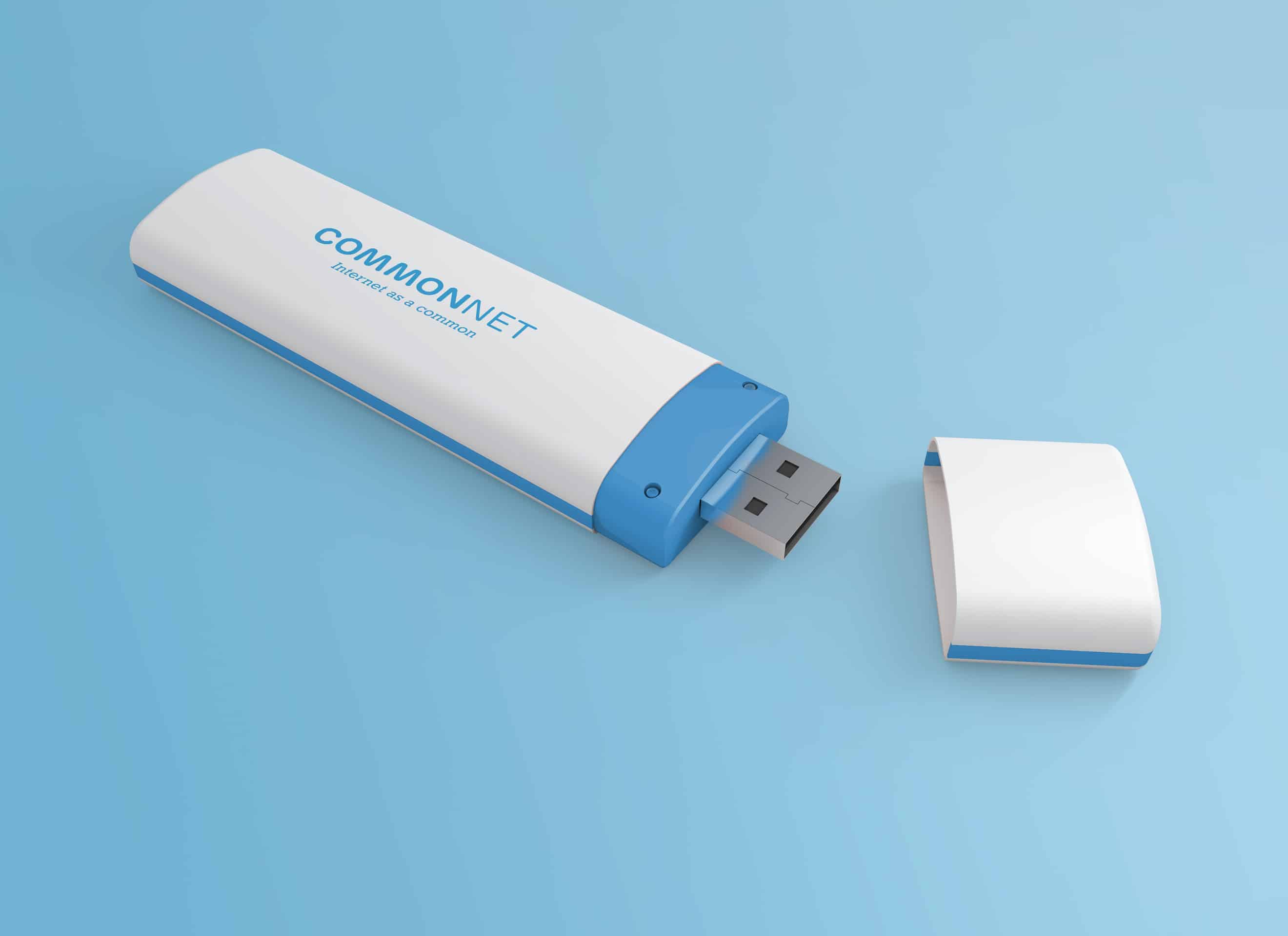
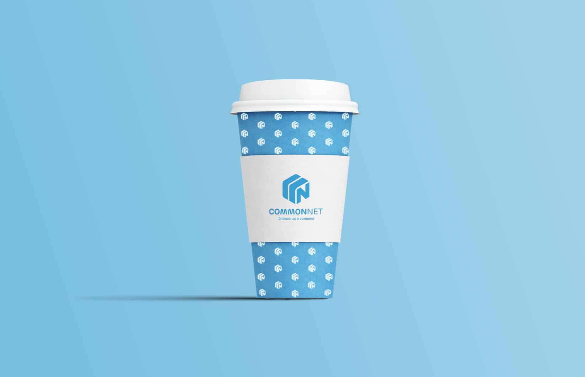
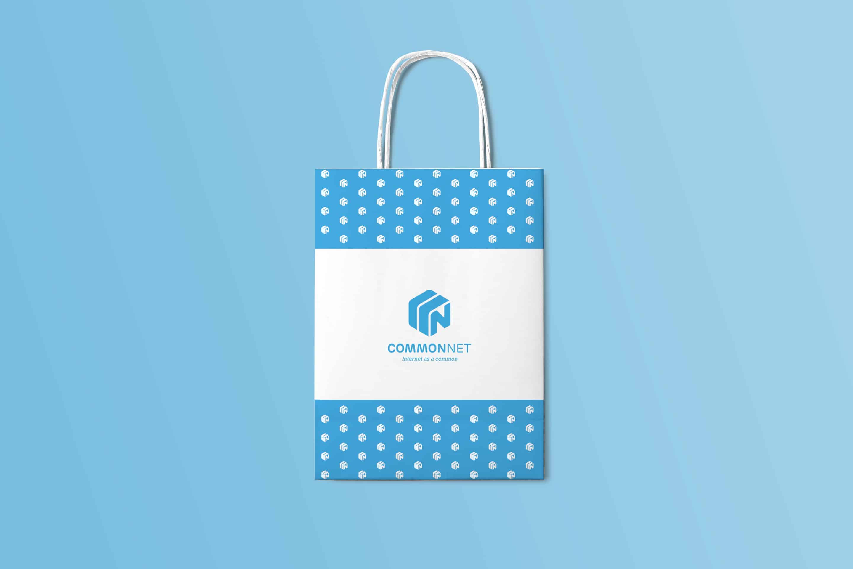
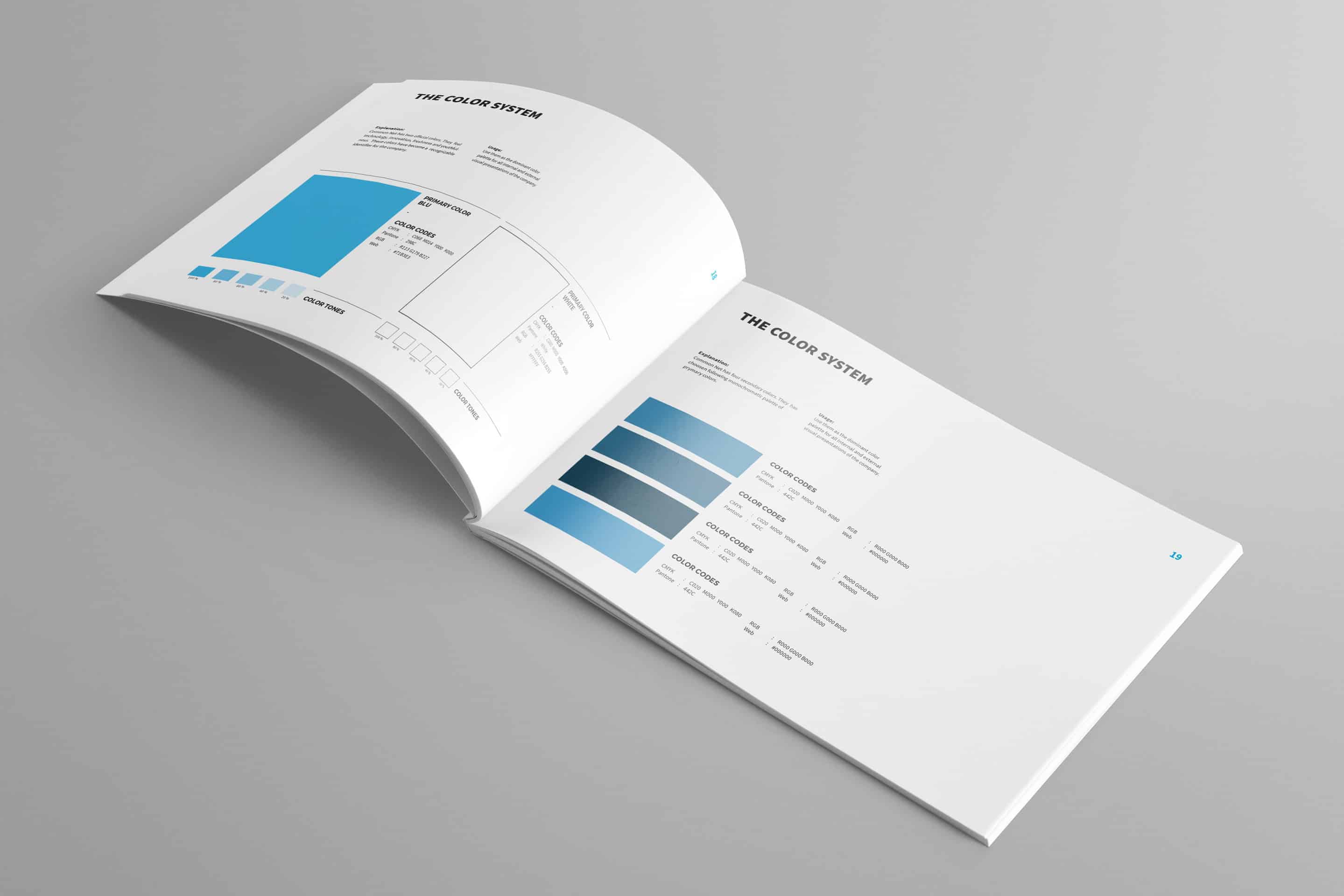
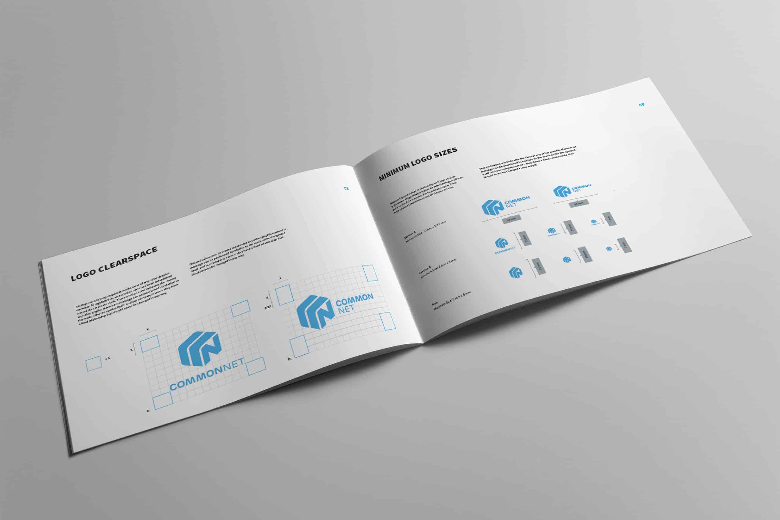
I published the project on Behance and people respond positively. I received several appreciations especially for the cleanliness of my style and for the modem packaging. People really liked that I also published the brand guidelines inside the presentation, something not very common in the branding project presentations.
Great Gianluca!!!!!
Great job