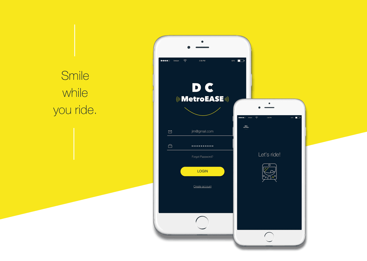
DC MetroEASE Mobile App

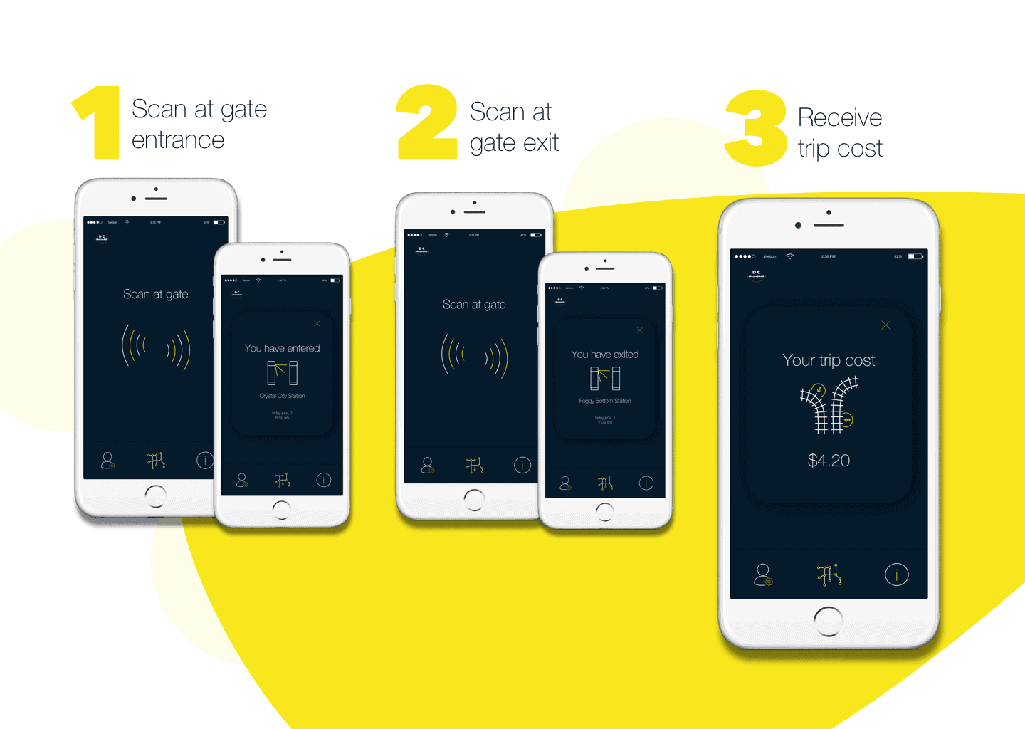
DC MetroEASE is a smartphone metro card that enables riders to enter and exit the metro station. The goal for creating this app is to put riders at ease while using the metro, ultimately making their days a bit less stressful. The concept is based off the idea of NFC technology.
I came up with the idea while living in Washington, D.C. I took a User Experience Design course at General Assembly and I chose this as my final project. I wanted to create a more convenient way for riders to enter and exit the metro station.
I have lived in many metropolitan areas over the years, including: NYC, San Francisco, Washington D.C., and Sydney, Australia, so I am no amateur to the metro system! Most metro stations I have used are structured in a way that you must have your metro card in hand every time you enter and exit the station. This causes people to have to rummage through their wallets and/or purses to find their cards each time they use the metro, twice! To put that into perspective: riders who use the metro daily to ride to and from work have to take out and put away their card, at minimum, 4 times/day. That's 20 times per week, 86 times per month 1,032 times per year!
Now, some may argue that with this app you'll have to take out your phone that many times. I get it, but let's face it, most people these days constantly have their phones in hand or know exactly where they are at all times. Also, there's other annoyances to these cards including having to refill your balances each week. Seems simple but there's nothing worse than watching your train drive away because you were one second too late since the ticketing machine wanted to give you grief that day, ultimately causing you to be late for work.
'So, why don't you just refill your card with enough money to last you a month or a year?', some might ask. Well, that's a great idea until you lose a card with hundreds of dollars on it that you can't retrieve.
DC MetroEASE was designed to create a solution to these problems.
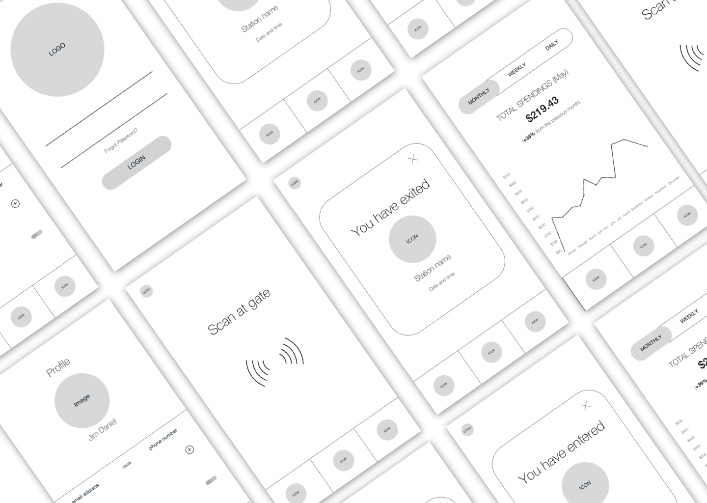
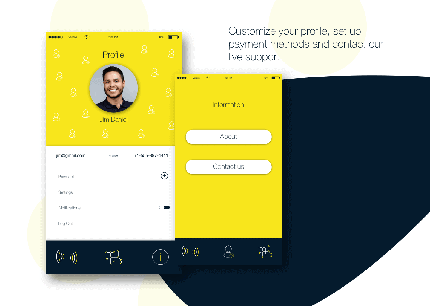
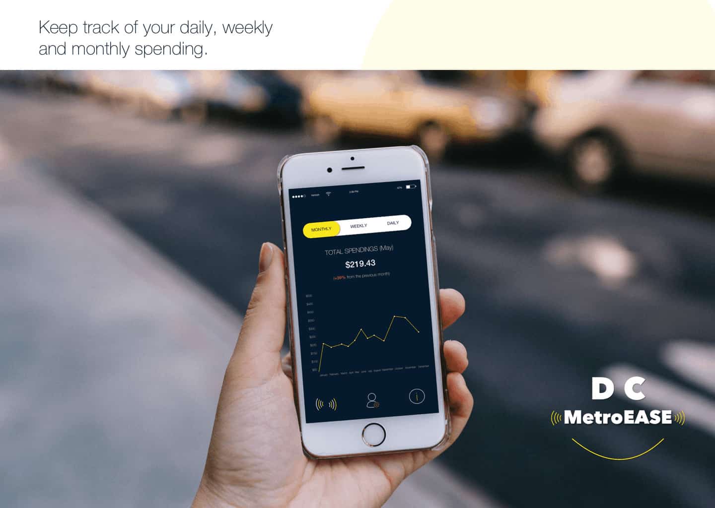
In terms of branding and UI, I created the app to make people feel at ease and ultimately happy. Since users are already faced with hectic, complicated and stressful days of getting to and from work and/or school in a busy city, I wanted the app to be lighthearted, simple and stress-free for the user. I chose the dark blue for the confidence, reliability and calming effect it portrays and the yellow for the positivity, happiness and energy it brings. The white creates a clean and simplistic look. I decided to make the logo into a smile to create a playful and happy vibe as well as created icons that were playful and lighthearted.
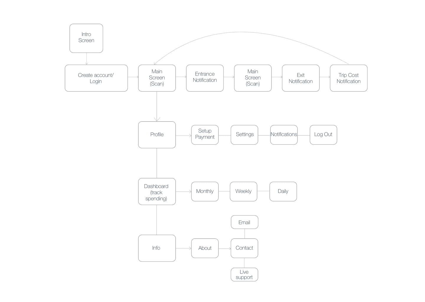
The process for this project was a combination of UX and UI practices. I started with user research, including: observational studies, interviews and analysis. From that research I created user personas, user flows and storyboards which helped create the functionality of the app. I then moved onto wire framing the entire app functionality. From there I created all the branding and UI elements, including color scheme, logo, typography and icon set. Lastly, I integrated the UX and the UI elements to create the final design.
Some statistics I found with my field research are as follows:
67% of riders have lost their metro card, at some point, with a remaining balance on it.
81% of riders hold their phone in their hands while riding the metro.
94% of riders wish there were a more convenient way to enter and exit the metro station.
This project has been a long time coming. This is the fourth time I have redesigned the app. The first time the UI was hideous. Seriously, hideous. People appreciated the idea but the visual appeal was not there. The second time around it got a bit better. By the third redesign I was finally putting together all the missing pieces but was still not happy with the color and overall feel. I believe the UI this time it very well rounded and effective for user rapport. People have responded very well to this project so far. They appreciate the idea. I wish I could do testing on it but since the app's main functionality is used with NFC it's pretty much impossible for me at this point since it would require a third party installation of NFC at all metro gates. The WMATA ran a pilot for this in 2015-2016 but has since postponed testing (Please note: I had/have no association with these testings).
I have learned tons from this project but mainly that there's always room for improvements in design, especially when your main focus is the user. Humans are constantly changing and since design is created to better people's lives, design needs to constantly improve and correlate with human needs.
Feel free to check out the full project here:
https://www.behance.net/rlowe2415c1fb
If you like it, make sure to press that appreciation button ?
And if you don't like it, I'd love to hear your feedback.