de Viés
"de Viés" is the brand of a one person business, the talented Ana Isabel Belo. She handcrafts beautiful patchwork products for everyday use: purses, toiletry bags, pencil cases, yoga mats, daily planner's covers or sport's bags.
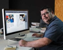
My challenge was helping her choosing a brand name and designing the logotype and business card.


THE NAME
While taking a coffee and discussing potencial brand names with Ana, I recalled a product some seamstresses used to buy at my parents' haberdashery, when I was young: "fita de viés" (bias binding tape). So I asked Ana if she knew that kind of tape and if she applied it to her pieces. Her answers were yes and yes!
Taking that idea, we omitted the "fita" (tape) part of the name and got "de Viés", which sounds great in Portuguese and it connects immediately with sewing, one of the main stages of Ana's work.
THE LOGOTYPE
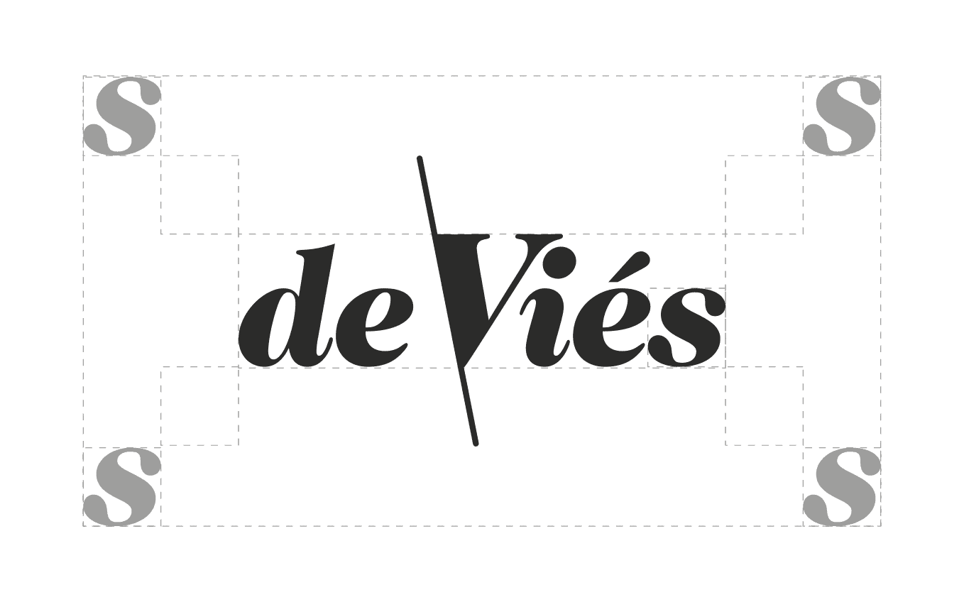
From the beginning, the logotype was intended to be simple, without any symbol. Although the products are handcrafted, they have a modern design, so choosing the right typeface should take that in consideration. Trying to get the best of both (handcraft and modern) meant that a script font nor a modern or sans serif one were the main choice. In the end, Caslon 224 Black Italic was the font chosen.
In Portuguese, the word "viés" means diagonal or bias (hence the name of the tape, because it is cut in diagonal to the weave of a fabric), so the long oblique line on the left stroke of the "V" emerged as an obvious graphic solution to enhance the brand name meaning and make it distinguishable.
THE BUSINESS CARD
Ana came with the ideia of making the business cards out of fabric, which I immediately embraced. My input was designing the label (with the left side parallel to the oblique line on the logo) so it would not cover too much of the fabric's pattern.

For the design of the logotype I used exclusively Adobe Illustrator.
The design started by choosing the right typeface, making sure it was suitable for small size uses – like the labels sewed on the products. After Caslon 224 Black Italic was chosen, minor adjustments were made to the kerning, and the "V" size was increased so the curve of its serif could adjust better to the "i" tittle. To make sure the proportions of the logotype were in balance, the top of the oblique line (from the top of the "V" to end of the line) has the same heigh as the small "s". The same happens to the bottom of the line.
For the business cards, the labels were printed and Ana cut them and sewed them on the pieces of fabric she has chosen.
Needless to say no two cards are alike!

Ana is very meticulous and the "de Viés" products are beautiful and very well made, plus they are given a lot of attention to detail throughout the process.
That being said, since its launch, back in November 2017, people have respond very well to the brand.
With regard to the name choice, people relate with it instantly.
Although it is not an unprecedented solution, the "de Viés" fabric business cards always bring a surprise factor and, more importantly, create brand memory.