Digital Mock-Up Collection 2019
Re-vamp of my mock-up designs for logos, merchandise and album layouts. Created for a more streamlined and cohesive design layout. Color composition defined by my website, design style inspired my minimalist typography and layout. Needed to update my previous design mock-ups to something that was more cohesive with my website and the other mock up designs. Previously I had been designing each mock-up separately without a similar layout and design for each. So I made sure to have a theme and motif that carried through each mock and resonated with my website.
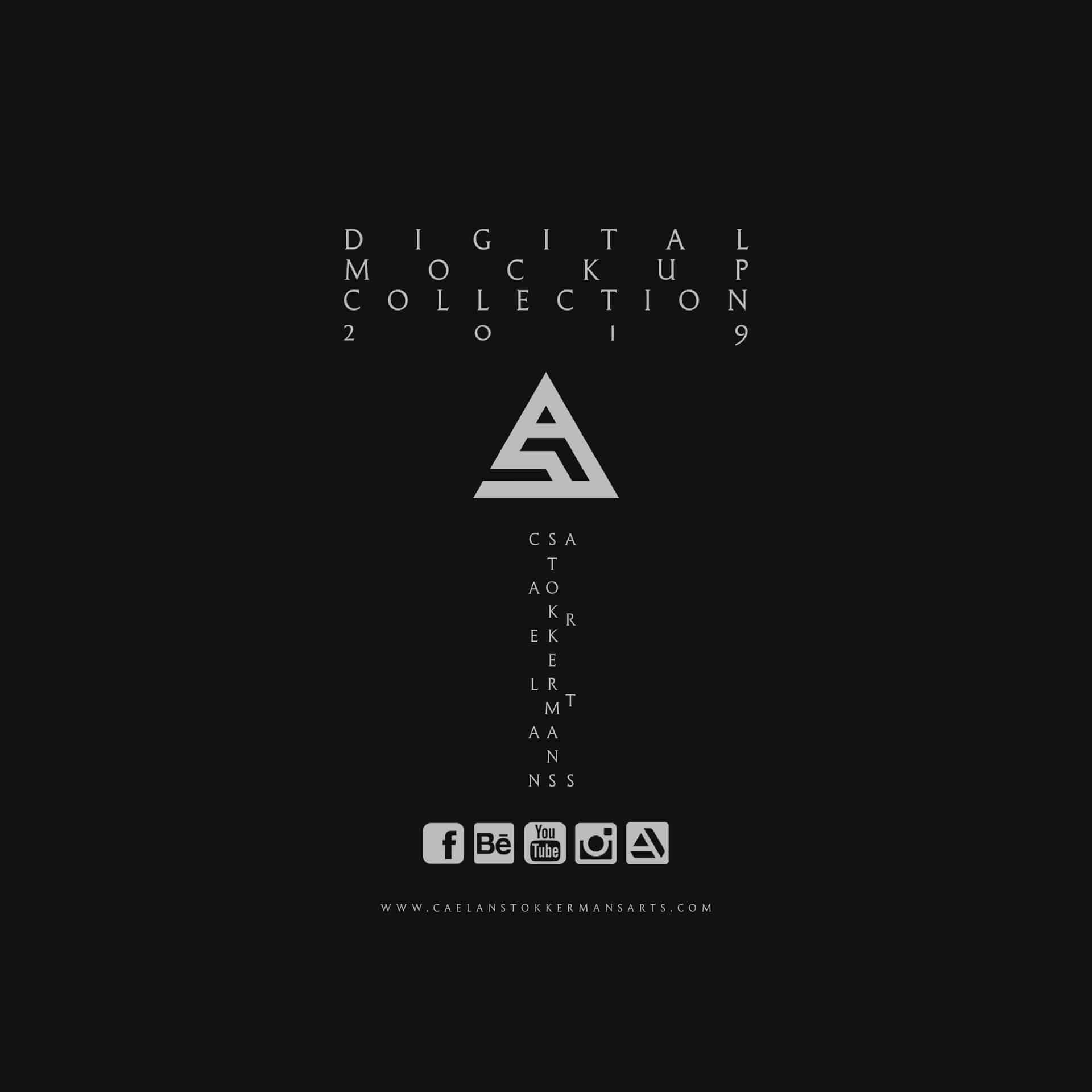
I wanted to have a more streamlined look to my mock-ups to better represent my work and style. Felt like my previous designs were outdated and didn't represent my work as well I would have liked. The color composition and style were inspired by my website where I use a lot of grays and blacks to make my colorful artwork pop out. I wanted my mocks to have that same cohesive look.
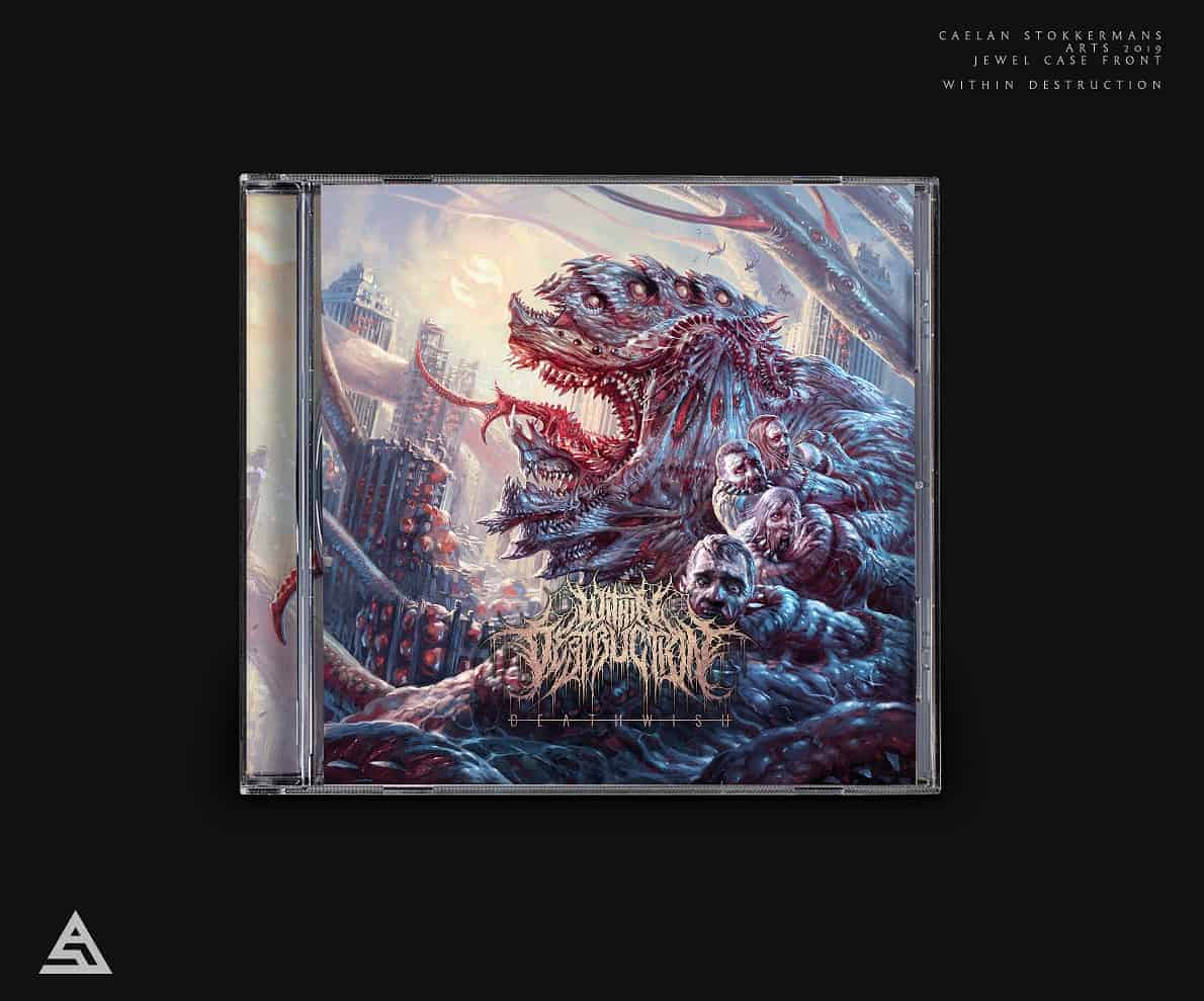
I used Adobe Photoshop to create these design mocks. I used my previous design mock-ups as the basis of the design and then altered the overall look and style. I started by pulling various design inspiration to work off of and then adjusted and re-arranged the design till I was satisfied.
My audience seemed to like the new look of the design mocks. I had an overall positive reaction towards them. I learned to make sure the text and design layout works with various social media sites. For example Facebook covered up the description when I placed the text in the upper left corner. So for future designs I will need to keep that in mind.
I like this! Awesome design