Divan Grozny

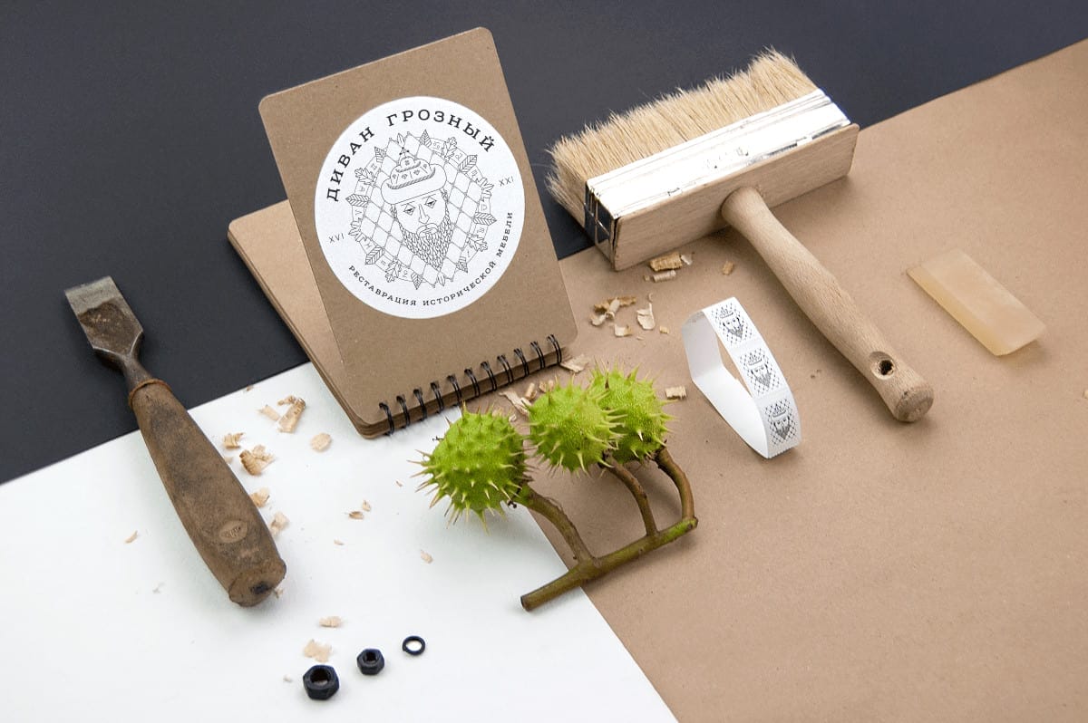
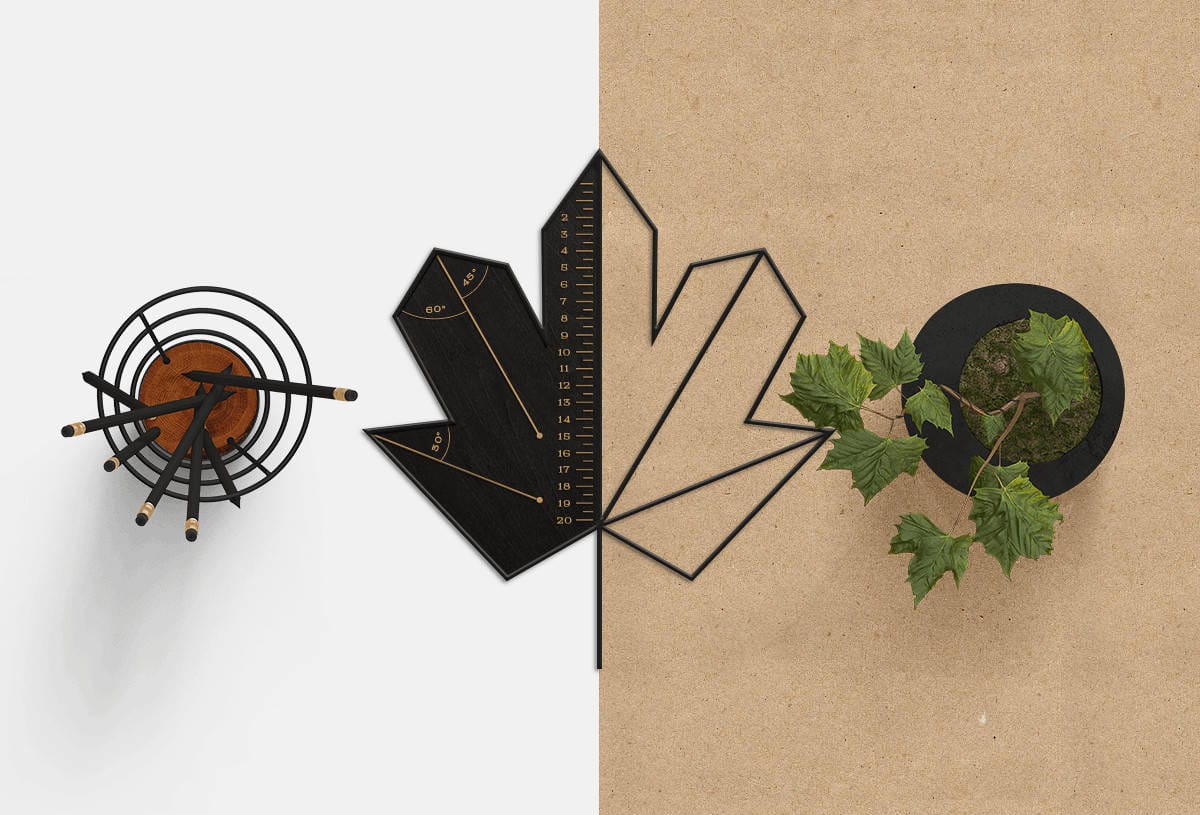
Divan Grozny is a company engaged in repair and refinishing of centuries-old furniture. The brand identity of Divan Grozny express this point in logo design, patterns, business cards, accessories and hidden symbols. You can see process, some images of design and communicative intention below.
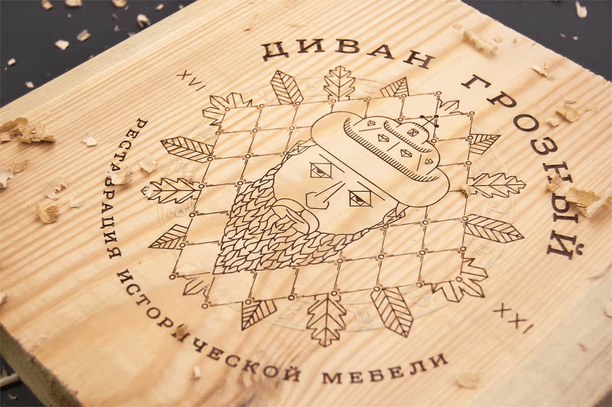
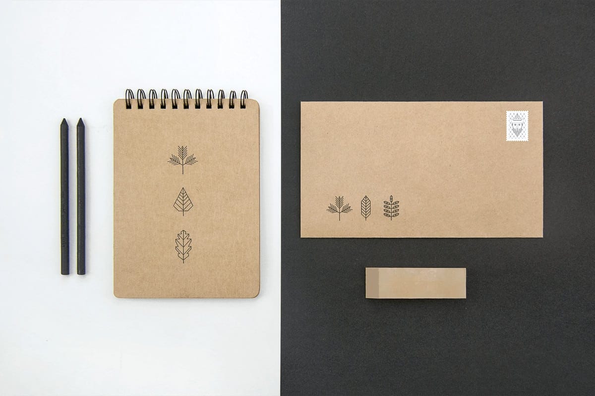
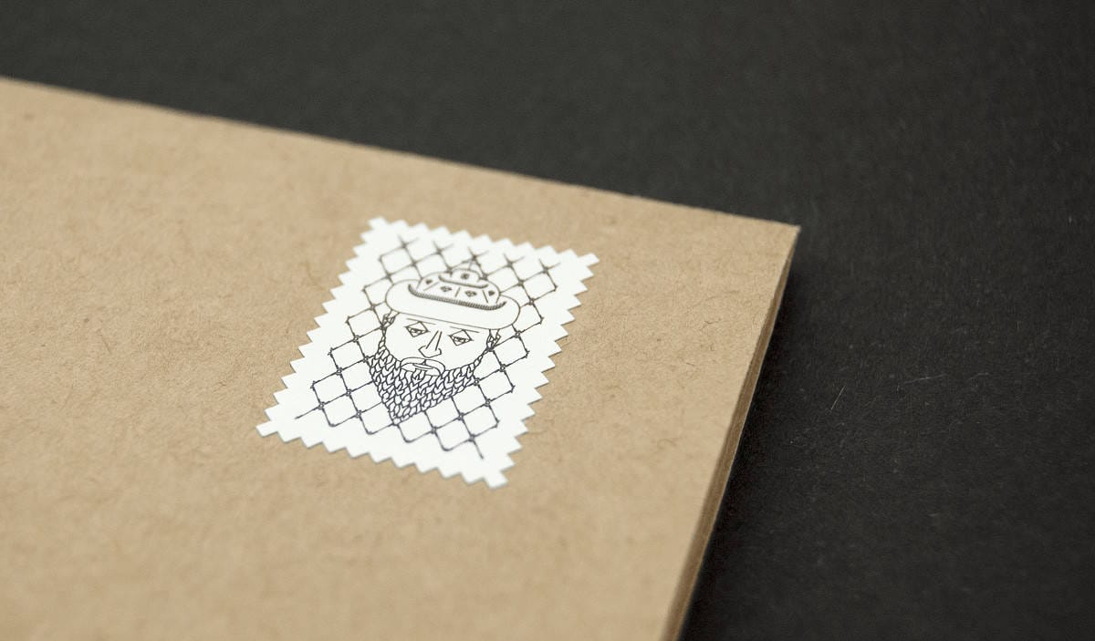
The style combines several ideas. The wood is a basic material and an embodiment of longevity, while the brand defines the pattern and the main character (company name is consonant with Ivan Grozny, known as Ivan the Terrible, a historical figure; ‘divan’ stands for ‘sofa’)
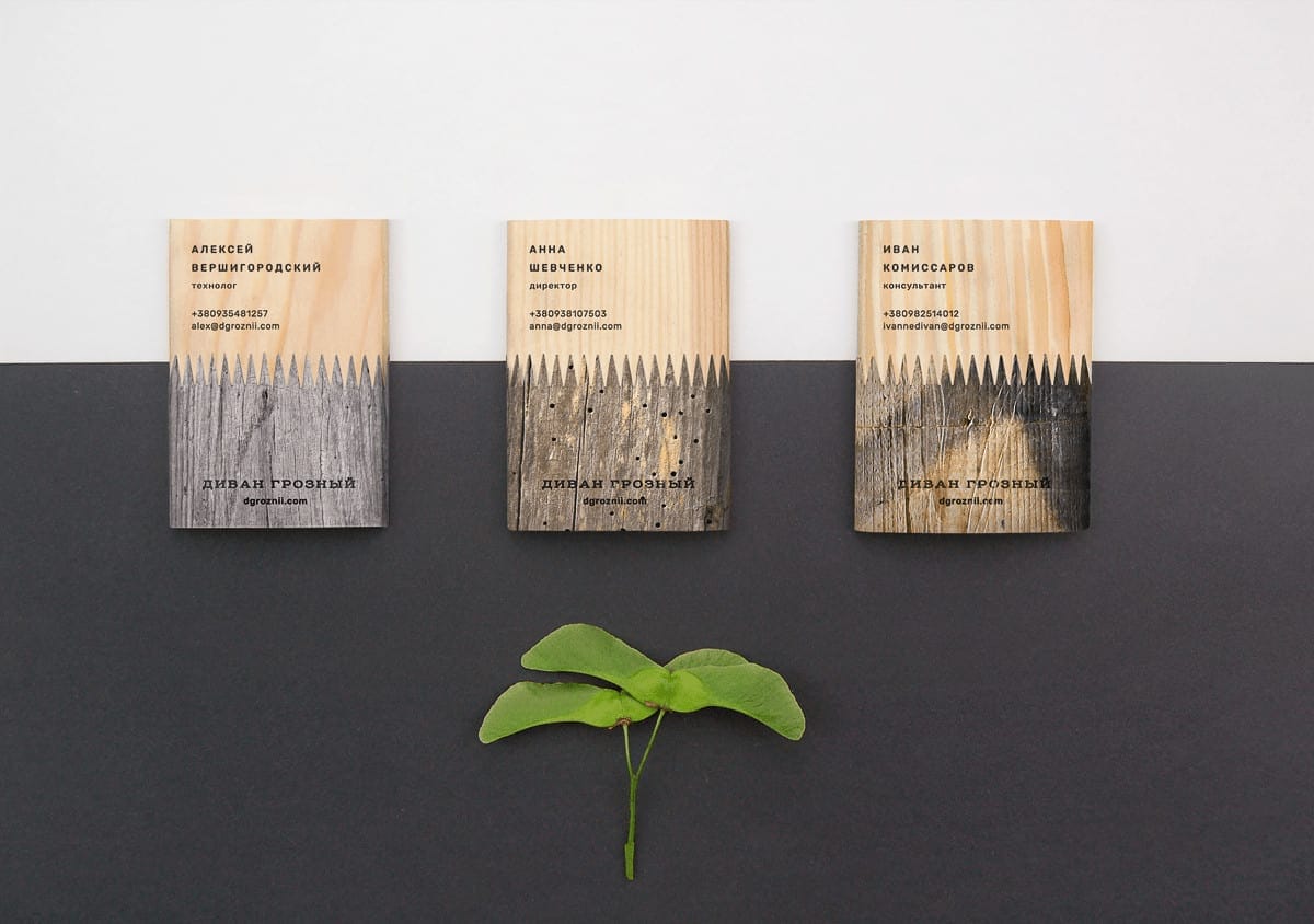
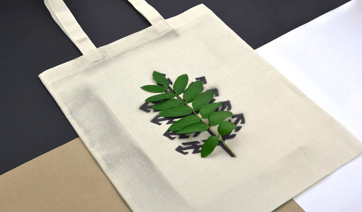
The logo contains non-obvious elements, zodiac signs. The thing is that the throne (or let us call it ‘divan’) of Ivan Grozny is embellished with zodiac signs and a horoscope. Zodiac signs arranged clockwise symbolize backflow of time, returning furniture to its pristine look. Luminofor and thermochromic inks help to emphasize this conception in a number of cases.

It's not common thing to combine historical person and refinishing of centuries-old furniture in one branding case. Smart naming and strong linework design creates unique visual picture and are aesthetically appealing . What do you think about Divan Grozny's brand identity and? Share your thoughts in the comment section please.