DK

DK – Engineering, construction & management.
Mr Dimitris Katsaris comes from a family of engineers with an extensive experience and great accomplishments on their fields. He approached us to create their new visual identity. The main goal of the new design was to be able to attract and approach the foreign market with a single, modern and functional corporate identity as well as to develop new domestic relations with the foremost goal to cooperate with companies and architects who share the same vision.
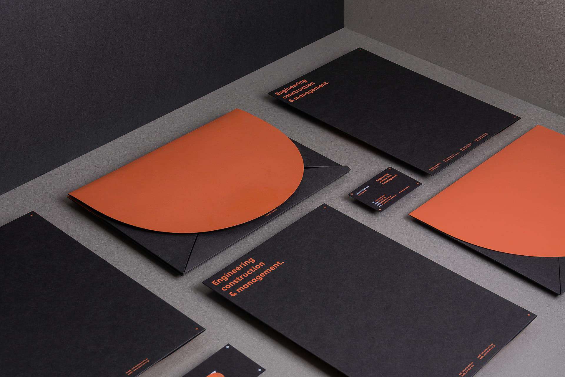
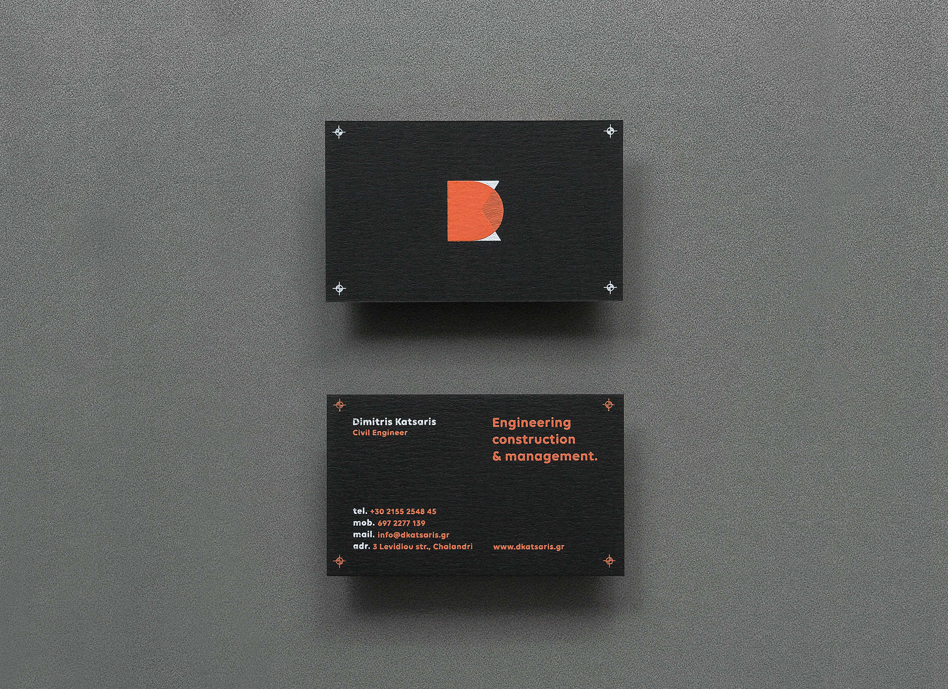
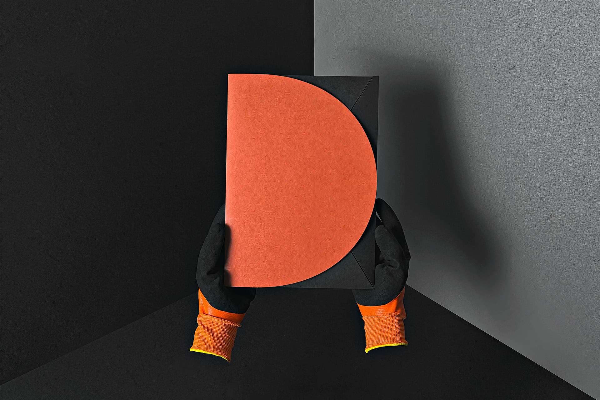
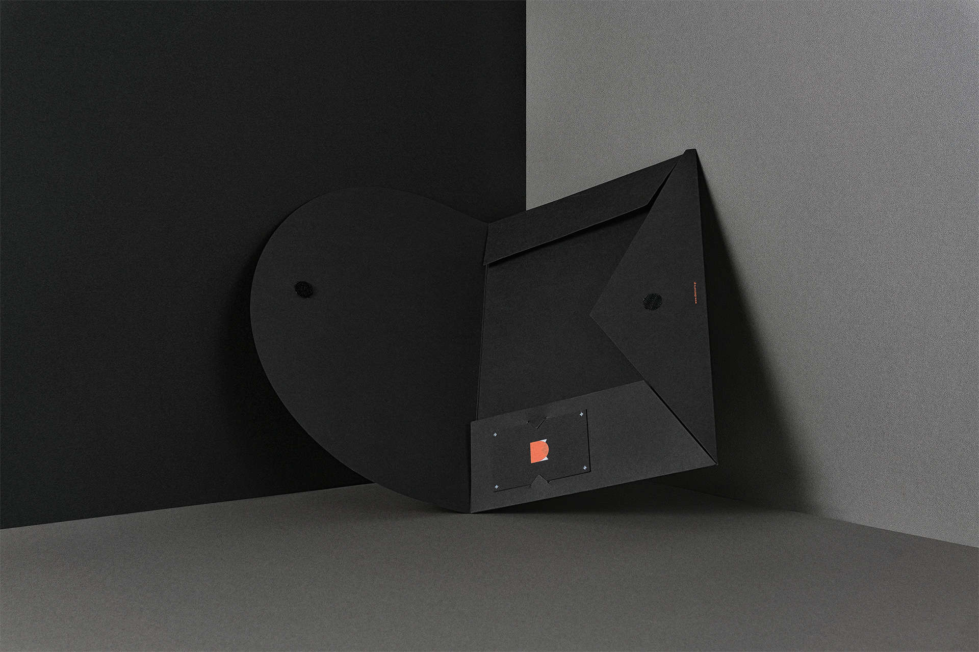
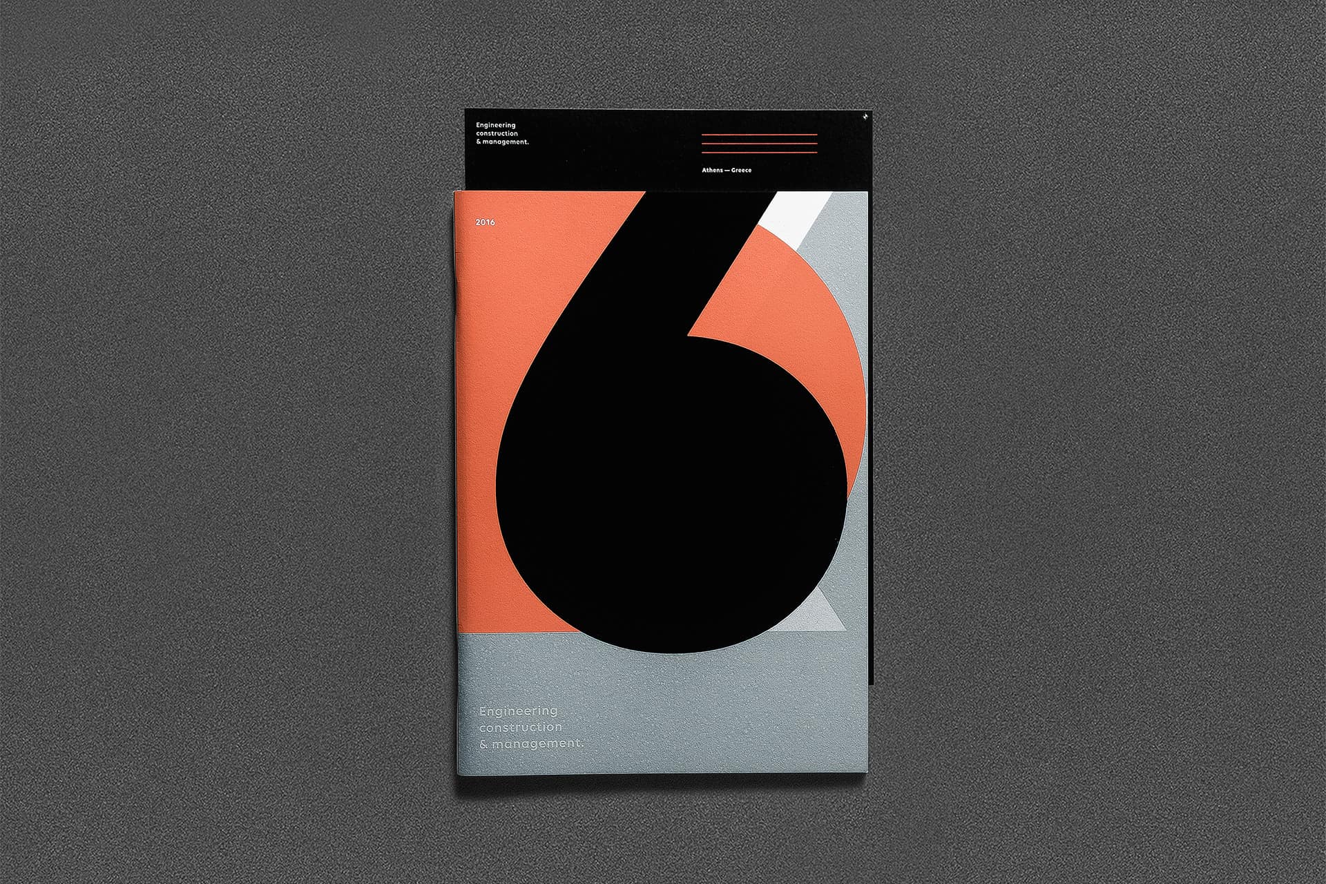
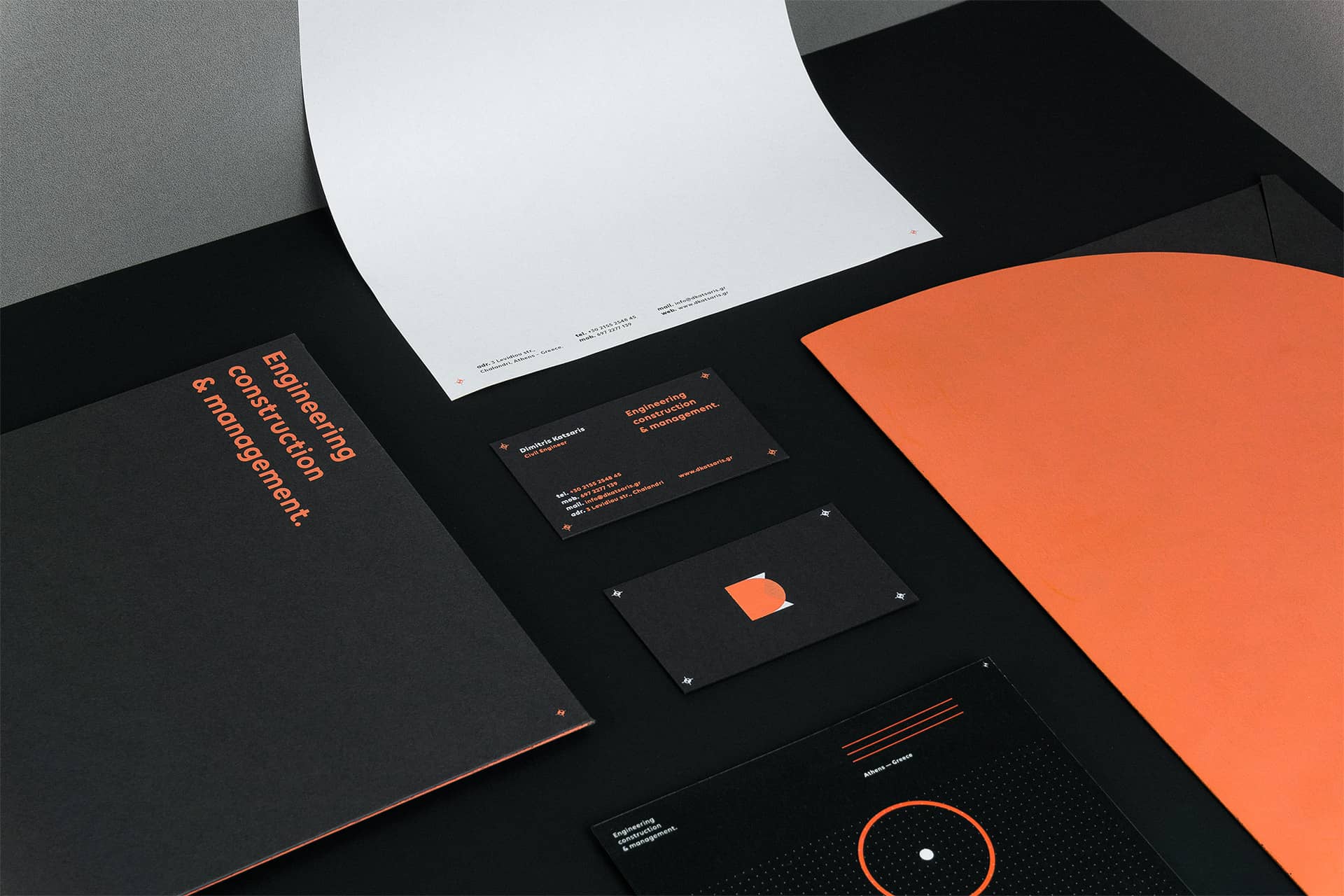
The new identity was mainly inspired from the geometric elements that can be found on the engineers blueprints. The chosen color palette uses a distinctive orange tint as the dominant color. A color that is inextricably linked with the signage on construction sites and demarcation areas.
In order to achieve coherence throughout the identity, we designed some basic visual elements as a guide for the development and the brands promotion. In order to achieve the desired print result of the “multilevel” new logomark and visually pair it with the digital applications we decided to implement all the applications using the silkscreen printing method. A custom orange color code was created and after a lot of trial and error we achieved the visual and the tactile prefered result.
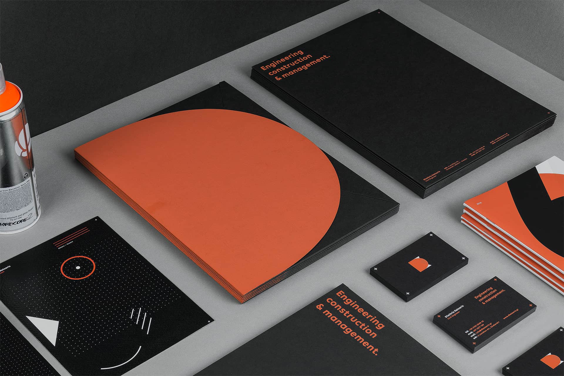
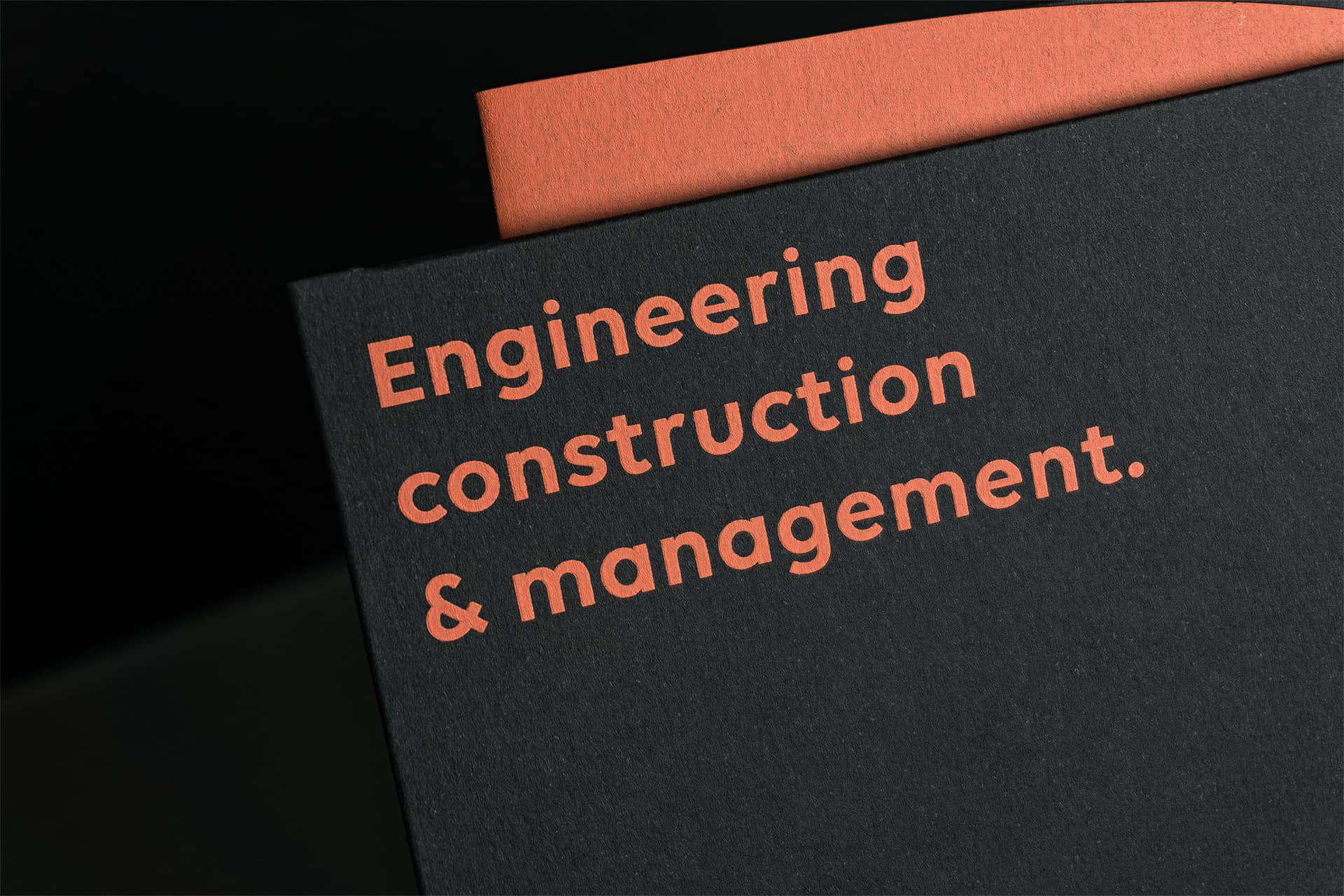
We started from pencil drafts as always and continue with adobe illustrator. The logomark, typography and layouts created there. InDesign was used to set up a brief brand guideline for internal use only and some other requested templates. For the early mock ups we used Live surface and Adobe photoshop and illustrator to create the presentation for the client. When everything was agreed from both sides regarding the finals designs, paper stocks and colors we then then worked closely with the print shop and other creative partners to supervise all the the steps of the printing process and delivery. When all the printed materials arrived we set up the studio to showcase the work and create some visual stills for the client through the process. Adobe bridge was used for the selection set up of the images and at last we jumped into raw editor and adobe photoshop to make the desired lighting changes and post editing accordingly.

So far the feed back is warm-hearted. The project has been been featured in various design related blogs, on behance's AIGA, the professional association for design feature page and will get published on 2 future publications. Further the visuals created for the brand got some really great attention over our instagram profile. Client side, there is already a great impact from their area of expertise and we are both very thankful from our creative cooperation and results.
You are more than welcome to see our work at www.angelosbotsis.com
Behance account: behance.net/AngelosBotsis
Instagram account: @angelbts
Facebook personal page: facebook.com/angel.botsis
This is really beautiful! It's super edgy and modern