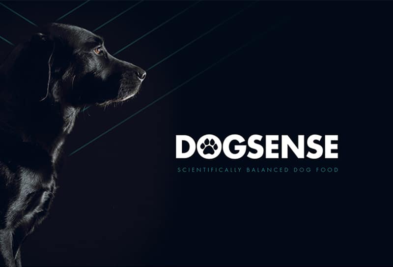
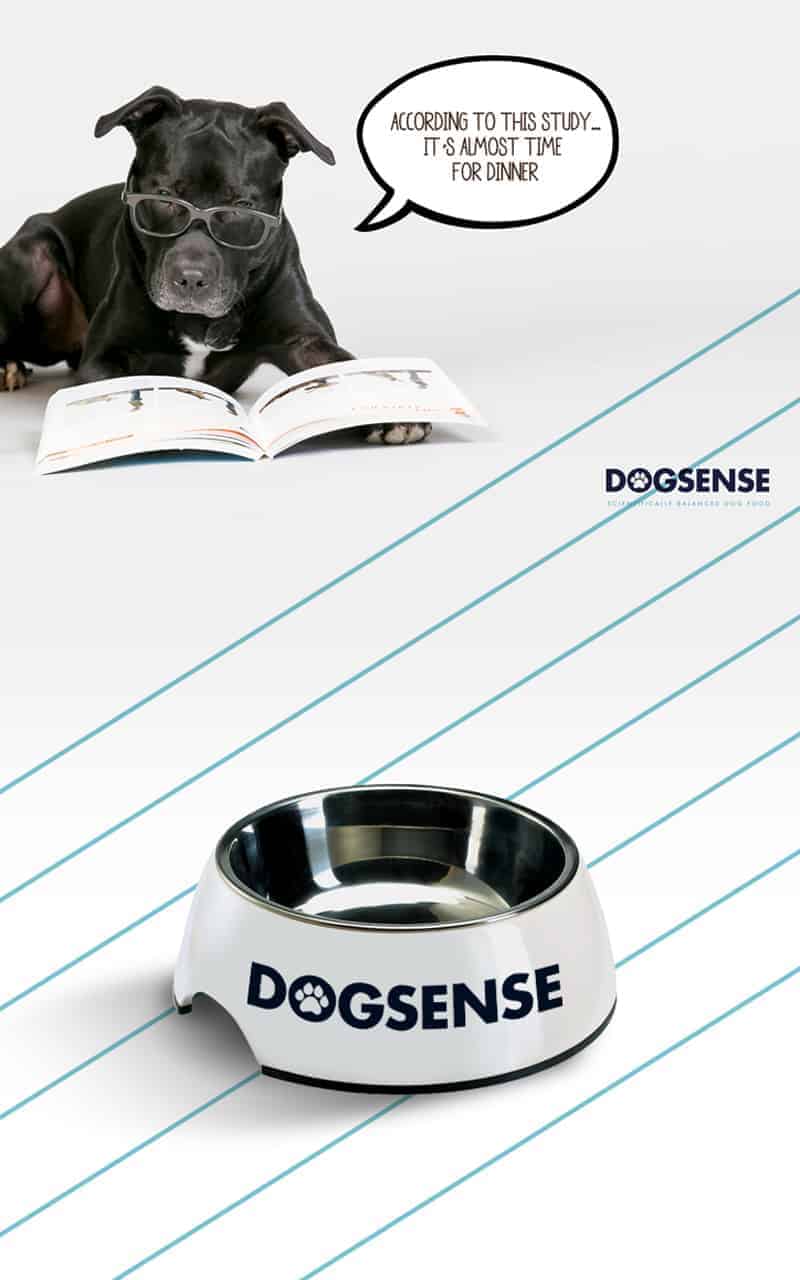
Dogsense

A company by the name Big Paw logistics needed a new look for their brand of dogfood. They felt like their brand was outdated. The goal was to bring their brand into the 21st Century and appeal to a higher market.
The client requested a more modern feel to their brand. They gave examples of brands that they were looking at. After an evaluation I came up with the brand and attempted to incorporate most of what they enjoyed about various elements that they presented.
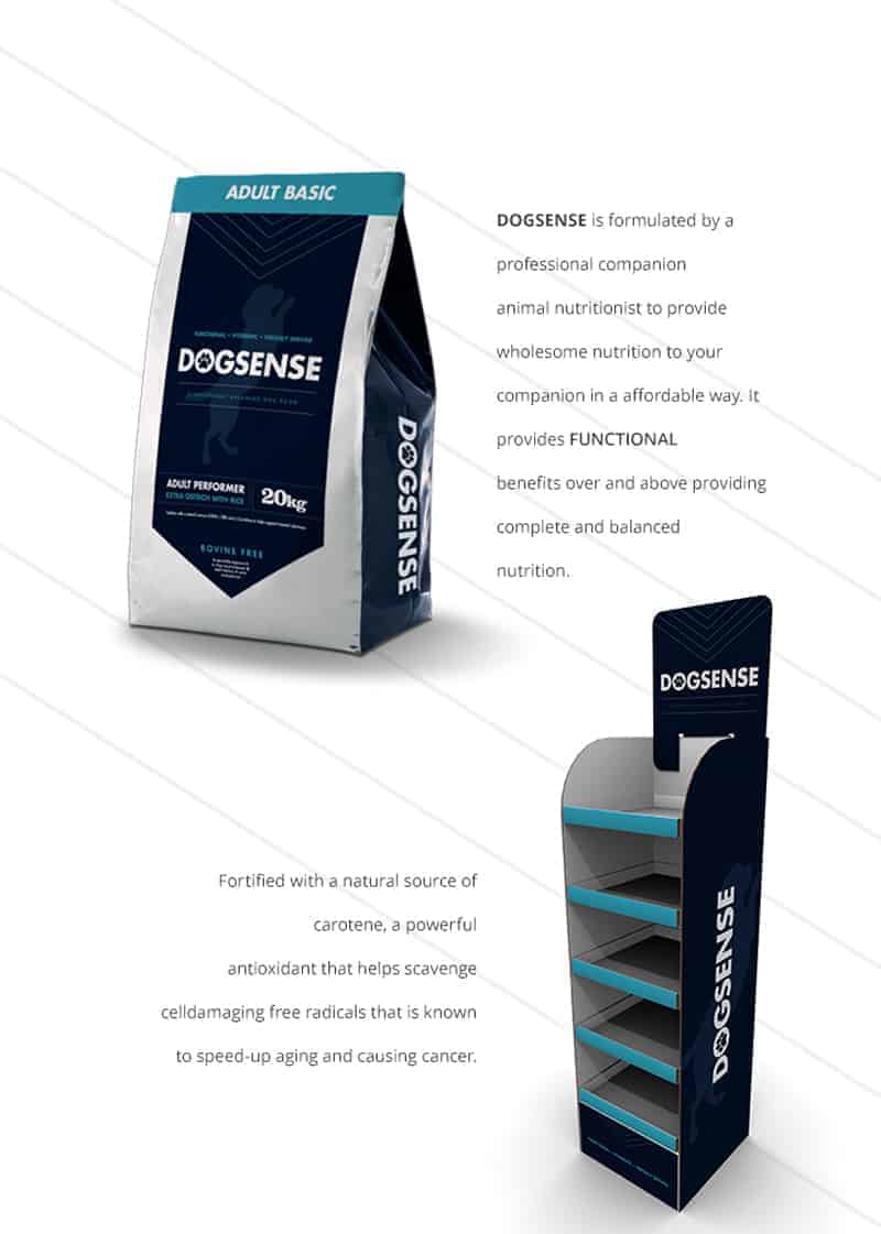
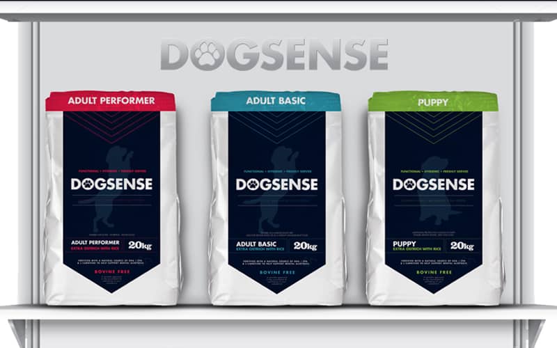
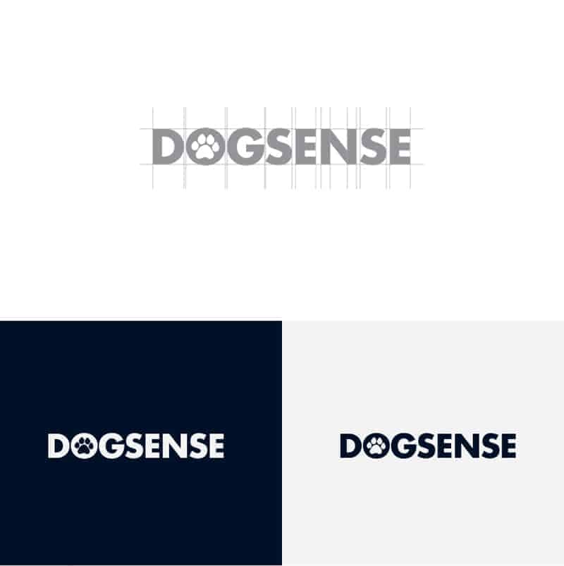
Adobe Illustrator & Adobe Photoshop. I began with the typography. It was based on Futura LT to keep it strong as a base type. From there I began selecting colour palettes and graphic elements to ground the brand. The dark blue was an idea I got from their previous colours that I darkened to create a stronger contrast. The packaging and mockups were all done in Photoshop.
The overall response has been positive. The client was extremely happy with the design and strategy put forth. Due to the new brand being in it's infancy we have not received feedback from the public as of yet. We are, however extremely excited to see what the response will be and what effect it might have on the company.