Droup Camp Logo

Droup Camp is a camp in Sinai, Egypt.
The camps in this area are very primitive and nature based places, very Arabian.
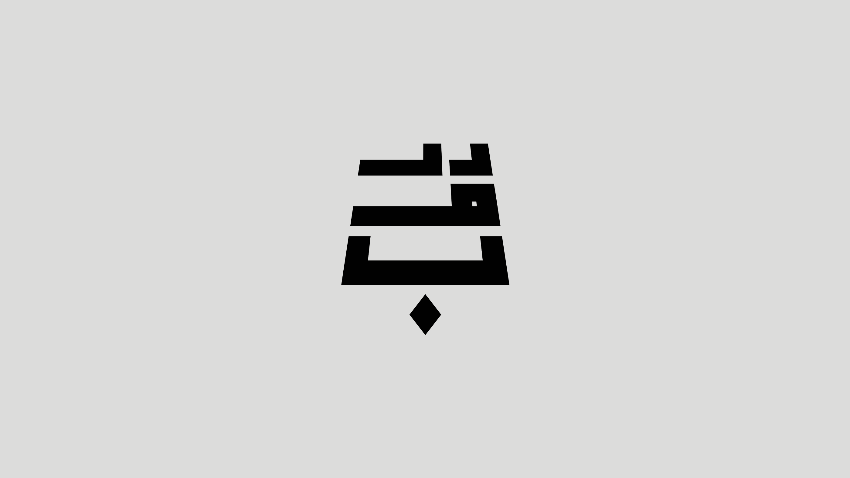
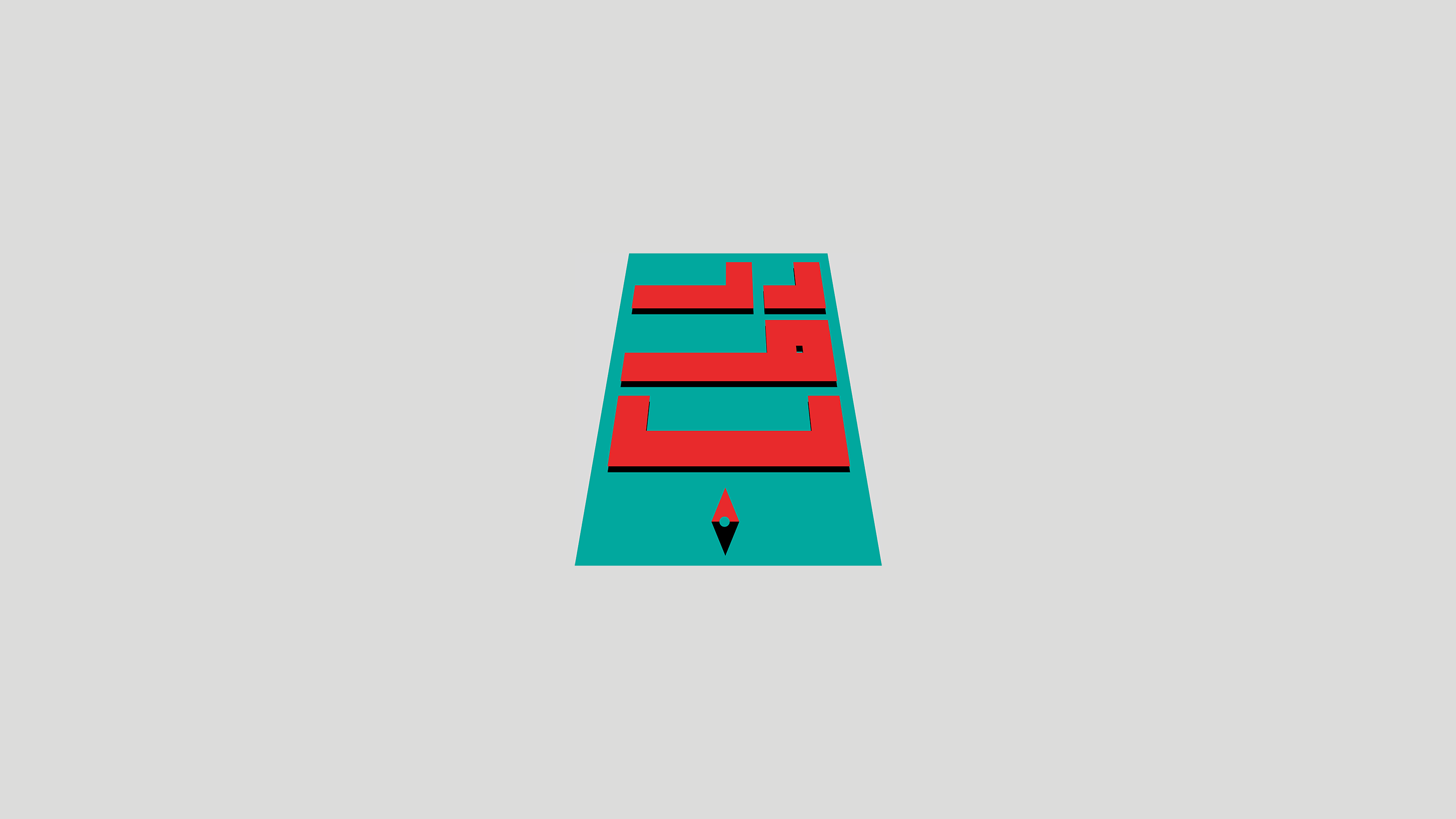
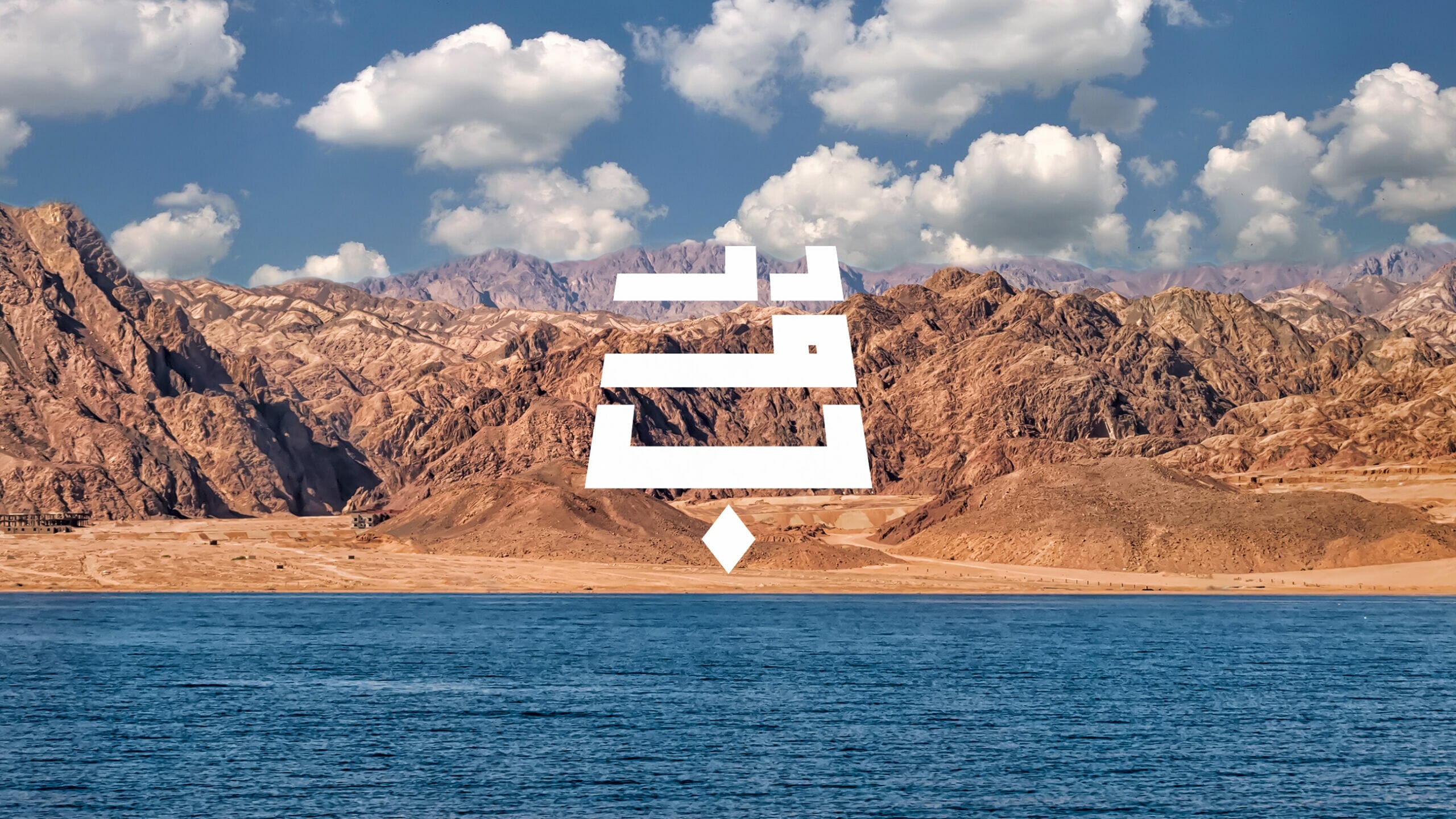
I worked on it as an Arabic typography logo with very bold letters in a cubic style and a perspective to give the nature and the compass feel cause Droub means paths that you need a guide to go through.
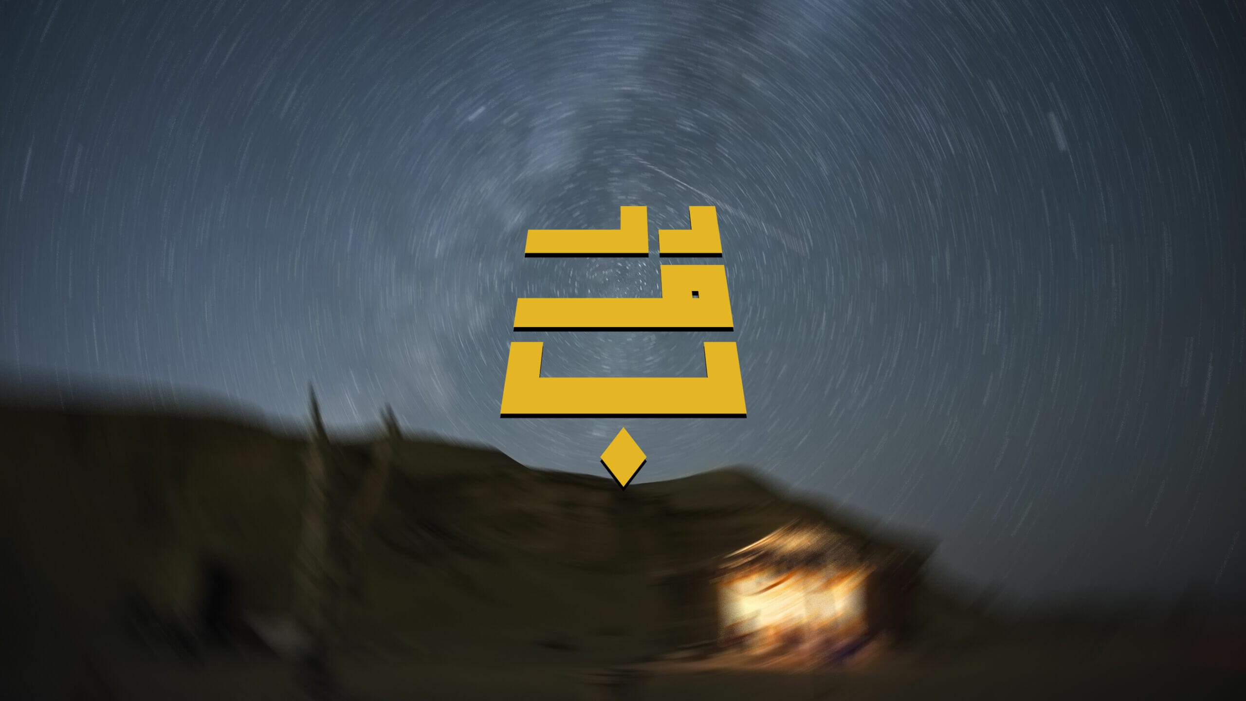
I chose the yellow color cause it's a desert nature originally and black and white.
I started with sketching and experimenting on a paper writing the name and drawing it in a different ways.
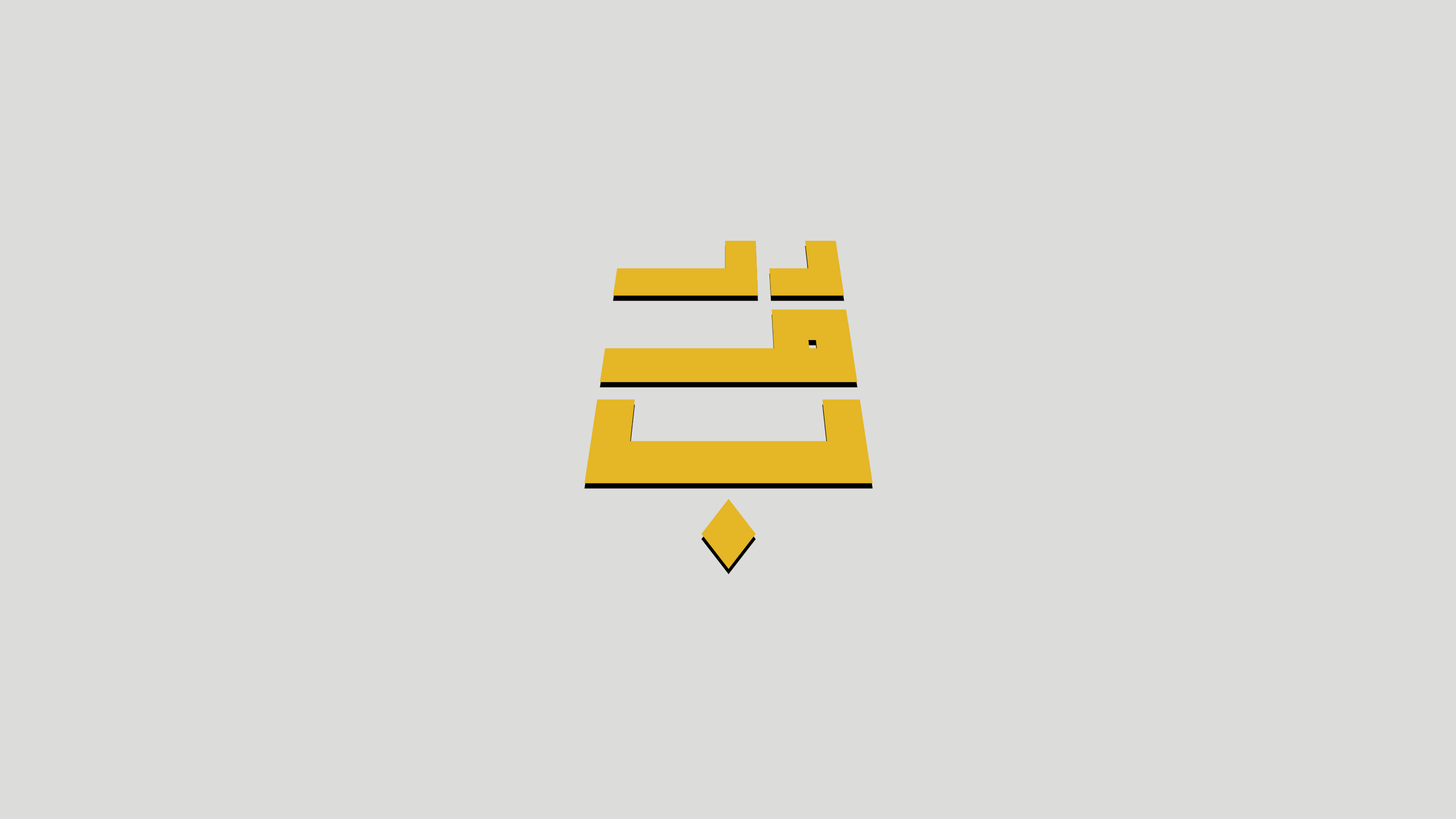
When i liked the cubic version i drew it in a way that shows the letter as layers on top of each other cause you can see in nature the layers very easily going together and clear.
I took the sketch to Adobe Illustrator and illustrated it using my Wacom tablet, then tried to see how it feels on the nature pictures using Adobe Photoshop.
The respond from the camp owner was a good impression and he liked it.
Other people commented on it that it needed some elements, my respond was to try to implement the compass in the letters and you will see that in one of the options in the project.