E-Side

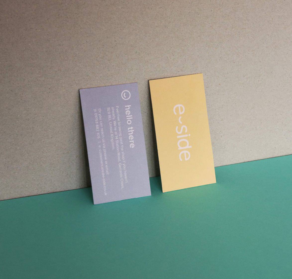
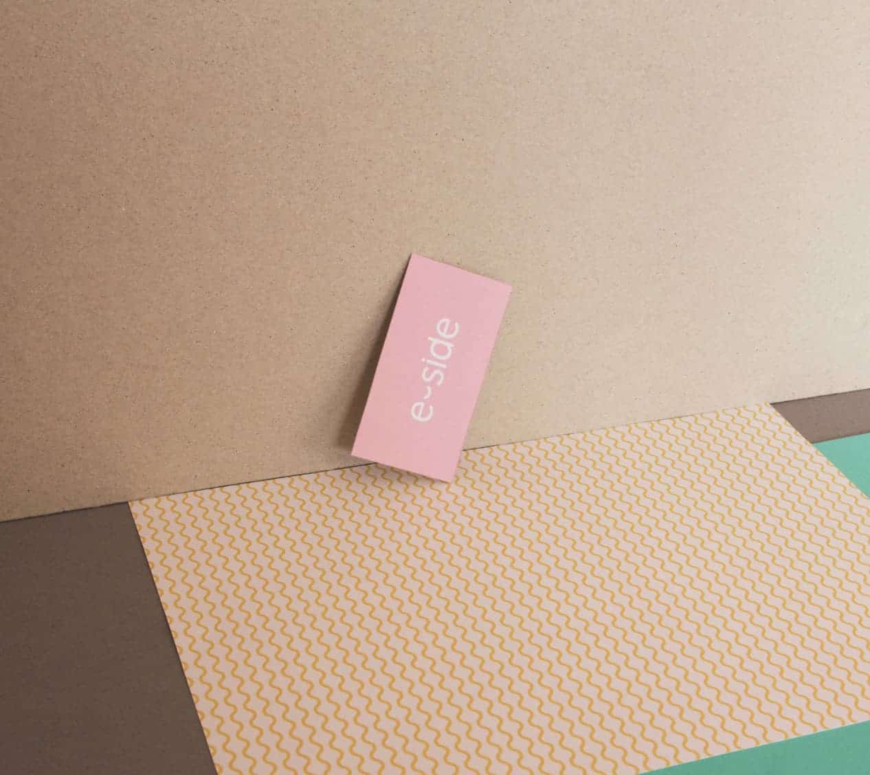
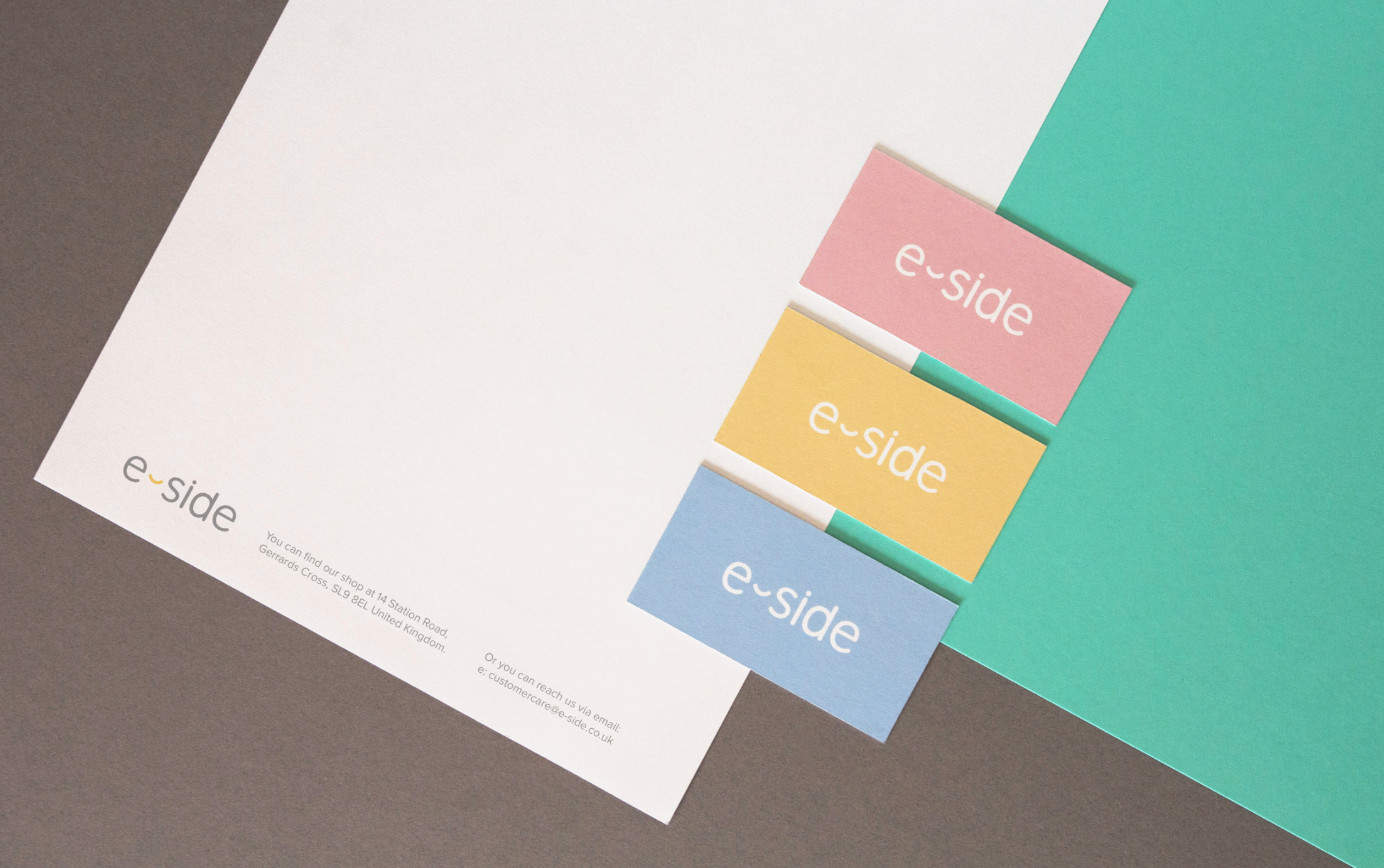
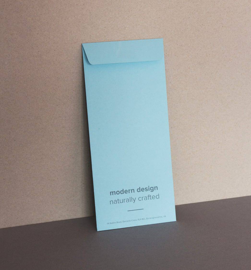
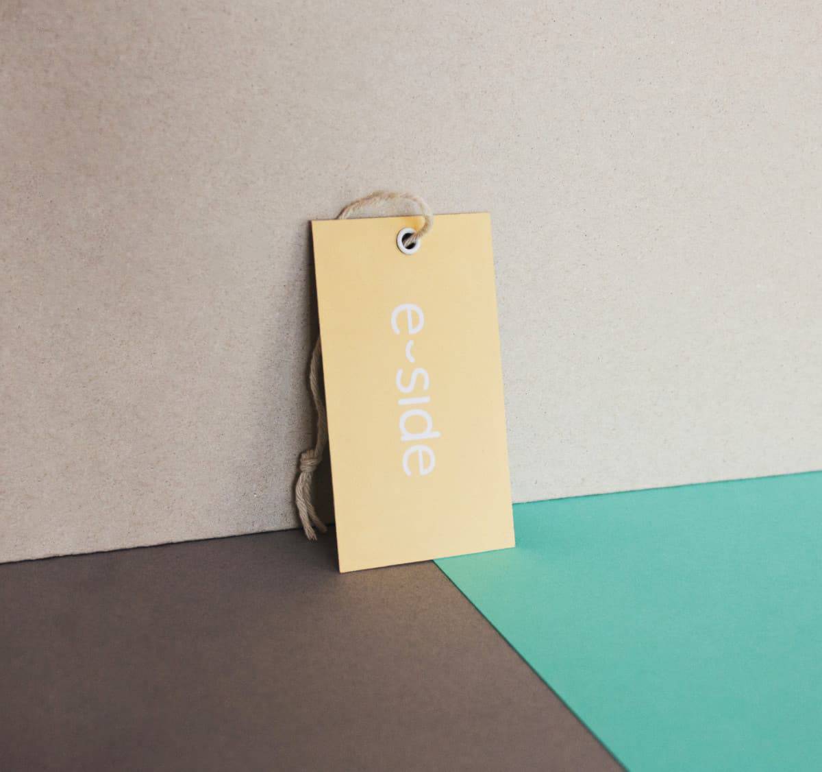
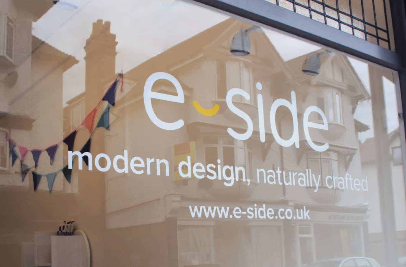
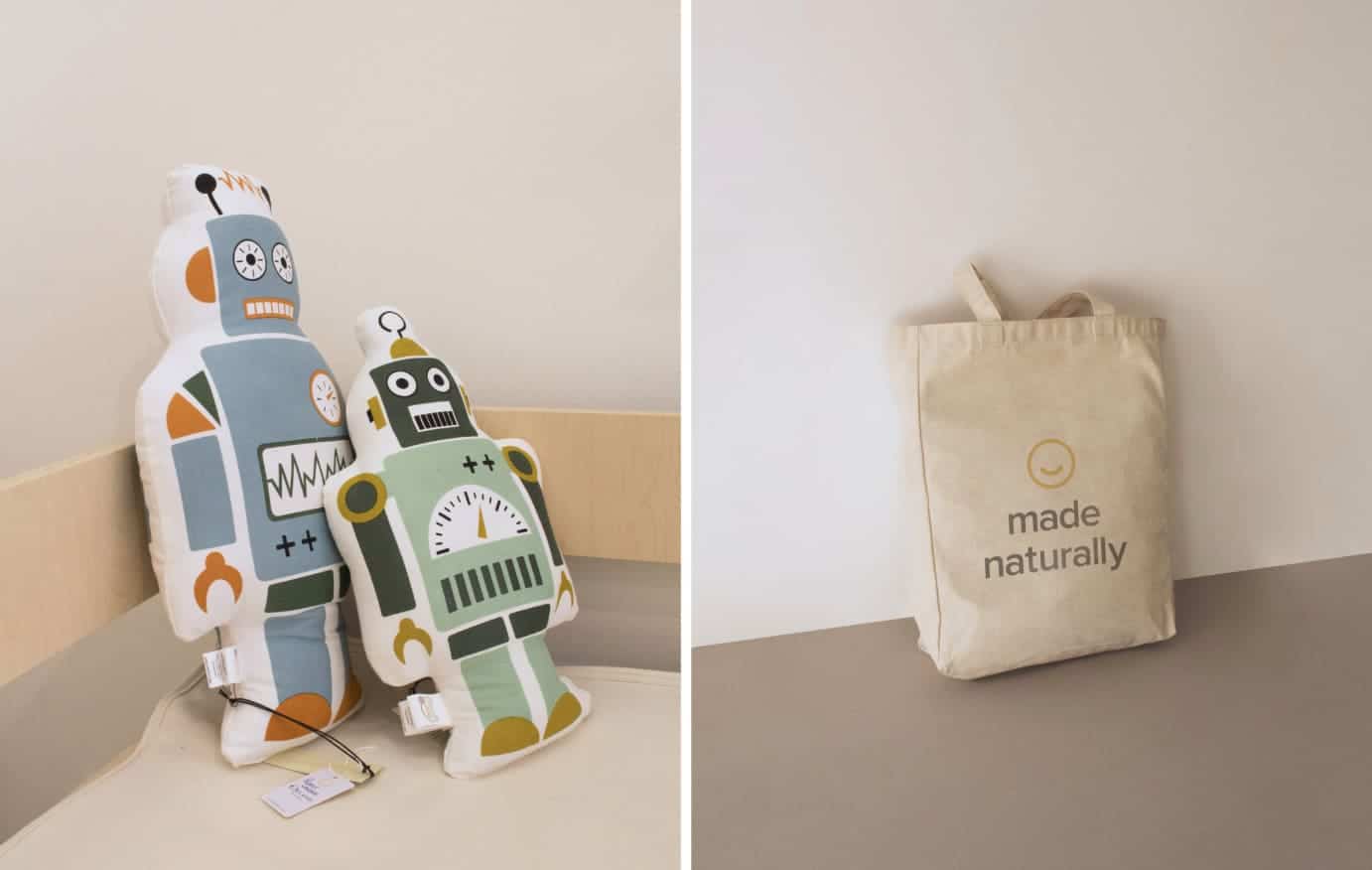
E-side is a children's furniture and homewares retail shop in Buckinghamshire. They were searching for a fresh and contemporary rebrand that would brighten up their image and boost appeal to their market. The branding elements comprise of; a clean, modern logo design, pastel colour palette, smiley patterns and minimalist typography.

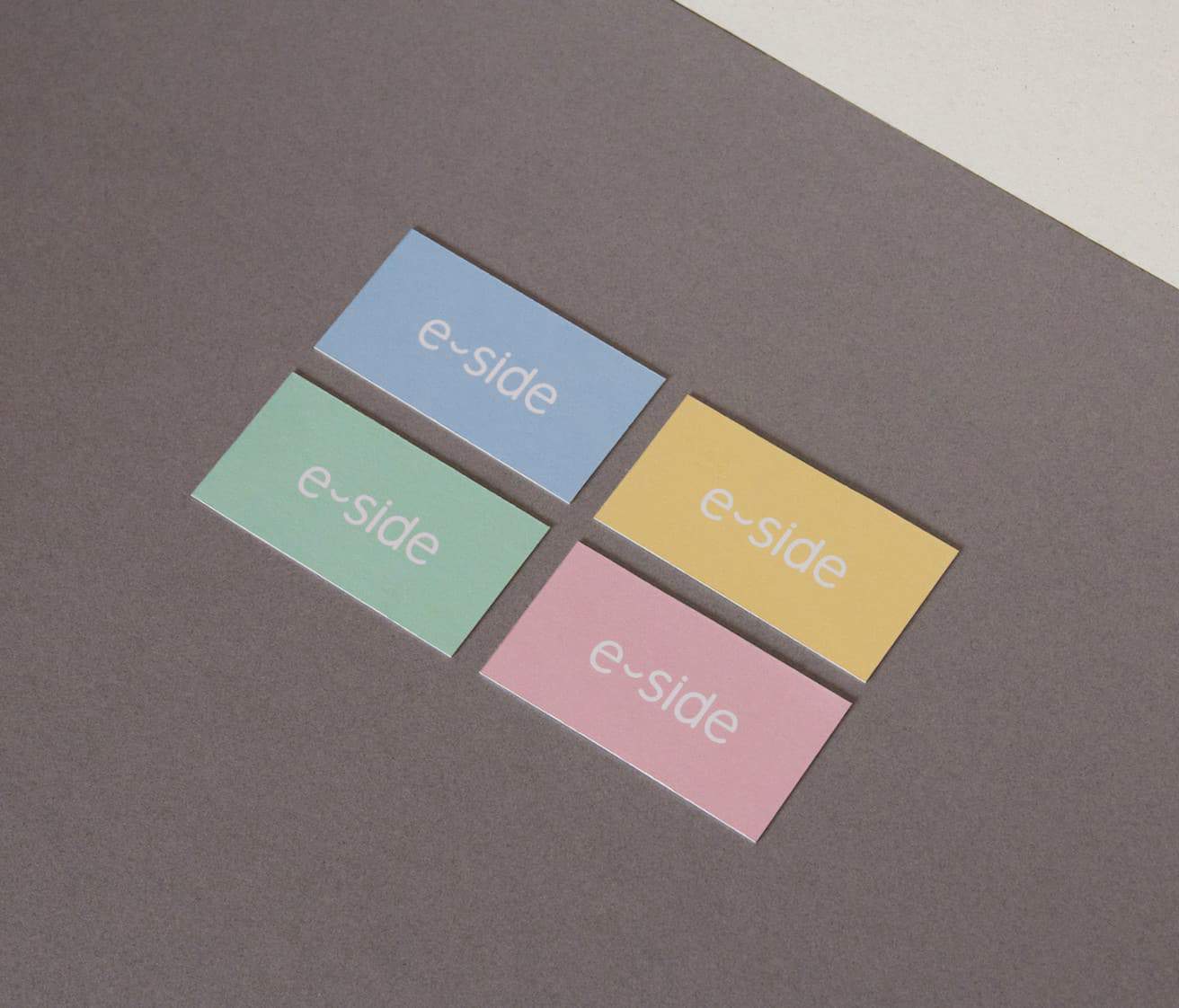
The logo - designed to make you smile - was inspired by E-side's distinctive furniture collection with a hint of modern curves, clean lines and minimalism. The concept came after browsing through E-Side's product range and finding much of their collection had design elements in common. So I decided to use this style that the curators of the shop had cultivated, and then built for them a brand that illuminates that style.
I've used mostly the Adobe Creative Suite, as usual (Illustrator, InDesign and Photoshop) to create the brand mark and other design elements. The logo concept though, began as a sketch in my notebook. I was looking for key elements in the E-Side furniture's shape and construct, and found myself drawing a little curved smiley. And because E-Side is for children's furniture the smiley seemed to fit perfectly!
I'm excited to hear that people really like the new design. I've had comments from other and also the customers of the shop saying how fresh the design is and how they love the new colour palette and contemporary, professional logo.