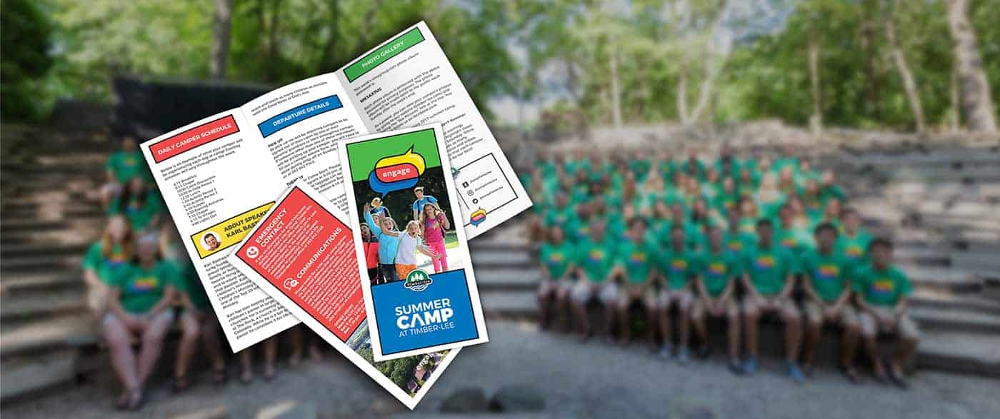
Engage 2017

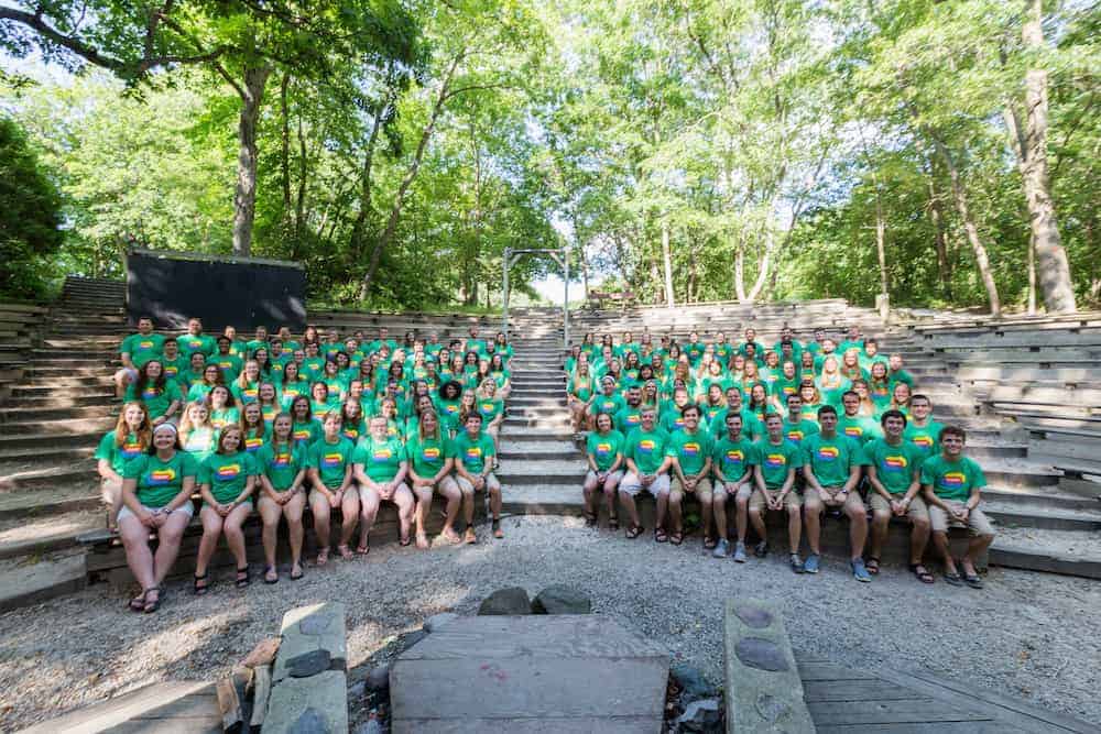
Camp Timber-lee is a summer camp in Wisconsin with 45-year history and a variety of programming all year round. Each summer at Timber-lee, a theme is chosen which serves as a spiritual concept to guide pastors' sermons, discussion, and study during the eight weeks of summer camp. This theme is then turned into a logo and used throughout media for much of the summer. It ultimately becomes a sort of icon for that year's summer camp, and for kids, a part of their camp experience.
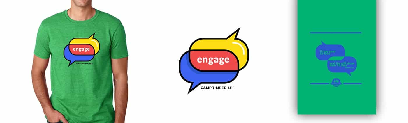
The word "Engage" had already been chosen and was proposed to me as the idea of moving deeper in one's faith and engaging with God on a deeper level. I tried many things to convey the word "engage" such as chain links and grasping hands before landing on the final design, but everything felt cliche and overdone and I didn't want the summer's theme to look like clip art.
What I finally landed on was two speech bubbles overlapping. One comes from above, and one from below and it represents God and a person in conversation with one another. The place where those two parts of the conversation overlap is where the word "engage" falls. It's a big concept in Christianity that a relationship with God is living and intimate, and talking about a conversation with him is not merely metaphorical. In short, to "engage" with God involves a conversation with both sides.
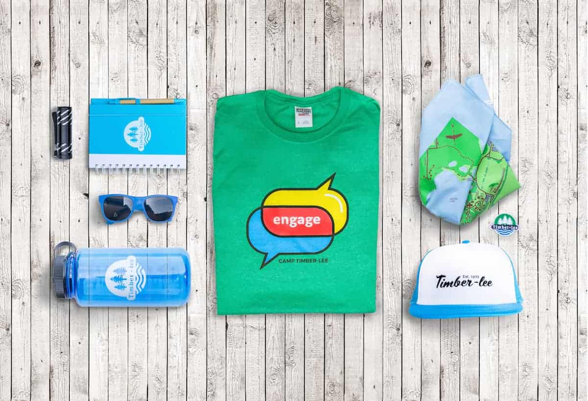
On a technical level we chose bright and youthful colors for this summer camp design, and we wanted to make the t-shirts as comfortable as possible by choosing a softer fabric. To my delight many people noted how they liked the soft tee and bright colors. It is my hope that it is a memorable logo for kids who attend this year and that they would look back on their summer camp experience with fondness and recall all the ways in which they grew and had a great time.

I work mostly in Illustrator with occasional use of other Adobe softwares. I went through several (pretty terrible) concepts, some of which I sketched by hand and others that I worked out in Illustrator before getting to the final version. My wacom tablet is also my absolute favorite digital tool that I use for everything.
The initial version of the design you see now didn't have a contour line and was more of a 'flat' design. But I felt it was lacking and so we added a bold stroke to make it stronger. Once it was completed I worked on how I would further use the logo. Throughout the summer this emblem is used in videos, banners, print materials, photos, social media, and of course, t-shirts, so it has to be versatile.

Designing for this project is always a bit of a shot in the dark. I'm always trying to make sure the design is relevant considering other trends, compatible with Camp Timber-lee's brand standard, and a great representation of summer camp at Timber-lee. Even with all those things considered there is always an element of the unknown and a fear that people won't love it. Luckily, it seems that they do! I've gotten lots of positive feedback on the project.