ESCOLA DO PENSAR

Visual Identity Escola do Pensar, a Brand Identity for school on Uberlandia, Brazil
Project made in collaboration with Agencia SIC.
A SCHOOL BRAND WAS CREATED WITH A PERSONAL REASON.
AND ALL PEOPLE ARE FORMED BY A SET OF VALUES:
-Responsibility for the education of our children
-International and daily availability of teachers
-Contribution for the creation of better schools, people and societies every day
-The student as the main focus of this school
-Teaching free thinking as the main mission of the school
-A 360-degree view on student education, building moral, spiritual, intellectual and social education
The importance of emotions and thoughts as free and individual values
-Management of emotions and thoughts through tools provided to the student
-God as creator of everything
Concept:
Three important features of the school of thought served as inspiration for the design of its visual representation:
- Knowledge, which gives freedom of thought
- The student, represented as the center of everything
- God, as creator of everything and everyone
But a simplified symbology of these three elements would not be enough to compose the design of a brand
who sets out to teach people and think.
It was necessary to be more intriguing, more thought provoking, more provocative, more challenging.
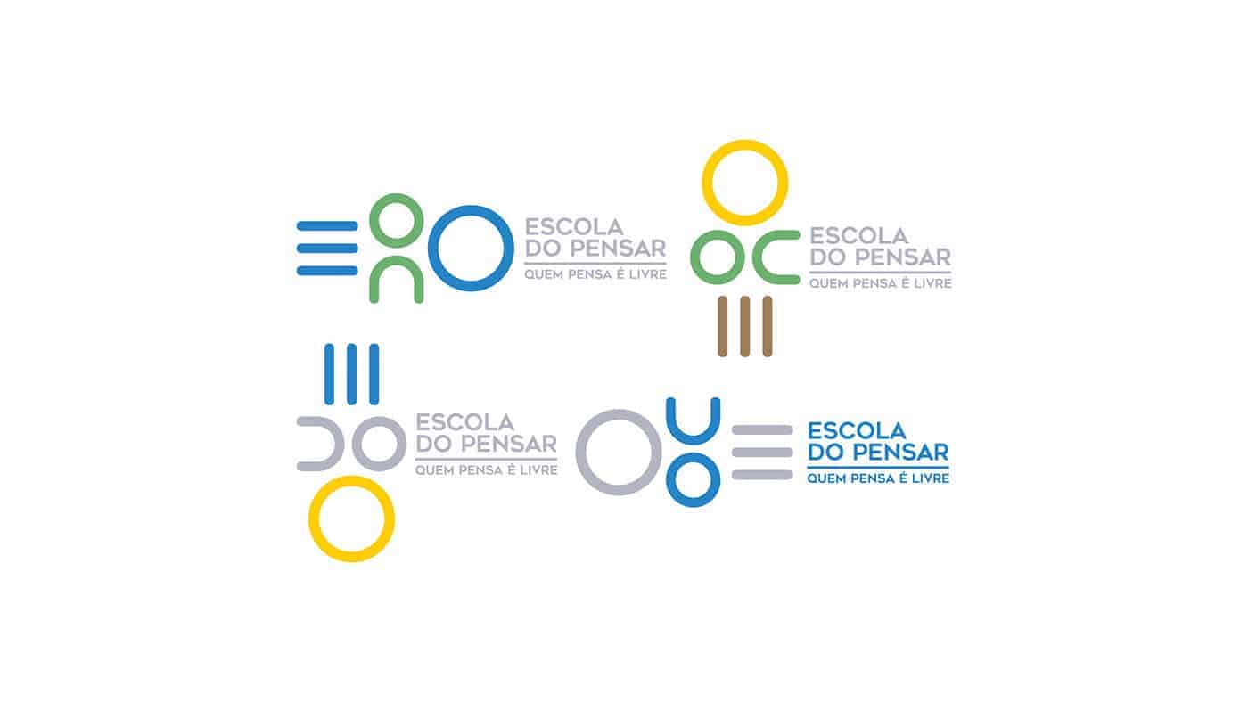
Therefore, we seek to make a mark with multiple readings, interpretations and representations. A brand with 360o, which can be used and interpreted from various angles, as well as the school in the training of its students.
The result of this reasoning is a transverse mark. A visual set with horizontal and vertical reading, which can
rotate freely on its axis. A brand that lives in the real world and in the world of ideas.
The reading of the mark in the real world is rational, objective, explicit:
- The student as the center of everything
- Knowledge coming from one side, represented by a simplified pile of books, universal symbol of education
- And individual and free thinking on the other side, as a result of the school's action
- With traits that clearly define a business focused on education services
Reading the brand in the world of ideas is playful and free:
- Knowledge can be seen as an E, initial letter of the name School
- The student in the center can be interpreted as an OD
- And knowledge would represent thinking
- Three icons as a representation of the school name
- But there is much more in a multiple reading and free
- Knowledge as a ladder to a life of growth in which the student encounters God
- The ladder as something that represents our first steps in life
- It is a free brand, whose traits and forms multiply and unfold, forming new meanings
-Simplicity: few tractions combining straight and organic shapes
- Meaning: strength and representation of brand name and essence
-Liberty: multiple readings
-Fertility: ease of unfolding and applications
Creativity: it is a brand that must be accompanied by aromas, flavors and sounds. It is a set of
essential elements that promote and encourage creativity and blurs a purely
of a school
-Attitude: it is a brand that invites us to think, build and transform from the simplicity and
freedom of thought
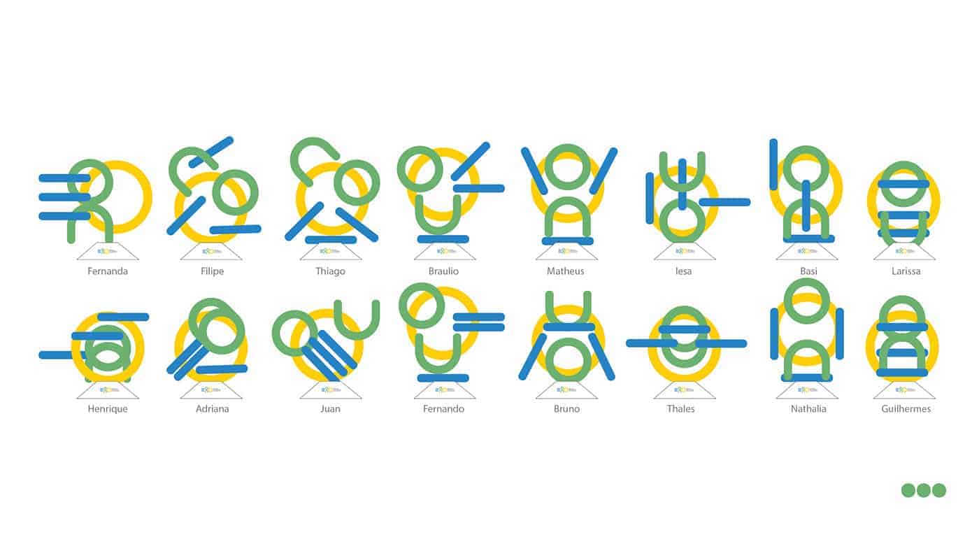
I'm start with sketch on paper, after Illustrator and used "Modo" a 3D software to make prototype, for the awards that was made to give to the students. The idea that every awards is unique for each student depend of his personality.


The client love it. I made being conscious that the most important costumers are the students who wear the brand everyday. Is a responsibility used the right colors, minimalistic use on different appliances to made students and parents proud of his school.
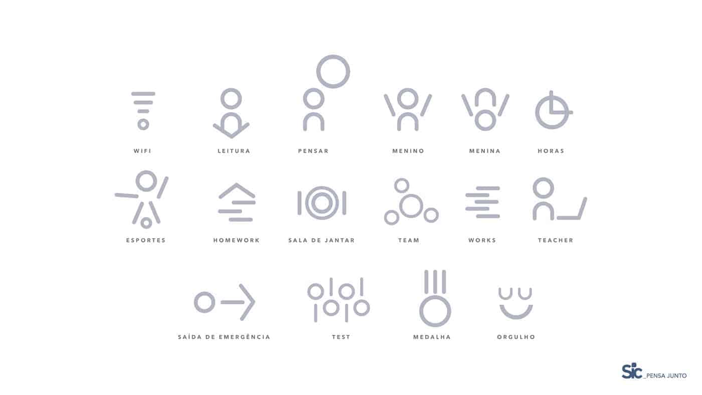
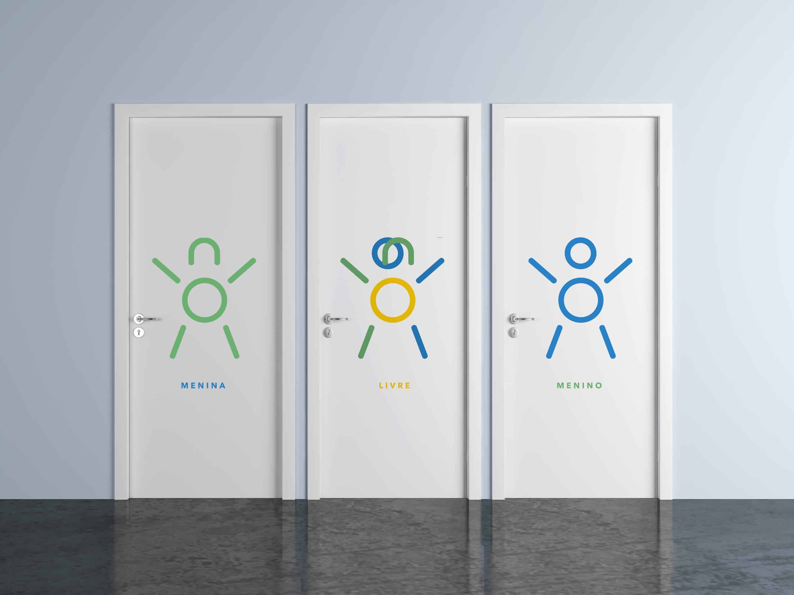
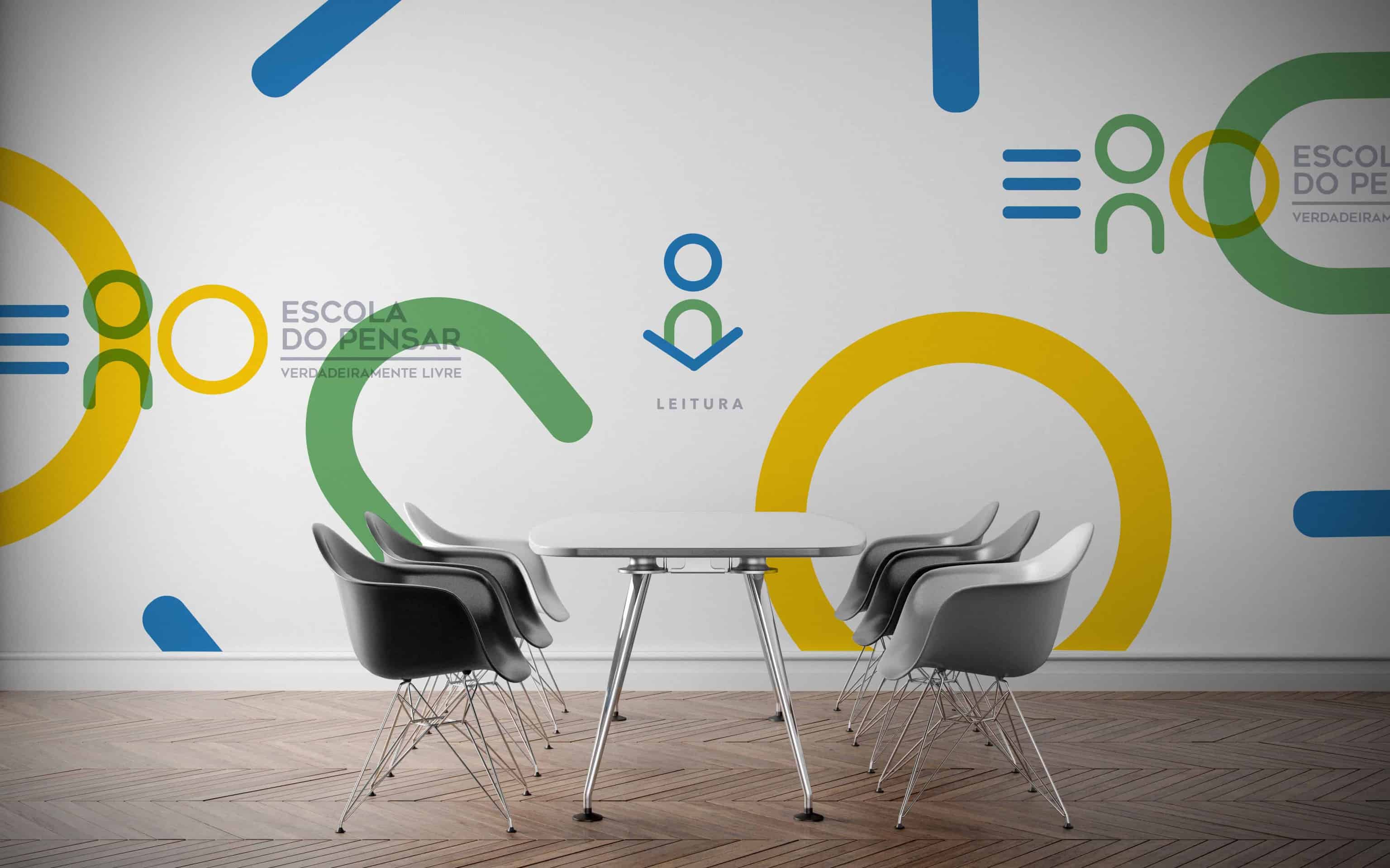
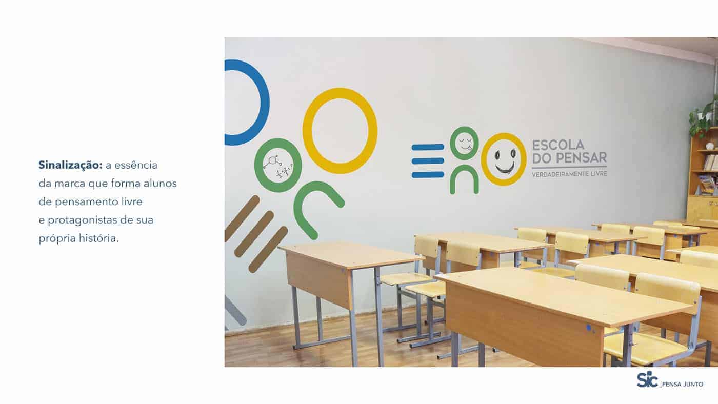
Toilets: symbolizes the building a schoolfounded on God, whoapply your teachingswith more attitude and less speech. Visual philosophy: the icons are built and operated from of tractions and icons of the brand,
in order to maintain its identity, its proportions and its essence. This iconography contains basic elements which, eventually, they will live in and out of school, from their own digital media until signage and materials
institutions.