Estúdio MIZU

Branding Manual made for a graphic and digital design studio called ESTÚDIO MIZU, in which he used as an inspiration the shape of water and how one should be a malleable company and that adapts according to the needs and difficulties of the client in question.
Thinking about responsive design and how much it is necessary to come up with a way of always adapting to the work environment and the differences between each client, I came to the reference of "water", and consequently to a famous thought of Bruce Lee on the comparison between water and how we should act.
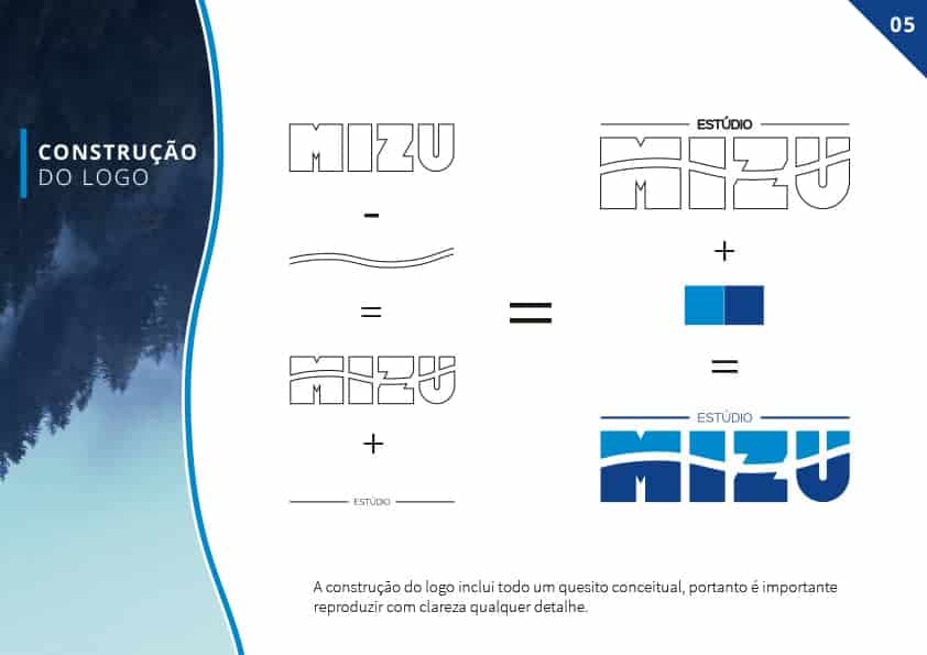
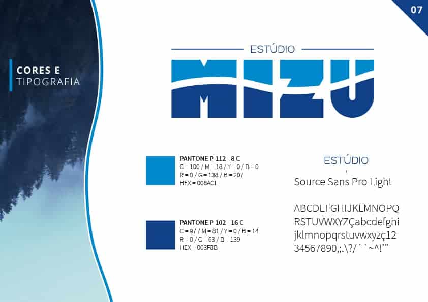
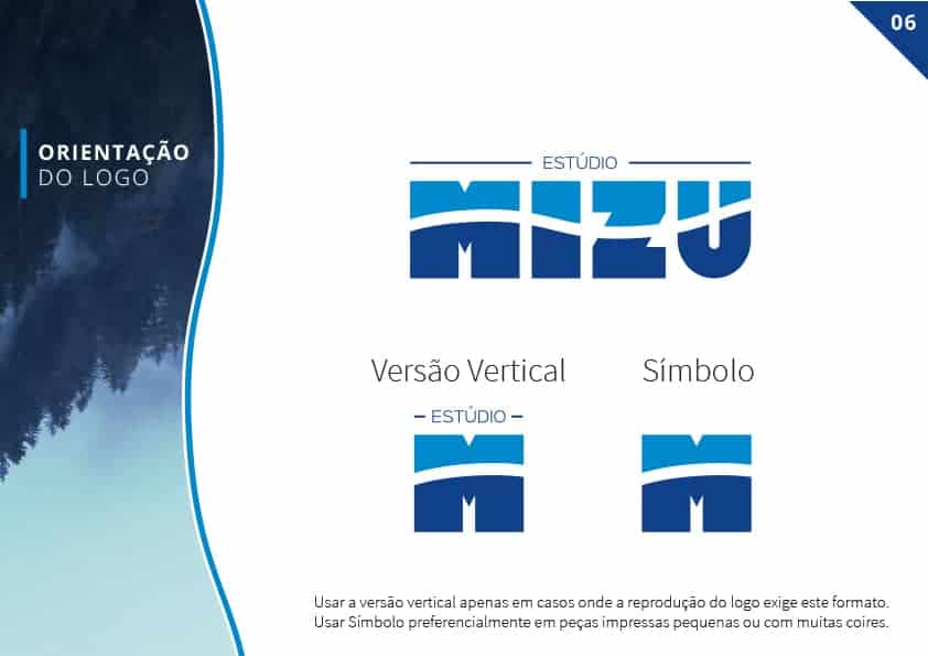
The creation and development of the logo was created through Adobe Illustrator, while the Layout and Mockups were made using Adobe Photoshop. Using as reference the shape of the water and how it behaves in motion, I used photographic references to create dynamic shapes and so I could make it influence the shape of the logo typography.
The client approved this project and was very satisfied with the aesthetics and with the meaning that we managed to reach and transmit to the public. We have achieved the identity of the company and the mission behind the work and projects delivered to each client.
Be like water...
Nice project, I think it's very well made!