Feminine Logo for PéTalle Natural Skin Care and Perfume

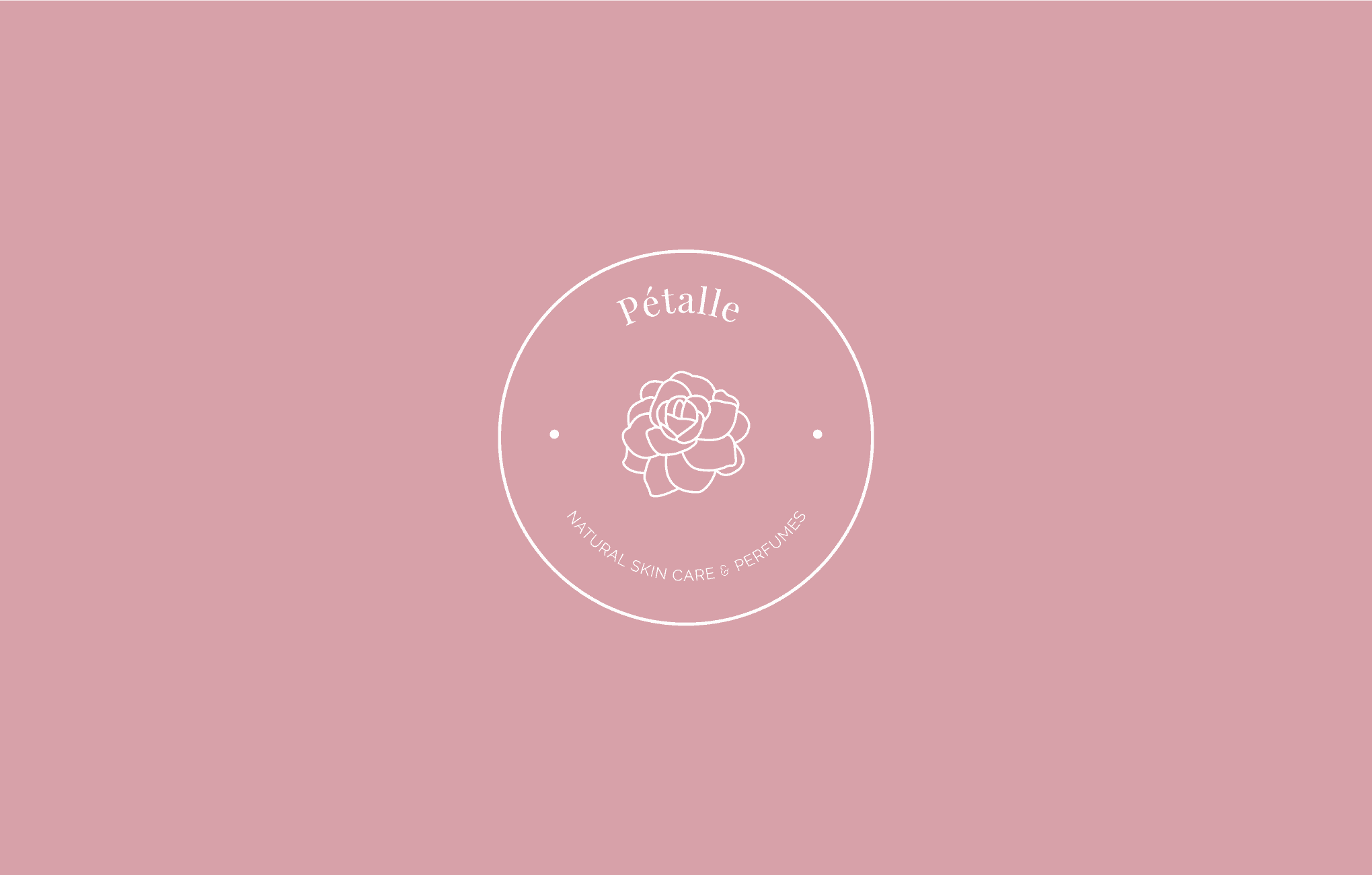
Pétalle is a natural skin care and perfumes company. The name Pétalle comes from flower petals. It's a luxury and elegant brand the target audience being women over 30. To convey the brand’s vision, we designed a clean and feminine logo, portraying women embracing their natural skin.
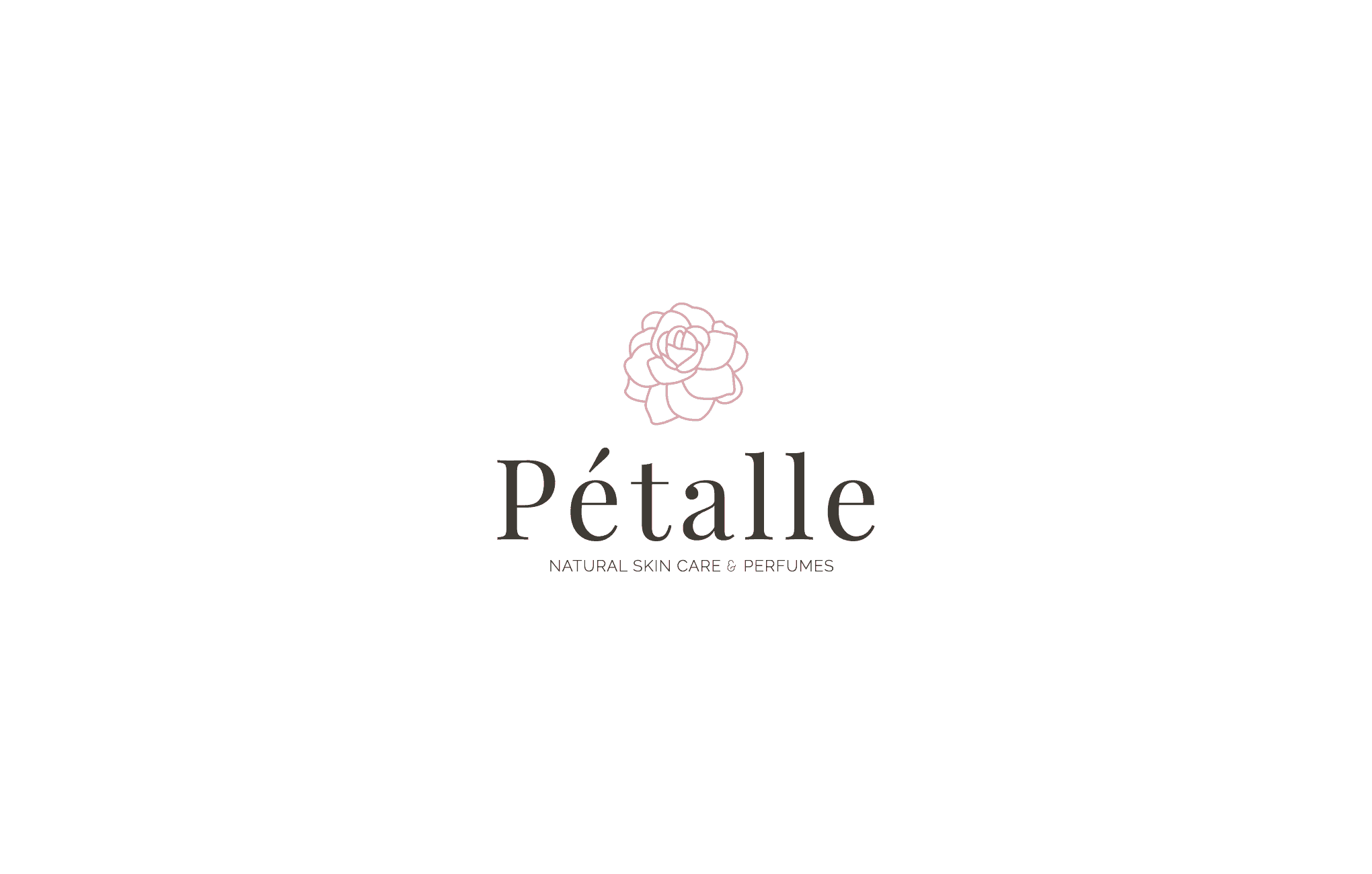
The gardenia flower is often given to convey “you’re lovely”. Used in this way, the gardenia is a flower that can be given to lovers, friends, and even family. It’s a way of telling them how lovely they are. And because the color of the gardenia is white, it also signifies purity.
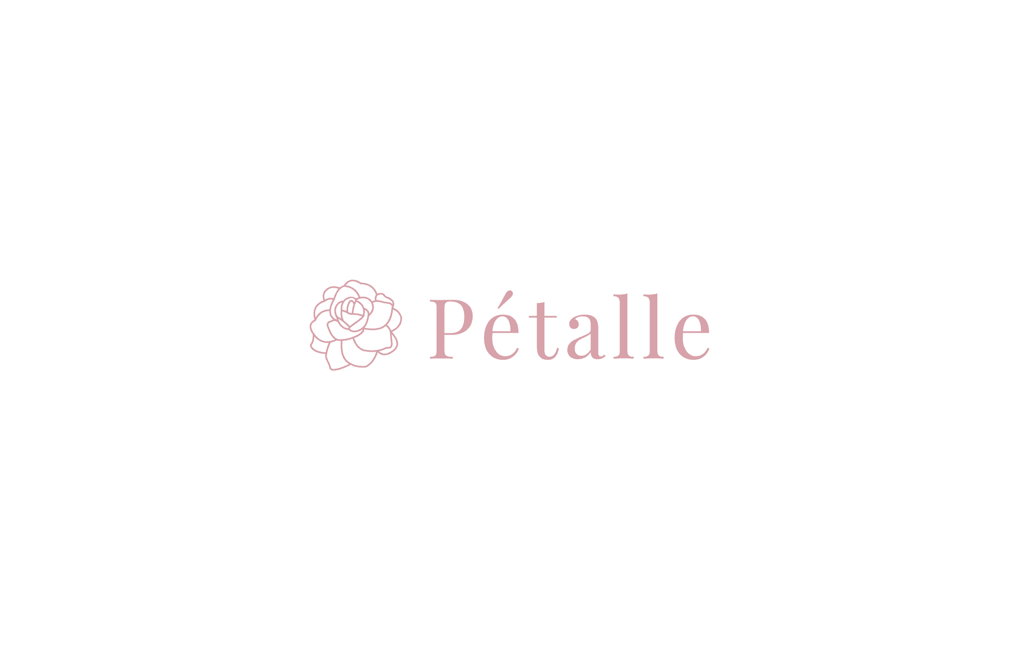
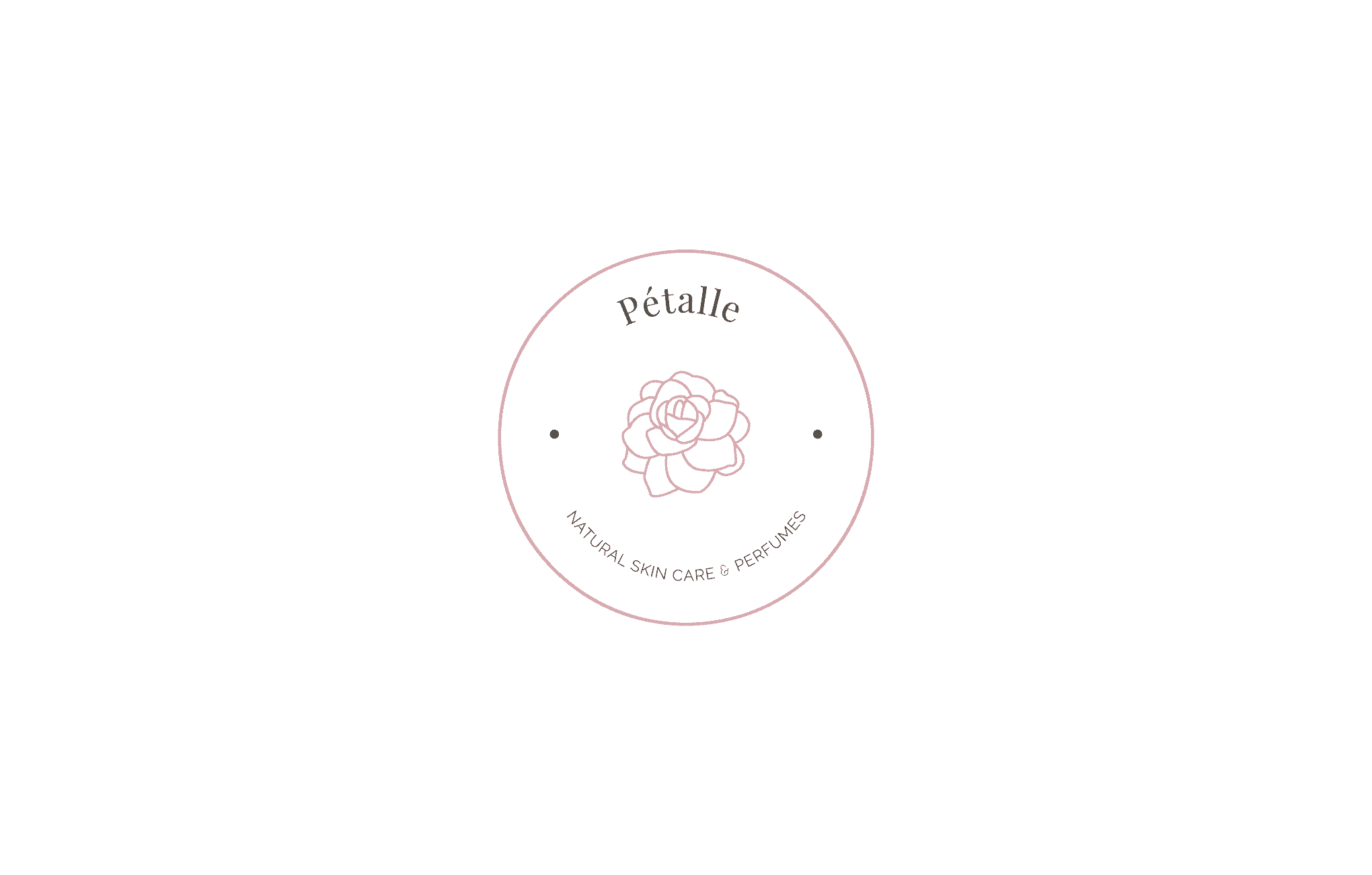
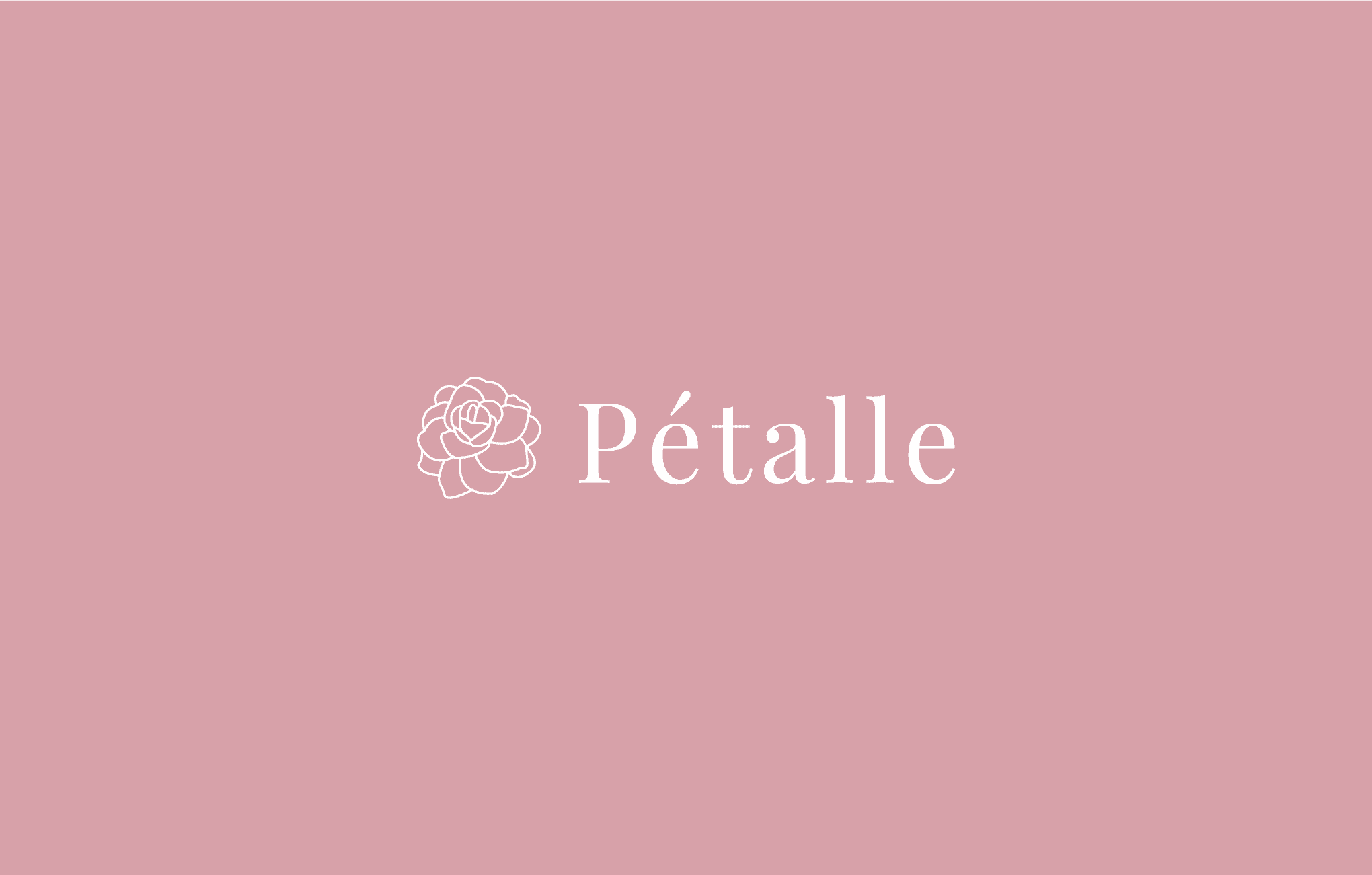
The gardenia flower is the perfect choice for Pétalle's brand image. The flower illustration celebrates the serenity and delicateness of women’s beauty. The font and soft color palette choice accentuates the femininity and gives an exquisite brand feeling. The logo can be varied in many ways, so it can be used on various packaging and cosmetic jars.
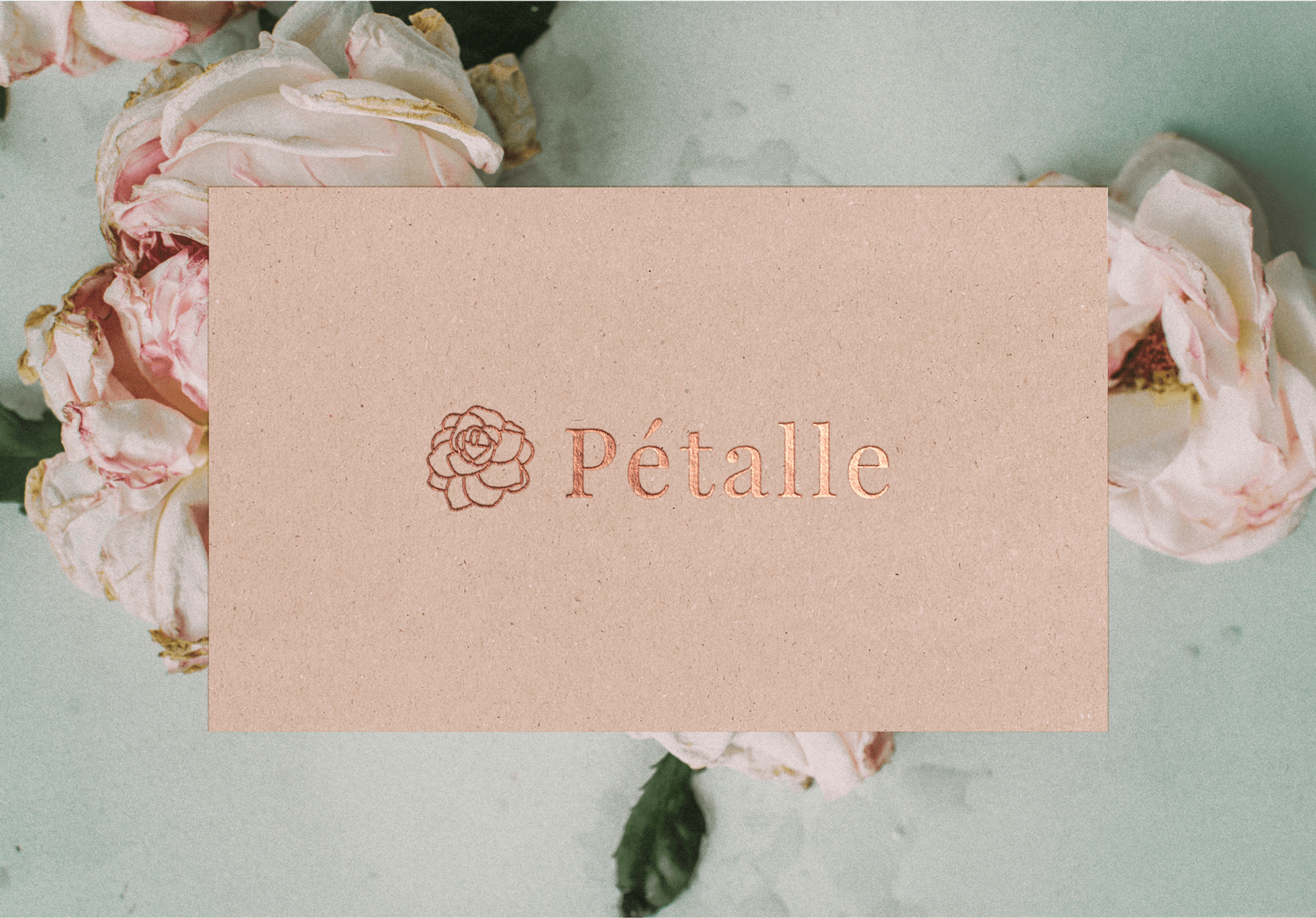
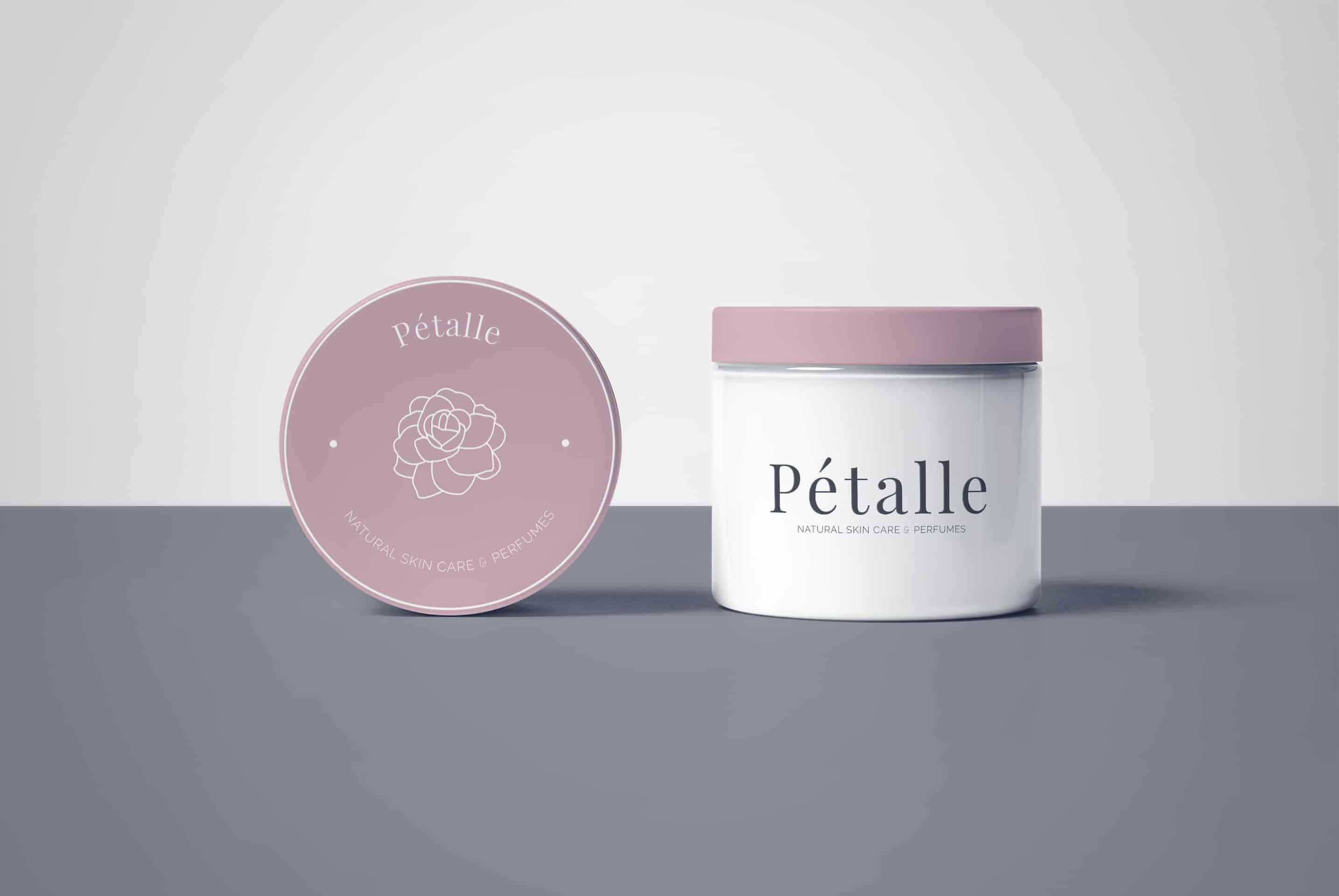
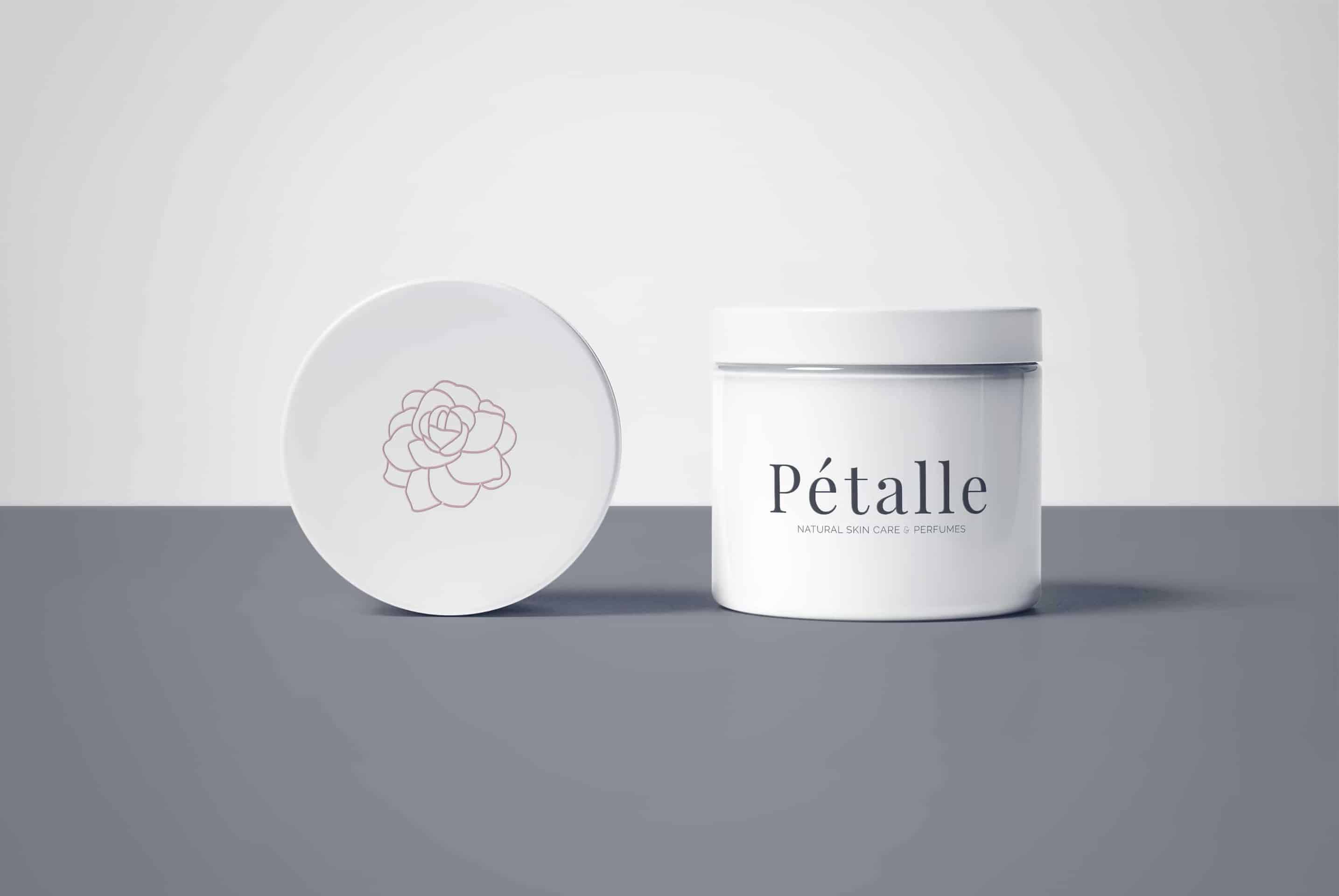
There were a lot of sketches for a simple gardenia flower, which is recognizable and looks great on smaller and bigger packaging surfaces. But it was worth the process because the flower illustration and the font choice made the product stand out among its competitors. Deriving from such a clean and simple idea, we are glad to happy to see our final work inspire others and bring new light to the cosmetics & beauty industry.
Full project available here: https://www.behance.net/gallery/66894905/Feminine-logo-for-Ptalle-natural-skin-care-and-perfume
This is a nice branding project. Lovely!
Thank you Rian!