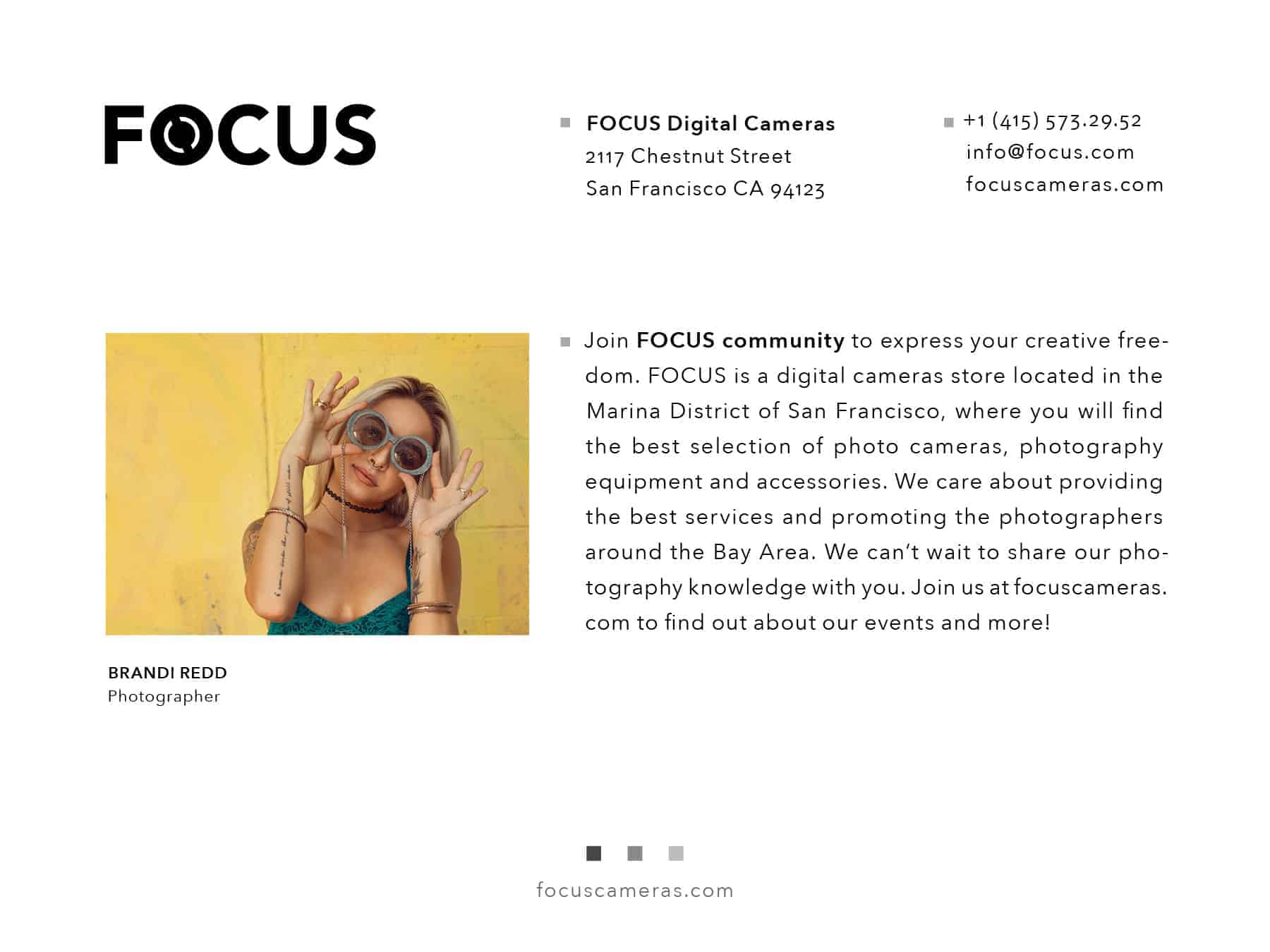
FOCUS Digital Cameras

This re-branding project is all about bringing a new life into small businesses. Fireside Camera is a privately held company, located in the Marina district, San Francisco. It specializes in cameras and photographic supplies and is surrounded by high-end specialty boutiques, popular restaurants and cafes. The store is very small and cluttered, with a very inconsistent design and messaging, therefore, it looks very inconspicuous on this busy street. To stand out and really be a part of the neighborhood, it had to go through a rebranding. Fireside Camera name was changed to FOCUS and the whole idea and message of the business was rethought.
![]()
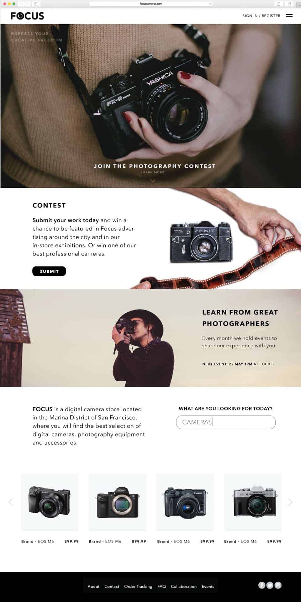
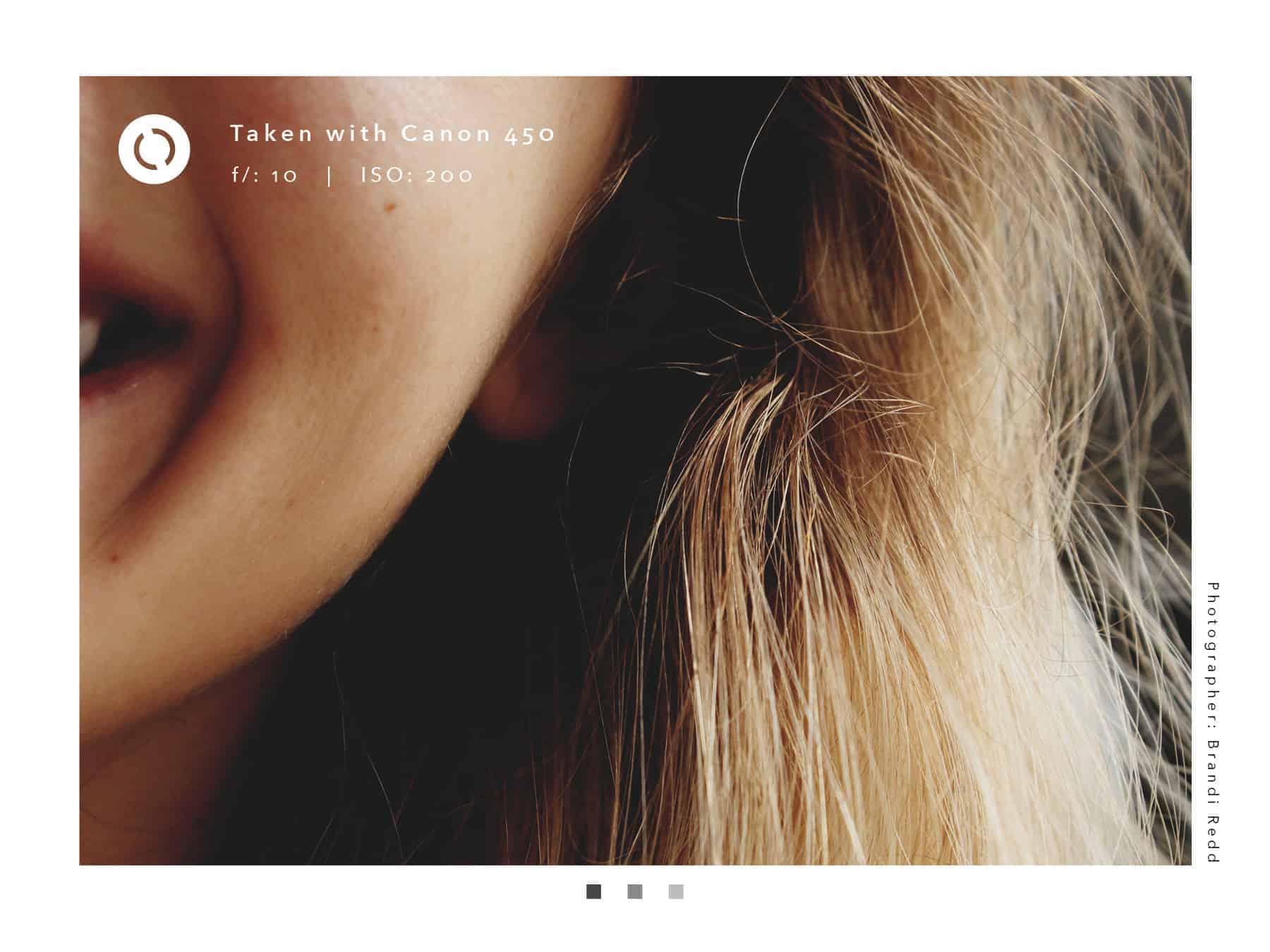
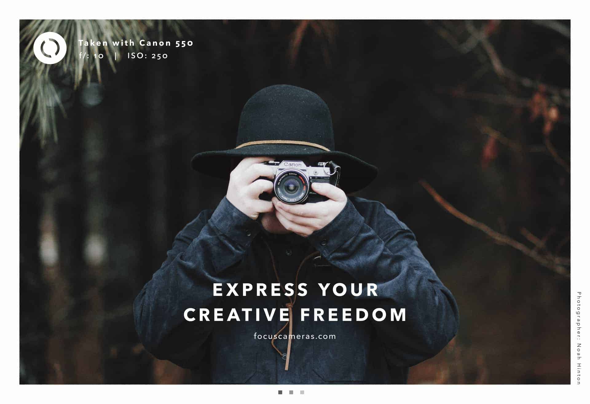
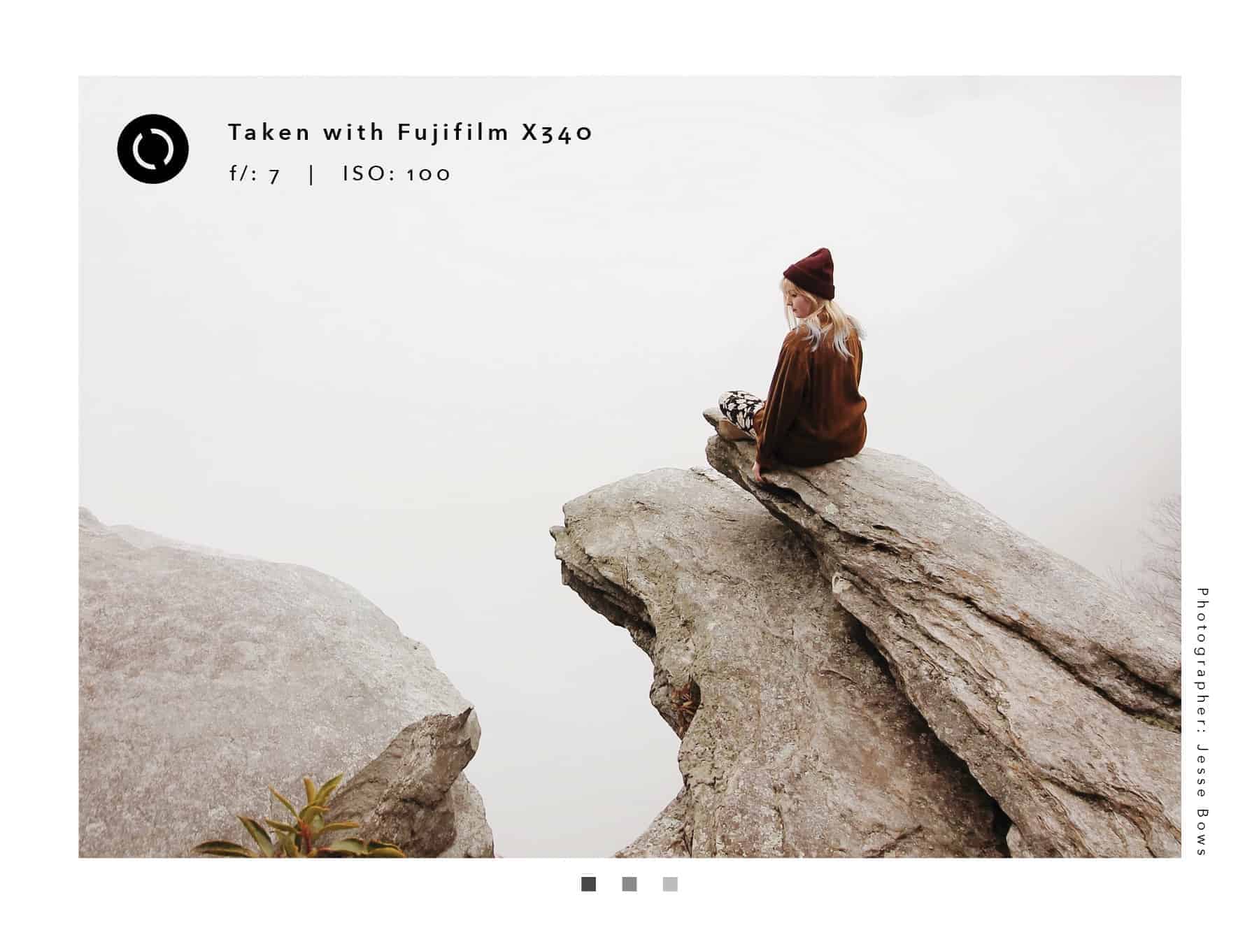
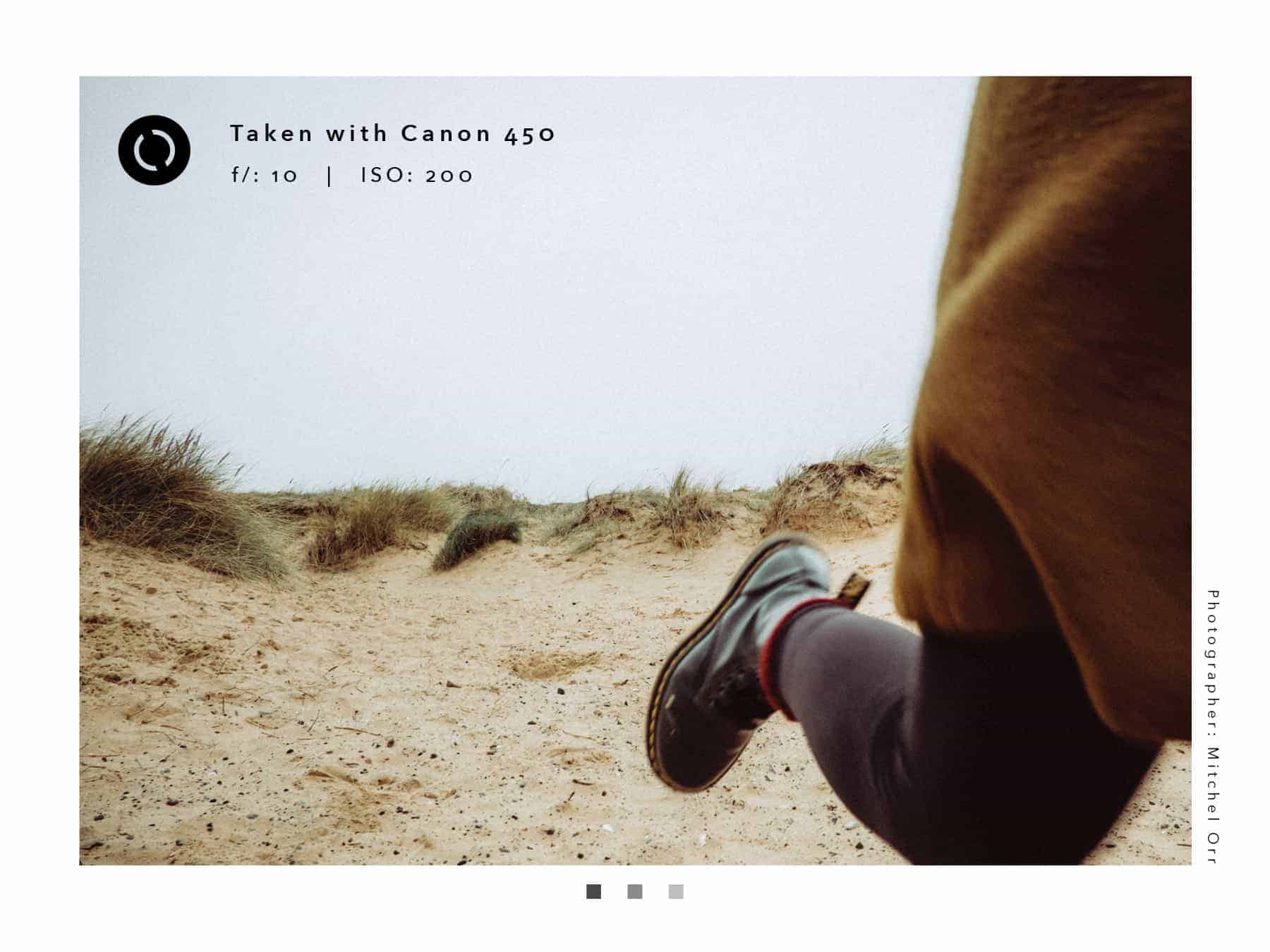
At first, I researched the target audience and the look and feel of other stores located near Fireside, and had quite a few initial ideas, all of them being quite modern and clean. I decided to go with a minimal look with an emphasis on inspirational photography and messaging, to attract a younger audience. The new message of the company was all about inspiring the new generation of photographers, so the posters, the post-cards, and the website was not just about cameras anymore. Just like the posters, each post-card shows a photograph with some information about the camera it was taken with. On the other side of the post-cards, there is information about the photographer, as well as a description of the brand. The website invites its visitors to take a part in the photography contest and to come to the monthly events to learn more about photography.
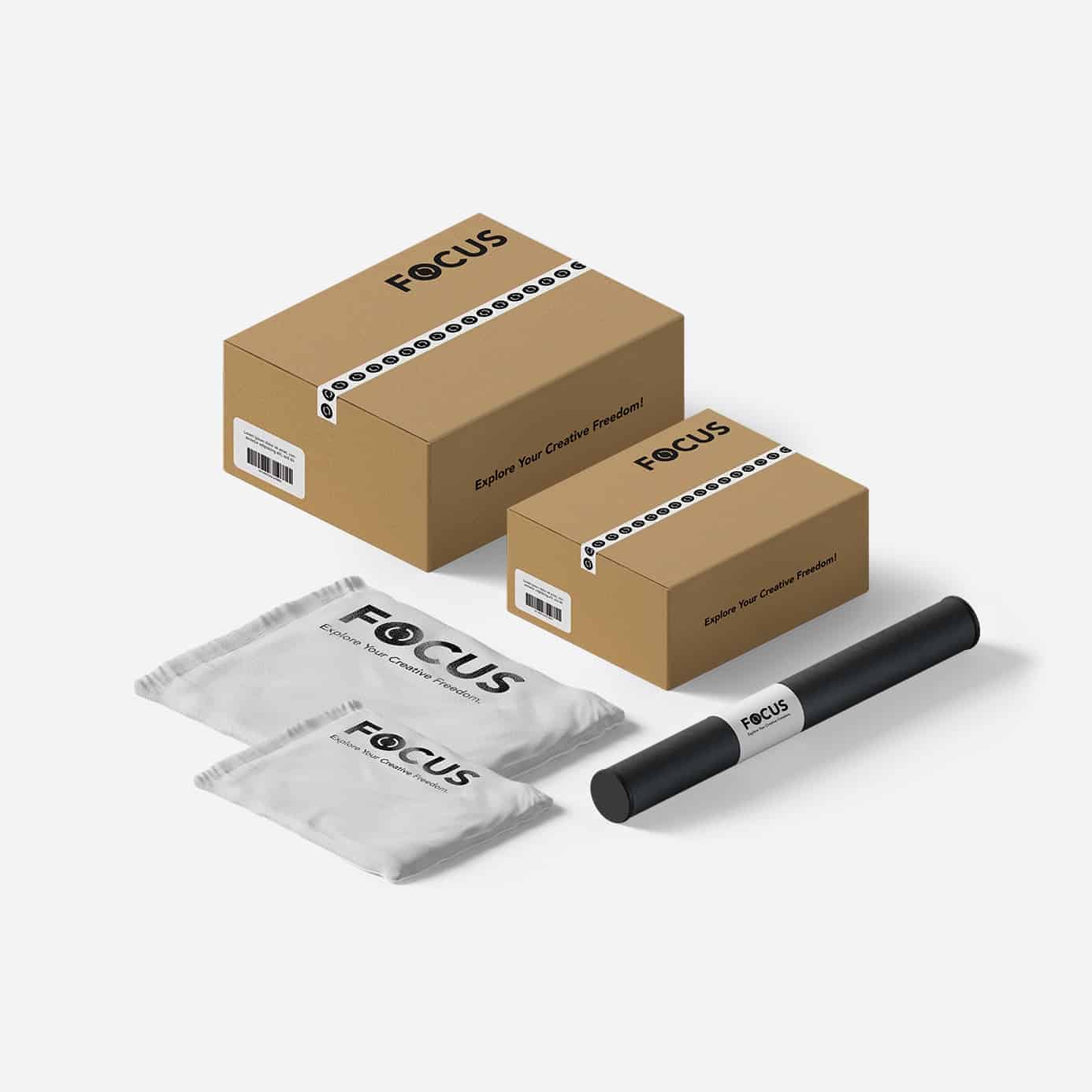
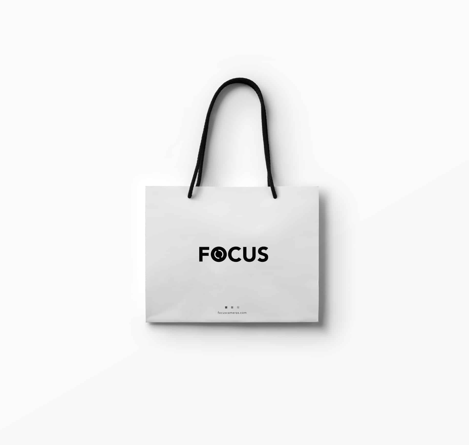
The first part of the process was designing the logo. It had to be simple, yet represent the idea of photography and cameras. I sketched a lot of ideas and developed the most successful ideas further, until I found the one that was working well. After that, I moved to the computer (Adobe Illustrator) and created quite a few variations on each of the best logos, choosing one at the end, and made sure that all the parts of it were proportional and worked well with the typography. The rest of the project was all about implementation of the logo and how it would apply in different parts of the system. I kept working on, and improving, the message of the brand throughout the process. I used some design resources like Creative Market and used templates of the bag and the boxes in Photoshop, while most of the layouts were designed in InDesign.
As it was one of my first branding projects, I deffinitely learned a lot about the branding process, and realized the importance of the concept. The look of the brand definitely plays an important role, but it is nothing when there is no idea behind it. I also got to improve my knowledge of design principles. It was definitely a practice of using consistency along with just enough variation.