Formosa Film Festival

The project is aimed to research the change of cultural identity of taiwanese people through taiwanese films. It explores taiwanese films which reflect the cultural identity. I want to create the new branding of island of Taiwan by using old house visual elements.
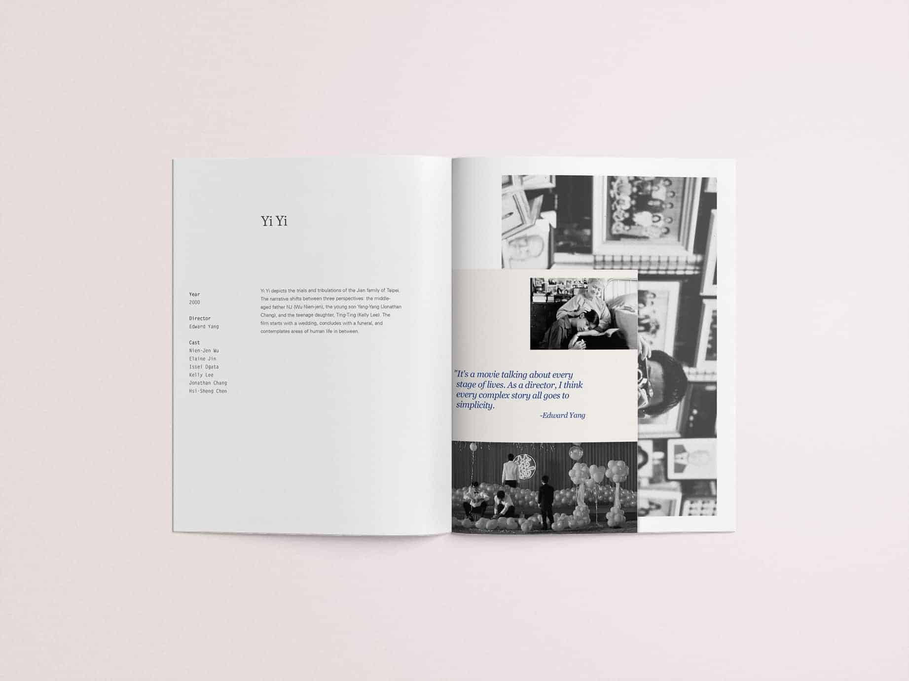
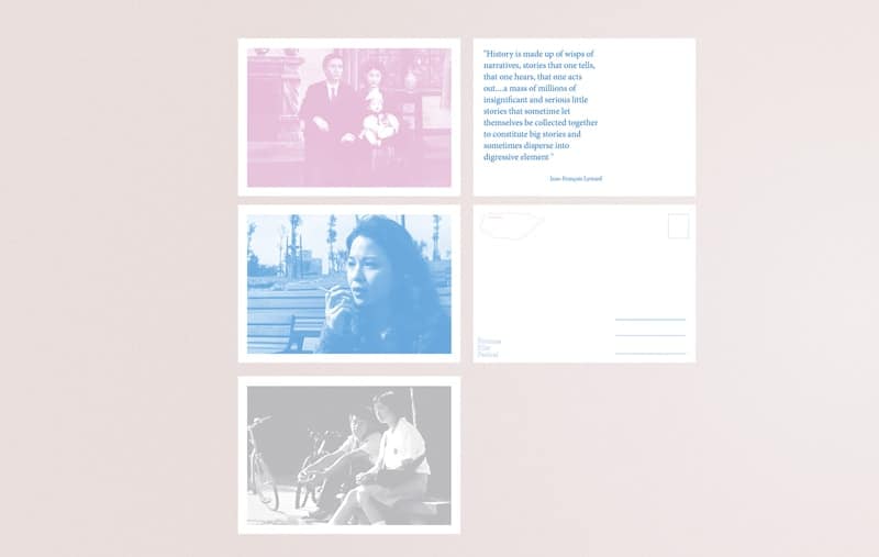
My original idea is to show public our culture identity issues in Taiwan which is very sensitive and political. Therefore, I decided to tell public this kinds of issue in an objective way. So, that's why the final outcome is a film festival. In the list of films in the festival, each films has different history and culture background, for example, the period under Japan rule, there are 2 films talking about aboriginal and Han people in the same period. The whole list of films tell the history of Taiwan over 100 years, identity and political issues in the island.
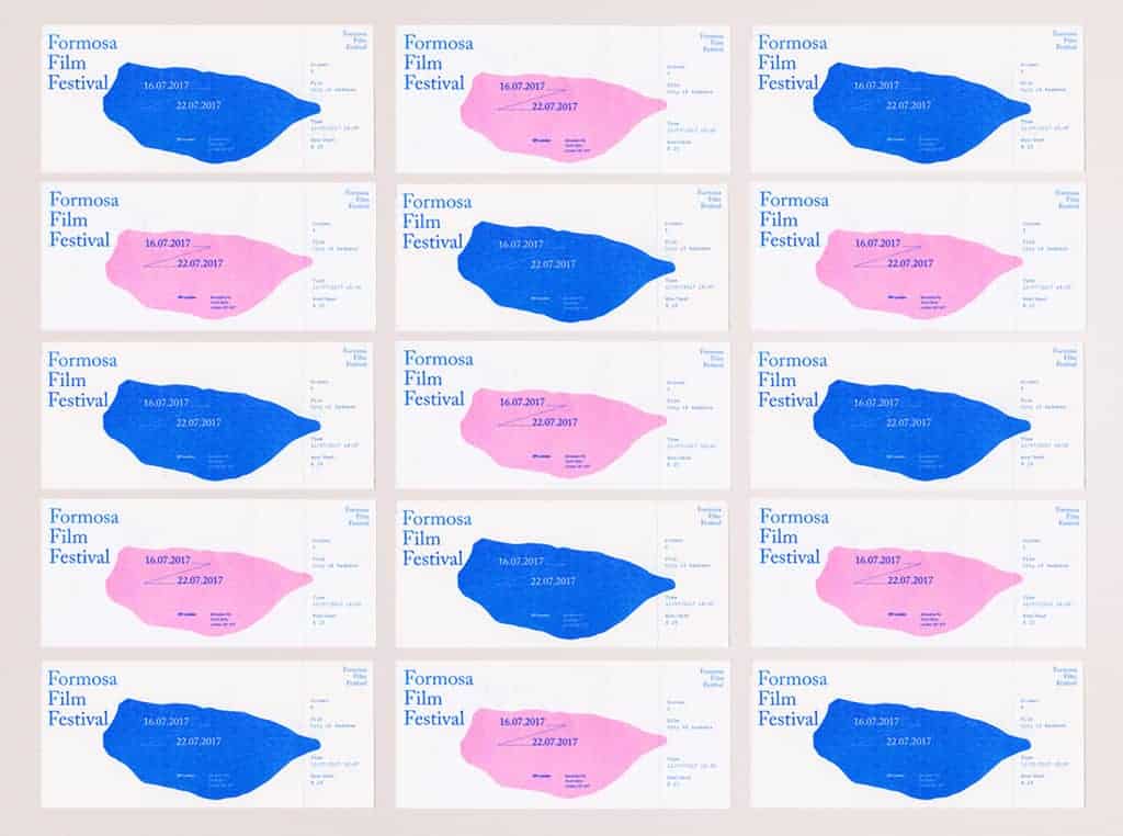
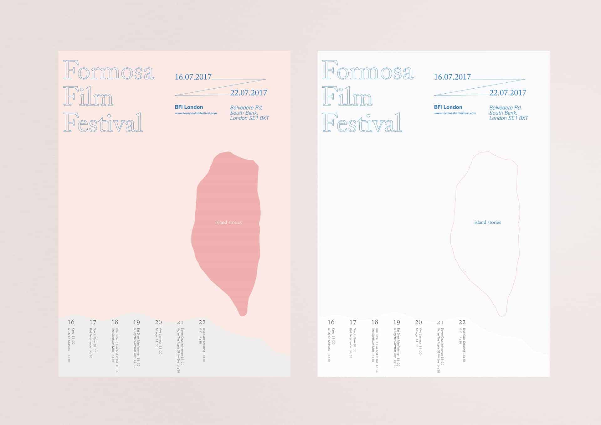
The main color I chose for the main visual is neon pink and neon blue which is inspired by our street view, the neon signs and advertisement flyers all around the road. People like to use bright and vivid color to catch visitors eyes, so we have a lots of vivid neon sign on streets. This is typical Taiwanese street view. I hence picked 2 of them as my main colors, and I also did riso printing for tickets that has unique printing texture and vivid colors on it.
About my final outcome, I tried many visual elements on the project. For example, I tried the elements of old traditional house like window frame, tile patterns. I also tried the religion elements as well, but I found it can not represent the whole island, they are just a part of ours culture. As a film festival taken place in London, the most important thing is let the world know what is Taiwan. Taiwan is a island that has a unique shape and located in a pacific ocean. That is the reason I finally used the shape of the island as my final outcome.
I used adobe photoshop, illustrator and indesign to finish the whole outcome. My main works are on the poster and the brochure design. In addition, I used riso and screen printing to test my work because I need more vivid colors than CMYK colors.
At the beginning, I found the unique visual element about Taiwan, and made many sketches on them, trying to find a strong visual for the project. Each of them has developed a part of the work. At this time, there are too many elements so that I get lost in them. Afterwards I had to go simple, chose the most simple and strong image as the final outcome.
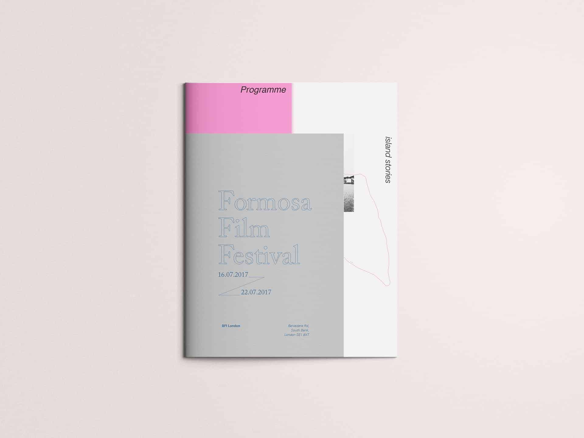
One of my classmate told me she likes the shape of the poster, very unique and beautiful. I told her it is the shape of Taiwan. She was surprised. I think it is a good start for people who doesn't know Taiwan. Even though they don't know where and what is Taiwan, they remember the shape.
Now I know it is not easy to promote a country to the world, in particular the country which has complex history background and political problems. But I'm happy I tried to find culture elements in this project. There are still a lot of unique and valuable cultures in this island. It is also a good chance for me to learn editorial design, colors, typeface and printing method.
I love the simplicity of this design!