FrootLoops Packaging

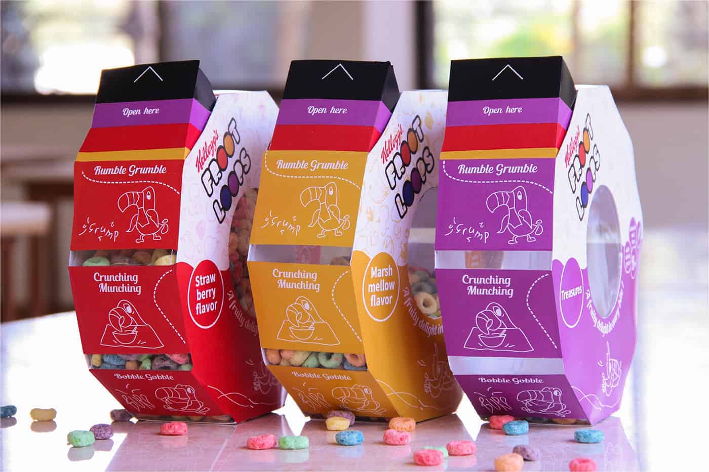
Frootloops is the preferred choice of breakfast for children all over the world. This packaging solution hopes to translate the delight and vibrancy of the doughnut shaped cereal, to its appearance on the shelf. This extends to the experience on the breakfast table as well, making a Frootloops breakfast a treat for the child's eyes and taste buds!
This project was done in collaboration with Shikha Kanakia (Product Designer)
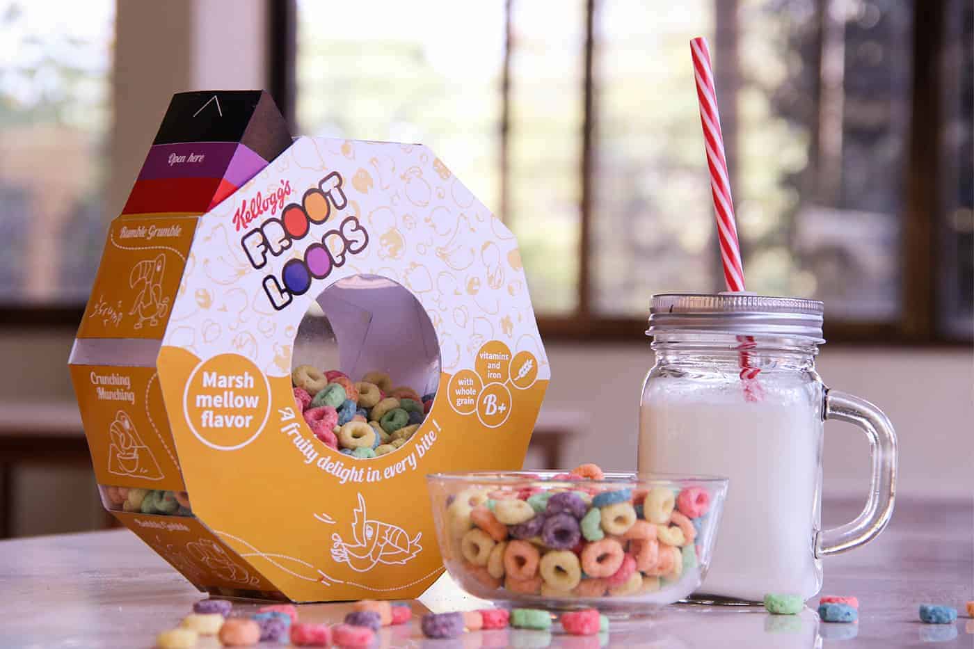
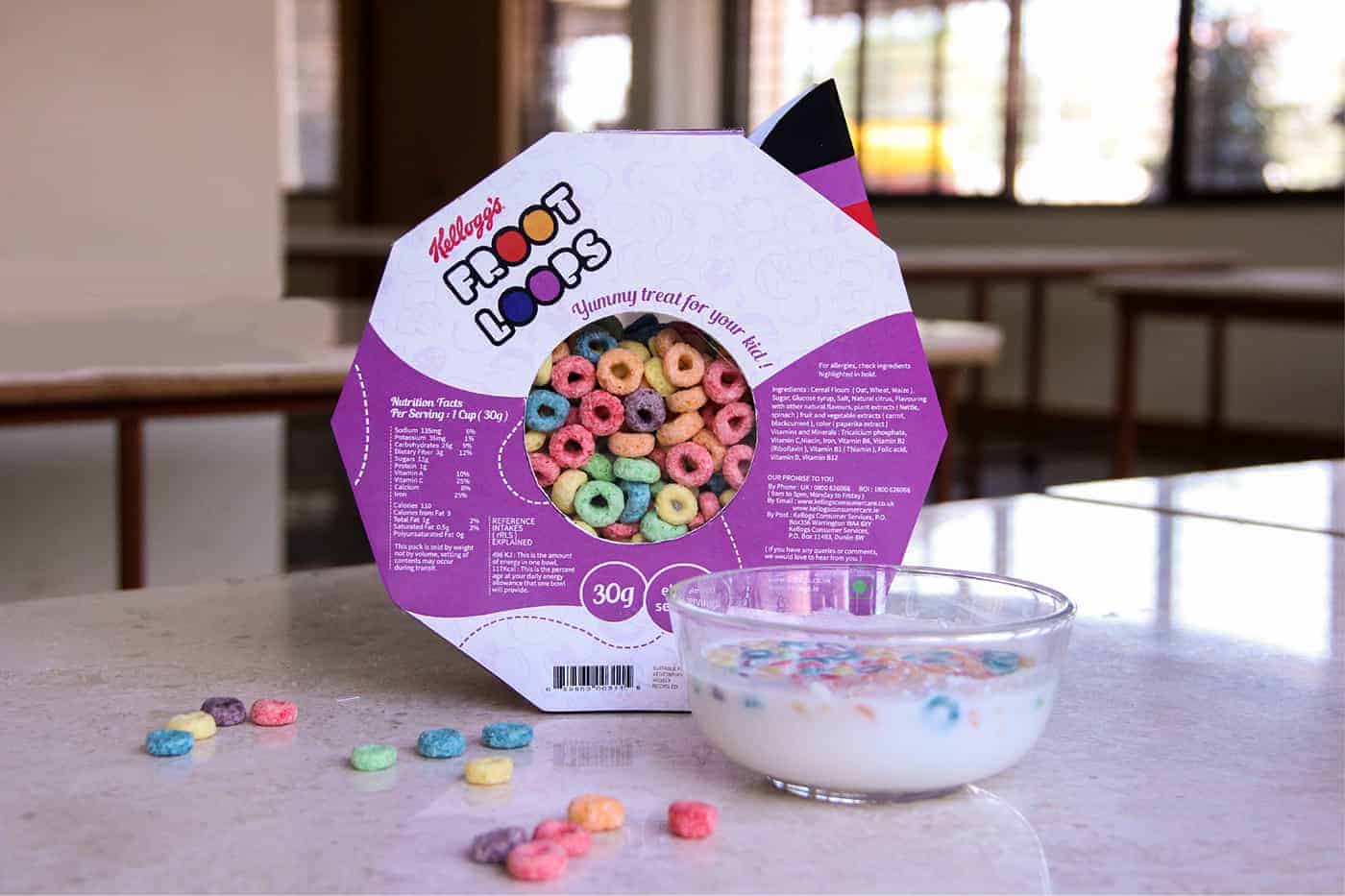
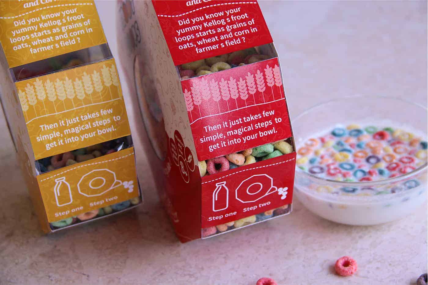
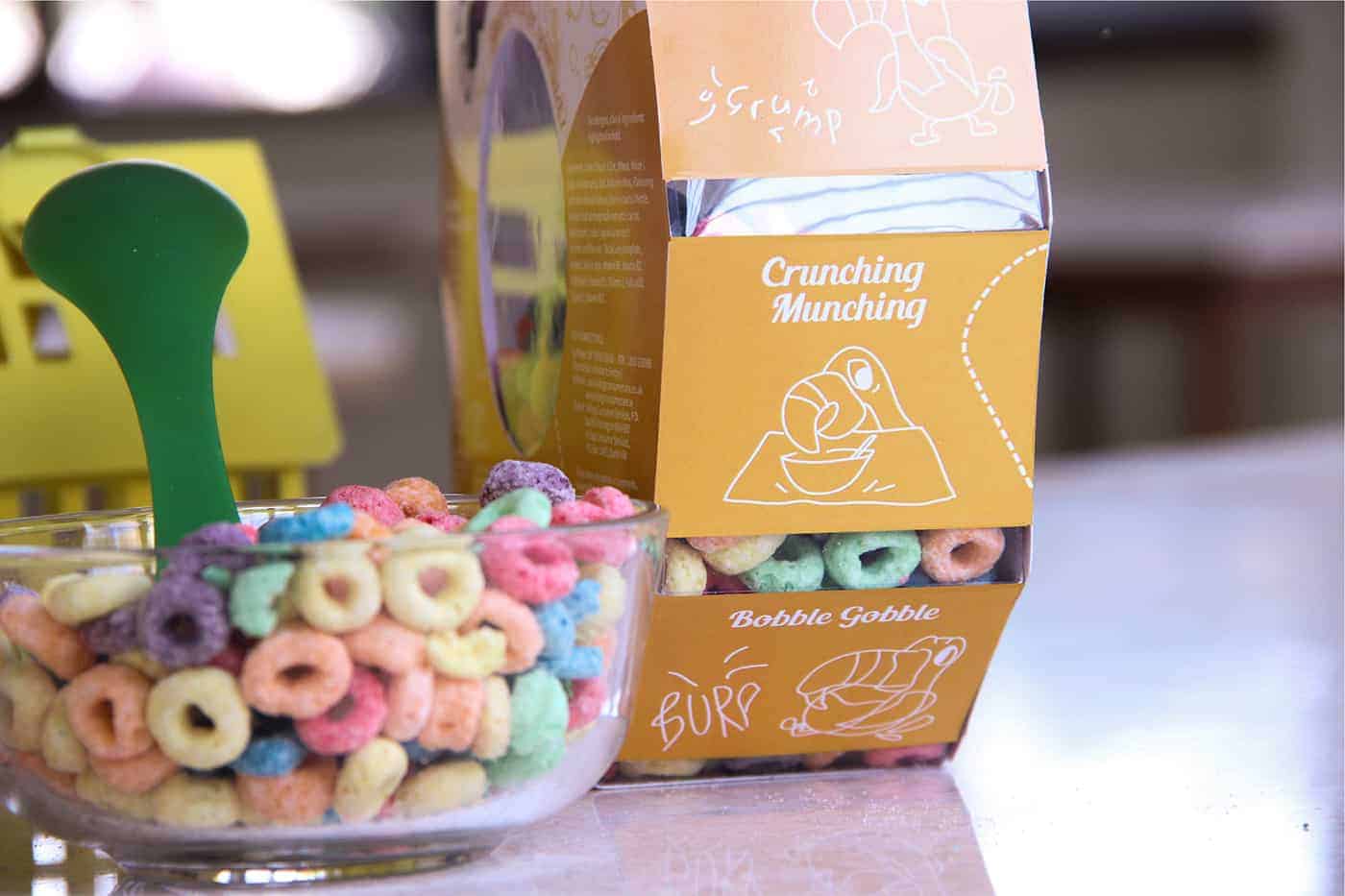
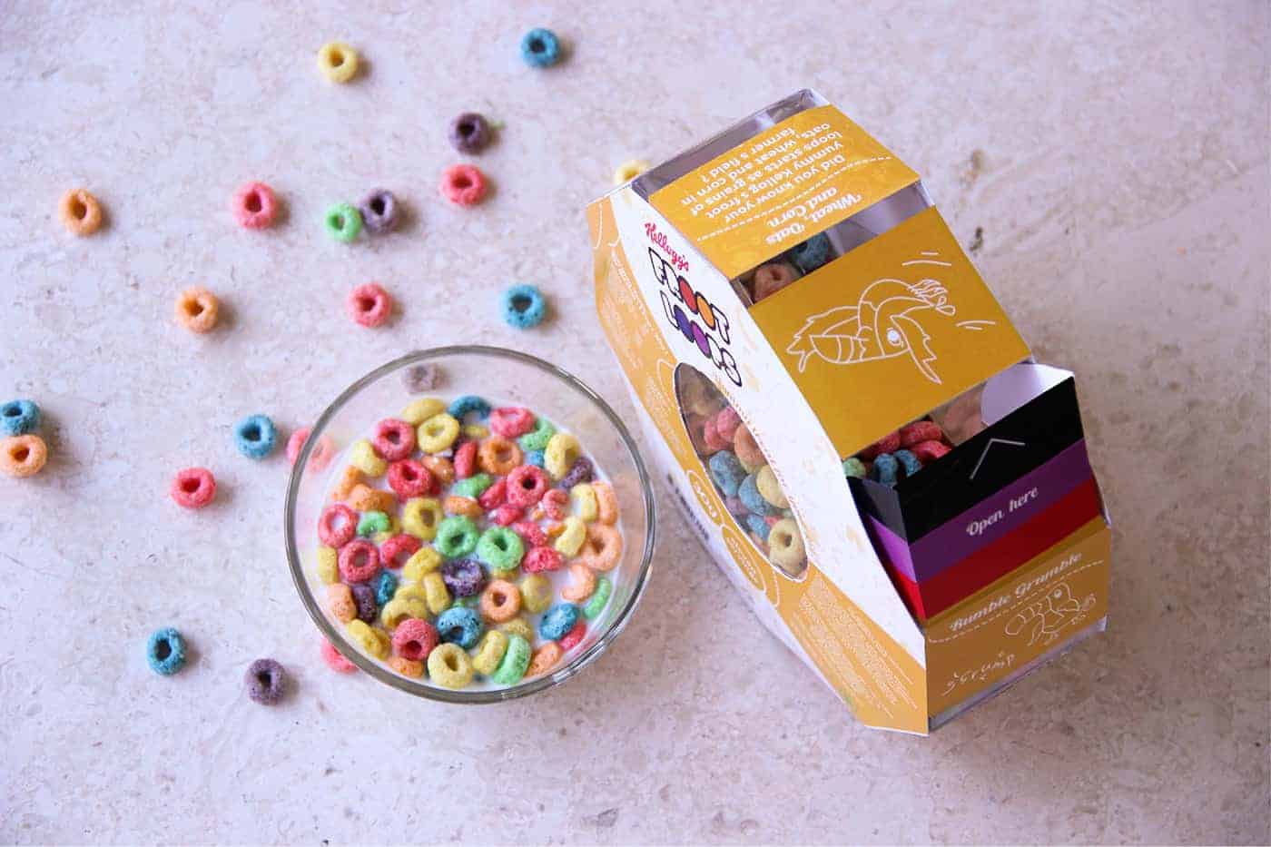
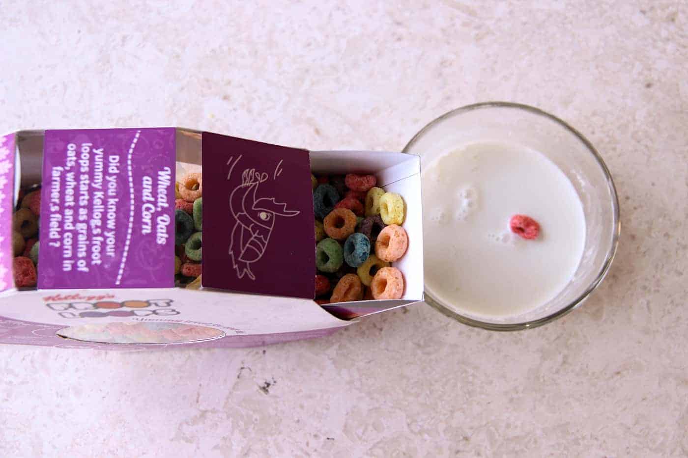
To come up with an idea was not difficult as we had all our research in place. Children were our users but their mothers were the ones who make purchases. Our package had to please both of them. In the process of finding a common ground between the two, we came up with a package which has a unique shape with transparent slots to see its scrumptious contents, and along with it there are illustrations for the mother to see how buying this pack would benefit her child’s health. There are also illustrations of a hungry Toucan (mascot) who starts getting full as he gobbles up the yummy loops. The flap of the packaging resembles Toucan Sam's beak. We played around these little things and it made the bigger picture look good.
Also, as we started working towards it, all the other elements fell in place. Our key thought lies in keeping minimum content and more of illustrations, keeping colours that are bright and will be easily identified on the shell against its competitors and using material which is cost effective as well as good for storing the contents of Frootloops.
We had to study and analyse the existing package and come up with a new concept and better package for the same product. After research, we concluded that the cereal should never be stored in the aluminium bag as the material is not appropriate for storage. Hence, you need to transfer your cereal. The visuals are not appealing and are clustered which creates confusion and lacks visual hierarchy. It fails to connect with the user as form, which is bulky, and emotion, which is not playful, happy and vibrant. The package was designed keeping in mind all of this.
Then we had to categorize the data, follow the process of brainstorming, mood boards, SWOT analysis, Target audience study and come up with a visual language and product concept which goes well with each other. In these earlier stages, we preferred working on huge sheets of papers, marking down everything with markers and Post-Its. Then as we narrowed down some concepts, we did initial sketches, prototypes and converted that to digital. It made our job easier as we had everything mapped down. We used softwares like Adobe Photoshop, Adobe Illustration, SolidWorks, Keyshot for our design process. And later once we were done with the Product shots, we used Adobe Lightroom and Photoshop for post processing.
People responded very well than we expected. Everyone loved it and talked about it. It often happens that when you spend so much time with your project, you get so used to it that it feels the same to you. Slowly, we started getting love from outside our college and friends circle as well. We got Features in DesignTaxi, Packaging Of The World, Creapills, Gurl Studio and many more websites and articles. It got published in a Shanghai based design magazine called as Chois Gallery (Volume 34). We were so overwhelmed to see this love and support from across the world. We never thought it would go so far!
I always believe in process and I believe my refusal to associate with a specific design style as my own; thats why I always end up learning new styles, new techniques and new ways of tackling the problem. Also, one thing that I always learn is; it gives me the possibility to become a different person in the design world every single time.
This is an amazing design, I think people will love it especially kids! Amazing work
Thank you!
Shikha Kanakia