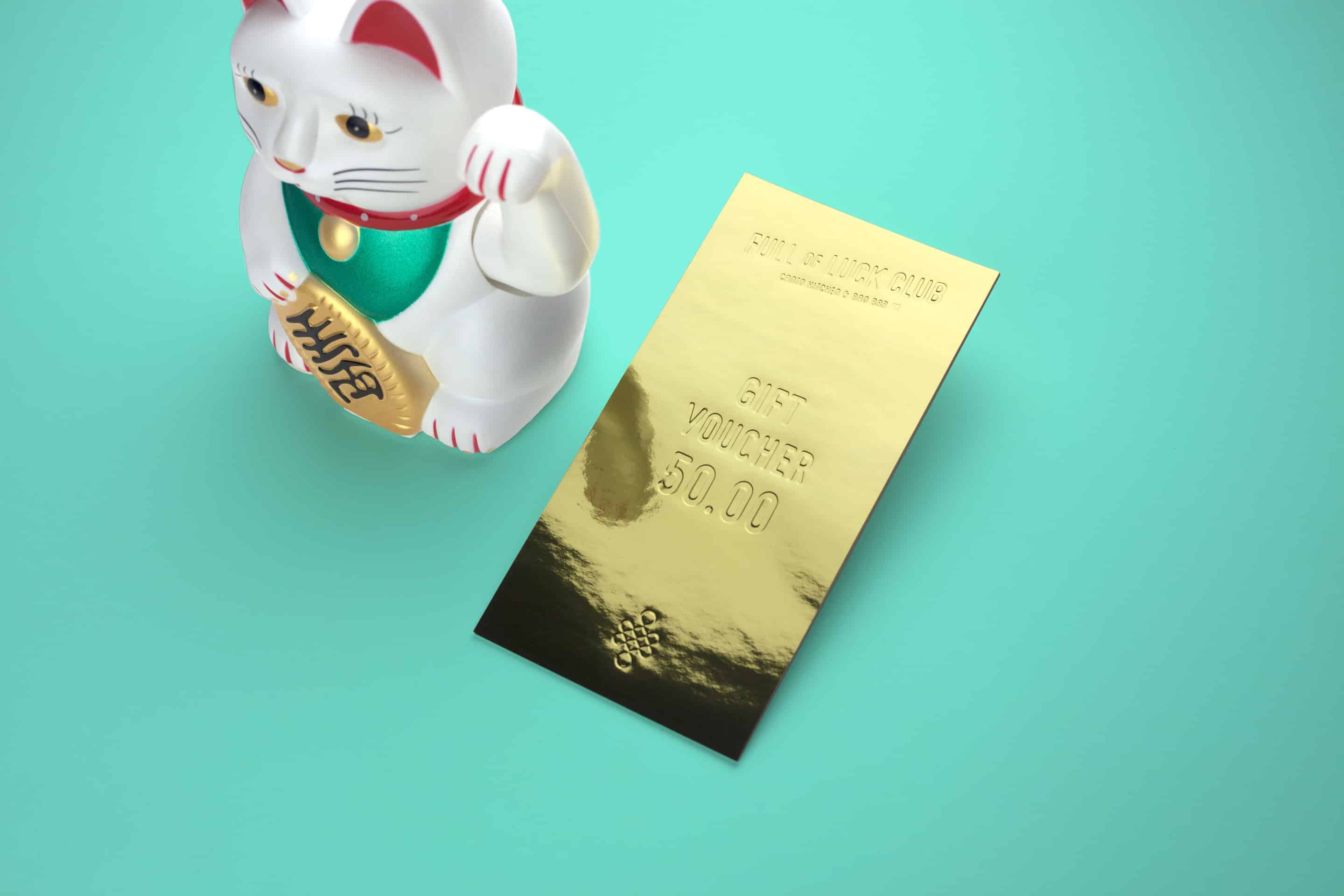
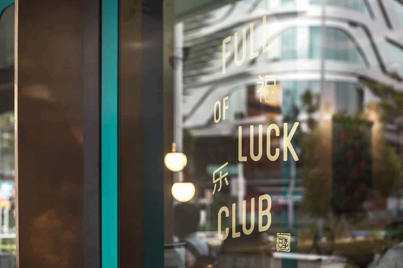
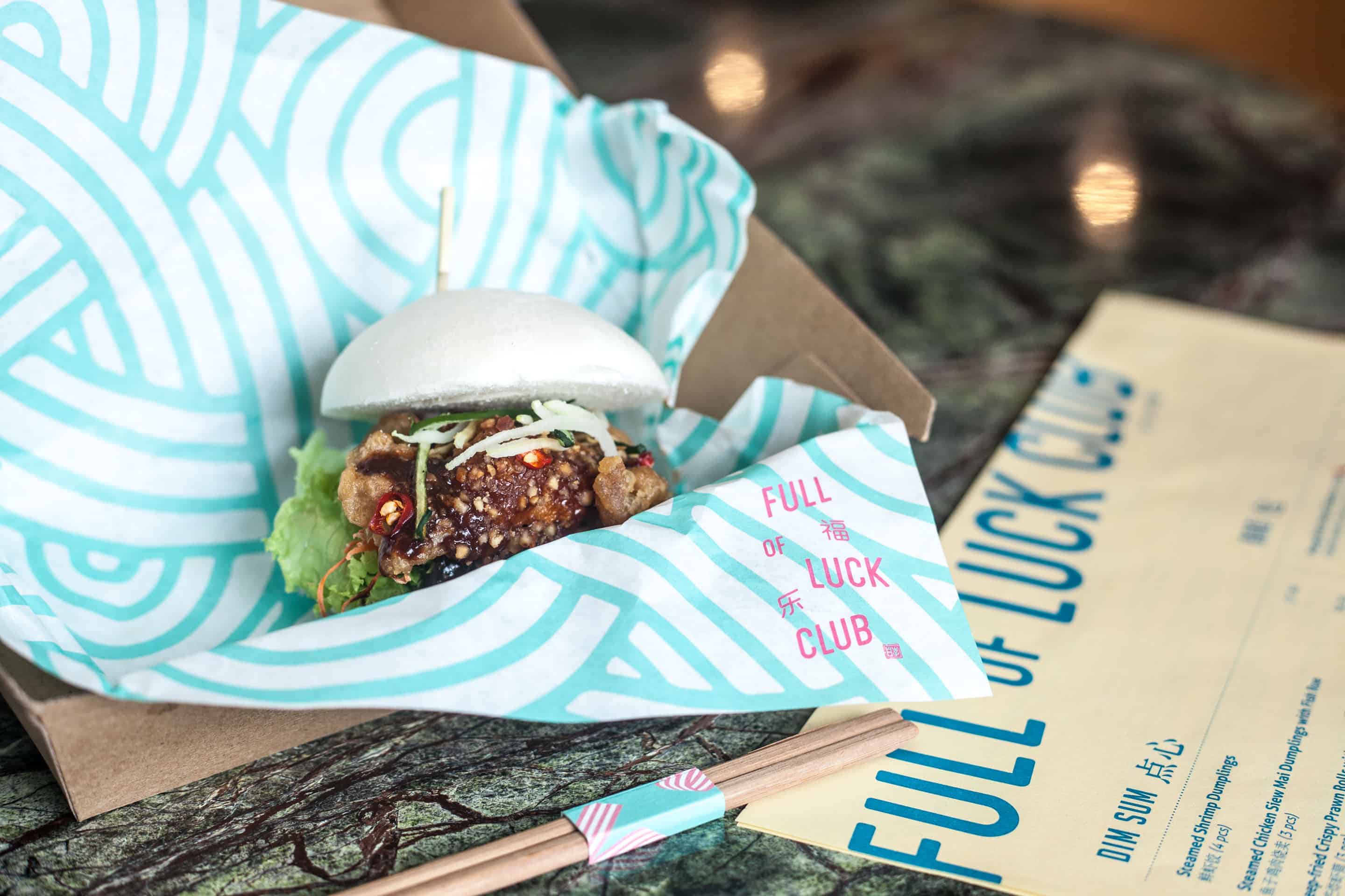
Full of Luck Club

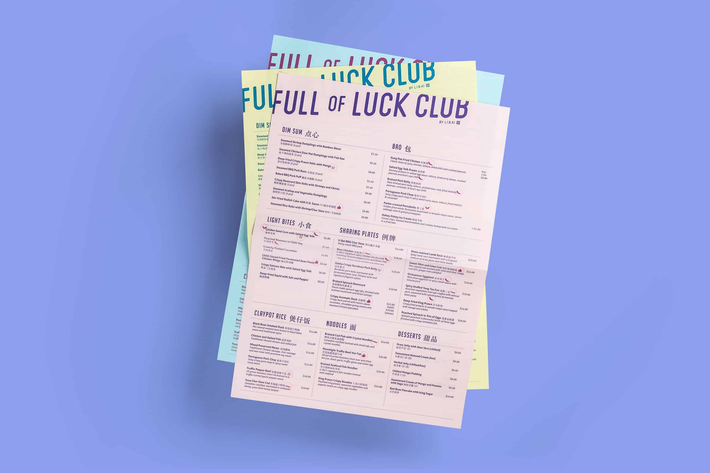
Full of Luck Club 福乐 by Li Bai, is a modern Cantonese kitchen serving authentic Chinese comfort food and lots of good luck. Run by the team behind Li Bai Cantonese Restaurant at Sheraton Towers Singapore, Full of Luck Club dishes out timeless plates like roast meats, fresh noodles and dim sum, alongside contemporary items including Chinese-inspired salads, craft beers, and speciality ‘baos' 包 from its takeaway Bao Bar.
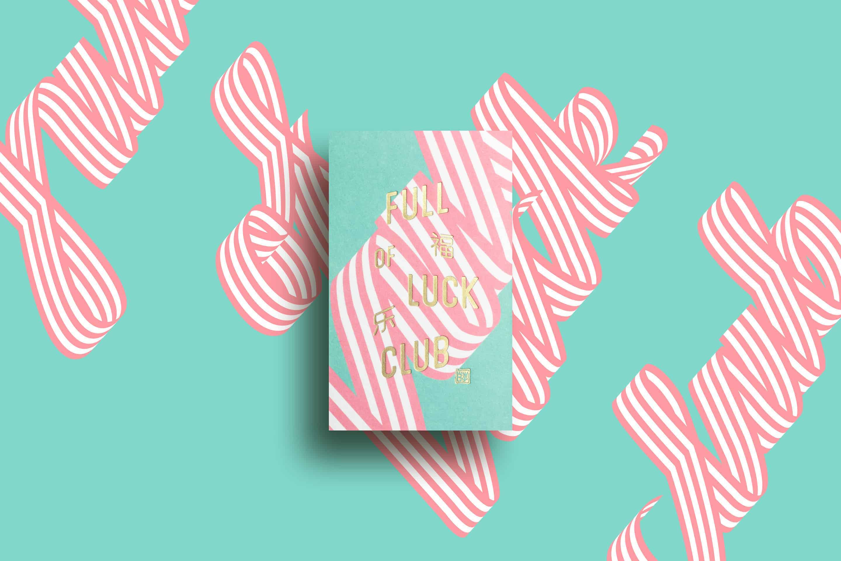
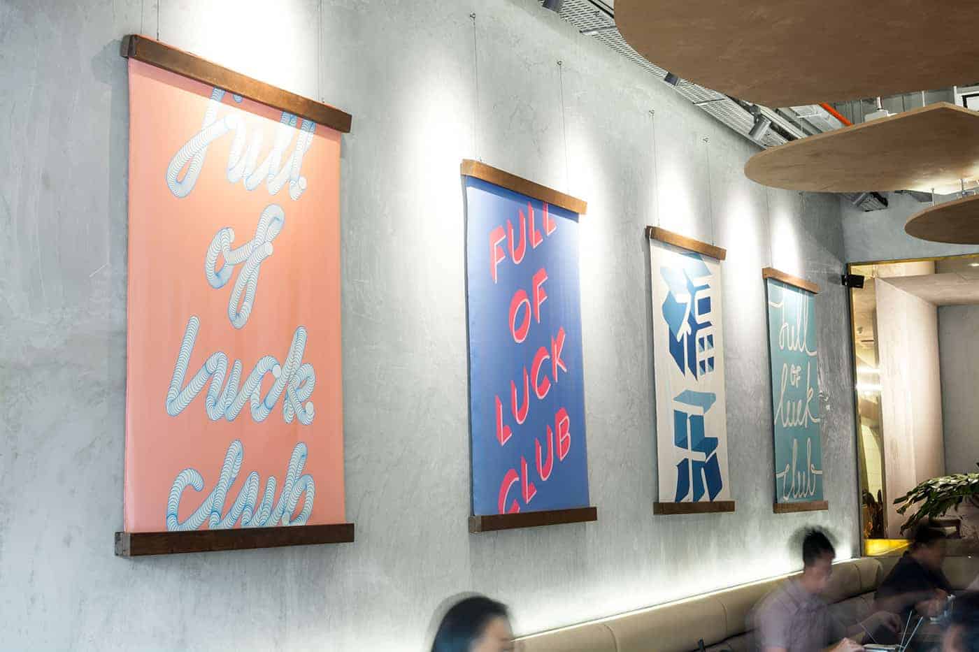
We went through many rounds before coming up with 'Full of Luck Club', a fun, cheeky name which we felt we could really play up visually. Luck is such a big thing for the Chinese, with so many visual elements to it, and we were really excited to weave that into the brand in a modern way.
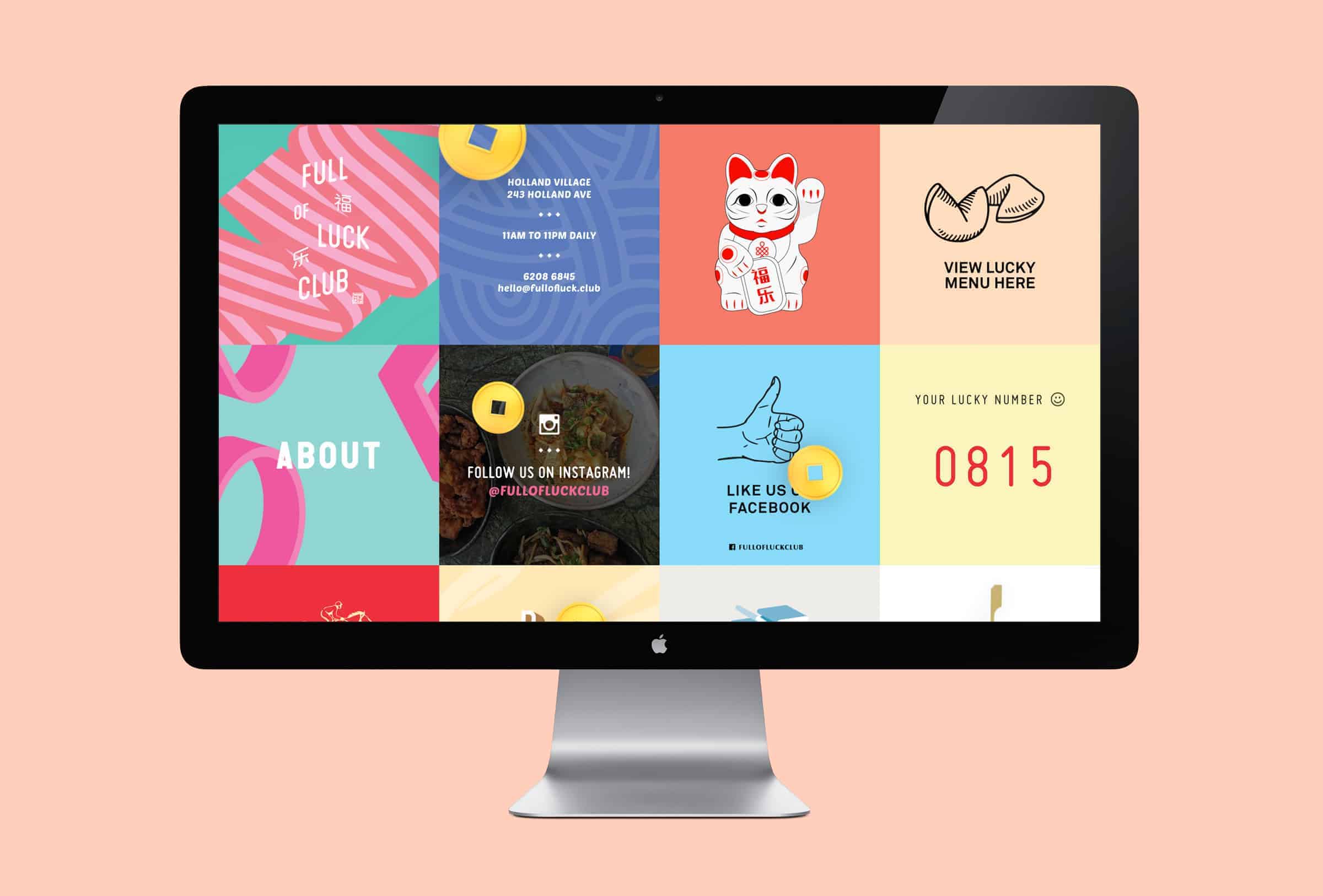
With a strong name that helped set the tone for the brand, we then looked at ways we could communicate that personality visually. We explored typography, colours, patterns and illustrations that would evoke that sense of playfulness in a modern way, while at the same time subtly hinting at the Asian heritage of the brand.
We explored various visual aspects of Chinese culture - both traditional and contemporary - from typefaces, lettering to patterns and icons. There was a wealth of resources to go through, so it was about distilling the good ones and seeing how best to interpret them in a fresh way that would resonate with the target audience.
We feel that the brand attracted the target audience the client was looking at – a more younger and cosmopolitan crowd. Similar to all projects, its hard to provide a specific answer when it comes to external observations since we're more behind the scenes, working internally on the design. These external observations, like the public's feedback on project are most likely based on metrics which isn't the best way to gauge – but we can say that it's been overall positive.
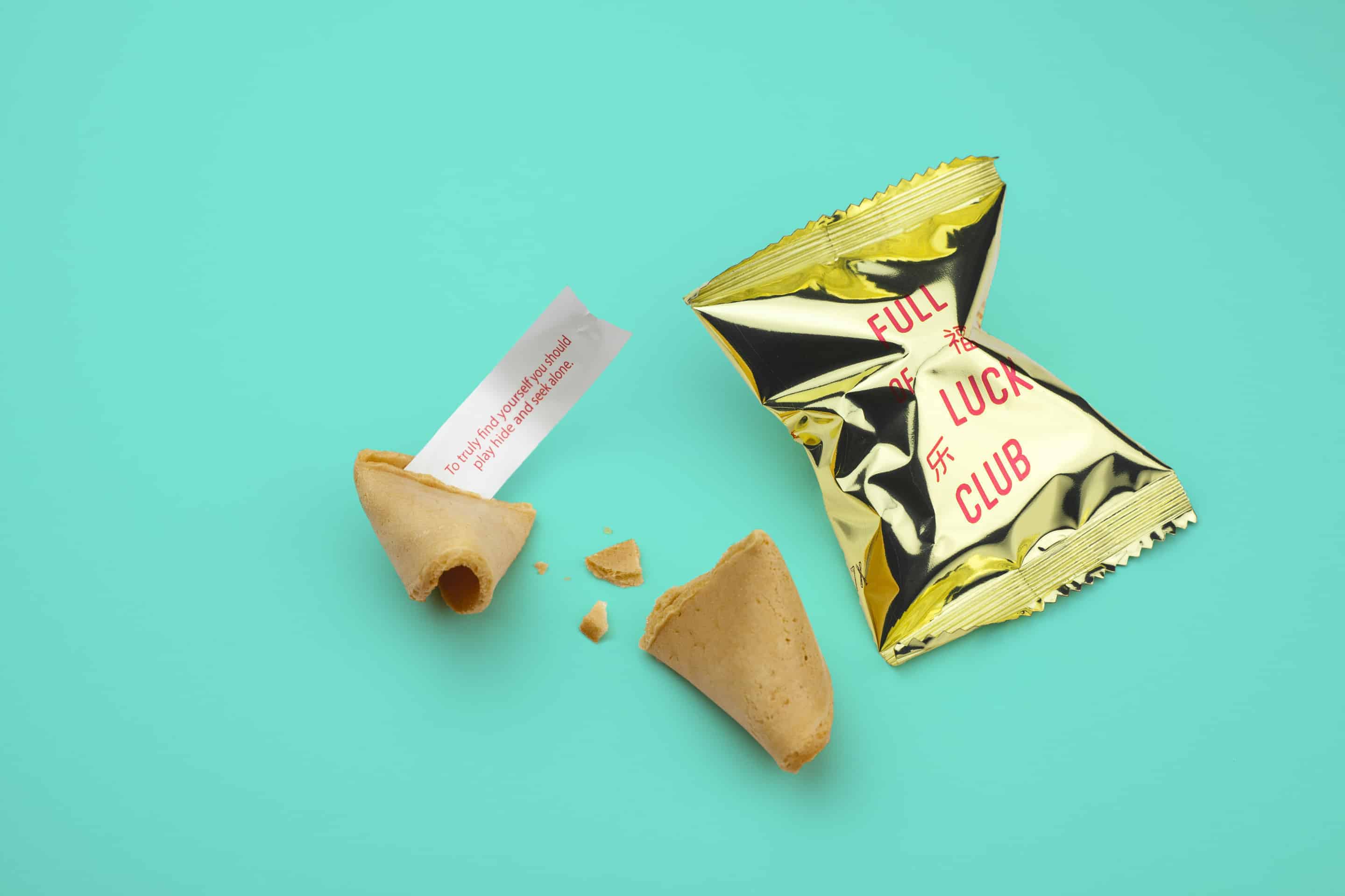
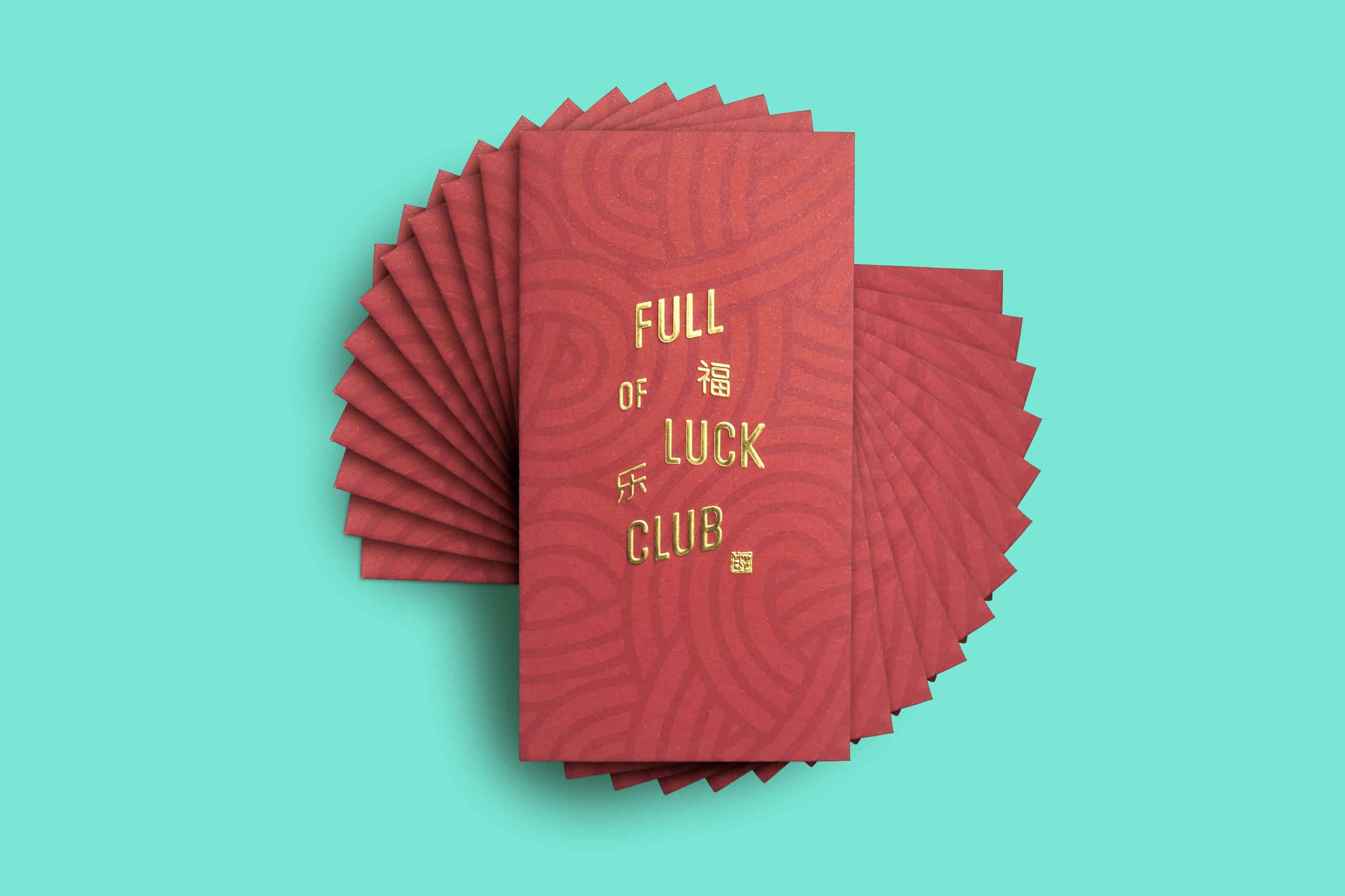
Production played a big part for Full of Luck Club as we utilised a plethora of materials, foils, colors etc to bring out the brand's personality. We experienced some mini road bumps along the production process, which our takeaway experience would be to always plan ahead and persevere.