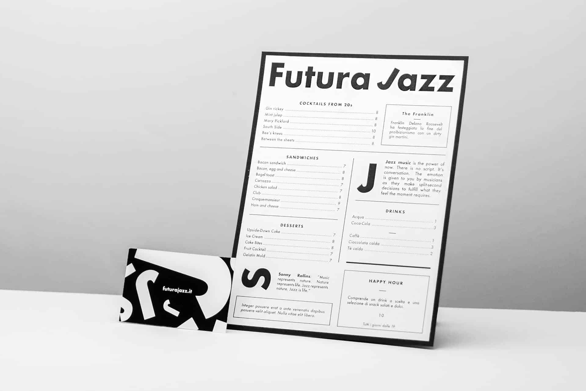
Futura Jazz Bar - Brand Identity

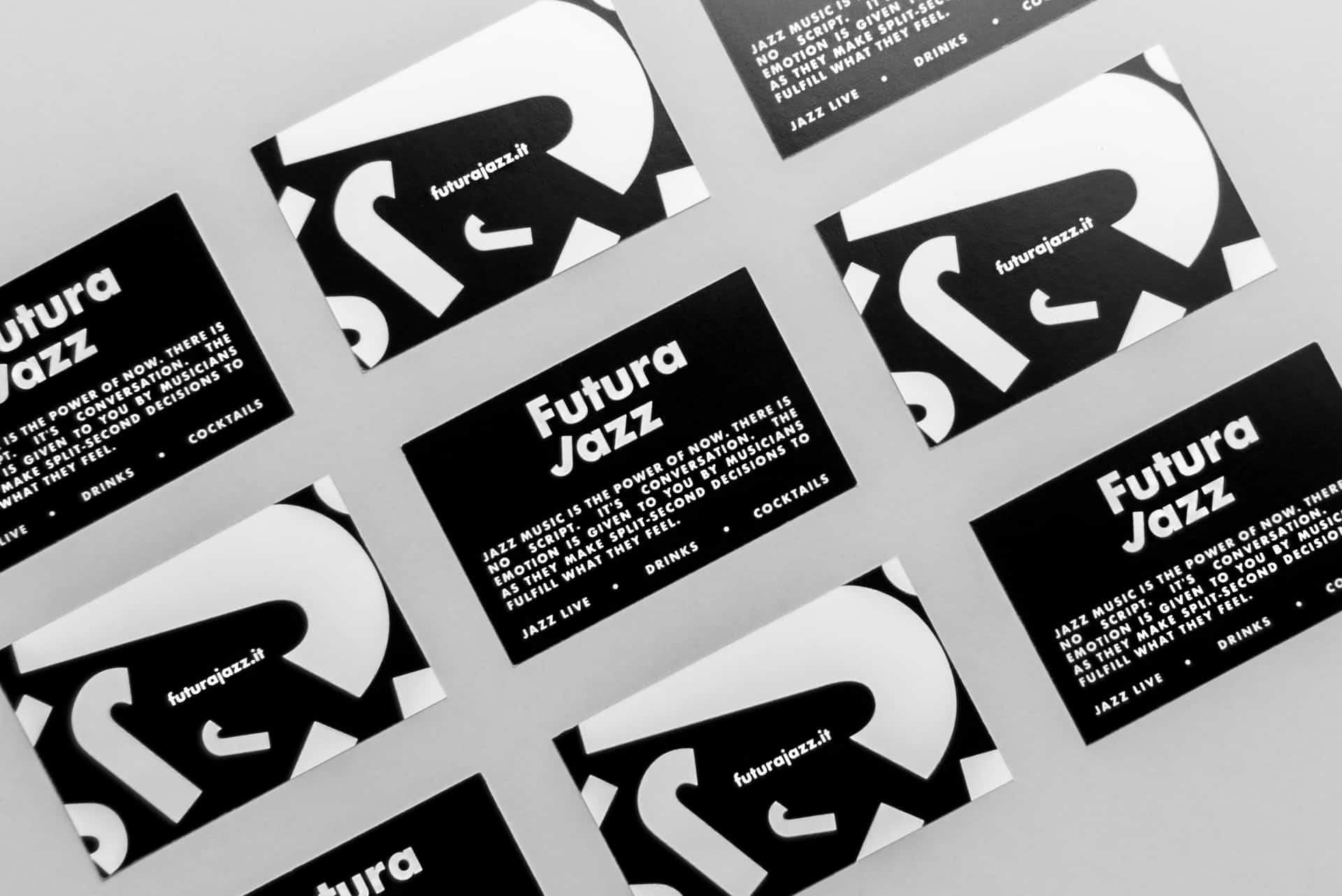
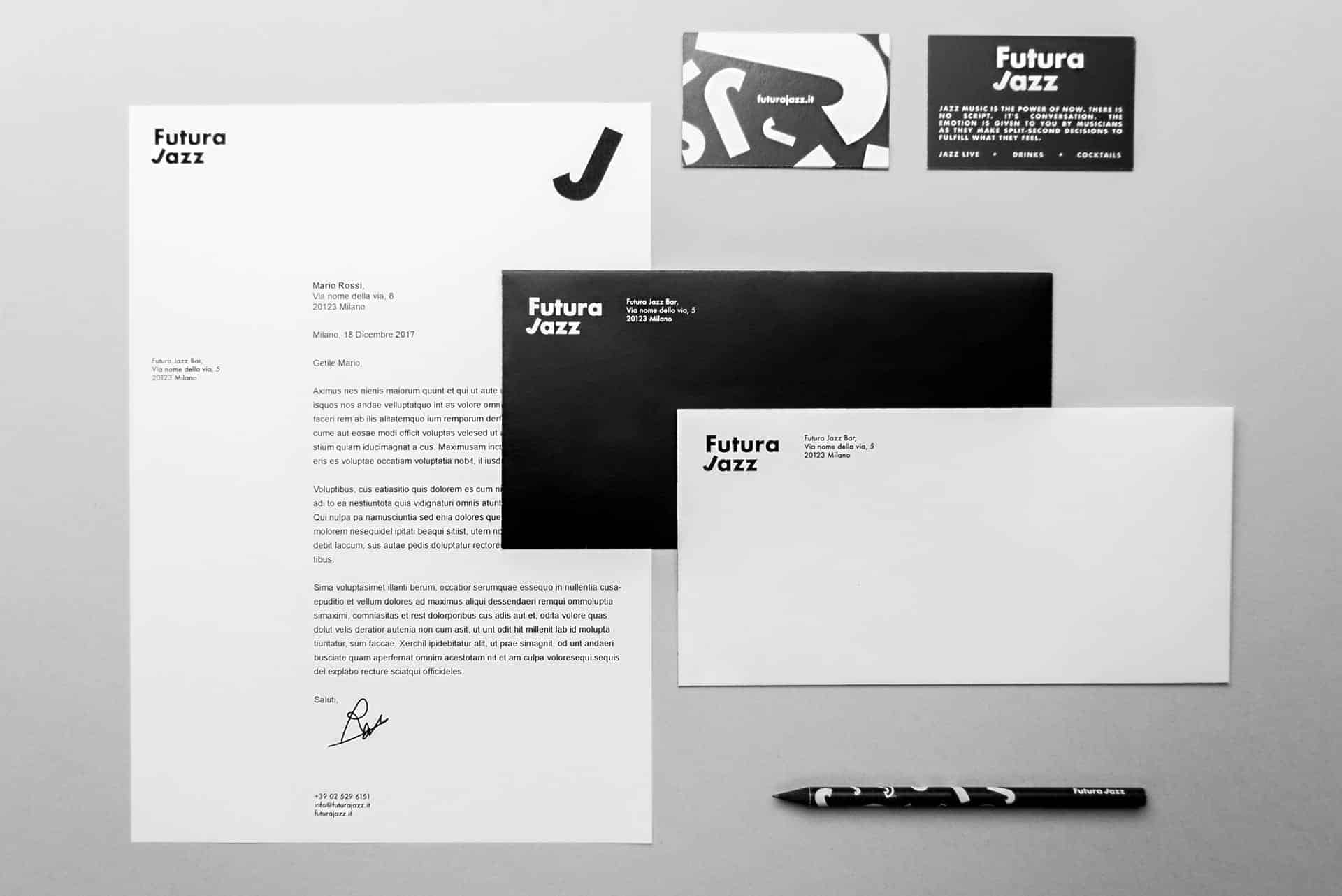
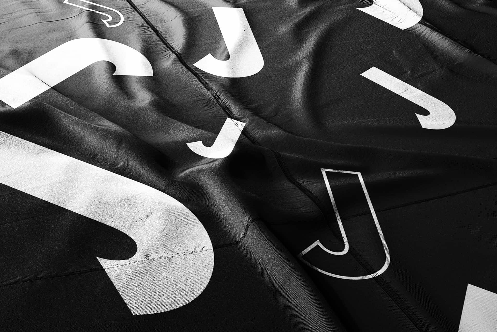
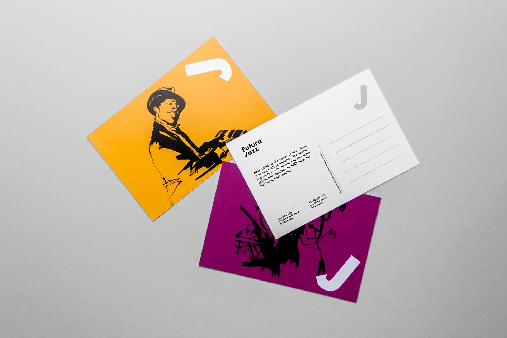
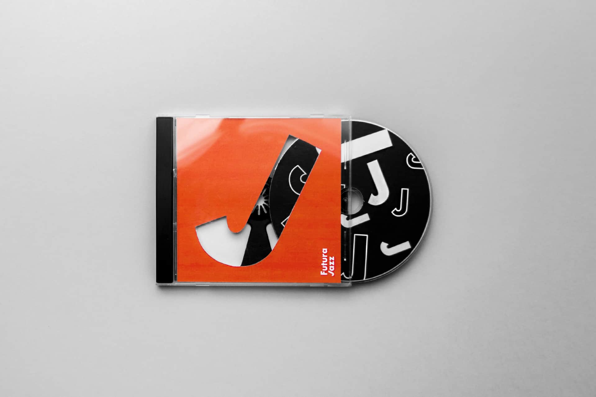
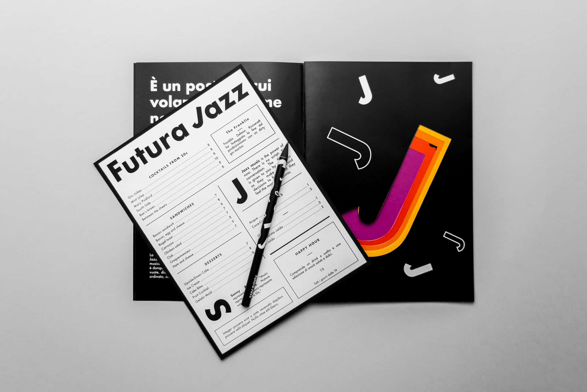
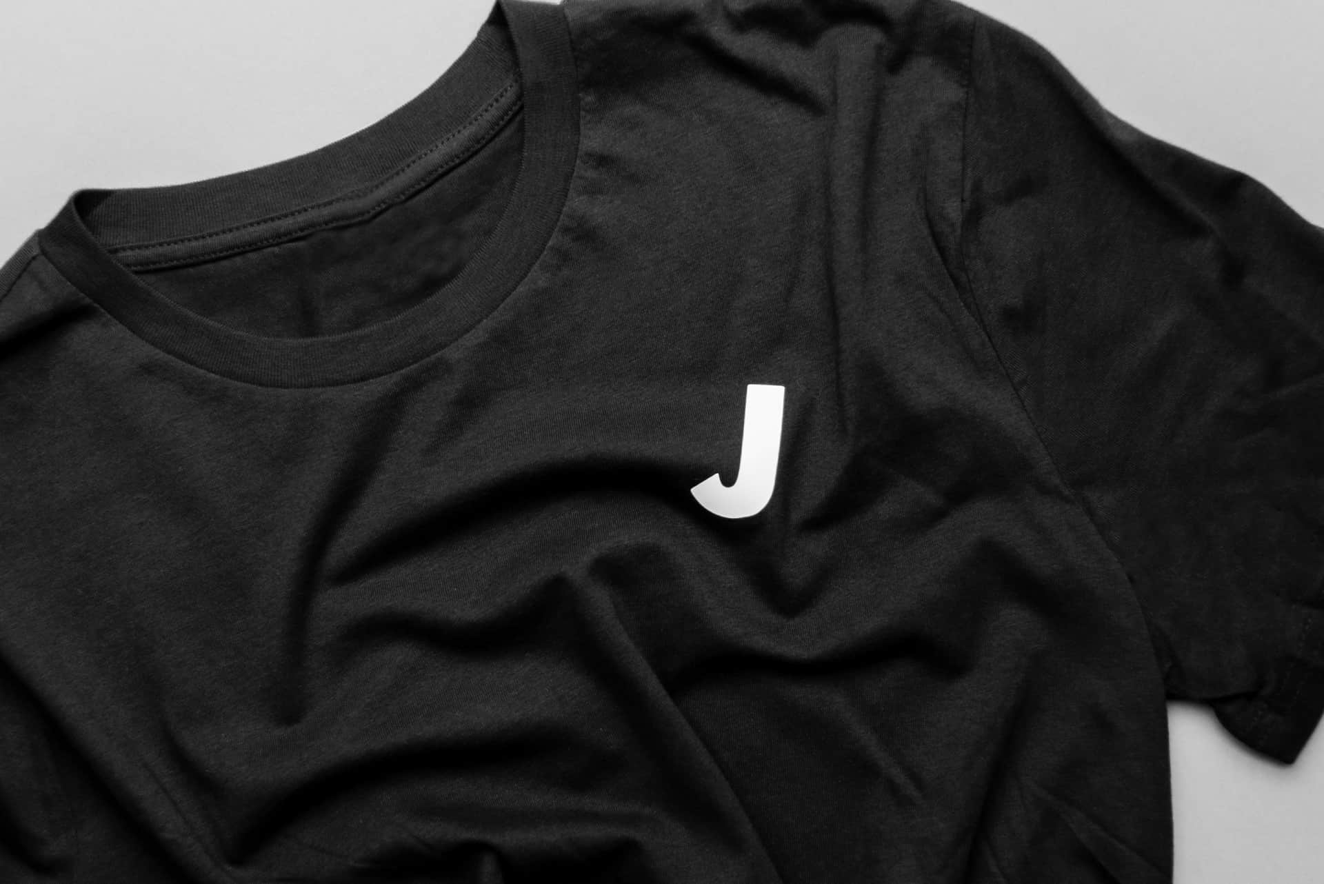
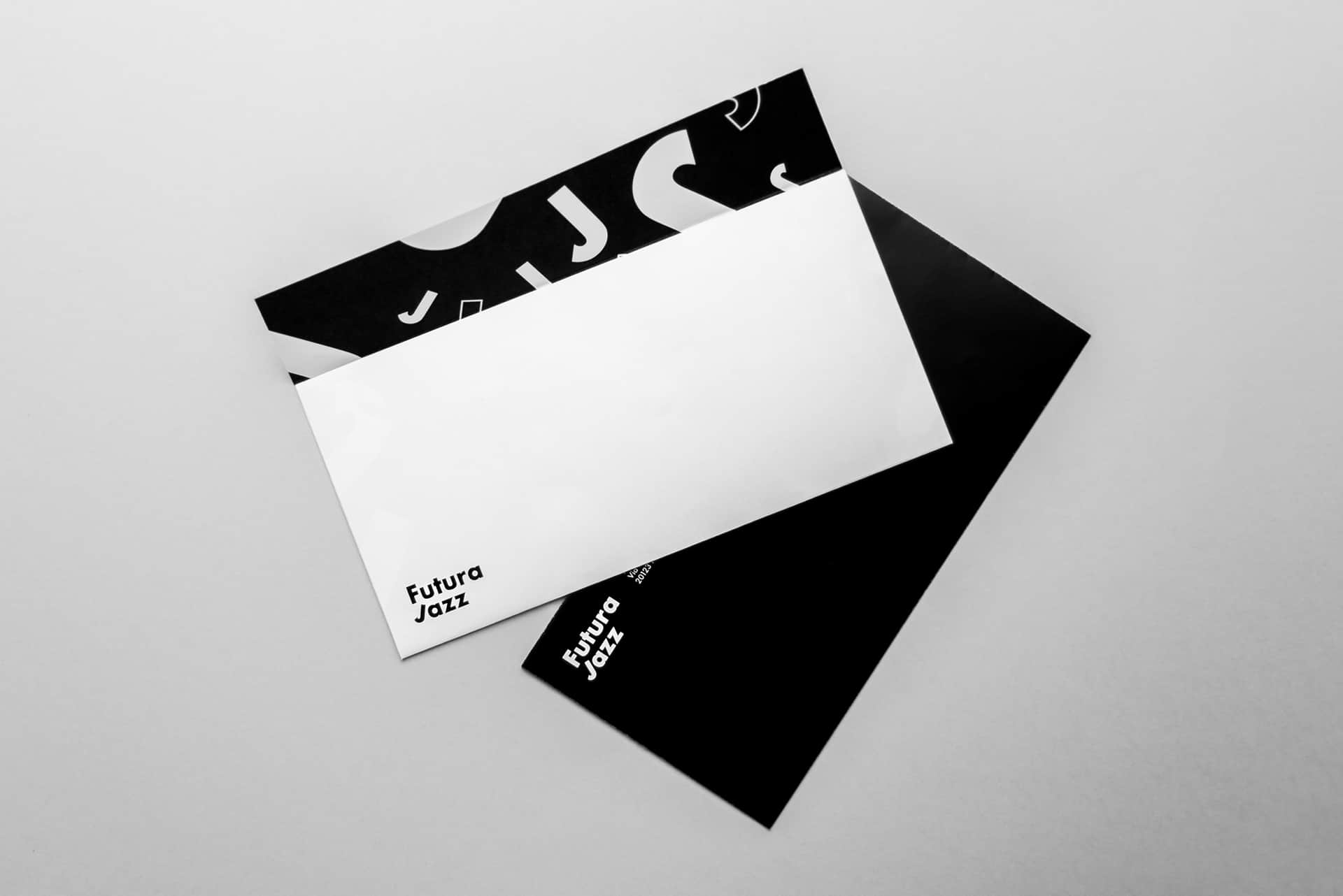
The aim was to design the brand identity for a Jazz Bar using only one typeface. Futura has been chosen because, due to its geometry, seems the perfect meeting point between past and future, like Jazz. It also has been published in 1928, in the Jazz Age. The identity is made unique and vibrant using a pattern of “J”. This letter, rotated by 30°, looks like a saxophone or like a note. That’s why in the pattern it is used filled but also outlined, resembling the half and quarter notes. The corporate identity is structured on a black and white palette while the complementary elements are made using bright colors; this is because jazz is both elegant and energetic. The mix of grids with the randomness of the “J”, black and white with bright colors, simple elements with more sophisticated ones, want to represent the soul of jazz: a mix of rules and improvisation.
Inspirations for this project come from the works of the masters like Vignelli, Paul Rand and Saul Bass, but also from famous jazz album covers form the 30s/50s. I got so many references that it had to reste everything and start from scratch. Then, working on the project, i found out how designers already solved minor problems i got through in a different way.
First i found the right typeface, because this is a font-oriented identity. Then i began sketching the letters, finding similarities, geometries and interesting shapes to work with. Then i discovered the J and then everything developed from that. The most difficult thing was to find the balance between past and present, but also between informal and elegant.

At first i was scared that my design was not enough Jazz-ish because of the typeface and because of many elements atypical for this kind of branding. Then i realized people loved the J idea and found the whole identity interesting. I'm happy when i see that people enjoy the branding i design; it has to interact with people, not only to be seen.