Gmail Redesign Concept

This was a self-initiated project. As a regular user of Gmail, I saw the potential to improve the UI and UX by simplifying and polishing everything. I love clean designs so I had this idea in mind of a neat interface with little distractions as possible and clear hierarchy.
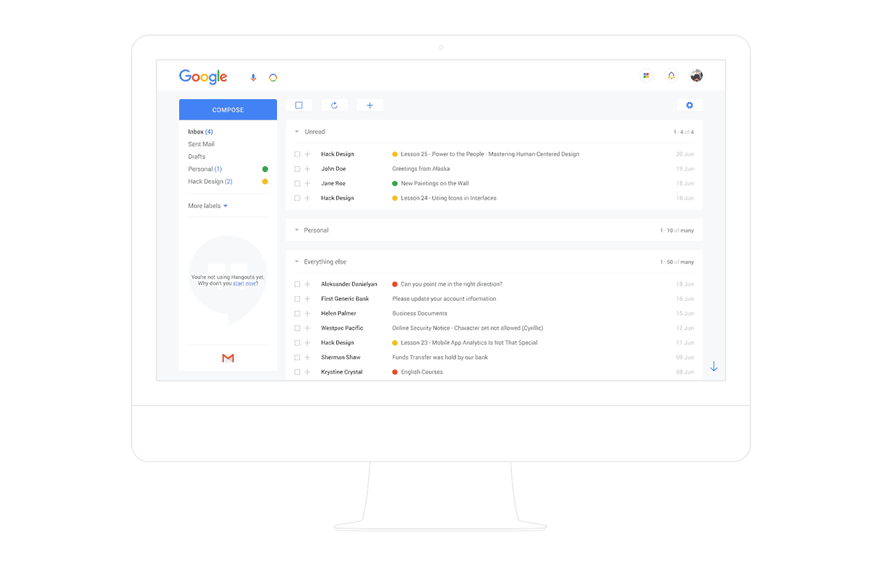
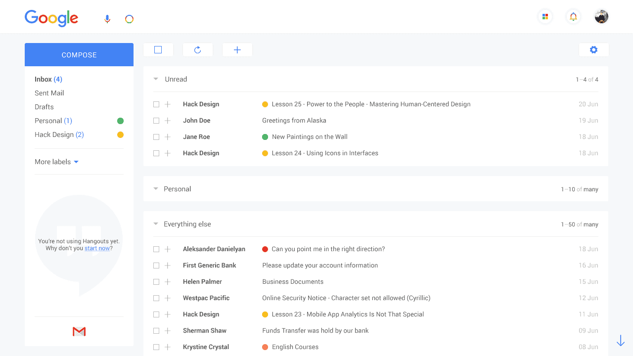
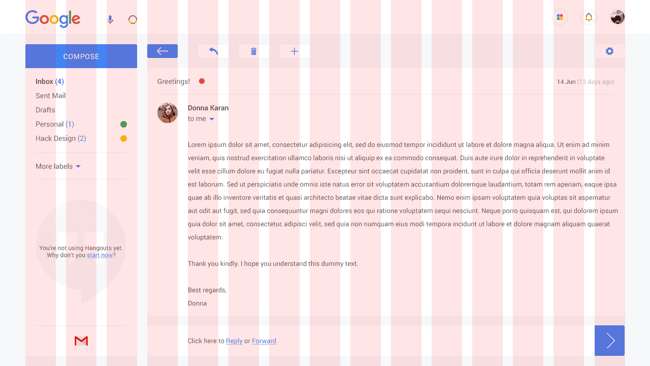
I got inspired by Google's new brand identity and I wanted to incorporate that change into Gmail UI. The main inspiration for the design revolved around the new bright colors of blue, red, yellow and green. I used them throughout the design elements to lighten up the design as a whole. And while Google is known for creating Material Design, I dediced to go for flat design with subtle hint of shadows. This allows the occasional use of colors to pop from the screen and make an impact.
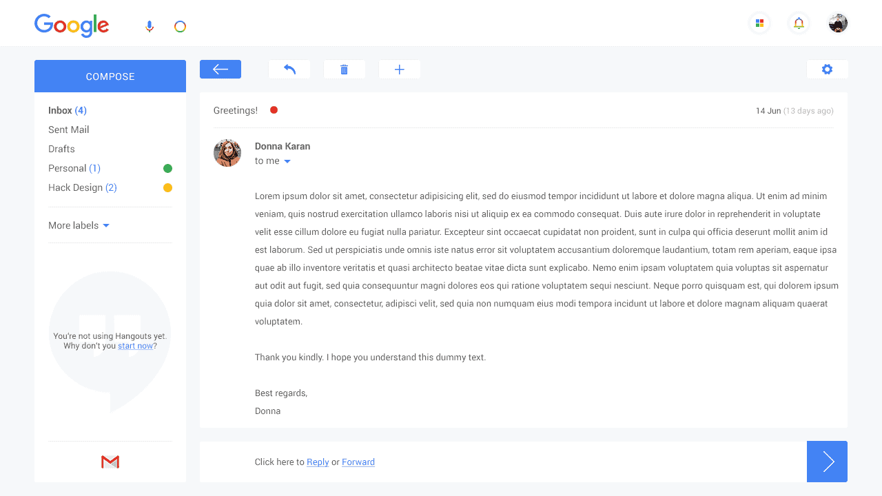
The whole project was designed in Photoshop but before I dived in Photoshop, I layed out the whole UX on a paper. The process was simple. I reviewed all elements in current Gmail UI and changed things that would either simplify it or in a way push its boundaries (e.g. technology-wise with the searchbar replaced by text and voice search).
An extremely important part of the project that holds it all together is the grid. I designed the grid based on the width of the control buttons. This approach to the grid design allowed the project to be not only consistent across pages but also focus the attention on usability with controls being at the center of the design.
The perception of the design was mainly positive and it started to gain some traction on Behance. I think it points to the fact that people would welcome a certain Gmail interface refresh, and hopefully we will get one in the future. The beautiful new brand identity of Google simply asks for one.