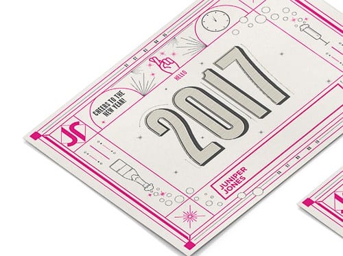
GOOD-BYE 2016. HELLO 2017!

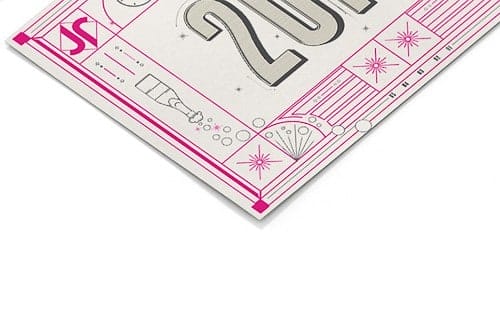
For New Years, I decided to make an ornate card with a very intense good-bye to 2016 and welcoming, with full hope, 2017. The concept was to show how 2016 made us feel after twelve long months of what seemed to be bad news. Supported with the hand drawings, clocks changing time and hot pink line work that helps the good-bye not be so aggressive. Still none the less, nothing saying Happy New Years like a bottle of champagne, a bubbling glass and fireworks.
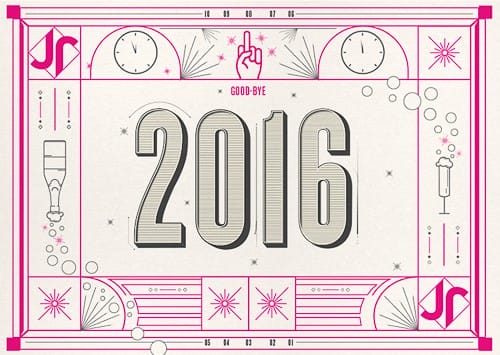
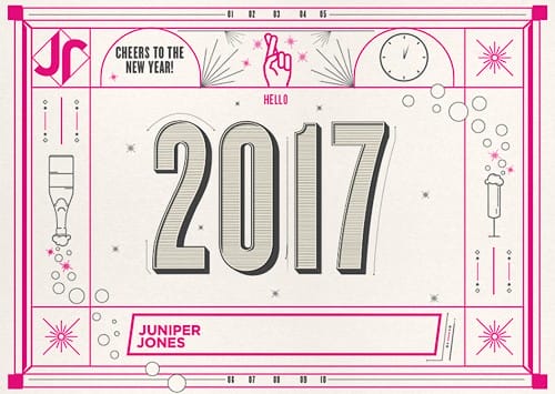
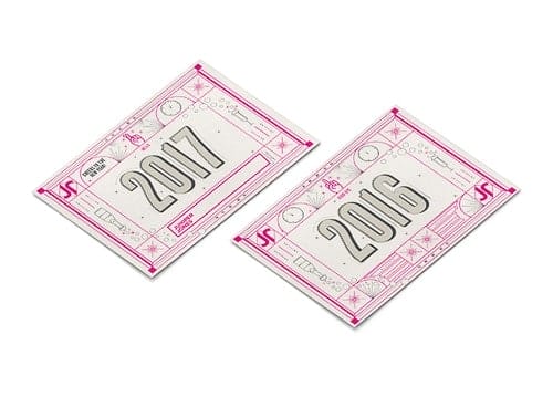
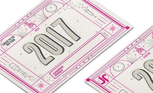
I wanted to make a postcard that would be letter pressed, so line work and details were developed because the texture would be nice to feel and help with hierarchy. The color, icons, and ornate elements help good-bye 2016 "flipping of the bird" be more elegant and less offensive, I wanted there to be lighthearted beauty. This was being sent to previous Clients, so making sure it wasn't offensive was important. Pink is a loud and warm color, it was chosen because of how eye catching it is, and New Years is a night people celebrate.
I did some personal sketches to get the lettering down and what icons I wanted to use to help tell the story. The base of the work was done in Adobe Illustrator. I started with my post card sized board, built the frames of the card first, then did each number, icons, and fireworks. I had to take away some details for printing reasons. The color was last, pink and grey which help the visual hierarchy. The numbers took the longest just because of the stripped line work in them.
It was self driven project for a studio I work at, we sent it to previous clients to be on their desk for January 2nd. The feed back was very positive! We received several emails saying how nice it was and very funny, one client even said "flipping of the bird never looked so elegant." What I learned was timing, I thought of this mid December so production didn't go as planned, so next time I will start earlier!
If anything, even if their is a negative connotation to a design or project, making it more approachable and having underlying meanings to work can sometimes be more powerful. I knew everyone didn't feel this year was bad, so I wanted to make sure I didn't cross a line, specially with clients who gave me really cool projects in the year 2016!