Gourmista by Lourdes García Traverso

Lourdes García Traverso's work "Gourmista" is a Michelin-star quality food-delivery service. They are 4 young entrepreneurs with business and culinary backgrounds. Their business idea was to have a rotating cast of chefs and menus to introduce diversity and quality to their customers. They needed the Branding for their startup business.
![]()
This project was part of a Master program in IE university (Spain). In collaboration with my team we helped them find their brand values, spirit and manifesto. This was the outcome:
Brand Values: Unique and Diverse because of the variety of chefs and menus. Excellent is linked to their positioning. Enticing for drawing in our audience, keeping us premium but approachable.
Spirit: Showing you the finer side of life, always.
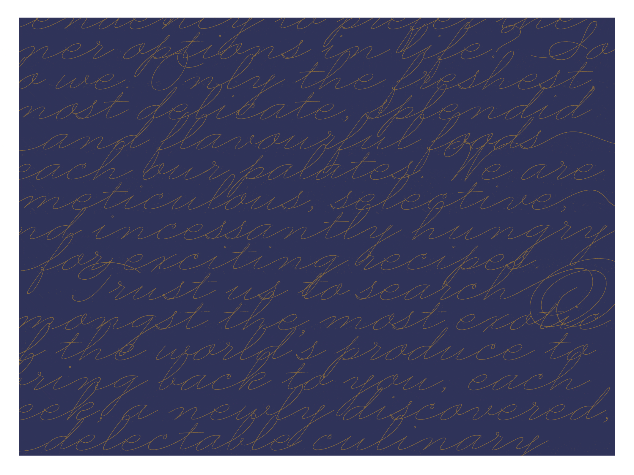
Manifesto: Do you have the tendency to prefer the finer options in life? So do we. Only the freshest, most delicate, splendid and flavorful foods reach our palates. We are meticulous, selective and incessantly hungry for exciting recipes. Trust us to search amongst the most exotic of the world’s produce to bring back to you, each week,
a newly discovered, delectable culinary experience.- Lourdes García Traverso
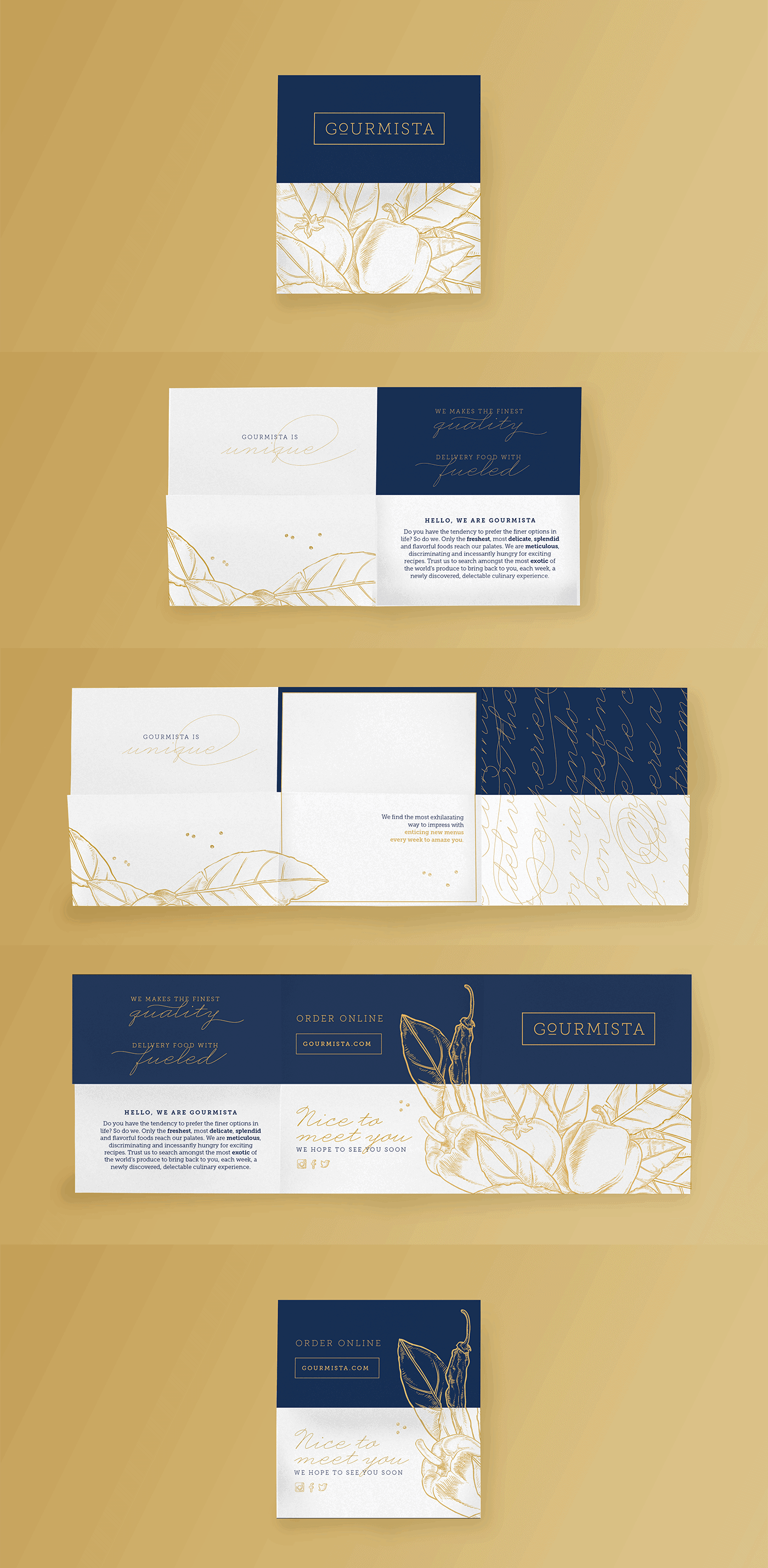
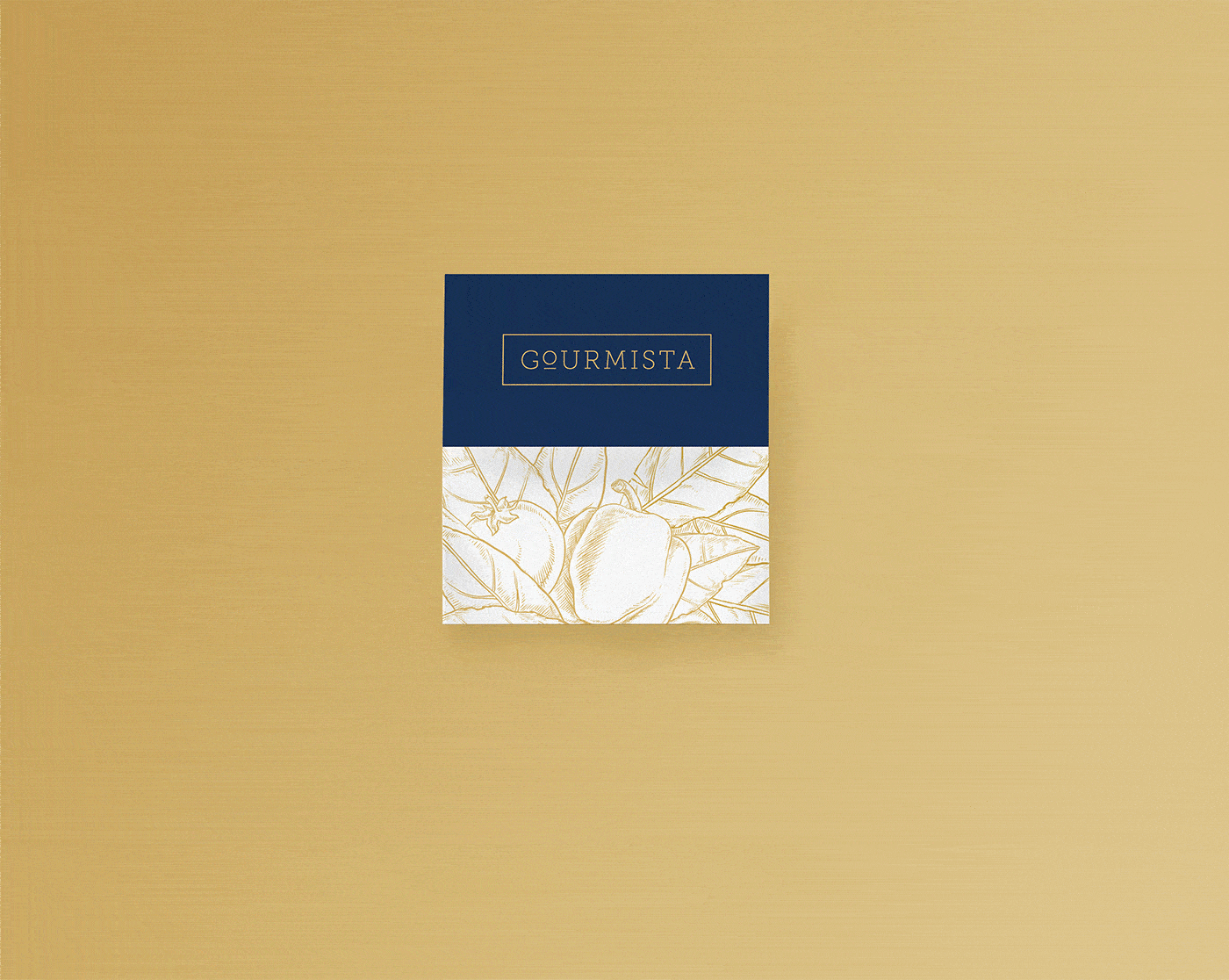
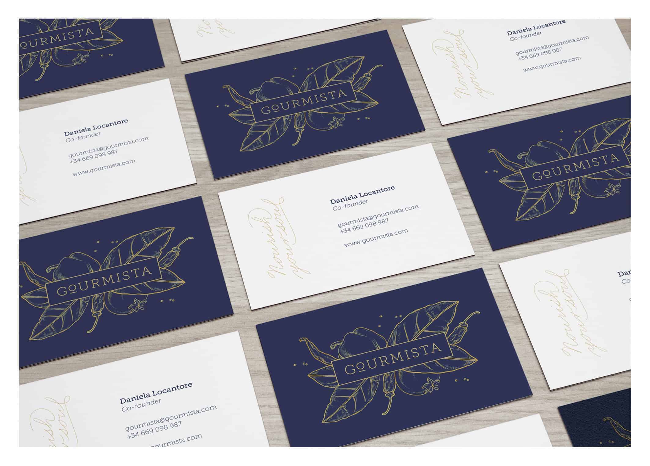
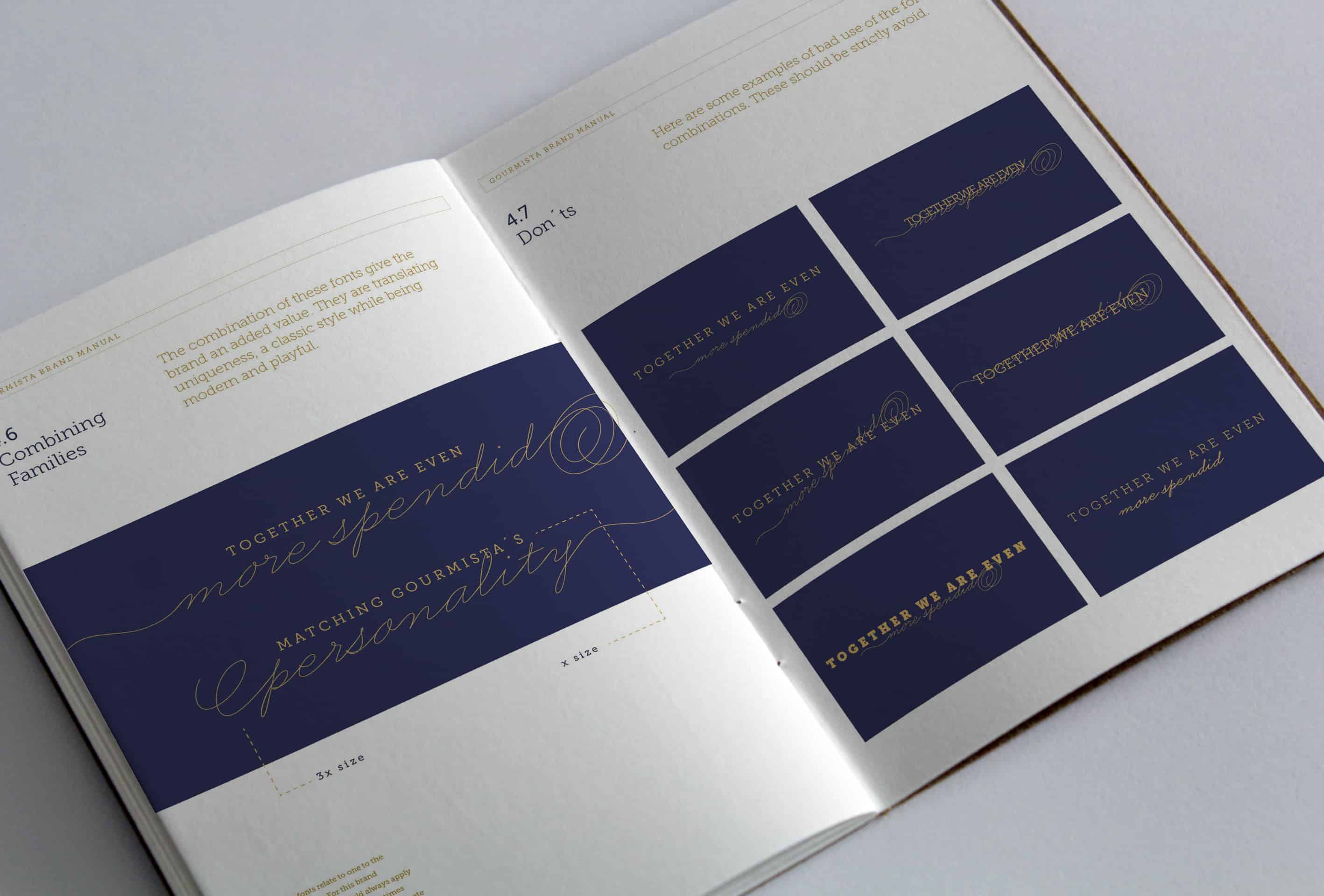
With this in mind we chose a slab serif font to transmit classic while still have a trendy look. We highlighted the "o" to play with the concept of "to go". We decided premiumness while still being reachable. We combined the type with some detailed illustrations belonging to the cooking environment to make very clear from the first look at the logo what the brand was about. To develop the graphic system around it we combined the museo slab font family with business penmanship that adds to the brand uniqueness because it has lots of alternates and ligatures to make every piece of communication unique. The fonts, the colors and the illustrations represent the brand values and whole spirit of the brand, making clear that the brand has a strong care for detail.
- Lourdes García Traverso
I worked with illustrator to develop the artwork and play with all the elements we had to combine them in different ways. For developing the folding piece of communication I worked with several layers on illustrator to have a clear idea of how each combination of the folding faces of the paper would look like. I simulated the folding by hiding the parts that wouldn't be showing when the folding happened, and this helped me figure out how to combine every object making it interesting as a whole while still having a perfect sequence and rhythm while discovering it in every moment of the unfolding process. I also worked with indesign to put everything into a brand book. And with photoshop to create the animated gif to make the manifesto look engaging when presenting it, highlighting specific words.
- Lourdes García Traverso
![]()
People were very positive about the project, specially the foldable piece that we did for them to put their menu inside. It was something that people wanted to have and keep, exactly as aimed. From this project I reinforced the importance of having strong and clear brand values and spirit, to develop from that a clear graphic system that goes along with it.
- Lourdes García Traverso
About Lourdes García Traverso
Lourdes García Traverso is a Graphic Designer from Argentina, she studied at the University of Buenos Aires and on the last term of a Master in Visual and Digital Media at IE university (Spain). She has a strong love for typography and printed communication. She believe her strongest point is in editorial design, worked on a magazine for several years and developed an eye that is obsessed with details. Lourdes love photography and have done some personal projects around it, some related to her obsession around details, some around people and some around traveling (my strongest obsessions).